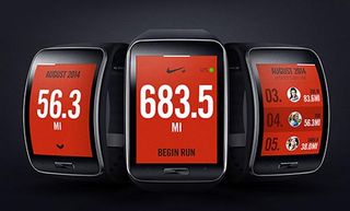
How to design for smartwatch UIs
Devices like the Apple Watch demand a new approach to design, says Nadine Chahine, legibility specialist for Monotype.
Know your audience
These numbers vary with the difficulty level of the text being read, the frequency of the words read, and the number of letters per words. Difficult text, infrequent words, and long words all increase the time required for reading. The solution? Use short and frequent words as often as possible when designing for fast consumption.
Reading times and recommended text sizes are also affected by the reader as well. Older readers require larger text sizes. This has been shown over and again in reading and legibility research so the question becomes, who are we designing for?

Do we deploy a graduated design that can be customized in size as per the user’s wishes or do we implement a calibration process that can best determine the settings required for each user? Some users are faster readers than others and can take in more information in a glance.
Testing issue
With that in mind, it could be feasible to include a step in the set-up process that tests the user's reading speed and then adjusts for the best font size, accordingly. Do we cater to the variability in readers or do we aim to please the average?
In every case, the one constant issue is that text legibility will be crucial for brands and app designers looking to convey messages quickly and to deliver effective, glance-based communications to consumers.
In a world where we are bombarded with text messages, e-mails, push notifications, and the like, it is becoming increasingly the case that the competition for our very divided attention is the next battleground. To win that competition, glances are the new currency of the age.
Words: Nadine Chahine
Get the Creative Bloq Newsletter
Daily design news, reviews, how-tos and more, as picked by the editors.
Nadine Chahine is a legibility specialist at Monotype. She is a native of Lebanon and specialist in Arabic fonts.
Like this? Read these...
- How to build an app: try these great tutorials
- Free graphic design software available right now!
- The best smartwatch

Thank you for reading 5 articles this month* Join now for unlimited access
Enjoy your first month for just £1 / $1 / €1
*Read 5 free articles per month without a subscription

Join now for unlimited access
Try first month for just £1 / $1 / €1
Rosie Hilder is Creative Bloq's Deputy Editor. After beginning her career in journalism in Argentina – where she worked as Deputy Editor of Time Out Buenos Aires – she moved back to the UK and joined Future Plc in 2016. Since then, she's worked as Operations Editor on magazines including Computer Arts, 3D World and Paint & Draw and Mac|Life. In 2018, she joined Creative Bloq, where she now assists with the daily management of the site, including growing the site's reach, getting involved in events, such as judging the Brand Impact Awards, and helping make sure our content serves the reader as best it can.
