How to design for smartwatch UIs
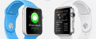
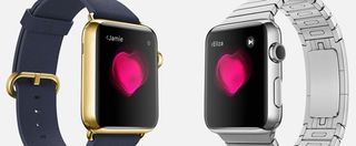
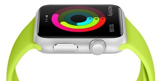
Devices like the Apple Watch demand a new approach to design, says Nadine Chahine, legibility specialist for Monotype.

It is a feature of the human body that the size of our extremities remains relatively constant after we reach adulthood. While adding weight will show up very quickly around our unlucky waists, the sizes of our hands, and to a lesser extent, our wrists, remain relatively unchanged.
Our smartphones, however, seem to continuously grow in size but sooner or later they will hit a threshold of what is possible to be held by one hand only. The new smartwatches set to hit the market will be even smaller. For convenience and durability, the face of a watch needs to fit onto our wrists, so the available real estate is rather limited.
As features and apps start to crowd that space, where will all that information be displayed? This is precious property we're talking about – key landing space for the increasingly valuable "glance". Glance has become the new click.
Glance not look
We've all spent hours fixated on our phones, so an addiction to a smart device is nothing new. When it comes to wearables, the devices are simply too small for one to spend long stretches of time interacting with them, and for some, the hand position of holding up a watch is not as comfortable as holding up a phone.

However, we have grown accustomed to an increasing amount of sophistication in apps and device functionality that a new way of interaction is required. And here comes the "glance", defined by Apple as a template-based screen view, not scrollable, associated with a single action, and optional.
In our conventional understanding of the term, a glance is a quick look where speed is part of the definition. Today, a glance is no longer just a quick look. It is a mode of interaction with a wearable. These template-based "glance" screens hold information geared towards fast consumption, and that information is very likely to be text-based.
Legibility is key
Text legibility and clarity of information design are then key to the success of these devices. Imagine the frustration of looking at a watch and having to hold it up close to your face because the interface is too busy or the text is too small to read, even when you have glasses on.
Get the Creative Bloq Newsletter
Daily design news, reviews, how-tos and more, as picked by the editors.

The success of a wearable will be in how effortless the interaction will be and how consumable these glances are. "Today's connected world is bound to become even more complex, as devices with screens become even more pervasive.
"Brands and advertisers will need to work harder to grab your attention – and legible type is key," says Bryan Reimer, a research scientist at the MIT AgeLab. To ensure that we can read what is needed in each glance, an increasing level of design optimisation is critical.
Size of text
So how can one work towards an effortless experience? There are several factors that influence legibility and these can greatly contribute to the user experience. A very important factor is the size of the text in relation to the distance from the eyes.

The distance of the wrist from the eyes is governed by the length of the forearm. This varies amongst people, taller people having longer arms, so some sort of average would need to be taken. Or, a flexible size setting can be introduced in order to provide text settings that are comfortable to hold up.
Another important factor is the amount and density of text on screen. How much information will we access in a glance? On average, studies have shown that it takes around 225 to 250 milliseconds to silently read a word in English. That is around 4 words per second.
Next page: knowing your audience and testing issues...

Thank you for reading 5 articles this month* Join now for unlimited access
Enjoy your first month for just £1 / $1 / €1
*Read 5 free articles per month without a subscription

Join now for unlimited access
Try first month for just £1 / $1 / €1
Rosie Hilder is Creative Bloq's Deputy Editor. After beginning her career in journalism in Argentina – where she worked as Deputy Editor of Time Out Buenos Aires – she moved back to the UK and joined Future Plc in 2016. Since then, she's worked as Operations Editor on magazines including Computer Arts, 3D World and Paint & Draw and Mac|Life. In 2018, she joined Creative Bloq, where she now assists with the daily management of the site, including growing the site's reach, getting involved in events, such as judging the Brand Impact Awards, and helping make sure our content serves the reader as best it can.
