How Apple Watch will change apps forever
Apple’s wearable looks set to cause another app revolution. App creators explain why.
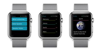
The word that sums up Apple Watch and initial apps that will appear on it is 'limitations'. This isn't meant negatively. Instead, it's about focus. Tappable UX head Aaron Humphreys elaborates: "While the tech may be prominent, these devices are limited in terms of functionality, but this makes them beautifully simplistic as a result." Upcoming Apple Watch apps therefore seem to mostly be concerned with helping you get at information in an accessible, efficient manner.
Humphreys believes this is a refinement more than a redefinition of mobile apps, yet the repercussions could be huge, because of how Apple Watch will be used. "Its intended use is to provide information more unobtrusively than pulling out your iPhone," says MindNode CEO Markus Müller-Simhofer. "On creating an app, you must ask yourself what is the single most important feature that makes sense on Apple Watch? Only focus on that. Enable the user to spend as little time in your app as necessary, to allow them to get on with more important things."

This in some ways echoes the iPhone's launch. Developers clamoured to port existing desktop apps, but rapidly found themselves having to figure out what features made sense on the relatively small iPhone display. "It's all about condensing things down to what's truly important – there's no space for filler," says developer Gary Riches.
And just as mobile websites and apps impacted on desktop design, he believes the razor-sharp focus required for Apple Watch "is a useful skill to apply to any app", and the way in which Apple Watch apps are only designed to be used for a few seconds "will go some way to improving overall app and interaction design".
Mobile-first
Lucas Brauer, UX designer at Smashing Boxes, reasons that developers have at least had some practice in this field. Mobile-first design has become increasingly prevalent, teaching designers to begin with the smallest form factor, before moving to larger ones offering more flexibility.
"But Apple Watch imposes unprecedented constraints, and so prioritisation is critical," he says. "And it's not a reduction game. Small-screen design is about being relevant to the user. More than ever, you need to know what the user needs and when, isolating primary content and elements to smoothly deliver core value. You have to accept you can't do everything, but you have to do one thing very well."

Use contexts will further impact the kind of apps we see on Apple Watch. Developer and designer Curtis Herbert thinks the device will extend people's expectation that apps are now "part of a coherent platform working across multiple devices".
Get the Creative Bloq Newsletter
Daily design news, reviews, how-tos and more, as picked by the editors.
Brauer adds that Apple Watch "isn't going to be stationary – it'll be moving about," which will have a knock-on effect on design clarity and readability. "When you think the contrast is sharp enough, double your assumptions," he recommends.
But there's also the reintroduction and increasing use of the watch form factor itself, which has been marginalised in recent years, and was previously only something you glanced at for the time.
"I suspect initially it will be socially awkward to interact with Apple Watch in public," believes Müller-Simhofer. "This makes it critical that apps should be fast and responsive – you don't want users waiting ages for data to load." He says the current SDK makes this a challenge, since content any third-party apps display must be prepared by an iPhone and then transferred.
However, this in turn means app-creators will have to keep down the amount of data they intend to send and not rely too heavily on imagery. Again, efficiency is key, although 'efficient' shouldn't mean 'dull'.
"It's important to keep in mind users are going to expect apps to feel lively. So spend extra time making sure your graphics have the animations they need since Apple has set the bar very high with its own apps," says Herbert. "But remain mindful of keeping things fast — users will raise their wrist and expect an app to immediately work. Slow interactions are going to be painfully obvious.
Next page: more about Apple's app revolution

Thank you for reading 5 articles this month* Join now for unlimited access
Enjoy your first month for just £1 / $1 / €1
*Read 5 free articles per month without a subscription

Join now for unlimited access
Try first month for just £1 / $1 / €1
The Creative Bloq team is made up of a group of design fans, and has changed and evolved since Creative Bloq began back in 2012. The current website team consists of eight full-time members of staff: Editor Georgia Coggan, Deputy Editor Rosie Hilder, Ecommerce Editor Beren Neale, Senior News Editor Daniel Piper, Editor, Digital Art and 3D Ian Dean, Tech Reviews Editor Erlingur Einarsson and Ecommerce Writer Beth Nicholls and Staff Writer Natalie Fear, as well as a roster of freelancers from around the world. The 3D World and ImagineFX magazine teams also pitch in, ensuring that content from 3D World and ImagineFX is represented on Creative Bloq.
