Fighting the flat: the resurgence of the photorealistic icon
Fed up of flat design? 2014 may be about to see the re-emergence of a smartphone app icon design trend - photorealism. Here are 10 brilliant examples...
No-one can deny the surge in popularity for smartphones over the last few years. But as well as an increase in the number of iPhones and other smartphones out there, the number of apps installed on those phones is also on the rise. In the US, Nielsen recently reported that between 2011 and 2012 the average number of apps per smartphone went up from 32 to 41 - and things have moved on apace since then. The bottom line is apps are up against stiff competition and lots of it, so they need to stand out from the crowd.
Once an app has been downloaded it needs to score highly on looks as well as functionality, or it’ll lose its coveted spot on a user’s smartphone. With 41-plus icons competing for attention on an iPhone’s app grid that little signature picture needs to look good. One trend that seems to be taking off in the field of icon design is photorealism. This design style offers a heck of a lot more texture than the numerous 'flat design'-style icons that are out there but has a lot more finesse than the clunky, tawdry design style that was around prior to flat design minimalism. The design pendulum is swinging back in favour of detail but in a way that looks polished, sleek and very technically advanced.
Where did photorealism come from?
Photorealism is a lot more than a web design ‘flash in the pan’. This fully-fledged art movement was borne on the back of Pop Art in the late 1960s and early 1970s and at the time was largely centred around the arts scene in the United States. Photorealism arguably came about as a reaction to minimalism. This reaction could easily be paralleled with its burgeoning popularity today, which could be seen as a reaction to flat design.
What is photorealistic design?
Photorealism has always trodden the slightly disconcerting line between what looks real and what looks artificial. The reason for this is explained in the way a design is made up. The artist usually takes several photographs to gather visual information about their subject, which are then used to make up the final image - or painting. The advent of photoshop and advanced design programmes like it have led to shortcuts in producing precision oriented results. These design programmes make it increasingly easy to introduce texture, shadow, bevelling and shine with relative ease. As a result, in terms of design today, photorealistic images looks almost too good to be true.
Why does photorealism work for iOS icons?
As mentioned above, iOS icons need to stand out. They also have a very small space to try to communicate high quality design and execution. The high shine on a lot of the examples below denotes technical expertise and a hyper-real, hyper-modern aesthetic. As you’ll see photorealistic icons really pop off the screen and in a relatively small space are capable of making a serious impression...
01. Konstantin Datz
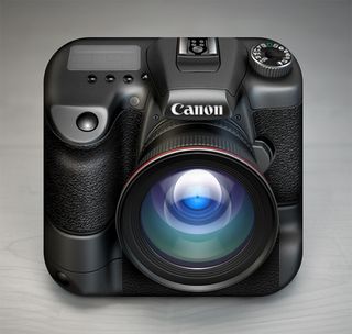
This icon was chosen due to the lens reflections and the lighting. All these features add authentic details, resulting in a photorealistic look.
02. Vasilije Ristovic

Chosen for its use of depth, each ball features rounded reflections that complement the vibrant colours. The wood texture and shape acts as a perfect frame.
Get the Creative Bloq Newsletter
Daily design news, reviews, how-tos and more, as picked by the editors.
03. Zolotco D Eugene

This icon was chosen due to its amazing light work and wood texture. The television looks so real and plays on the nostalgic emotions of the viewer.
04. SvN

This Old Power Socket iOS icon showcases immaculate simplicity. Its glossy finish is beautifully slick.
05. Aleksandr Novoselov
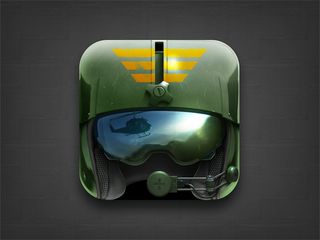
The concept and the execution of this icon is incredible. The use of reflection on the visor suggests a story which adds realism and detail.
06. Rosetta Icon Design

This icon was chosen because the detailed glass work and texture on the gold fish.
07. Loggia
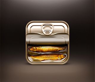
The metal work and detailed textured fish make this icon a true masterpiece
08. Valery Zanimanski

This icon displays a prenominal use of light. The blurry effect on the reflection looks very real.
09. Ryan Ford
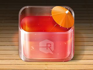
This icon has been chosen due to the exceptionally executed glass work and use of reflections.
10. Román Jusdado

This icon displays beautiful coloured tones, realistic features which all contribute to its vintage style.
Words: Libby French
Libby French is a Director for iphonerepairs.co.uk. She currently manages all sales and marketing activities. In her spare time she enjoys blogging. Add Libby French on Google+ to find out more.
Liked this? Read these:
- How to make an app: try these great tutorials
- The best photo apps for iPhone, iPad and Android
- Discover the best iPhone apps for designers
If we've missed your favourite design-related app then please flag it up in the comments.

Thank you for reading 5 articles this month* Join now for unlimited access
Enjoy your first month for just £1 / $1 / €1
*Read 5 free articles per month without a subscription

Join now for unlimited access
Try first month for just £1 / $1 / €1
The Creative Bloq team is made up of a group of design fans, and has changed and evolved since Creative Bloq began back in 2012. The current website team consists of eight full-time members of staff: Editor Georgia Coggan, Deputy Editor Rosie Hilder, Ecommerce Editor Beren Neale, Senior News Editor Daniel Piper, Editor, Digital Art and 3D Ian Dean, Tech Reviews Editor Erlingur Einarsson, Ecommerce Writer Beth Nicholls and Staff Writer Natalie Fear, as well as a roster of freelancers from around the world. The ImagineFX magazine team also pitch in, ensuring that content from leading digital art publication ImagineFX is represented on Creative Bloq.
