Design a simple mobile app for iOS 7
Julia Khusainova explains how to create an iOS 7 application design using some of the operating system's newest features.
We'll be creating an iOS 7 application design using the most exciting features of Apple's new mobile operating system. Apple's iOS 7 introduces a fresh new look to the iPhone and iPad operating system. General guidance for designing an iOS 7 application interface can be summarised as:
- Flat - Apple design guidelines for iOS 7 encourage simplicity, usability and an easy-to-use approach. Some newly-designed apps (and in Apple's own styling) counter some of the characteristics of flat design. But don't take it too literally. For example, the keyboard and buttons shown are not 100 per cent flat; every letter is contained within a button that has a drop shadow on it. This subtle effect has some advantages and is what makes it different from a completely flat approach.
- Colours - Colours for iOS 7 applications are supposed to be bright, highly saturated and inviting. Although, native iOS 7 apps don't always follow that. For example, see the Email or Messages app.
- Typography - Content features lightweight typography. The font is Helvetica Neue Light.
- Layout - Accent on light, easy-to-use interface, with minimum or no layer styles.
Once you have your wireframes in place, we can continue to start creating the design.
01. Basic canvas

Let's create a basic canvas to place UI elements on. Create a 640x1138px canvas in Photoshop with a transparent background. The application is supposed to be accessible, usable and content-oriented so we won't use crazy colours for the background.
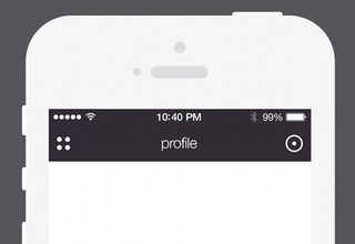
Instead, we'll reserve our brand colour (eggplant purple) for the top bar. The top bar usually has a height of 100px. (When starting with iOS 7, the status bar is part of the top bar interface, so don't forget to include it in your design if you haven't done it before.)
Create a 640x100px solid rectangle on the very top. I usually use up to 3200% zoom to make sure the design is pixel perfect.
If you learn basic keyboard shortcuts, you'll be able to make these repeatable actions in a blink of an eye. Start with a transparent canvas and create a few screens that will be used in specific parts of the flow.
02. Interface elements
The app logo is based on circles, which is why I decided to use it to inform the interface elements. Instead of having standard three vertical lines for the menu, let's be creative! Draw a 12x12px circle, fill with #fff, copy it three times and place as shown on the image. The space between the circles is 8px .
Get the Creative Bloq Newsletter
Daily design news, reviews, how-tos and more, as picked by the editors.
On the right side, we'll have the 'Settings'. Let's create something similar for the Settings icon: a 10x10px circle with an outside stroke 4px wide. You can create this stroke by drawing a circle with 42px in diameter and subtracting the inner circle with 34px in diameter. Place the icons on the left and right side appropriately allowing 20px space on each side. The title for this page is 'Profile', centered horizontally. The font is Helvetica Light and the font size is 36px .
Try to use the top bar as the basis for brand colours in your app design. Good examples of this can be seen in the Facebook and Instagram iPhone app.
03. User information

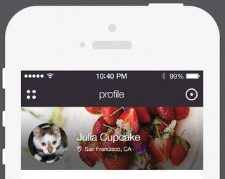
Let's draw a user information area, which contains the user's name, location and photo. The background is a square that's 222px high. Place a sample photograph and create a mask using the Clipping Mask tool. Centre the photograph appropriately.
Photography-based layouts should be designed carefully, taking into consideration the usage of the layout. We'll have text placed over it so we need to ensure the contrast is good and the text is accessible. Make sure you test the text visibility with different photos in the background. I picked text with #fff and 1px drop shadow.
In order to achieve even more contrast, we'll add some black gradients to the background. Create a rectangle and apply the Clipping Mask to it.
Never scale the photography with the Transform tool. The quality will suffer tremendously. Instead, use the Image Size tool and scale it down to the size you need. For best results, use professional software such as Adobe Lightroom, which will export the file in a specified size.
Use this technique to achieve better contrast so that any photography can be used as a background, thereby providing user flexibility.
04. Inbox layout

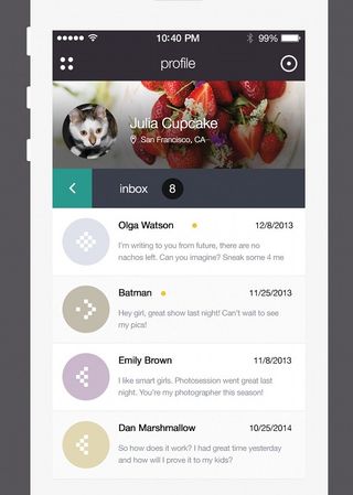
Now we're going to create the inbox layout. Start with the top bar for the Inbox section. Create a 640x100px rectangle with a solid #3a3e4b as background. The left part of it's going to be an arrow to go back to the inbox menu. Create a solid #2e988d rectangle, which is 100x100px.
This is where the wireframing is handy. You can have numerous variations of the same layout, but exact interactions will tell you which one is the most usable.
It's extremely important to use complementary colours in your app design. Play around with some colours, use colour theory guidance and don't forget to use brand colours as you go. (There are some online resources that can help you to learn about colour theory and how to combine colours for your UI. My personal favourite for application design is creative community site COLORlovers (colorlovers.com).)
To design the arrow icon, create a 19x4px rectangle. Fill it in with solid #fff and apply Transform/ Rotate to a 45 angle. Copy the rectangle, apply Transform/Flip Vertical, Drag it so it creates the arrow shape. Merge the shapes. Voilà!
Place the 'Inbox' title 70px from the left. Make sure it's aligned vertically. Next, create a circle with a #141516 background, place a number 8 inside and align vertically and horizontally. This is the new email notification.
05. Email items
Create a rectangle and fill in with solid #fff. Draw a #e3e3e3 border and place it on the bottom edge of the rectangle. Create a 120x120px circle, fill in with grey colour, grab a photograph of the user, and place it on top, apply the Clipping Mask to it.
Centre horizontally and vertically. Make sure there is 25px reserved on left and right. Add the sender's name in #000 and message copy in #868b98. Position appropriately. The date is also in #000 and in a lighter font weight, aligned to the right. Repeat three times.
For even items, use #fafafa as background colour. For content-oriented layout (reader, email client, newspaper) use light backgrounds and grey text to ensure it's accessible and easy to read on small screens.
06. New button

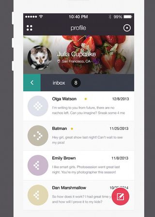
Create a circle with 102px in diameter and fill in with solid #ec2e49. Place it on bottom right. Design the pen icon with a size of 40x40px. Place on a circle and align vertically and horizontally. Give the icon 90% opacity. To add a cherry to your cake, a button that pops up nicely among the overall light interface will add a last detail and interest to your app UI.
Conclusion
You've designed the interface of a trendy iPhone application featuring inbox layout and profile styles. Try playing around with the layout, add a mosaic background to the user profile piece and create the menu. Don't forget to design and define the menu actions. You can also add interactions using Adobe After Effects, or similar design tools. Ship it!
Words: Julia Khusainova
Julia Khusainova is a senior product designer, who specialises in UI/UX, visual and mobile design and wireframing. This article originally appeared in net magazine issue 250.

Thank you for reading 5 articles this month* Join now for unlimited access
Enjoy your first month for just £1 / $1 / €1
*Read 5 free articles per month without a subscription

Join now for unlimited access
Try first month for just £1 / $1 / €1
The Creative Bloq team is made up of a group of design fans, and has changed and evolved since Creative Bloq began back in 2012. The current website team consists of eight full-time members of staff: Editor Georgia Coggan, Deputy Editor Rosie Hilder, Ecommerce Editor Beren Neale, Senior News Editor Daniel Piper, Editor, Digital Art and 3D Ian Dean, Tech Reviews Editor Erlingur Einarsson and Ecommerce Writer Beth Nicholls and Staff Writer Natalie Fear, as well as a roster of freelancers from around the world. The 3D World and ImagineFX magazine teams also pitch in, ensuring that content from 3D World and ImagineFX is represented on Creative Bloq.
