Design a mobile retail interface in Sketch
Dev Morgan of ustwo explains how to create a shopping basket for an iPhone 6 app interface in six steps.
When handmade cosmetics company Lush wanted to develop its first mobile experience, the brand turned to global digital studio ustwo. Taking cues from the company's web presence and existing brand, the goal was to push what could be achieved on mobile and produce a best-in-class shopping and discovery experience. Designer Dev Morgan walkthrough the process…
Lush Digital came to ustwo looking to create their first mobile experience, with the aim of augmenting their site and bridging the gap between online and in-store experiences.
Together we built a team involving both companies, allowing for quick decision-making and skill-sharing. My role was to come up with ideas, organise which features were worked on and construct the interface in stills and motion design.
Starting a project is a good opportunity to refresh your thinking and learn new things. We were keen to try out Sketch from Bohemian Coding, having heard good things about it.
It's got a shallow learning curve and has many of the best features that have made the Adobe Creative Suite and Creative Cloud so popular over the years – it's like a mix between Photoshop, Illustrator and InDesign. In this walkthrough, I'll explain our day-to-day workflow on the project, including exporting assets and supplying them to our developers.
01. Set up a canvas

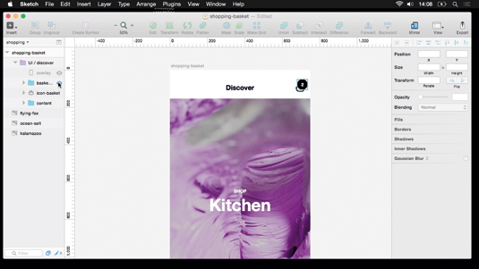
Launching Sketch, before you start working you need to set up an artboard to match the dimensions of an iPhone 6 – 750 x 1334 pixels – and place some background artwork as a holder. In this example I'll be making a shopping basket that mirrors the Lush website.
02. Use symbols

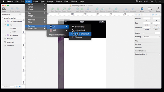
Commonly used icons and buttons can be created and then stored as symbols. Making symbols means that changes inside one instance will be reflected anywhere that they've been re-used – handy if you have the same elements occurring across several artboards.
Get the Creative Bloq Newsletter
Daily design news, reviews, how-tos and more, as picked by the editors.
03. Get the spacing right

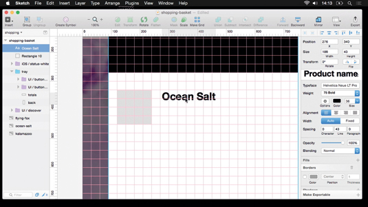
For consistency, I'm checking my horizontal and vertical alignments against the grid, which I've set up inside Sketch. In this case, I'm using a base unit of 30 pixels as a spacer. Sketch enables you to pre-set type styles and sizes and re-use them across a project, which is what I'm doing here.
Next page: the next three steps

Thank you for reading 5 articles this month* Join now for unlimited access
Enjoy your first month for just £1 / $1 / €1
*Read 5 free articles per month without a subscription

Join now for unlimited access
Try first month for just £1 / $1 / €1

The Creative Bloq team is made up of a group of art and design enthusiasts, and has changed and evolved since Creative Bloq began back in 2012. The current website team consists of eight full-time members of staff: Editor Georgia Coggan, Deputy Editor Rosie Hilder, Ecommerce Editor Beren Neale, Senior News Editor Daniel Piper, Editor, Digital Art and 3D Ian Dean, Tech Reviews Editor Erlingur Einarsson, Ecommerce Writer Beth Nicholls and Staff Writer Natalie Fear, as well as a roster of freelancers from around the world. The ImagineFX magazine team also pitch in, ensuring that content from leading digital art publication ImagineFX is represented on Creative Bloq.
