Pro tips: creating flat app designs for iOS 7
Apposing's Dave Brown and Vicky Roberts provide their essential guide to effective iOS 7 UI design in Photoshop.
Designing for iOS has always thrown up particular challenges that the designer has to contend with. Whereas previous versions of iOS were very much focused on a skeuomorphic look and feel, iOS 7's famously 'flat' aesthetic requires a different approach and the best iPhone apps simply have to adapt to it.
With what seems like the whole industry moving towards a flat design trend, it was no real surprise when Jony Ive's design team at Apple took iOS in this direction last year. Graphics are now bolder, more colourful and more focused on function than form. So even if you already know how to make an app, take heed of these tips and techniques for designing iOS 7-ready UIs in Photoshop.
01. Try out Skala Preview
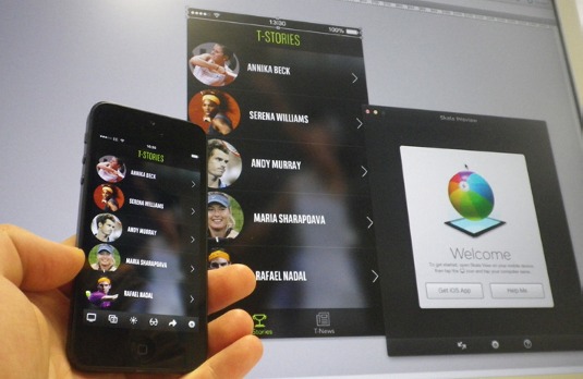
Skala Preview is a super-handy tool for all app designers. It enables you to see your design - pixel-perfect and colour-perfect - on the screen of your linked device, straight from Photoshop. It removes the guesswork and saves you a lot of time.
02. Blast through it with DevRocket
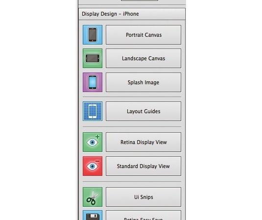
DevRocket is another Photoshop plug-in which is great for iOS designers. With it, you can generate templates in both orientations, switch between Retina and standard in Photoshop, and even export at both resolutions. Essential.
03. Design icons in a square

You might think that because app icons appear with rounded corners on your iPhone, that's how you need to design them. Not so. Take the visible area into account and mark it off in Photoshop as a design guide. Submit a square image to the App Store and let Apple do the rest.
04. Use an Apple icon design template
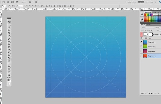
There are many templates to help you design an icon which works with the new Apple layout grid (Find one here for free). These are great as they enable you to create multiple icons by simply pasting graphics into predetermined layer masks.
05. Design for iPhone 4 and scale up
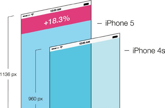
If you don't have time to create a bespoke UI for the iPhone 4 and 5, design for the slightly smaller screen of the iPhone 4 and scale it up. If you do have time, put the iPhone 5's extra space to good use and give your app - and its primary function - room to breathe.
Get the Creative Bloq Newsletter
Daily design news, reviews, how-tos and more, as picked by the editors.
06. Remember your pixels
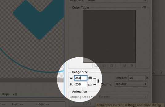
Designing for the Retina display means working at two resolutions - normal size, and twice the original size for Retina. To avoid fuzzy edges when your design is scaled down, keep image proportions even (not odd) and tick the Snap to Pixel checkbox in Photoshop.
07. K.I.S.S.

Don't get bogged down with gradients, bezels and drop shadows, as this won't fit with the simpler, brighter iOS 7 feel. If you want your app to look at home, allow for plenty of white space and steer clear of a skeuomorphic approach in favour of flat design.
08. Dynamic type
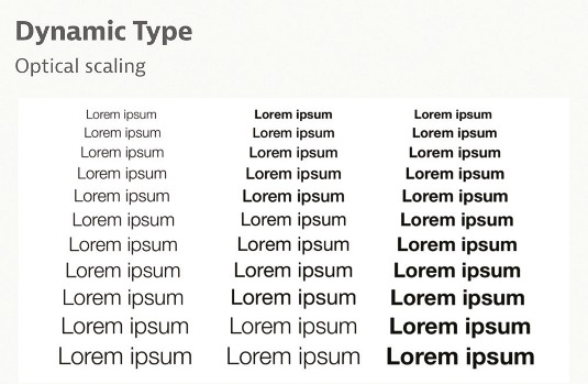
Text in iOS 7 can be dynamically scaled to suit the needs of the user. Apple has taken care with system fonts to ensure legiblity - if you choose custom fonts, consider the same. As borderless buttons are popular now, use text colour to signify which elements are interactive.
09. iOS 7 status bar
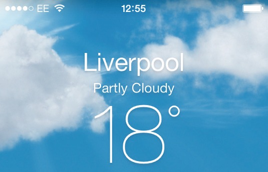
With the new emphasis on function over ornamentation, designers should make content reach the whole width and height of the screen. One good example of this is Apple's Weather app. The clouds float behind the status bar, maximising use of the full-screen real estate.
Words: Dave Brown and Vicky Roberts
Apposing is a mobile and digital creative studio. Founder and managing director Dave works with PR and communcations specialist Vicky on projects for clients including Unilever and the BBC. This article originally appeared in Computer Arts issue 225.

Thank you for reading 5 articles this month* Join now for unlimited access
Enjoy your first month for just £1 / $1 / €1
*Read 5 free articles per month without a subscription

Join now for unlimited access
Try first month for just £1 / $1 / €1

The Creative Bloq team is made up of a group of art and design enthusiasts, and has changed and evolved since Creative Bloq began back in 2012. The current website team consists of eight full-time members of staff: Editor Georgia Coggan, Deputy Editor Rosie Hilder, Ecommerce Editor Beren Neale, Senior News Editor Daniel Piper, Editor, Digital Art and 3D Ian Dean, Tech Reviews Editor Erlingur Einarsson, Ecommerce Writer Beth Nicholls and Staff Writer Natalie Fear, as well as a roster of freelancers from around the world. The ImagineFX magazine team also pitch in, ensuring that content from leading digital art publication ImagineFX is represented on Creative Bloq.
