Is A/B testing worth the trouble?
Mike Kulakov offers the benefit of his experience in using A/B testing for the launch of his time management and reporting tool, Everhour.
About a month ago at Everhour, we moved from private to public beta. And we were about to jump into the marketing sprint to let the world know how cool our product - a handy time management and reporting tool - was. To better prepare for the coming promotion activities, we decided to get detailed and explicit analytics.

Since we were going to spend some money, we naturally wanted to track how effective our investments and certain marketing techniques would be.
As a part of our analytical adventure, we planned to launch two app landing pages at a time to check which of them would have higher conversion rates:
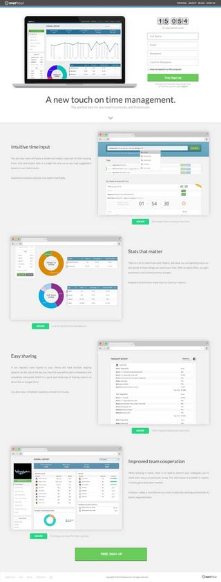
- A) one with a more detailed description of the app features, problems it solves, screenshots to help visitors make an informed decision on signing up
or
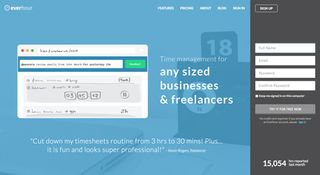
- B) a minimalistic design page with a striking tagline aimed at urging visitors to try the tool and see all the benefits themselves.
We’ve investigated the topic and come across some great stories such as the following blog post series by 37Signals: Behind the scenes: A/B testing part 1; part 2; part 3.
Eventually, we’ve come up with two design options provided below and started rotating them randomly on our app site.
Options A and B


So, what did it cost us?
- Mockups for two landing pages including discussions and editing
- Two design versions with implementation of responsive design behavior in widescreen and laptop resolutions
- Image slicing (preparing images for wide, laptop and Retina resolutions)
- Coding
- Developing A/B testing functionality
- Cross-browser testing
Additionally:
- We also had to adjust Pricing, About, and Sign In pages to each design version.
- We coded responsive landing pages though we haven’t particularly elaborated mobile design.
- To get stats on each landing page performance, we set up Google Analytics.
Total time spent: 96.5 hours.
Results
Having launched the landing pages, we started a promotion campaign described here and after a month of active marketing, we were ready to finally examine the A/B testing results.
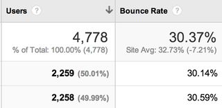
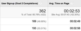
We had had quite big hopes for the testing. But the numbers got us very disappointed, as you can see below (A is at the top, B below):


As you may see, the whole experiment has turned out to be useless! Stats for both pages are almost the same except for a slight difference in conversion rates which is too small to be seriously taken into consideration.
The only conclusion we can make based on the results is that we need to increase conversions. And honestly, it’s clear even without the whole testing thing. Though a conversion rate of 7-8 % is actually good enough at the early stages when you submit your startup to as many sites as possible and as a result, get really miscellaneous visitors. At the moment we’ve an average conversion of 10%. Besides, signups are just a way of measuring the effectiveness of promo pages and not an ultimate aim.
Conclusions
For us personally, all the efforts have been spent in vain. And we are pretty sure that any early-stage startup will come to the same thought after running A/B testing for their product. But anyway, every experience is a good experience.
The process has been time consuming even given the fact that we have few pages on the website. And what if you have a lot of them? Preparing design will turn into a full-time, non-stop job for you and your team. Well, you can, of course, work just on landing pages leaving others unchanged, but we believe you should follow the same style throughout the whole website.
Besides, with A/B testing you need to keep experimenting instead of getting satisfied with a couple of variants. We realize that currently we have other priorities such as improving the app functionality as well as redesigning our landing page to present Everhour in its best light.
However, we don’t claim that A/B testing is pointless on the whole. We just think it’s worth trying only when having an extensive amount of visitors on your site. In such a case you’ll get enough data for deciding what actually works best for you product.
Words: Mike Kulakov
Mike Kulakov is the proud CEO of time management and reporting tool Everhour.

Thank you for reading 5 articles this month* Join now for unlimited access
Enjoy your first month for just £1 / $1 / €1
*Read 5 free articles per month without a subscription

Join now for unlimited access
Try first month for just £1 / $1 / €1
Get the Creative Bloq Newsletter
Daily design news, reviews, how-tos and more, as picked by the editors.
The Creative Bloq team is made up of a group of design fans, and has changed and evolved since Creative Bloq began back in 2012. The current website team consists of eight full-time members of staff: Editor Georgia Coggan, Deputy Editor Rosie Hilder, Ecommerce Editor Beren Neale, Senior News Editor Daniel Piper, Editor, Digital Art and 3D Ian Dean, Tech Reviews Editor Erlingur Einarsson and Ecommerce Writer Beth Nicholls and Staff Writer Natalie Fear, as well as a roster of freelancers from around the world. The 3D World and ImagineFX magazine teams also pitch in, ensuring that content from 3D World and ImagineFX is represented on Creative Bloq.
