5 pro tips for designing for disabilities
Developing an app that will help the visually impaired cross the road, art director Sergey Andronov discusses designing for disabilities.
This year, the electric traffic light's 101st anniversary, but unfortunately only 10 per cent of traffic lights worldwide are currently equipped with audible signals or tactile paving and none of them have a GPS tag.
This can make street crossing problematic for the blind and visually impaired. Hungry Boys has addressed this issue and developed the SeeLight app. Two versions exist:
- SeeLight – for public authorities and individuals to share data on traffic signals so they can be mapped.
- SeeLight Blind, which can then be accessed by the visually impaired.
By activating this version, audio prompts and vibrations are delivered to the user helping them to cross streets and roads safely. This video demonstrates how it works and an Indiegogo campaign has been set up to help fund further development.
Here, Sergey Andronov, art director for Hungry Boys, talks through the project and shares some of the lessons they've learned...
01. Learn what people really need
When we first had the idea for SeeLight, many Russians thought that blind people didn't use iPhones, leave the house much or have any need for gadgets. Thankfully, we didn't pay much attention to the general consensus.

Instead, we went to the All Russian Association of the Blind to dive deeper into the requirements of the visually impaired. We learned exactly what they needed versus features that were surplus to requirements.
02. One size won't fit all
Our main task in terms of visual design was to create a version that could be used by both the blind and the visually impaired.
Many people not immersed in the topic think that blind people can not use smartphones equipped with touch screens, because they can not navigate. This is in fact, completely wrong. Blind people can use any standard applications using VoiceOver in iOS, which allows you to use your smartphone, even when they cannot see the screen.
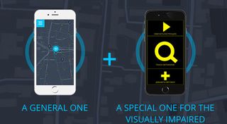
However, we tried to take things one step further, as we were not initially satisfied with the standard version of the design for both the blind and partially sighted user.
We, therefore, decided to make a separate version solely for the blind, which has been specially adapted for easy use with VoiceOver.
03. Plan properly
When designing for disabilities, absolutely detail is absolutely vital – and consequently so is planning properly. The process of creating SeeLight was in turn carefully built from several key stages.
During our discussions with the All Russian Association of the Blind, we collected information on mobile device use patterns for the blind as well as the problems associated with urban infrastructure. We then extensively analysed all the information obtained in order to develop the most likely solutions to the problems identified.
Only then, did we start to create and test various design concepts for ease of use without the ability to see the screen. This continual testing and debugging resulted in the formation of two versions for the seeing and another version for the blind.
04. Reduce visual clutter
When you are designing for visual and/or mental disabilities, keeping things visually simple is key.
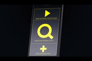
There are two versions of our app SeeLight. The version for the completely blind uses voice and vibration to help the user navigate traffic crossings. For the version for the visually impaired, we chose a black and yellow colour scheme because of the high contrast levels between the hues.
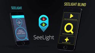
This combination simplifies and reduces 'visual clutter', allowing the application to be more easily decoded by the brain and therefore seen as best as possible. The use of large iconography also eliminates the need to read text and immediately adds clarity to the functions.
With regards to the shapes we used, the simplified application design actually consists of continuous large rectangular blocks which were selected for a reason.
In VoiceOver, the user is guided by touching a certain area of the interface and listening to the voice prompt which informs them about the function which will be available on the neck click. Therefore, by creating large solid areas, we have simplified the use of the VoiceOver function for blind users.
05. Don't give up
Do your research. Don't give up halfway and don't listen to naysayers. The idea is key.
Liked this? Read these!

Thank you for reading 5 articles this month* Join now for unlimited access
Enjoy your first month for just £1 / $1 / €1
*Read 5 free articles per month without a subscription

Join now for unlimited access
Try first month for just £1 / $1 / €1
Get the Creative Bloq Newsletter
Daily design news, reviews, how-tos and more, as picked by the editors.
The Creative Bloq team is made up of a group of design fans, and has changed and evolved since Creative Bloq began back in 2012. The current website team consists of eight full-time members of staff: Editor Georgia Coggan, Deputy Editor Rosie Hilder, Ecommerce Editor Beren Neale, Senior News Editor Daniel Piper, Editor, Digital Art and 3D Ian Dean, Tech Reviews Editor Erlingur Einarsson and Ecommerce Writer Beth Nicholls and Staff Writer Natalie Fear, as well as a roster of freelancers from around the world. The 3D World and ImagineFX magazine teams also pitch in, ensuring that content from 3D World and ImagineFX is represented on Creative Bloq.
