16 killer design tips for creating mobile apps
Valerie Lisyansky of SWARM explains what you need to know about creating mobile apps.
Specialists generally assume that everything they know is obvious, and need to remind themselves that isn't the case for most of the population.
What specialists do have is a speed at which they make decisions in their work. This is reflective of the years of targeted work and experience, and not an assumed reality that everyone possess. There is a point when a specialist has to step back and view the bigger picture of life, otherwise they remain interested in only the thoughts of other specialist; in effect making art for other artists.
One of the more valuable things that can be taught are the assumptions used to make decisions; an explanation of the strict rule set designers use will help others learn to ride their bikes quicker.
So here are 16 tips on mobile app design. Let's go!
01. Everything exists on a grid
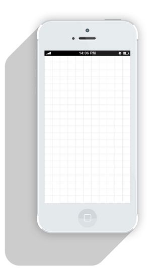
There's an invisible grid on every surface. You may not see it, but it's there to guide you.
02. Every element defines the spacing
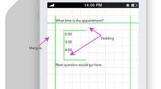
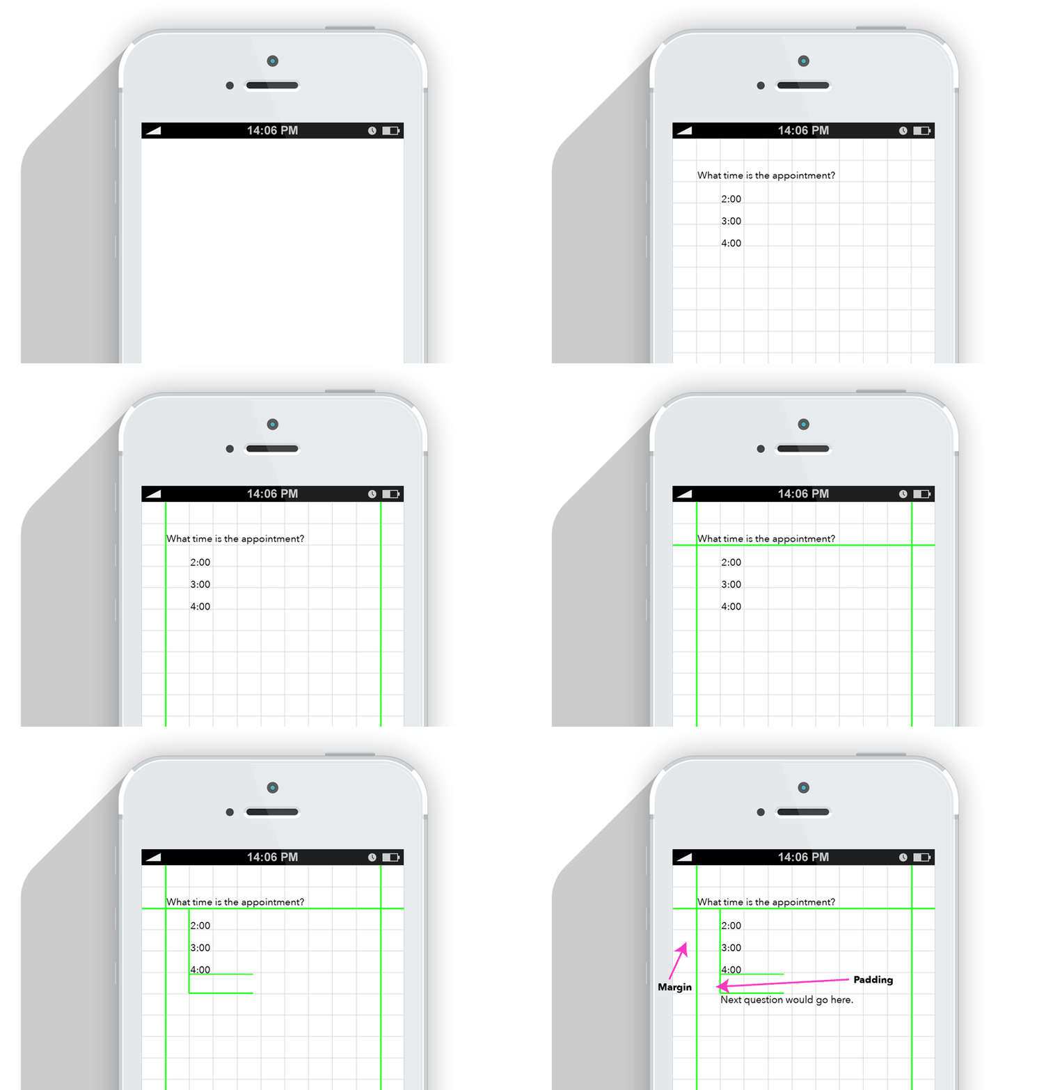
The moment a dot, a word, a line is placed onto a canvas/monitor/screen, you have defined your margins and padding. Every stroke defines the space you have to work with.
With that, make sure to maintain consistent widths and heights with the margins and padding. Sixty pixels in one place and 20px in another had better have a good reason behind it (like one section is a child of the other). Otherwise, all should be the same.
Get the Creative Bloq Newsletter
Daily design news, reviews, how-tos and more, as picked by the editors.
03. Colour creates hierarchy
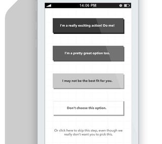
Colour value is used to denote purpose. Let's start with black and greyscale. If you make one button black, the next dark grey, and the third light grey, what you are in effect saying is this: "Button one is most important to the visitor, button 2 is less important, and button 3 is least important."
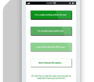
Try not make the button colours the same colour as the site or app, as it will fade away. Also, a good tip is to avoid creating "buy" or other call to actions buttons in a bright red – as that means stop in the US, and may actually prevent users from clicking it, often thinking it won't get them to their goal (see image).
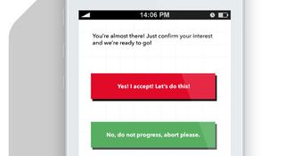
This brings up the next point which is that colour associations are culturally based and should be considered when defining the market. For instance, I once worked on a team that had the main 'access' button as red which we later changed to green and increased clicks twofold.
Red can mean, "stop, don't do it, are you sure? warning!" being aware of this will help you get results closer aligned to your needs.
04. Colour is not about you liking it, it's about the brand
Brand is focused on the emotional relationship you consumers or customers have with your service or product. Colour helps define that relationship in subtle yet effective ways. You don't have to like your colours for them to be effective.
05. Pink is not a shade of red
Learn the meaning behind 'shade' and 'tint' as I will be all over you for misusing it in conversation.
Colour 101: Hue is the base colour, like red, blue, green, etc. If white is added to a colour, it is a tint of that colour, if black is added, it is a shade of that colour. Got it? Thus when describing the colour of something it may have a red hue and be a shade or a tint but not both at the same time. What about Canary you ask? That's a marketing colour name used to inconsistently refer to furniture or nail polish.
I use colours like 'Robins Blue,' 'Pumpkin Pie,' and 'Baby Vomit,' when speaking with clients because it humanizes colours and gives then an appropriate association - but when speaking technically - use the words shade and tint.
Oh, and what's Baby Vomit you ask? That's a colour I've been seeing creep up in logos as of late. I've always thought it couldn't get worse when a client insist on using Corporate Blue. Well, it sure can. The new villain is Baby Vomit.
06. Logos add style but they don't make or break
A brand makes the client as much as the client makes the brand. A logo isn't going to make you a great business: but a poorly executed and thought out logo will reflect poorly on your business.
One of the things people say is that a logo is timeless. By default, design is trendy, therefore a logo cannot be timeless. Logos are stuck by the age they were created in. There's nothing wrong with that. CocaCola isn't timeless - it very much feels reminiscent of the 1920's - around the time it was designed. It's been updated to a clean vector since then, helping it feel appropriate to our sensibilities, but the essence is vintage - not modern.
07. The page title
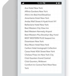
Screen titles on websites are excellent ways to remind the user of where they are after they opened 35 tabs and don't recall the content.
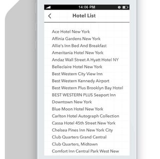
In apps, they take up precious space, and real-estate here is more expensive than in Manhattan, so if you think your user won't forget which screen they're on, you can sometimes skip it, or have it disappear until refresh or scroll.
Alternatively, this space can be transformed into a search area when the user needs that function. (Although, titles do frame the screen well, and can give the design a polished look.)
08. Define elements, then repeat them
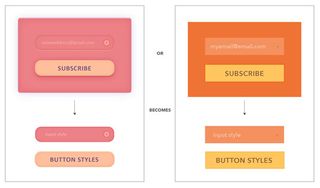
If one of the 'go' buttons is the colour purple, then all 'go' buttons should be the colour purple. If one screen has 20 px padding on all side, all screens should maintain this consistency.
This is what we mean by defining elements and repeating them. Each element should be defined, as should the colours inside the app.
09. Simple tricks can be used to separate text and create hierarchy
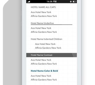
All caps, title case, indent, contrast, and underline: these are all stylistic choices. None are necessarily better than any other and you can use them in any place as long as you are consistent.
10. Outdated is another word for not trendy
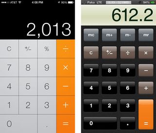
Design is focused on trends, and currently, the trend is to move toward a more flat design. Flat design does not mean it has no texture or shadows, nor does skeumorphic mean that every aspect should have a realistic texture. Generally you should be aware of what your audience will expect to see, as they will judge you for it. If your app looks outdated – users will note that.
"Skeuomorphism is a catch-all term for when objects retain ornamental elements of past, derivative iterations - elements that are no longer necessary to the current objects' functions." (Austin Carr - design and technology writer for Fast Company)
11. Most apps are basically just lists
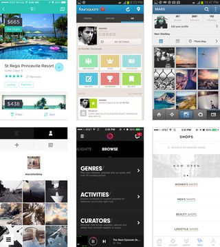
The majority of mobile apps (that is not a game) are basically a way to navigate lists. The job of the designer is to hide the fact that it is just a list and make it an interesting experience that is both rewarding and fun. This is why IA and proper hierarchy is so important – with the right foundation, the layout can be very varied yet convey the same information.
12. How to make a decision on a layout
Design libraries exist to help decide which layout is the best for a particular problem. Here are some good ones.
- http://www.pttrns.com/
- http://www.mobile-patterns.com/
- http://inspired-ui.com/
- https://www.cocoacontrols.com/
- http://www.lovelyui.com/
- http://androidux.com/
- https://developer.yahoo.com/ypatterns/about/libraries.html
13. Actions requires feedback, and fast
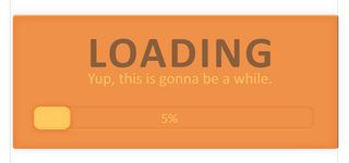
Users have an expectation that their phones will respond quickly, and efficiently to all their interactions. This isn't always the case, and developers frequently tell me that certain interactions take a long time. So you may have to find a way to fake it.
Every interaction should have feedback. For instance, when a user action (swipe, tap, click) is responded to with an animation, this gives the user feedback that they have been heard and their process is being executed on.
Think about how it works in web design: when a user hovers over a button, it changes, and then again, on click, it changes. This should occur in mobile as well. If the user refreshes, there needs to be a moving symbol. If they hit something, it should slide, or glow, or bounce – anything to let that user know that it is working.
This also gives the system time to process the original interaction or call, making it appear like it was instant. In short, a lot of interaction design is smoke and mirrors.
14. Postpone sign up
Offer sign up on one page. Have the user signup once they 'like' or 'heart' an item; allow them to get engaged first. You'll have significant user dropoff from logins, and usually the sign up doesn't offer much value to the brand anyway.
15. When to use a fancy font

When designing comps, time can be better spent elsewhere. Most people quickly distinguish between serif, sans, decorative, or condensed but frequently think slab is serif, humanist is sans, and anything Jessica Hische is decorative. The most important considerations for selecting a font are:
- Can I easily use it on mobile/web?
- Is there a variety of weights?
- Is it legible?
I subscribe to the belief that type design takes a lifetime to master, so if you pick a type from a good foundry, there shouldn't be much of an issue.
With your mobile apps, keep in mind that a good number of users cannot distinguish between Arial, Avenir, Roboto, or Helvetica. This means that as long as the typeface is clean and easy to read, your'e ok. The time to add in a more complexly flavored font is when you're focusing on brand, and less on usability. In this case, the new, atypical font will create a feeling of being somewhere, perhaps nostalgia, maybe even whimsy. Whether or not you do this is based on your decided priorities, but it isn't something to get hung up on.
16. Each system has visual guidelines

Android, Windows and iOS have design guidelines that cover different design styles and are rather detailed with specific information like widths between text. They're a great resource when you're not sure how to proceed.
This is a good round up of rules to get you started. Let me know your thoughts!
Words: Valerie Lisyansky
Valerie Lisyansky is partner at SWARM, a NYC-based boutique agency that creates apps for mobile, wearable and the second screen. Connect with her on Twitter.
Like this? Read these!
- The 10 best free tools for app designers
- How to build an app: try these great tutorials
- Free graphic design software available to you right now!

Thank you for reading 5 articles this month* Join now for unlimited access
Enjoy your first month for just £1 / $1 / €1
*Read 5 free articles per month without a subscription

Join now for unlimited access
Try first month for just £1 / $1 / €1
The Creative Bloq team is made up of a group of design fans, and has changed and evolved since Creative Bloq began back in 2012. The current website team consists of eight full-time members of staff: Editor Georgia Coggan, Deputy Editor Rosie Hilder, Ecommerce Editor Beren Neale, Senior News Editor Daniel Piper, Editor, Digital Art and 3D Ian Dean, Tech Reviews Editor Erlingur Einarsson and Ecommerce Writer Beth Nicholls and Staff Writer Natalie Fear, as well as a roster of freelancers from around the world. The 3D World and ImagineFX magazine teams also pitch in, ensuring that content from 3D World and ImagineFX is represented on Creative Bloq.

