App commercial transcends East-West boundaries
Italian agency Fab Design created this sweet animation to promote a niche Korean app. Discover how it was made and why it's been such a success story.
The most useful new apps are increasingly those that are most niche. Problem is, they're also the most difficult to explain. Take Yellow Ribbon, created by Korean company MagnaLAB. The app lets you send a message to someone that can only be opened when they get to a specific location the sender dicates. How do you explain that concept - and why it's useful - in a quick video ad?
Fab Design, an animation and post-production studio based in Bari, Italy, were tasked with this challenge. To make matters even trickier, explains Fab's Francesco D'Ambrosio, "MagnaLAB wanted an 'Eastern looking' feeling - since the company is based in South Korea but looking to expand their audience to Europe and North America - with a style that could appeal a young audience (20-30 years old), with minimal use of text and without any kind of voice-over."
Emotional heart

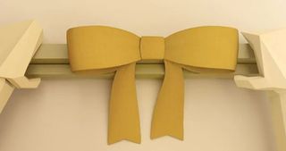
After trying several different ideas, Fab came up with this low poly commercial, which goes to the emotional heart of how the app could be used. The sweet story gives a relaxed, childlike feel to the ad that breaks down any knee-jerk resistance in the viewer to "yet another app". Sometimes less is more, and here the lo-fi approach to animation is very well chosen.
The entire animation was created with Blender, and the render engine used was Cycles. A small amount of post-production was added with After Effects.
Global response

The ad has not appeared on TV but has done storming business across social media, with new users are signing up from all around the world including Europe, North America, and the Middle East.
"We think we have hit just the right note with the audience in terms of emotional engagement, as many people were saying that they were 'deeply moved' by the way how the video ignited their imagination," says D'Ambrosio. "What makes it even more exciting is that we were able to transcend cultural differences. Even though we wanted to speak more to an Eastern audience, part of our primary target audience included Korean users, and they've been describing the video as 'beautiful', 'enticing', 'mesmerizing' and 'enchanting'.
"It can be very difficult to strike the right balance between promoting something and showing your creativity, especially when you deal with a very short promotion video. However, we were lucky enough to achieve some of both with this particular project."
Liked this? Read these!
- How to build an app
- Download the best free fonts
- Adobe Photoshop CS6 hands-on review
Have you seen an inspiring video ad on the web? Share it with us in the comments below!

Thank you for reading 5 articles this month* Join now for unlimited access
Enjoy your first month for just £1 / $1 / €1
*Read 5 free articles per month without a subscription

Join now for unlimited access
Try first month for just £1 / $1 / €1
Get the Creative Bloq Newsletter
Daily design news, reviews, how-tos and more, as picked by the editors.
The Creative Bloq team is made up of a group of design fans, and has changed and evolved since Creative Bloq began back in 2012. The current website team consists of eight full-time members of staff: Editor Georgia Coggan, Deputy Editor Rosie Hilder, Ecommerce Editor Beren Neale, Senior News Editor Daniel Piper, Editor, Digital Art and 3D Ian Dean, Tech Reviews Editor Erlingur Einarsson and Ecommerce Writer Beth Nicholls and Staff Writer Natalie Fear, as well as a roster of freelancers from around the world. The 3D World and ImagineFX magazine teams also pitch in, ensuring that content from 3D World and ImagineFX is represented on Creative Bloq.
