Watch Smith & Foulkes gripping cancer-killing short animation
Behind the scenes on the Nexus directors' stunning two-minute film parody Pay Back Time.
British multimedia agency 4Creative commissioned Nexus Productions to make a two-minute animated promo for Channel 4's 'Stand Up To Cancer' entertainment night in October 2014.
Parodying the style of disaster movies, the film needed to work as a piece of standalone storytelling and find effective new ways to visualise cancer cells, drugs and therapies. Here, director Alan Smith, one half of acclaimed directing duo Smith & Foulkes, and producer Tracey Cooper explain how it was done...
The design brief
Alan Smith: 4Creative came to us last October with a concept of what they wanted to achieve. It was very ambitious, which was great. We don't often get to make projects like this – it's basically a two-minute short film and it was very exciting to be offered that opportunity.
Often, you have to rush through the pre-production of a project, but on this occasion we had a good chunk of time in which to do it. 4Creative came up with the idea of a disaster movie parody, so Adam and I wrote a script about how it could all play out, and from there it was just a question of working out the details.
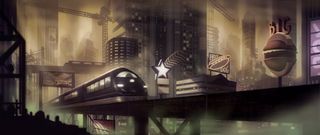
The main issues we had to think about were how to show the presence of new drugs and technology in the movie short, and how to visually represent cancer cells. The subject matter is serious, but it's a promo to advertise a night of entertainment.
It's an opportunity to have a laugh at cancer's expense, and it was important that it didn't just become a heavy piece of film about the horrors of cancer. It's not advertising any particular drug or treatment – it's about the fact that human beings are developing ways of fighting cancer and it's a call to arms saying "let's keep going".
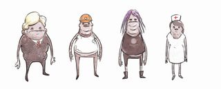
And we were really keen to nail the narrative twist at the end so you don't expect it. The visuals were a blank slate to start with.
Get the Creative Bloq Newsletter
Daily design news, reviews, how-tos and more, as picked by the editors.
We collaborated with art director Dan Burgess, who works on several of our projects. He visualised the world and the character designs and started sketching.
Work in progress
Tracey Cooper: There was a definite air of excitement about the change of direction with regards to portraying cancer. We had around six months for pre-production, so the design, exploration and character work were spread out over that whole period. Which meant that, once we started, everyone had a really clear idea about what the film and the characters were going to look like.
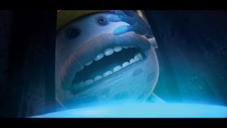
We had a core team working over three months with the main production staff. The animation, compositing and matte painting were mostly done concurrently – we didn't really divide things into blocks.
We did all the matte painting in Modo and used After Effects for comping. There were very few 3D sets. We just did the characters in 3D and used matte painting to create all the background sets. Very few scenes were traditionally edited. It's more of a montage style.
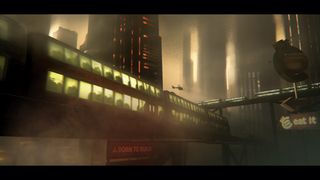
We needed to create two minutes of content in a way that wasn't going to break the bank, and of course we didn't want it to feel like the trailer outstayed its welcome.
Unusually for an animation project, we animated more than we needed. We lost a total of around 10 seconds as we put a head and tail in some of the shots just in case we required them.
Conclusion
Alan Smith: This film is about a very selfish society. They want to save their own skin. It's reduced storytelling, in the same way that a disaster movie sells itself through a trailer. We needed to grab moments of action and storytelling that would suck you in and make you want to see the film, but we obviously needed to tell the whole story in that time.
The camera angles were very much dictated by the action – it's quite a free camera and there was quite a lot of discussion about how, say, Michael Bay might shoot a particular scene.
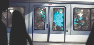
There are well-known narrative stages within a typical disaster movie, starting with the wide-eyed innocent society rattling along at its own pace, unaware of any threat. Then comes the first hint of threat during which everyone's carrying on as they were, and then you get the full-on panic scenario at the end.
The film moves through those stages, which gave us a really good structure to work from. At one point we considered doing everything in 2D, but we wanted the flexibility you get with 3D characters.
That meant we could run multiple cycles in the background to create mass panic, rather than having to individually animate everything. It also gave it quite a painterly feel overall, which helps conjure up the dirt and grime.
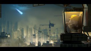
Disaster movies have expensive, expansive set pieces, and we wanted to create some sense of that. It's really a modern equivalent of the industrial revolution – a city that's expanding too quickly for its own good, so its success is the reason for its impending doom. They're not likeable, but they are a fully functioning society whose aim is to spread and grow.
We're having a laugh at cancer's expense, and at the disaster movie format. The aim is to get people talking. We've played with those expectations of calamity and apocalypse, and it's provided a great opportunity for narrative storytelling.
This feature first appeared in Computer Arts 235: Branding Secrets, a special issue exclusively revealing the brand strategy secrets at the world's biggest agencies. You can pick up a copy of CA 235 here.
Liked this? You'll love these...

Thank you for reading 5 articles this month* Join now for unlimited access
Enjoy your first month for just £1 / $1 / €1
*Read 5 free articles per month without a subscription

Join now for unlimited access
Try first month for just £1 / $1 / €1
The Creative Bloq team is made up of a group of design fans, and has changed and evolved since Creative Bloq began back in 2012. The current website team consists of eight full-time members of staff: Editor Georgia Coggan, Deputy Editor Rosie Hilder, Ecommerce Editor Beren Neale, Senior News Editor Daniel Piper, Editor, Digital Art and 3D Ian Dean, Tech Reviews Editor Erlingur Einarsson, Ecommerce Writer Beth Nicholls and Staff Writer Natalie Fear, as well as a roster of freelancers from around the world. The ImagineFX magazine team also pitch in, ensuring that content from leading digital art publication ImagineFX is represented on Creative Bloq.
