Top 40 character design tips - Part 1: Animal based characters
Whether they’re animal-based or humanoid, creating convincing characters is all about self-belief. In Part 1, some of the world's leading character design experts share their top dos and don'ts for creature design.
Nothing comes from nothing. It’s an oldie but a goodie, and as far as character design goes, the final word. Characters require a story, a world and a purpose.
Once you have this, ask yourself: what should his/her/its body plan be? Are there teeth on show? What accessories are needed? From there you can develop a convincing character – the rest is craft.
There are, of course, a number of important techniques that can be applied to any design: keep things simple, always ensure you have a strong silhouette, start with general shapes and work towards detail. But while these are valuable, they aren’t rules. Sometimes a good design just has to escape your subconscious.
Here, we speak to a range of character artists, each exploring their own worlds using expressions unique to them. What they have in common is their belief in the characters they produce. The lesson is simple: if it’s real to you, there’s a good chance other people will believe in it too.
01. Psych them out
“Take advantage of what psychologists know about how we react to each other – things like the baby-face effect and the five personality factors, which are openness, conscientiousness, extraversion, agreeableness and neuroticism. Remember the acronym OCEAN.” -- Katherine Isbister, Associate professor, New York City, USA
02. Employ contradictions
“Bring some contradictions to your characters. A vampire with rounded teeth and big, rounded eyes will look cute, and have a different style from what you’d expect. Try to give your creatures accessories to customise them and make them more human-looking.” -- Jacques Bardoux, Illustrator and graphic designer, Paris, France
03. Build with doodles
“Many of my illustrations have come from doodling. Often the right line comes only after many attempts. My Pupetta character was born quietly, sketch after sketch, drawing up a sinuous line that became the edge of a stocking, then the shape of a hand and the tips of lashes.” -- Maria Vittoria Benatti, Graphic designer and illustrator, Modena, Italy
Get the Creative Bloq Newsletter
Daily design news, reviews, how-tos and more, as picked by the editors.
04. Use an experimental item
“I use the skull as a staple item to experiment with style-wise. If I’m trying something new, it’s my go-to item to play around with. Earlier this year I was experimenting with a Kaiju monster style and the result was a T-shirt design that I made a small run of.” -- Nick Carroll, Graphic designer and illustrator, Leicester, UK
05. Show some teeth
“If you can see a character’s teeth when its mouth is closed, it looks funny. It gives it a goofy look. Use thumbnails to quickly rough out as many variations as you can think of, and use them to work out how the character will look from different angles and with different expressions.” -- Stefan Marjoram, Freelance animation director, Bristol, UK
06. Think about how it will move
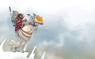
“Movement is one of the first things I try to imagine, and can act as a good source of inspiration. The movement of a creature is almost entirely determined by its anatomy, so thinking about how it will move can provide you with clues for designing its frame, as well as its personality.” -- Ryan Firchau, Senior concept artist, Measham, UK
07. Play with colour and renders
“This can have a huge effect on the personality of a character. Muck around with different stroke weights and contrasts, and different fill options – whether you want a complex gradient or simple, flat, single colour, realistic 3D render or high-impact bold and graphic finish.” -- TADO, Design and illustration duo, Sheffield, UK
08. Draw on your childhood
“My creatures come from my childhood memories, when everyone possessed cartoony characteristics. I guess it was my way of facing a society where not everyone is friendly and nice: I simply imagined them as cartoon characters, and lots of those memories still stick in my mind.” -- Alberto Cerriteño, Illustrator and designer, Portland, USA
09. Know what lies beneath
“I find that it can often really help to get your teeth into the bone structures of animals. Look at the different forms of jaws and skulls. In my experience, you’ll always find something interesting, which can act as the initial spark to get your character design started.” -- Florian Satzinger, Production and character designer, Steiermark, Austria
10. Get a grasp of biology
“Small changes in biology can have wide-ranging implications. For example, something as simple as: ‘What if jaws did not evolve?’ is enough to keep me busy for a while – it encompasses everything about the creature, from body plan, locomotion and anatomy to its sensory organs.” -- Helen Zhu, Freelance illustrator, Dallas, USA
Next Page: Don't...
11. Don’t recreate Frankenstein
“Don’t bolt together two or more animals and expect it to look like a believable creature. Subtlety is the key to believability. For your audience to connect with your creature, they need to feel that they can understand what they’re looking at; that they’ve seen it before in some way.” -- Ryan Firchau, Senior concept artist, Measham, UK
12. Don’t be limited by convention
“Don’t limit yourself by drawing only classic sci-fi creatures. Everything can be turned into a creature, you just have to add eyes, a mouth and arms. Try to transform cars, trees or TV sets into creatures: anthropomorphism is the key to making an original graphical universe.” -- Jacques Bardoux, Illustrator and graphic designer, Paris, France
13. Don’t put veins on beans
“Bean shapes are simple, and simple shapes – squares, triangles, circles – are strong. They read well in silhouette, which is good when it comes to poses at the animation stage. The down-side is that sometimes people think they look like willies and write to the BBC to complain.” -- Stefan Marjoram, Freelance animation director, Bristol, UK
14. Don’t make it too creature-like
“The classic Disney guys talk about how their creatures always had human-like features, and how hard they had to work to make things like snakes scary, but not too scary. For example, in The Jungle Book, Ka the snake’s tongue is red, like a human’s tongue.” -- Katherine Isbister, Associate professor, New York City, USA
15. Don’t fix your proportions
“Experiment with different shapes and proportions. This can transform a character, the classic example being a big head with a small body and limbs – very cute. However, it’s probably more fun to break away from these rules and have fun playing around with different proportions.” -- TADO, Designers and illustrators, Sheffield, UK
16. Don’t overdo the ‘what if?’
“Most animals have two key features: cephalization (major sense and communication organs are concentrated in the head area); and bilateral symmetry (the left and right sides are largely symmetrical). Make changes to these and viewers may struggle to identify with your creatures.” -- Helen Zhu, Freelance illustrator, Dallas, USA
17. Don’t use a million colours
“Forcing yourself to work with just a few colours will increase your ability to explore new things in your colour process, such as adding textures. The result will always be a good visual balance between the simple and complex, producing an original effect.” -- Alberto Cerriteño, Illustrator and designer, Portland, USA
18. Don’t put colour first
“Colour, for me, is not essential – the drawings of the character should still work when rendered in a simple black line. But when I do use colours, they can help communicate a character’s personality – pink and red may suggest a feminine, cute character, for instance.” -- Maria Vittoria Benatti, Graphic designer and illustrator, Modena, Italy
19. Don’t short-change evolution
“Don’t play the game too much by putting a lion loaf on a chicken corpse or the like. Think evolution: invent your own evolutionary run. Keep in mind that you’re designing a unique individual with typical (not stereotypical) qualities – qualities that only this character has.” -- Florian Satzinger, Production and character designer, Steiermark, Austria
20. Don’t overlook iconic symbols
“The skull is one of those cultural icons that everyone can take a swing at because of the rebellious nature it represents. When you deconstruct my version of the skull, it’s just circles and an inverted heart. It’s the simple lines I use to outline these collected shapes that makes it what it is.” -- Nick Carroll, Graphic designer and illustrator, Leicester, UK
Come back tomorrow to read Part 2, which is all about Human Character Design
Main image credit: Wayne Harris

Thank you for reading 5 articles this month* Join now for unlimited access
Enjoy your first month for just £1 / $1 / €1
*Read 5 free articles per month without a subscription

Join now for unlimited access
Try first month for just £1 / $1 / €1
The Creative Bloq team is made up of a group of design fans, and has changed and evolved since Creative Bloq began back in 2012. The current website team consists of eight full-time members of staff: Editor Georgia Coggan, Deputy Editor Rosie Hilder, Ecommerce Editor Beren Neale, Senior News Editor Daniel Piper, Editor, Digital Art and 3D Ian Dean, Tech Reviews Editor Erlingur Einarsson and Ecommerce Writer Beth Nicholls and Staff Writer Natalie Fear, as well as a roster of freelancers from around the world. The 3D World and ImagineFX magazine teams also pitch in, ensuring that content from 3D World and ImagineFX is represented on Creative Bloq.
