How Surround made this surreal music video
Brothers Brian and Brad Palmer of Brooklyn studio Surround mixed animation and live action in a surreal, pop art-inspired video for Neon Trees' Sleeping With a Friend.
Surround used a mix of stop-motion, 2D animation, 3D, CGI, hand-drawn illustration and life-size character design and live-action in the music video for Sleeping With a Friend by rock band Neon Trees.
The brief
We've had a relationship with the record label Island Def Jam since we directed The Killers' Mr Brightside video in 2004. When you think of your clients as family it makes the project even more important. Often, a label gives us a song and budget and asks us to think of an idea, but this project was different as they came to us much earlier on in the process.
When we wrote our initial treatment, we had heard some music but we didn't know what the single would be. We had some rough ideas and written references to decode, but there weren't any strict guidelines, which was a nice level of trust to have so early on. They wanted a really visceral, engaging visual world and were looking at some early music videos - like Sledgehammer by Peter Gabriel - that really drew you in.
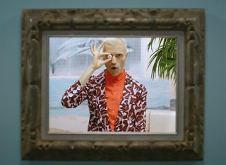
Depending on the project, you can sometimes put yourself into a corner by writing treatments that are too strict. We set out to create our own world and we aimed to keep this free enough to create more as the piece developed. We did have a very tight shot list and a clear art direction, but it wasn't necessarily important to know what every single detail meant in each scene until we'd shot the live action and had done the first layer. You know some great things are going to happen when you shoot and you want to be ready to embrace those in the post and design process.
Work in progress
We outlined the live action in a traditional way with a shot list and storyboards. We knew how we'd get from point A to B and we thought about a good portion of the animation before the three-day shoot. But we kept some space intentionally blank to add animation and design.
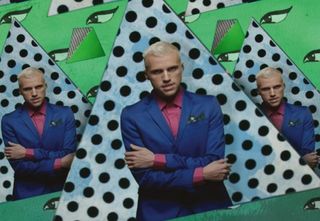
The project really started to take shape when we saw frontman Tyler Glenn's very colourful, layered wardrobe design, which informed the palette. His energy and his polka-dot pants and cupcake suits called for a certain background and we formed a world around that.
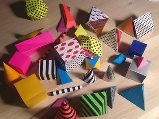
We cut the piece with Adobe Premiere and used Illustrator, Photoshop and After Effects, and the CG was done in Maya and Cinema 4D. We shot stop-motion with a DSLR in front of a green screen, but much of it was also created outside of the computer. The geometric shapes were all made of paper and the illustrations were done with pen and ink. GIF animations were one influence in modernising some of the animations - the idea of these short, sweet, mesmerising moments or transitions.
It was a challenge deciding what should be live action, life-size character design, handmade or CG. For example, we wanted to do the tropical fruit and the parachutes dropping heart-print knives in stop-motion, but we had to leverage the time and budget.
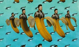
Also, when you move something into a live action world it needs to take on a believable state - that was one of the challenges here. If you make a scene with a lot going on, you can't just go on to an empty frame. That pushed us into a constant layering process, but we had to be careful how far we went - some moments are more intense than others, so we really tried to be mindful of creating some breathing room.
We discussed and shared things with Tyler throughout, which made it an organic process. We work with lots of artists, but the best ones are those that trust you. We believe we made the video that everyone wanted because we were trusted to sculpt things along the way and give birth to something that may not have been so easy to express upfront, in its entirety.
Conclusion
It's great when you get a project like this where you can let the ideas marinate. So many projects are rushed in our industry. I think you can achieve more creative growth as a director and take bigger steps when you have the time to reflect on what you're making. It gives you the ability to move through the conventional ideas and techniques, the popular trends and your own tricks.
While this is ultimately a music video, we're creating other worlds, and we want people to live in those spaces. When the band played Jay Leno, they had the house character from the video on stage with them, and the final shot was used for the single sleeve.
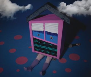
We're starting not to do a music video as a contained thing, but create an identity and a world around it. It turns the project into more than just a music video. That's what design is there for: creating a space to give a better understanding of what you're experiencing.
Words: Brian and Brad Palmer
Surround has directed hit music videos for artists including the Killers and TV on the Radio, and other clients include Comedy Central and American Express. This article originally appeared in Computer Arts issue 225.

Thank you for reading 5 articles this month* Join now for unlimited access
Enjoy your first month for just £1 / $1 / €1
*Read 5 free articles per month without a subscription

Join now for unlimited access
Try first month for just £1 / $1 / €1
Get the Creative Bloq Newsletter
Daily design news, reviews, how-tos and more, as picked by the editors.
The Creative Bloq team is made up of a group of design fans, and has changed and evolved since Creative Bloq began back in 2012. The current website team consists of eight full-time members of staff: Editor Georgia Coggan, Deputy Editor Rosie Hilder, Ecommerce Editor Beren Neale, Senior News Editor Daniel Piper, Editor, Digital Art and 3D Ian Dean, Tech Reviews Editor Erlingur Einarsson, Ecommerce Writer Beth Nicholls and Staff Writer Natalie Fear, as well as a roster of freelancers from around the world. The ImagineFX magazine team also pitch in, ensuring that content from leading digital art publication ImagineFX is represented on Creative Bloq.
