6 tips for crafting a spell-binding animation
Award-winning Irish animation studio Cartoon Saloon reveals how to create an Oscar-nominated animated feature film.
It's been an incredible few months for Irish animation studio Cartoon Saloon. In January, the Kilkenny-based team of creatives received an Oscar nomination for their second animated feature film, Song of the Sea – just five years after The Secret of Kells won the studio its first Oscar nomination and rave reviews around the world.
Song of the Sea is a stunning masterclass in animated storytelling. Seeped in legend, the film tells the epic tale of Ben and his sister Saoirse, the last Sealchild, as they attempt to return home – taking inspiration from the ancient Celtic myth of the Selkies, who live as seals in the sea and humans on land.
Underneath it lies a powerful message about climate change and global warming. During a trip to the west of Ireland some years ago, Cartoon Saloon creative director Tomm Moore and his son encountered a number of dead seals on the beach. According to his landlady, local fishermen were killing them from frustration with falling fishing stocks, due to over-fishing.
"She said years ago that no fisherman would dare harm a seal as there was a widespread believe in Selkies," Moore has said. "I began to think about how the old stories served us well in protecting what is truly valuable and important, and how by losing these stories we are losing a lot more than just folklore."
As the dust settles on last night's glittering Oscars ceremony, we caught up with Moore, who directed Song of the Sea, to find out what it takes to make an Oscar-nominated animated feature film.
To find out more, make sure you've got your ticket to Dublin's OFFSET 2015 conference in March, where Cartoon Saloon join an epic line-up of creative speakers. In the meantime, here are six tips for making your animations stand out from the crowd…
01. Intricacies lead to repeat viewings
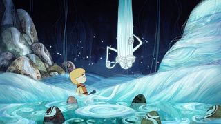
Moore describes Song of the Sea as a labour of love. The animation is incredibly intricate – so why put so much time and effort into the tiny details and design? After all, not everyone will notice all the intricacies, right?
Get the Creative Bloq Newsletter
Daily design news, reviews, how-tos and more, as picked by the editors.
Wrong, says Moore: "The intricacies add to the viewing experience and lead to repeat viewings. They help build out the world and make it more immersive. It helps us stand out from the crowd as every aspect of the design is made to suit the story. We try not to fall back on generic cartoon designs."
02. Don't rush the animation style
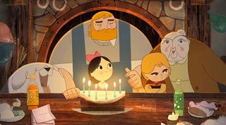
Cartoon Saloon worked closely with Adrien Merigeau, a key background artist on the Secret of Kells, to develop an animation style that would be appropriate to explore the mythology around which Song of the Sea is built. "We developed the look over seven years, starting during production of The Secret of Kells," recalls Moore.
"The style evolved over the course of the financing, and both Adrien and I wanted an organic style that would allow input from the team who worked on it. Many artists had an influence on the final look over the years."
03. Invest in research
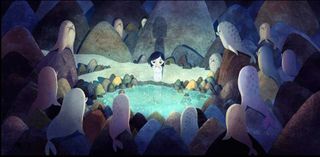
"We started with watercolour concepts based on research trips to the west of Ireland. We also researched landscape painters such as Paul Henry," says Moore, adding that research was essential to help inject the magic of Celtic fokelore into the visual language of Song of the Sea.
"We wanted to integrate the Pictish carvings from the megalithic rocks around the country. Adrien actually felt these carvings reminded him of modern art like Klee and Kandinsky. Overall, the hope was to create a timeless fairytale feeling, like an old picture book."
04. Consider your media carefully
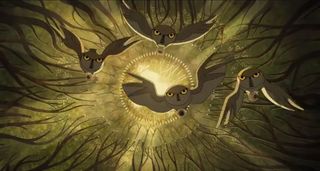
Cartoon Saloon blended a mixture of traditional 2D animation methods and new techniques to give Song of the Sea a timeless appeal. Moore explains: "We decided to use watercolours as a base for all the backgrounds to create a more mystical and misty feeling, especially for the landscapes."
"For the animation we moved from Paper to TV Paint, which is a software that allows us to animate frame by frame using tablets, eliminating the need for scanning."
"We used a hybrid of new and old techniques to create a traditional look, as I believe traditional 2D animation has a timeless appeal that can be watched even 20 years from now without seeming dated."
05. Tell the story through the details
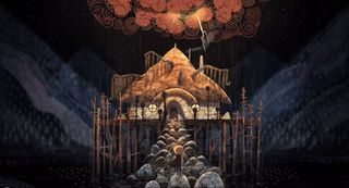
"Design in film, for me, is everything from how the characters look to the environments they're in, to the way a drop of water splashes, to the shot choices, compositions and even the editing choices, such as match cuts and rhythm," Moore reflects.
"It's tied at a basic level to the storytelling: it gives an added layer of information to the audience and informs how we feel from scene to scene, much like music can influence the audiences mood and feelings."
06. Design your way out of budget limits
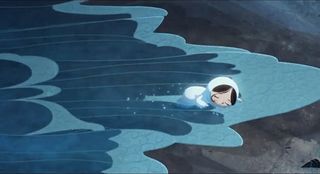
One of the most challenging aspects of Song of the Sea was the sea itself. "So many versions exist and we worked on it for most of the production to get it right. It ended up being something quite subtle, where we moved watercolour textures subtly with some small hand-drawn elements added. However it took a long time to perfect," Moore admits.
"Similarly during the stormy sequences we used a combination of techniques where we could built the whole sea from a big library of hand-animated waves and splashes. That way we designed our way out of the limitations of the budget by finding a look that was effective and suited the style – but that was possible within our means."
Song of the Sea is currently being shown around North America (theatre list here), and will be released in Ireland in March.
Find out firsthand how Cartoon Saloon are winning worldwide acclaim for their animated feature films, and more, at OFFSET 2015 in Dublin, 6-8 March.
And don't forget: to celebrate OFFSET 2015, Computer Arts is offering a whopping 13 free issues of CA with a two-year subscription (for a limited time, so be quick).
Liked this? Try these...
- 9 steps to stunning magazine design
- How to publish your own books on a shoestring
- The designer's guide to working from home

Thank you for reading 5 articles this month* Join now for unlimited access
Enjoy your first month for just £1 / $1 / €1
*Read 5 free articles per month without a subscription

Join now for unlimited access
Try first month for just £1 / $1 / €1

Julia is editor-in-chief, retail at Future Ltd, where she works in e-commerce across a number of consumer lifestyle brands. A former editor of design website Creative Bloq, she’s also worked on a variety of print titles, and was part of the team that launched consumer tech website TechRadar. She's been writing about art, design and technology for over 15 years.
