How Pixar made The Blue Umbrella
We go behind the scenes of the short accompanying Monster's University with animation supervisor Ross Stevenson and supervising TD Chris Burrows.
Sign up to Creative Bloq's daily newsletter, which brings you the latest news and inspiration from the worlds of art, design and technology.
You are now subscribed
Your newsletter sign-up was successful
Want to add more newsletters?

Five times a week
CreativeBloq
Sign up to Creative Bloq's daily newsletter, which brings you the latest news and inspiration from the worlds of art, design and technology.

Once a week
By Design
Sign up to Creative Bloq's daily newsletter, which brings you the latest news and inspiration from the worlds of art, design and technology.
Once a week
State of the Art
Sign up to Creative Bloq's daily newsletter, which brings you the latest news and inspiration from the worlds of art, design and technology.

Seasonal (around events)
Brand Impact Awards
Sign up to Creative Bloq's daily newsletter, which brings you the latest news and inspiration from the worlds of art, design and technology.

Some people would say that the only thing as good as a new Pixar movie is the short animation that's screened before it. These shorts are not only superb examples of short-form storytelling, but they also offer Pixar a way to test new technologies and launch new directors.
This is all certainly true of The Blue Umbrella, the short accompanying Monsters University, and proves that Pixar still has the ability to tell charming stories with only a couple of everyday objects.
The short tells a simple love story between a blue and a red umbrella in a magical city that comes alive with expressive faces when it begins to rain. It's the brainchild of technical artist Saschka Unseld, who has worked in Pixar's camera and staging department since 2008.
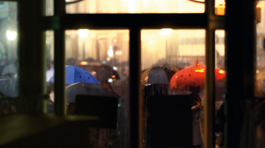
To create the photo-realistic animation style, Pixar had to develop new special effects techniques. "The photographic look of the film was a substantial departure for Pixar," says supervising technical director Chris Burrows. "To accomplish it, we were fortunate enough to use some new illumination techniques developed within RenderMan for Monsters University."
The photographic look of the film was a substantial departure for Pixar
When you watch The Blue Umbrella, the CG is so good that you'd be forgiven for thinking you're watching live action. Originally, the team had considered shooting footage, but eventually the fully CG cityscape was chosen for its flexibility in the camera placement and movement.

The team built all the shots and then rerecorded them with a separate camera capture unit for a hand-held look. This helped to give a sense of weight and the impression of moving through physical space.
In this inventive, visually dynamic world, where the blue and red of the principal characters stand out in a sea of drab umbrellas, you can see some of Unseld's visual influences at play: "Our director was heavily influenced by the films of director Wong Kar Wai, in particular Chungking Express," says Stevenson.
Sign up to Creative Bloq's daily newsletter, which brings you the latest news and inspiration from the worlds of art, design and technology.
Selling the realism
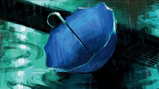
One of the more challenging scenes - both technically and for animation - were the shots where the blue umbrella is lying in the gutter. "In order to sell the realism of a limp umbrella, animation had to hand-animate each rib as well as the sagging cloth in between," explains Stevenson.
"Additionally, we had to run a cloth simulation where the grate pushes up against the cloth and blend that simulation into the keyframed animation. Because this is also a close-up of rain hitting the ground, we decided to run some hero fluid simulations of the rain hitting the ground and flowing down the drain."
A talented testing ground
The short was in production for about 18 months, which is pretty typical for a Pixar short. "The great thing with shorts is that they give us tremendous creative freedom to experiment, not only with stories and the medium but also with people and technology," says Burrows. "We were able to cycle through a large number of people who contributed specific expertise for a short amount of time, sometimes as short as a week or two."
The great thing with shorts is that they give us tremendous creative freedom to experiment
For animation, the team used Pixar's proprietary software, Presto. All of the assets were modelled in Maya and animated in Presto, and the cloth and crowd simulations were also run through the proprietary software. Some FX elements were created in Houdini, and all the imagery was rendered with RenderMan and composited in Nuke.

Tools are continually being developed at Pixar. The animators took these and really pushed them, using notable global illumination techniques and new compositing techniques to achieve a depth of field. "The flexibility and programmability of RenderMan gave us a lot of control over how we managed our complexity," says Burrows.
"The ability to output deep opacity data also allowed us to easily recombine rendered elements and to manage applying our depth of field in the composite. Also, being able to easily switch between polygonal surfaces and subdivision surfaces at render time gave us a lot of control over geometric levels of detail without needing to model and shade multiple versions of assets."
Words: Kulsoom Middleton
Liked this? Read these!
- Top free 3D models
- Best 3D movies of 2013
- Blender tutorials: ways to create cool effects

The Creative Bloq team is made up of a group of art and design enthusiasts, and has changed and evolved since Creative Bloq began back in 2012. The current website team consists of eight full-time members of staff: Editor Georgia Coggan, Deputy Editor Rosie Hilder, Ecommerce Editor Beren Neale, Senior News Editor Daniel Piper, Editor, Digital Art and 3D Ian Dean, Tech Reviews Editor Erlingur Einarsson, Ecommerce Writer Beth Nicholls and Staff Writer Natalie Fear, as well as a roster of freelancers from around the world. The ImagineFX magazine team also pitch in, ensuring that content from leading digital art publication ImagineFX is represented on Creative Bloq.
