Behind the scenes of Ray-Ban's animated promo
Get some inspiration from this walkthrough of how the Ray-Ban Hub's animated projections were created.
The creative directors at LA-based Yours Truly Creative asked me to pitch for this project via Nexus Productions. Ray-Ban was opening a new venue in New York – the Ray-Ban Hub – which was set to place SoHo back at the centre of the creative world.
The brand wanted to create a shop that was also a platform for promoting art and was looking for an animation to advertise the new address.
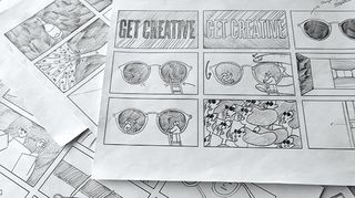
I immediately grabbed my pencil and let myself loose, throwing tons of random ideas straight onto the page. In the first version I presented, I hadn't included any transitions; I wanted the piece to be a series of playful, weird concepts that delivered the message in a surreal way.
The feedback from the clients was that they wanted something with a little bit more of an arc, so I redesigned the storyboard so everything transitioned smoothly, but still kept the core idea of having a bunch of playful concepts following each other.
The structure was guided by a simple brief: that I needed to communicate the slogan 'get creative' at the beginning, show the products and the venue's address, so I determined the final structure with these requirements in mind.
01. Sketches to storyboards

I have an A2 paper pad on my desk, and usually start projects by drawing a lot. That's how I get my ideas. With this project, I took the best ideas from the sketches and put them together to make a storyboard.
The process is a bit like a LEGO construction – you create idea blocks, then see how they would fit together.
02. Faithful Accuracy
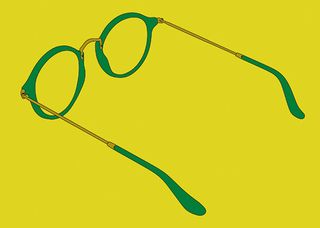
At the beginning we had to render the Ray-Ban glasses in 3D because we needed them to always look exactly like the actual product, down to the little Ray-Ban logo. Michal Firkowski at Nexus Productions modelled the glasses, and we rendered them with cartoon shading to make them look hand-drawn.
03. Palette Picking
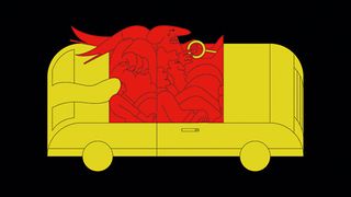
A client will often dictate the colour palette, but in this case they had enough confidence in the shape of their iconic glasses to be happy to represent them graphically. I went for a simple palette that I thought best represented american pop art, which I always identify with New York because of Warhol and Haring.
04. Page to Screen
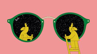
While I did the storyboard, I also created two or three style frames – illustrations to show the client what the finished film would look like – by taking the initial sketches from paper and digitising them. I usually draw everything in photoshop from this point on, but I also do thumbnails on paper just to figure out compositions.
05. Custom Type
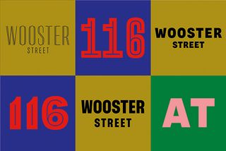
Once the style frames were approved, I created a still of each key part of the animation, like the crowd of women putting their glasses on and the typography. I hired Coppers and Brasses to create custom letter forms. It was an essential part of the ad, intended to communicate the message in a unique fashion.
06. Painstaking Animation
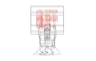
Most of the 2D animation was done by Anne-Louise Erambert [using Photoshop, Flash and After Effects]. For example, for the ladies with the hair in the wind, Anne-Louise animated the hair and the characters putting their glasses on individually, then I put them together to create a pattern and set up the camera move.
07. Creative Explosion
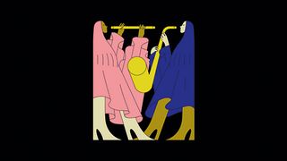
The first shot is a bunch of illustrations appearing really quickly. I wanted to express the slogan as an explosion of ideas. Initially the client wanted it slower, so people could see [each image], but we agreed it didn't work. although the drawings are worth looking at for longer, the idea of that burst was more important.
This article was originally published in Computer Arts magazine issue 252.

Thank you for reading 5 articles this month* Join now for unlimited access
Enjoy your first month for just £1 / $1 / €1
*Read 5 free articles per month without a subscription

Join now for unlimited access
Try first month for just £1 / $1 / €1
Get the Creative Bloq Newsletter
Daily design news, reviews, how-tos and more, as picked by the editors.
