Funny town council logos drive Twitter wild
But are they charming, or just plain bad?

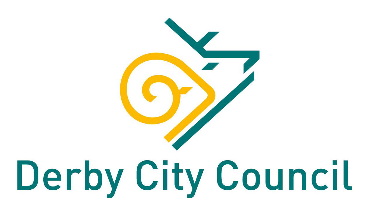
If there's one thing designers love, it's analysing a logo. Often the discussion is sparked by a big corporate rebrand, or the visual identity of a new company. But a recent Twitter thread shook things up by asking folk to share the logos of their town councils – and the thread is pretty amusing.
Logos have been shared from towns and cities all over the UK and, judging by the iconography and font choices (no-frills being the main visual hook), many of the places included have super similar features. Or maybe the designers could have done with a look at our logo design guide, to fully encapsulate their location's uniqueness.
I present to you my home town council’s logo. It’s bloody awful. Show me yours. pic.twitter.com/bmGGC6BgsBAugust 31, 2020
Nick Clement kicked off the discussion, by sharing Bridgend's logo (see above). It's a dated affair (as seems to be a running theme with council logos – perhaps budgets are to blame), with the font on the word Bridgend changing sizes more than a MySpace profile page.
But it’s a river, bridge and a T. What’s not to like?August 31, 2020
Symbolising rivers by using three lines seems to be a popular choice, as shown by Torfaen County Council and Tameside Metropolitan Borough (see above and below). Though we do appreciate the effort Torfaen went to to also create a T with its river. Perhaps Tameside could take note?
My hometown's logo is also a river and a T, must be a council thing! pic.twitter.com/eASYzidPUxSeptember 1, 2020
Cambridge's river iconography makes a splash of a different sort...
Jesus mother of..September 1, 2020
Many councils choose to add in symbols of their boroughs into the icons, to convey a sense of the place, though as Clement points out, the simplicity of the vectors mean they can run the risk of winding up as pretty ambiguous.
Various styles of writing materials?August 31, 2020
pic.twitter.com/3aj8Pd2WVWAugust 31, 2020
Others, like Colchester or Brighton, add a sense of gravitas by calling on history (though seeing that building set in a certain way can change its connotations, eh Brighton?).
Get the Creative Bloq Newsletter
Daily design news, reviews, how-tos and more, as picked by the editors.
pic.twitter.com/Rn9jAWUplmAugust 31, 2020
Great curry houseSeptember 1, 2020
In contrast, Bolton has gone slightly more modern with its nod to WordArt.
Special indeedSeptember 1, 2020
Most of the offerings are super simple (leading some commenters to assume they've been made in MS Paint). But we'll leave you with one that bucks the trend – the super-duper, fancy-pants logo for Pwllheli, Wales.
Hmm... many elephants in Wales?September 1, 2020
We think there's a certain charm in the way town council logos have been designed, with zero bells and whistles. And seeing them laid out next to each other has shown us there is a definite sector style that's super recognisable.
But a recent logo redesign project showed us what can be achieved when altering dubious logo designs, so we would also love to see what could be done if more resources were thrown at the visual identities of town councils in the UK. A bit of innovation could make us see the places in a totally new light.
Read more:

Thank you for reading 5 articles this month* Join now for unlimited access
Enjoy your first month for just £1 / $1 / €1
*Read 5 free articles per month without a subscription

Join now for unlimited access
Try first month for just £1 / $1 / €1

Georgia has worked on Creative Bloq since 2018, and has been the site's Editor since 2022. With a specialism in branding and design, Georgia is also Programme Director of CB's award scheme – the Brand Impact Awards. As well as immersing herself with the industry through attending events like Adobe Max and the D&AD Awards and steering the site's content streams, Georgia has an eye on new commercial opportunities and ensuring they reflect the needs and interests of creatives.
