Dashlane app rebrand will get your attention (but not in the way you'd expect)
It's not the prettiest new logo, but it's still a win for Pentagram.

If there's one way to get the world to pay attention to your brand, it's to get Pentagram to redesign the logo. And that's what Dashlane – a password manager and online security app – has done. It certainly got our attention.
Eddie Opara headed up the design team for the brand overhaul that includes a revamped logo and a completely new brand identity. The old brand logo (below) showed a gazelle and a shield – the shield being a typical design trope used by the best antivirus software companies, and others claiming to protect people online, and the gazelle supposedly representing the 'dashing' of Dashlane.
We didn't love the old branding, but it did show what Dashlane did pretty nicely (and that's something that can really help when you're creating outstanding logo design). However, Pentagram's new look is much more effective.

The new look consists of the 'Dashlane D', and it's made up of what Dashlane is calling 'AroundRects' – basic shapes (they're pretty much lines) that join together to make up the logo. It doesn't look so exciting in static form, but animated, it comes together pretty nicely. We also think it's just abstract enough to work as a pattern as well as a letterform, which adds a bit of depth to the new look.
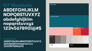
As well as the new logo, there's a new typeface, GT Walsheim, which Dashlane states is: "grounded in strength". It's also supposed to represent an evolution "from an overly tech-forward look and feel to reflect a much warmer, more human, way forward." We'll go with that, it's definitely clear. And it feels pretty human and warm to us. (See our free fonts roundup if you're looking to refresh your own font collection.)

There's also a new colour palette, focused around green and a complementary pink, which may not be the most attractive we've ever seen, but it is fairly distinctive, and – again – functional.
"While imbued with purpose and energy, our colours resist becoming bright or flashy," says Dashlane. "We give you a better way to move through the web. The last thing we want is to get in your way." Indeed, it seems this whole rebrand is delightfully focused on the user, and deliberately enhances the user journey, rather than interrupting it.
Get the Creative Bloq Newsletter
Daily design news, reviews, how-tos and more, as picked by the editors.

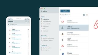
This seems to be in line with Dashlane's main function as an app, which is to fill in your passwords for you to help you do things quicker online. Overall, it seems like, as usual, Pentagram has designed a new identity that is entirely fitting for the brand.
“Our old brand identity didn’t quite reflect where we are going as a company,” says Dashlane's CMO Joy Howard. “We wanted a clean, flexible system that reflects the clarity of our commitment to fix the UX of the internet. We help our customers reveal and conceal themselves and their data online; that idea turns into motion in our new identity system."
"We removed any extraneous filigree to present a sharp-edged visual identity system that points to Dashlane’s commitment to fix the UX of the internet," says Opara on the Dashlane site. When you're using words like "filigree" to explain your branding, who are we to argue?
Read more:

Thank you for reading 5 articles this month* Join now for unlimited access
Enjoy your first month for just £1 / $1 / €1
*Read 5 free articles per month without a subscription

Join now for unlimited access
Try first month for just £1 / $1 / €1
Rosie Hilder is Creative Bloq's Deputy Editor. After beginning her career in journalism in Argentina – where she worked as Deputy Editor of Time Out Buenos Aires – she moved back to the UK and joined Future Plc in 2016. Since then, she's worked as Operations Editor on magazines including Computer Arts, 3D World and Paint & Draw and Mac|Life. In 2018, she joined Creative Bloq, where she now assists with the daily management of the site, including growing the site's reach, getting involved in events, such as judging the Brand Impact Awards, and helping make sure our content serves the reader as best it can.


