Master minimalism in web design
Discover a minimalist aesthetic can help users engage more.

When it comes to user interface design, the term 'minimalism' still causes a lot of confusion. What is it? How should we use it (if at all) and where does it fall on the spectrum alongside flat design, flat 2.0, material design and other modern-day design systems and visual aesthetics?
First, let's take a look at minimalism. Is minimalism flat or flat-ish? It can be. Is minimalism white? It can be. Does minimalism mean less clutter? It can do. Minimalism can look like a lot of things – take a look at our roundup of minimalist website designs for a range of examples. However, we often forget about what it aims to achieve, and why we actually need it.
Fundamentally, minimalist design advocates clarity mixed with intention; in other words 'no more than what's needed' to shift user focus to the most valuable aspects of the experience, while removing focus on the aspects that may distract users. By that logic, all design should be minimal, but only if we're using minimalism correctly.
If you're creating a whole new design system for your minimalist website overhaul, make sure you store files securely for your team to access seamlessly. The best cloud storage options will help.
Sure, minimalist design may look nice but it should never be at the expense of clarity – i.e. where a design displays notable minimalist qualities but without conscious thought, displaying beautiful form that lacks any intuitive function or usability.
Let's walk through how you can achieve minimalism, step-by-step.
01. Limit choices
Limiting choice is one way to reduce cognitive overload, in turn helping the user make decisions more efficiently. However, for usability's sake, we'll need to include a couple of things:
Get the Creative Bloq Newsletter
Daily design news, reviews, how-tos and more, as picked by the editors.
- Relevant choices
- Alternative choices
Relevant choices
Deciding what's relevant to users depends on the context. For example, if we were showing a list of new blog articles, deciding on a few to showcase might depend on whether or not the user is logged in. With the former, we could use artificial intelligence to decipher the user's reading tastes. With the latter, we wouldn't be able to tailor content to a specific user but that doesn't mean that we don't have data at our disposal. We can still list results based on traffic data (a decent web hosting service can run a range of analytics for you).
However, that's content. When it comes to UI, tracking tools such as Google Analytics help us learn more about our user's behaviour. A/B testing tools like Crazy Egg and Google Optimize can test alternative versions of our layout. Heatmaps can also indicate what users do and don't care about.
Or, if you're creating an app or website from scratch (perhaps by using a website builder), designing information architecture through usability testing would be a better tactic in the absence of data – open and closed card sorting or functional salience testing springs to mind here.
So as you can see, there are numerous ways to obtain qualitative and quantitative data and combine them to make informed decisions.
Alternative choices
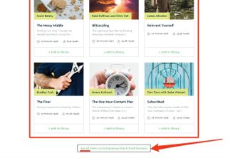
If we're designing our information architecture well, we'll be offering simple ways to access alternative options. For content this could be a 'see all' button but for navigation it could be a hamburger menu (yep, the hamburger menu isn't so bad!).
Even though less is more when it comes to minimalism, that doesn't mean we need to limit our overall offering, only our upfront offering. Minimal clutter = maximum impact!
Interesting fact: when it came to product presentations (i.e. content), Steve Jobs famously swore by the rule of three.

02. Strip visual clutter
Speaking of clutter, visual clutter refers to cosmetic styles that only add emotional value – i.e. they look cool but they don't offer much else. Now I do love things that look nice (don't all designers?) and emotional design is extremely important, especially in consumer-based industries, but there's a reason why it's called the surface layer – it's applied last.
It's so easy to run with the wind when it comes to the surface layer – some call it over-designing. If something just doesn't feel right to you, Coco Chanel once said: “When accessorising, always take off the last thing you put on”.
But if you really want to take a more sensible data-driven approach, there's a really neat trick I like to use that involves screen sharing. While sharing your screen, acquire a few users and have them decide which styles to toggle on and off. Carry on until the user is satisfied with both the visual appeal and usability.
In terms of tap targets specifically (buttons, links, input fields and so on), visual affordance testing can reveal which elements appear to be clickable and which don't. You may find that the former technique is more useful though because it will also reveal solutions (i.e. which styles to remove in order to reduce visual clutter).
03. Optimise visual hierarchy
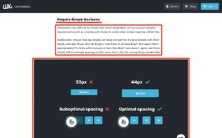
So we've minimised our upfront offering and optimised it visually in order to reduce cognitive overload but could we take this a step further? Absolutely but we also need to remember that users are lazy – before users read, they scan.
This means where users are briefly scanning our UI and content holistically, even the tiniest visual distraction can draw users away from what's really important, making minimisation ever more important when it comes to scannability. But that aside, the elements that are left after minimisation should complement each other well. Less is only more if we make it speak volumes.
Content and headings
Since users precap content by scanning its headings, these headings should be extremely informative, not only hinting at what its accompanying paragraphs will elaborate on but be good enough that if users only read the headings, they would still walk away satisfied – this is still true even if it costs us in terms of SEO value. After all, what use is acquisition if we can't offer a decent reading experience once the user has arrived?
Headings should also benefit from a clear typographical hierarchy, aiding users in their effort to understand how individual snippets of content form a body of information.
UI and colour
A similar concept applies to UI and colour. Colour can not only help with contrasting but also help to infer meaning, so when users come across these tap targets, they automatically understand what it is they do or where it is they will lead to.
Getting the headings and colours right might not have anything to do with minimalism directly but it ensures that the elements we aren't willing to minimise are as effective as they can possibly be. Otherwise, we run the risk of over-designing in order to compensate.
04. Make more mean less
'Put everything on one screen. It's simpler, right?' In theory this sounds like a top-notch idea but it's not a solution that works in every case. Some designs are more complex than others and, besides, simple for who? You need to be mindful of confusing simpler implementation (making things easier for developers) and simpler UX (making things easier for the users).
Consider breaking down UI-heavy components into smaller user flows. While technically this does result in more, it creates the illusion of less. Typically this means breaking up long forms into logical steps but it could also mean breaking up lengthy articles with images.
Overall, minimalism is a tricky subject. Sometimes we mean it as a visual aesthetic (flat UIs, white backgrounds, etc.), other times we consider it merely a concept or even a lifestyle. In terms of user interface design, the best way to think of it is to consider the impact on cognitive load that each element has.
When designing to reduce cognitive load, ask yourself these questions for every style, user flow, interaction, and feature:
- Is it needed?
- Is it over-shadowing elements that are more important?
- Is it being over-shadowed by elements that are not more important?
It comes down to visual hierarchy – eliminating clutter and using design to indicate importance. Sometimes that means moving things out of sight if it helps the user focus on what's really important.
This article was originally published in issue 321 of net, the world's best-selling magazine for web designers and developers. Buy issue 321 here or subscribe here.
Related articles:

Thank you for reading 5 articles this month* Join now for unlimited access
Enjoy your first month for just £1 / $1 / €1
*Read 5 free articles per month without a subscription

Join now for unlimited access
Try first month for just £1 / $1 / €1
Previously a design blog editor at Toptal and SitePoint, and before that a freelance product/UX designer and web developer for several years, Daniel Schwarz now advocates for better UX design alongside industry leaders such as InVision, Adobe, Net Magazine, and more. In his free time, Daniel loves gaming, café culture and Wikipedia, and also travels perpetually when there isn’t a pandemic.
Related articles
-
 I wish this Nintendo Switch 2 logo concept was the real deal
-

-

-

