AI art, promtography, or whatever you want to call it, remains controversial and something of a legal and commercial grey area. Many people hate it – as shown in the reaction to the Coca-Cola AI Christmas ad. But can we really tell the difference?
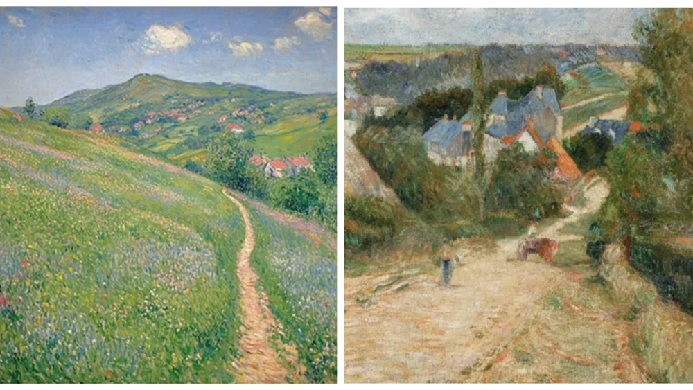
A recent study aimed to find out. Some 11,000 participants looked at 50 images and decided whether each one was created by AI image generator or a real human. They were also asked which image they preferred. The results were surprising. Take the two images above, or those below, for example. Can you tell which is AI?
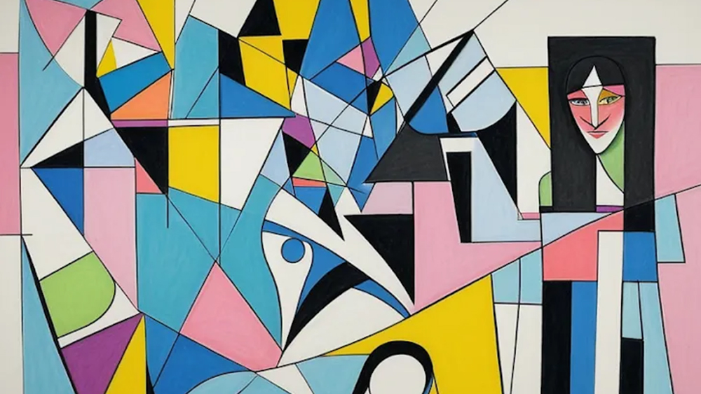

The blog Astral Star Codex's online survey featured 50 images in all. The test found that although five participants managed a score of 49/50, people chose wrong 40 per cent of the time.
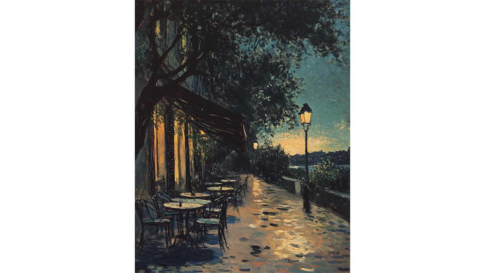
The two images at the top of this article were used in the study. The one on the left was AI-generated while the one on the right is Gauguin’s “Entrance to the Village of Osny”. As for the images in the gallery above, the first was AI-generated, but the style of art being mimicked means that it lacks the obvious giveaways.
Meanwhile, 84% of participants thought that the second image in the gallery above was AI generated, presumably because of the detail lighting. But it was created by the human artist Mitchell Stuart without using AI.
But more than just a difficulty in distinguishing AI art, the test also found that participants liked the AI images slightly more than the human-created ones. Six of the ten most-liked images were AI-generated, including the top two. The study found the same preference even among participants who said they had a strong dislike of AI art. See more on the results here.
As interesting as it is, I have a lot of doubts about the merits of the test. It wasn't conducted in a scientific way, and some of the images seem to have been chosen specifically to make it hard. The AI images didn't contain obvious giveaways like misshapen hands or nonsense text and many were made by experienced users of AI image generators.
Get the Creative Bloq Newsletter
Daily design news, reviews, how-tos and more, as picked by the editors.
As for preferences, it may be that participants simply had preferences for particular styles of art. A test at DSL put pairs of human/AI images of the same style side by side and participants scored close to 100%. The site's readership also has an inherent bias since it includes many AI enthusiasts. Nevertheless, some of the example images still look very clearly AI to me. Check out the anime girl and the giant cats below.
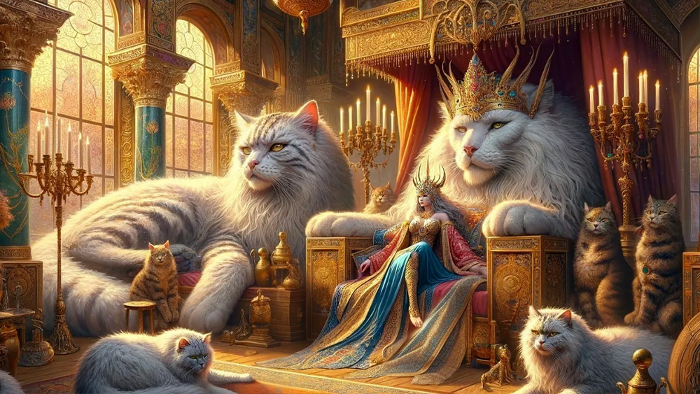

For more recent AI art controversies, see Netflix's Arcane Season 2 poster debacle.

Thank you for reading 5 articles this month* Join now for unlimited access
Enjoy your first month for just £1 / $1 / €1
*Read 5 free articles per month without a subscription

Join now for unlimited access
Try first month for just £1 / $1 / €1

Joe is a regular freelance journalist and editor at Creative Bloq. He writes news, features and buying guides and keeps track of the best equipment and software for creatives, from video editing programs to monitors and accessories. A veteran news writer and photographer, he now works as a project manager at the London and Buenos Aires-based design, production and branding agency Hermana Creatives. There he manages a team of designers, photographers and video editors who specialise in producing visual content and design assets for the hospitality sector. He also dances Argentine tango.
