Whether you're designing a website for a client or yourself, it's very easy to create something that looks like every other site. And sometimes that's a good thing: if visitors are primarily coming to your site to access a service or buy a product, a familiar looking design can help them from A to B quickly and easily.
But if the purpose of your site is to showcase your agency's design smarts and originality, then often you'll want to do things a little differently.
In this post we've brought together 10 of our favourite agency websites. All show how it's possible to infuse your site with a sense of personality and individuality that shows what your agency is all about.
01. Sagmeister & Walsh
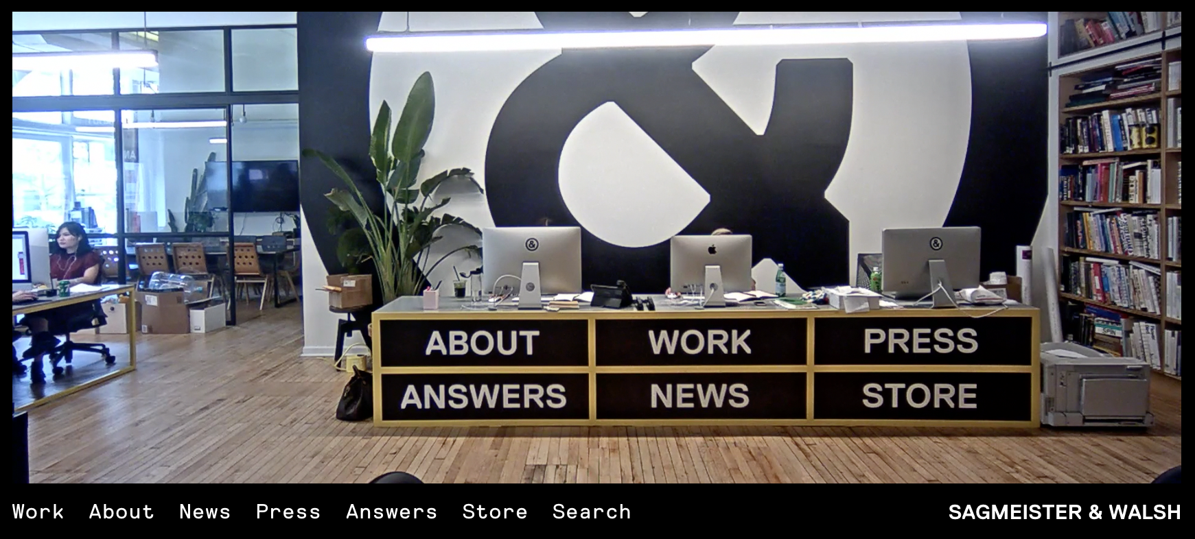
Whenever superhip New York design studio Sagmeister & Walsh releases something for public consumption, it never fails to make a splash, whether that be its superlative work for big brands or its trademark nude pictures of team members.
The agency's website continues in that tradition, featuring three angles of live feed video from the studio, including one from inside its pet snake's enclosure (yes, really).
These webcam scenes form part of the navigation of the site, with the main destinations superimposed over each view. The case studies, such as the agency's work for Appy Fizz, make delightful use of subtle effects and animations to really engage the visitor.
02. Stink Studios
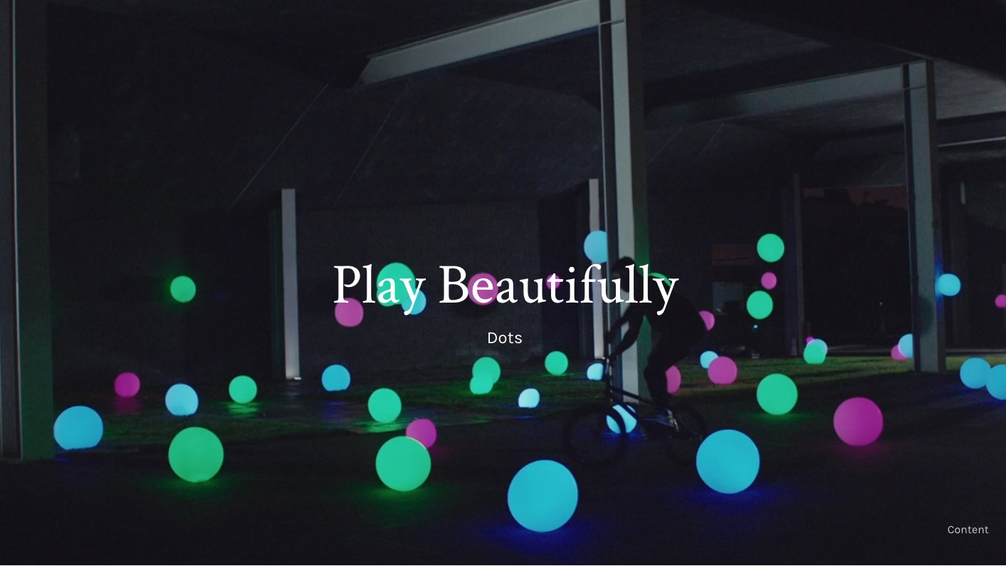
A global creative agency comprised of Stink Films and Stink Studios, Stink has some huge clients including Google, Spotify, Twitter, Ray-Ban and Nike, and consequently a lot of great work to show off. This it does masterfully on this site.
Get the Creative Bloq Newsletter
Daily design news, reviews, how-tos and more, as picked by the editors.
Huge, bold imagery and video dominate the case studies and make full use of the screen. But it's the little touches and attention to detail that really float our boat, such as being able to filter projects by subject and discipline, and the written-out times that appear when you mouseover the location of each office in the website footer.
03. Bolden
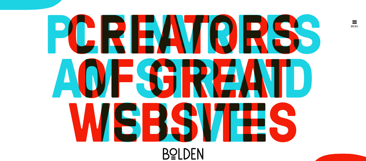
A strategic design and development studio based in Amsterdam, Bolden makes intriguing use of typography on its wonderful new site. From the opening spread shown above (click on the red and blue shapes to reveal each slogan) to the big and beautiful type of the menus, the confident use of lettering throughout this site compels you to delve further.
04. Haus
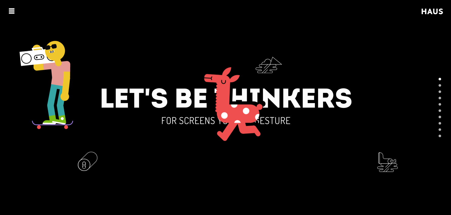
In a world of cookie cutter sites, it's great to see something original in digital, and that's just what LA-based brand development agency Haus has brought us with its site. The structure may be clean and simple, but everything is presented in such an energetic and inventive fashion it never stops being visually stimulating and engaging. And if you thought the idea of showcasing your work in a carousel was outdated, just check out what Haus has done with it here.
05. Studio Rotate
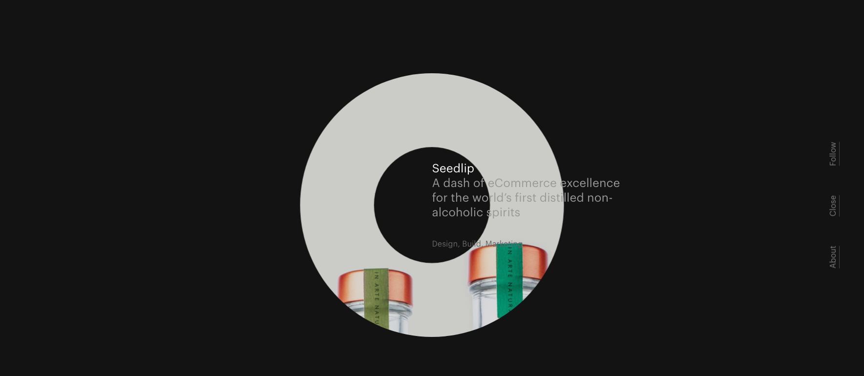
Dutch digital agency Studio Rotate takes its name as the central organising design principle of its new site, making for an innovative approach to presenting work based on hollowed-out circles. It's a minimal design, and in fact not that easy to navigate, but the visual playfulness of it all can't help to put a smile on your face.
06. Active Theory
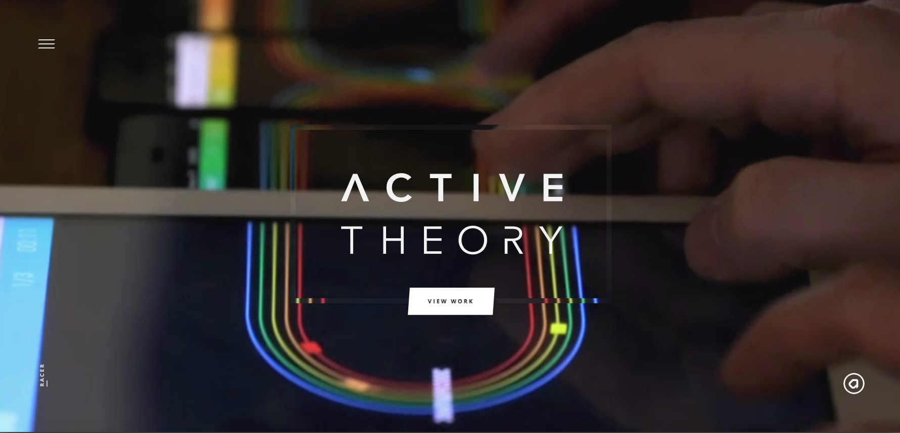
Active Theory is a creative digital production studio based in Venice, California, and its compelling website makes great use of background video to draw you in. Rather than the dreaded video wallpaper that adorns many agency homepages, there's a real sense of movement and energy to these clips.
07. Twenty Nine NYC
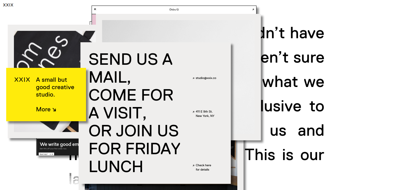
Twenty Nine NYC, a "small but good creative studio", does things a little differently, and that certainly applies to its anarchic website. Breaking almost every rule about how an agency site should look and function, this intentional mess of a design looks more like an old-school fanzine than a website, but it's infused with a sense of fun just makes you want to learn more about this charming company.
08. FCINQ
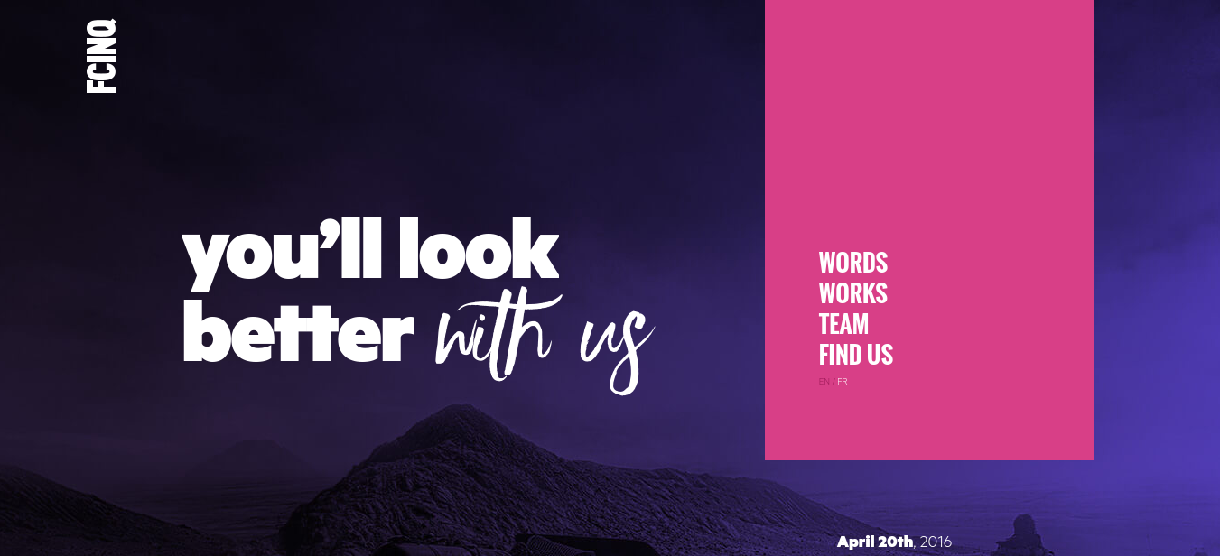
Parisian agency FCinq (French for 'F5') has one of those websites that's just a joy to scroll through. Its catalogue of work is presented artfully, in a way that allows both text and images to breathe. In many ways it feels more like a magazine or newspaper blog than an agency portfolio. The ability to switch between English and French is also a nice touch, and adeptly implemented.
09. Joan
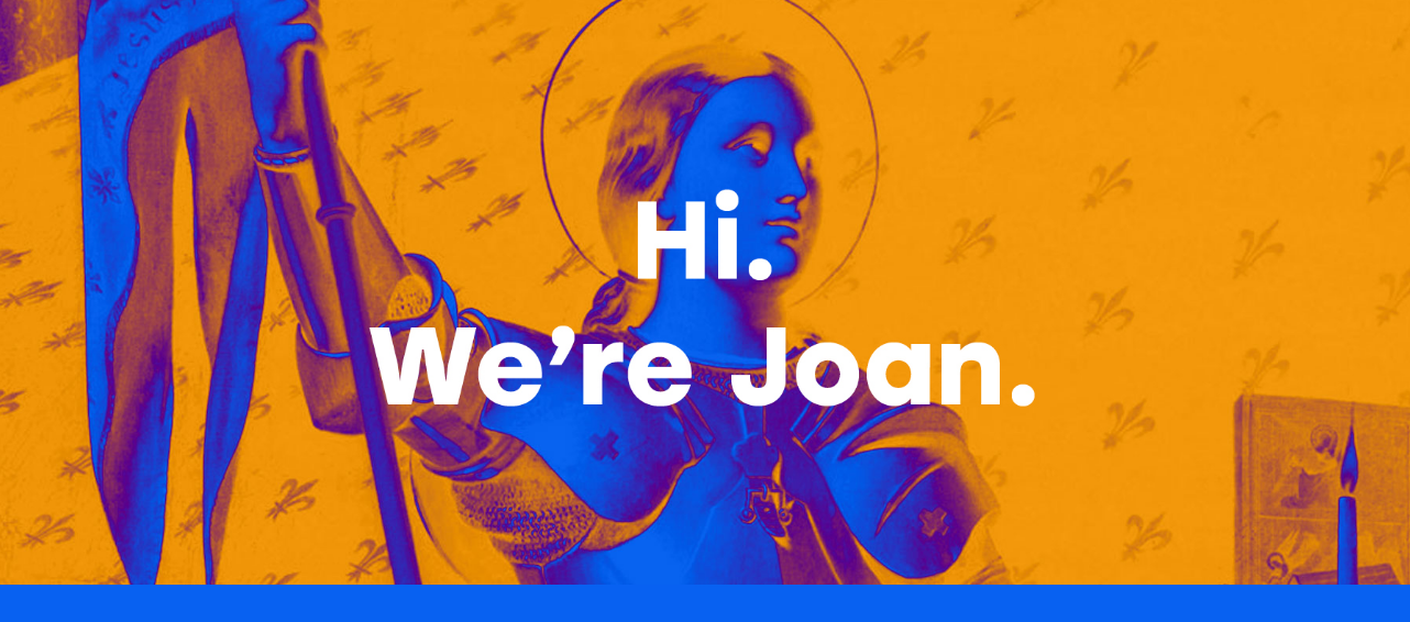
Joan is a creative studio founded in 2016 by ad agency veterans Jaime Robinson and Lisa Clunie, formerly of Wieden + Kennedy and Refinery29 respectively. The shop's site is big, bold and beautiful, announcing its arrival in style, with formidable design smarts. We love the multitude of logo designs for Joan, the intense colour scheme, and the general devotion to 'irregular thinking' behind this simple yet stylish site.
10. Zulu Alpha Kilo Inc.
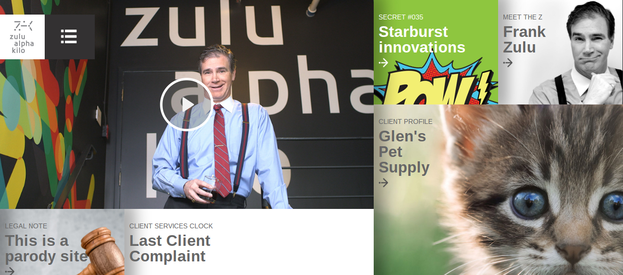
If you're thinking this homepage looks awful, then fear not: this is not a real agency site but a parody of such (albeit launched by the real agency of the same name). In short, it's a hilarious sendup of the worst agency website cliches, from OTT inspirational posters to cringeworthy founder bios, with a ton of terrible jargon and buzzwords holding it all together.
One case study describes how the agency created a viral video to promote condoms: "We sent out fake positive STD tests to influential college students and captured their reactions on hidden camera. Their reactions were priceless. Best of all, we never revealed it was a hidden camera prank, so they only learned the truth when they saw themselves crying on a national television campaign."
Related articles:

Thank you for reading 5 articles this month* Join now for unlimited access
Enjoy your first month for just £1 / $1 / €1
*Read 5 free articles per month without a subscription

Join now for unlimited access
Try first month for just £1 / $1 / €1

Tom May is an award-winning journalist and editor specialising in design, photography and technology. Author of the Amazon #1 bestseller Great TED Talks: Creativity, published by Pavilion Books, Tom was previously editor of Professional Photography magazine, associate editor at Creative Bloq, and deputy editor at net magazine. Today, he is a regular contributor to Creative Bloq and its sister sites Digital Camera World, T3.com and Tech Radar. He also writes for Creative Boom and works on content marketing projects.
