Prep images for motion
Andy Martin’s top 10 tips for preparing artwork in Photoshop for After Effects
01 WORK TO THE RIGHT SIZE
Before you begin artworking, find out the screen size you’re working to and set up your Photoshop files to this size or larger. You can shrink objects in After Effects, but it’s much harder to scale things up and keep the quality high. Beware of making all your images massive though, as you might find After Effects struggles to cope and you get some long renders.
02 STICK WITH RGB
Another fundamental setting that you need to make sure is correct from the start is the colour mode. All your artwork should be RGB; After Effects won’t import CMYK files. If you’ve been given artwork from a print campaign it’ll generally be CMYK, so convert it to RGB and double-check that the colours haven’t altered – if they have, tweak them to match the original image.
03 IDENTIFY STATIC OBJECTS
Think about what does and doesn’t need to be animated. You want to give yourself options, but you don’t want to spend hours artworking up elements that are going to stay static in the background. Similarly, if you have lots of one particular object (like leaves on a tree) just create four or five variations and duplicate them up once in After Effects.

04 LABEL CLEARLY
When you import Photoshop files into After Effects, the names of the objects will be determined by the labels given in Photoshop. This applies to the file name, layer names and folder names. Make sure labels are obvious and descriptive. If things are labelled ambiguously at this stage, you’ll soon become confused when the After Effects project starts to become complicated.
05 KEEP THINGS TIDY
When you’re putting together your artwork – or if someone else has given it to you – you might find various working layers that are no longer needed. Delete them and just focus on the bits that you’ll use in your animation. Also, keep an eye out for parts made up of a few layers that you can merge together to make one.

06 IMPORT PSDS AS COMPOSITIONS
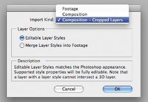
This will create a comp in After Effects that will retain the layout and order of your Photoshop layers. It’s particularly useful for background scenes or characters that have been split into their component parts. When artworking these, take into consideration the order of your layers as it will be replicated in the timeline.
07 ORGANISE WITH FOLDERS
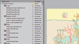
When you import art as a composition into After Effects, the folders in your Photoshop file will become separate comps within your main comp. If you’re splitting up a landscape, for example, you might want to create a folder for each different area. Doing so also avoids situations where you have huge comps with hundreds of layers.

08 SEPARATE CHARACTERS INTO SECTIONS
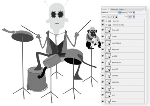
If you want to animate a character, it’s best to split it up into sections – with each joint on a different layer – to have full control over it in After Effects. It has become less necessary to split each joint up onto different layers since the addition of the Puppet tool, but it can still be useful to separate the limbs from the body and facial features from the head.
09 SPLIT LANDSCAPES BY DISTANCE
When artworking landscapes for backgrounds, split the image up into sections based on how far away they are. Your bottom layer is usually the sky, followed by objects and land in the distance. Then comes where the action will happen and, finally, foreground objects. These layers can be put into 3D space in After Effects to have parallax scrolling techniques applied and depth created from a flat image.
10 USE THE CLONE STAMP TOOL
If you lift an object onto a new layer, make sure you paint it out of the original layer. This is particularly important if you’re putting it into 3D space in After Effects, as when you move your camera around you’ll see the duplicate on the original layer, which will look odd. The Clone Stamp tool can be useful for this when working with photographs.
Get the Creative Bloq Newsletter
Daily design news, reviews, how-tos and more, as picked by the editors.

Thank you for reading 5 articles this month* Join now for unlimited access
Enjoy your first month for just £1 / $1 / €1
*Read 5 free articles per month without a subscription

Join now for unlimited access
Try first month for just £1 / $1 / €1

The Creative Bloq team is made up of a group of art and design enthusiasts, and has changed and evolved since Creative Bloq began back in 2012. The current website team consists of eight full-time members of staff: Editor Georgia Coggan, Deputy Editor Rosie Hilder, Ecommerce Editor Beren Neale, Senior News Editor Daniel Piper, Editor, Digital Art and 3D Ian Dean, Tech Reviews Editor Erlingur Einarsson, Ecommerce Writer Beth Nicholls and Staff Writer Natalie Fear, as well as a roster of freelancers from around the world. The ImagineFX magazine team also pitch in, ensuring that content from leading digital art publication ImagineFX is represented on Creative Bloq.
