Design a branded loading animation in After Effects
How to make a custom loading animation in After Effects, and turn it into a lightweight GIF.
Good visual design is becoming easier and easier to come by. It's getting harder to tell who's got real design chops, and who just has access to really nice website templates or UI kits. This means that in order to create an impactful user experience, you need to go above and beyond what people are expecting.
Some of the most memorable touches are the small ones. Think of MailChimp's famous 'monkey hand high five' that shows up when you hit Send on your campaign. Instead of a general success message, as you might expect, they dug a little deeper, and worked their brand into the experience. We won't be animating any monkey paws here, but we will make a colourful loading animation that's easy to customise with your own brand colours and logo. You can see InVision's example below:

We'll use After Effects to create the loading animation sequence, and then bring our exported video file into Photoshop and turn it into a lightweight GIF that can be launched anywhere you need an animated loading element.
Before you dive in, you'll need to pick out four brand colours and have a small, single-colour, transparent version of your logo handy. If you've been meaning to learn After Effects, this is a perfect opportunity for you to jump in, create something uniquely yours, and learn some great basic techniques in the process.
Watch this exclusive screencast, or follow the steps below to create your loading animation.
01. Create a new sequence
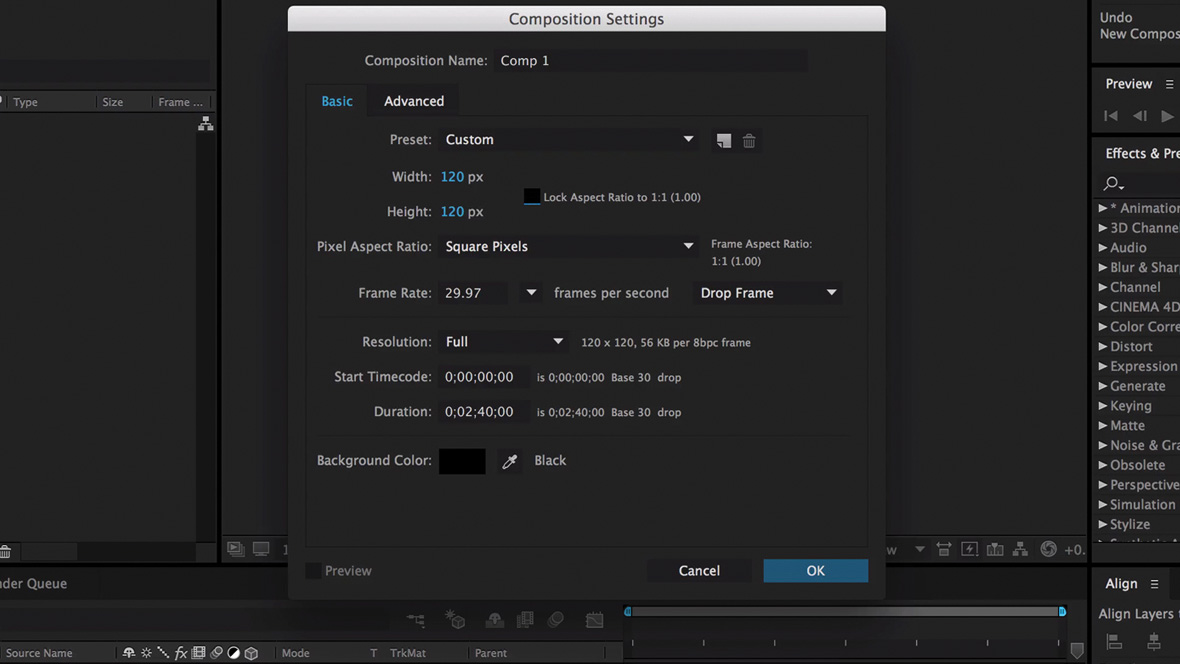
Open up After Effects and press cmd+N to create a new sequence. Since our video is going to be a square, instead of the standard 16:9 aspect ratio, change the width and height to 120px in the composition settings and click OK. The recommended final output of our GIF will be 60px, but we want to be able to account for Retina screens, too.
02. Sort out your workspaces
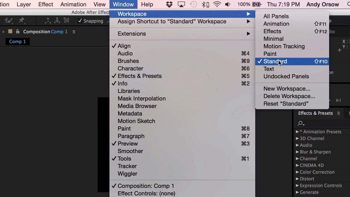
Before we continue, let's make sure our After Effects workspaces are the same. In your top menu, go to Window > Workspace > Standard. This way, when I say "Click that thing at the bottom right of your screen" it will actually be at the bottom right of your screen.
Get the Creative Bloq Newsletter
Daily design news, reviews, how-tos and more, as picked by the editors.
03. Make some shapes
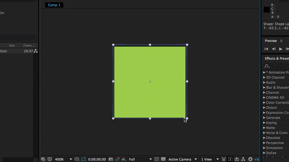
Now let's create a handful of square shapes that will become our animated blocks of colour. Click on your sequence (the black square in the middle of the screen), press Q, then Shift+click and drag a square on screen so the edges extend just outside the edges of the composition.
It's good practice to centre the shape perfectly on screen. In the Align panel at the bottom-right, click Horizontal Center Alignment and Vertical Center Alignment.
04. Add colour
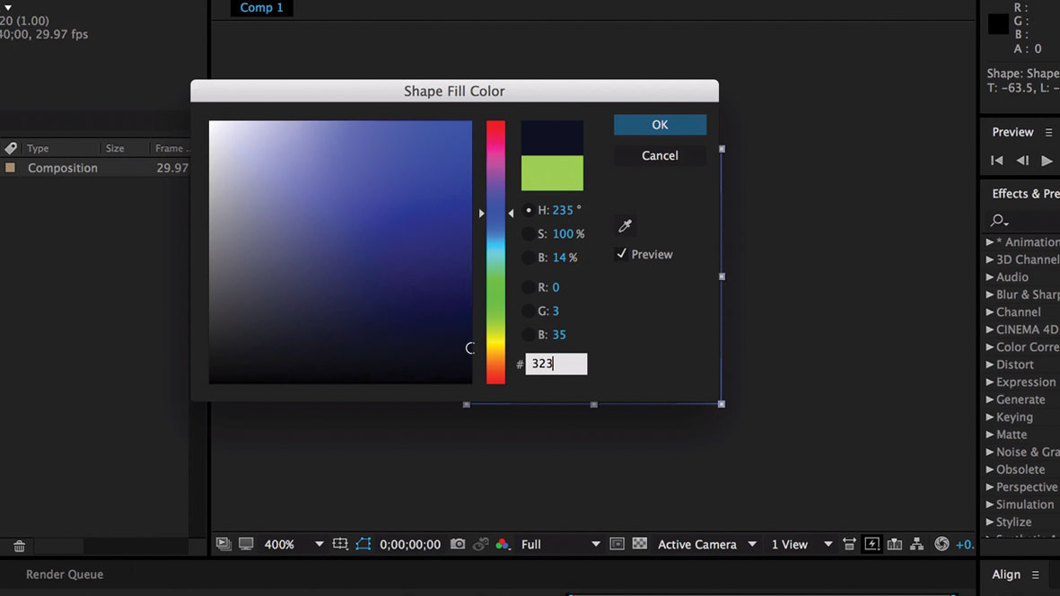
While your shape is still selected, click the Fill colour option at the top of your screen and enter one of your primary brand colours as a hex or RGB value. You can also use the eyedropper tool to sample colours from anywhere else on screen, including colours outside of the After Effects window, which is helpful.
05. Duplicate your layers
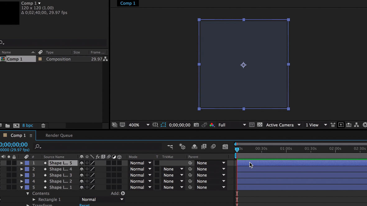
Along the bottom of your screen you'll see a timeline with a single layer named 'Shape Layer 1'. Select it by clicking on the name or the blue bar in the timeline, and press ctrl/cmd+D four times to duplicate it. You should end up with five identical layers in your timeline. These will be entitled Shape Layer 1, 2, 3, 4 and 5.
06. Use anchor points

Each shape is going to animate in from a different side of the screen. To make that easy, we'll change the location of our anchor points ahead of time. Select Shape Layer 2 and press Y to bring up the Anchor Point tool. Then click on your anchor point (it looks like crosshairs somewhere inside your shape) and drag it to the bottom edge of your square. Repeat on layers 3-5, placing each anchor point on a different edge than the last. You don't need to do anything to Shape Layer 1.
07. Stagger the timing
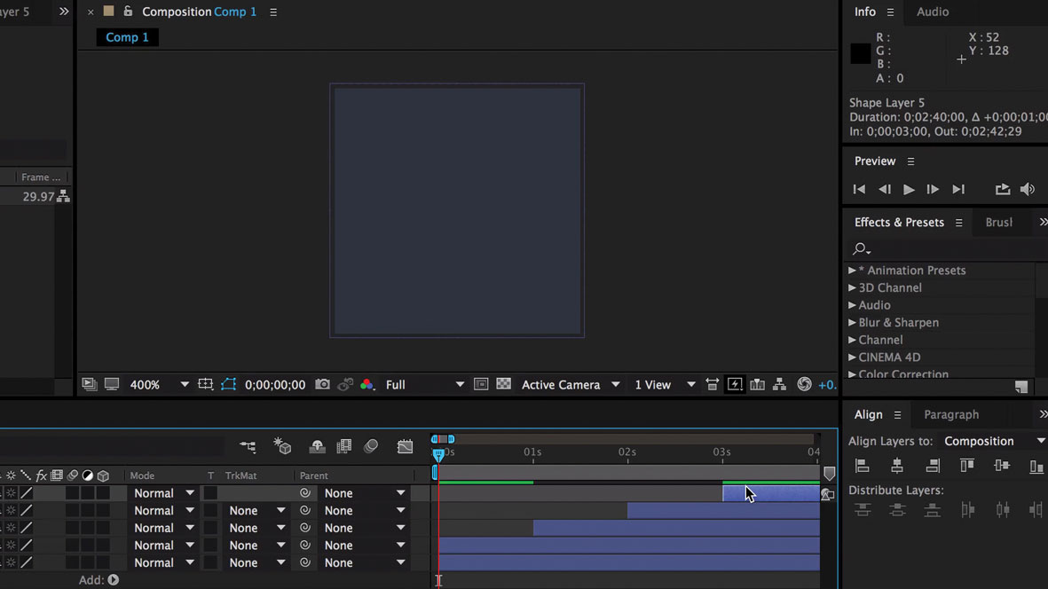
Now it's time to stagger the timing of our shapes in the timeline. Press V to switch to your selection tool, and in your timeline shift+click the blue bars for layers 3-5 and drag them to the right, spacing each out by one second. They should begin at the 1, 2, and 3 second marks in your timeline. If your timeline is too zoomed out, hold down alt and scroll down – this action will zoom you in and out of your timeline.
08. Add more colours
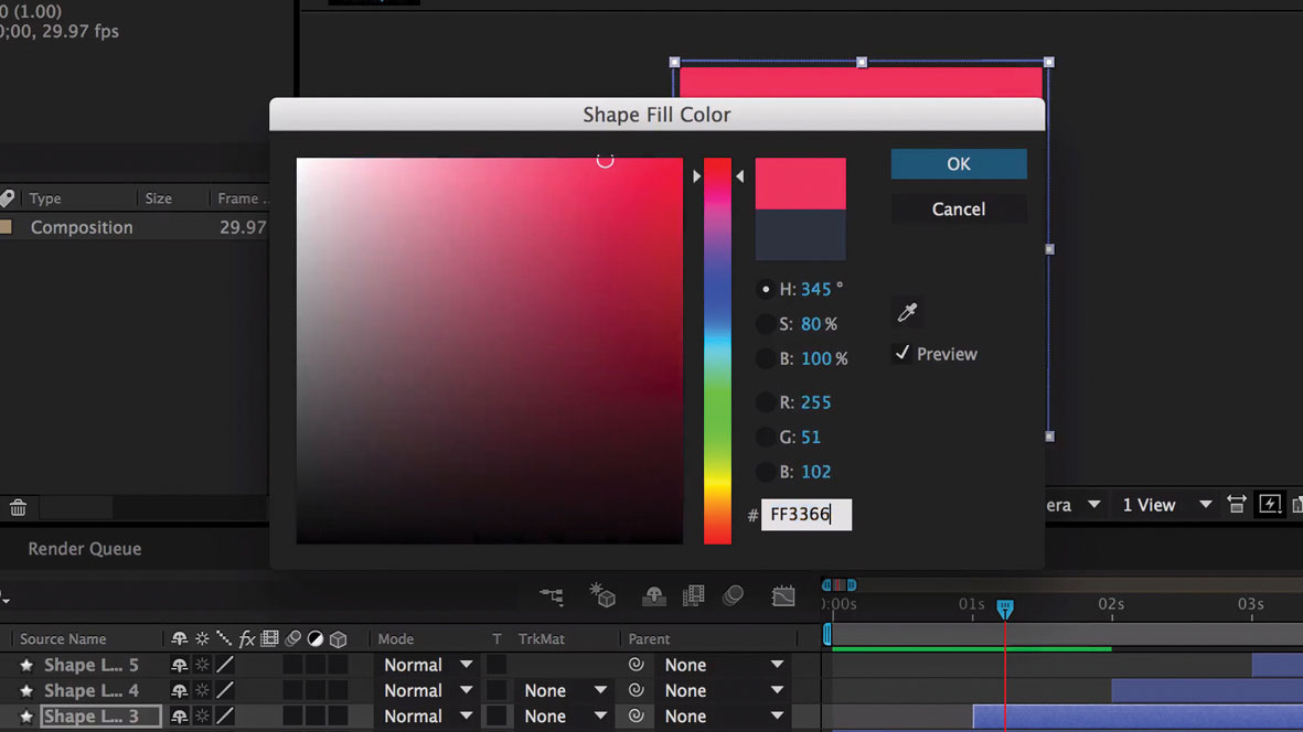
Individually select shapes 2-4 and change their fill colour like you did back in step 4. You can drag your playhead (the vertical red progress line) over the shape you're editing to see your changes take place. We'll leave Shape Layers 1 and 5 the same colour, because we'll be creating a loop that starts and ends on the same colour. If that doesn't make sense right now, don't worry – it will.
09. Do a first preview
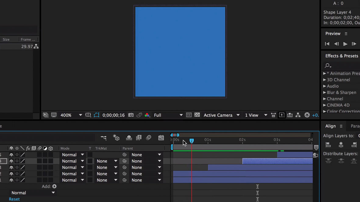
It's time to preview your handiwork so far. Press the spacebar and watch the colours change on screen. Hit spacebar again to stop it (or esc if this doesn't work).
10. Create a keyframe
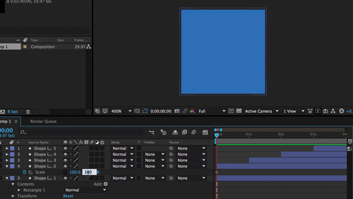
Click and drag your playhead back to the beginning of your timeline. Select Shape Layer 2, then press S on your keyboard to bring up the scale options for that shape. Now click the stopwatch icon next to Scale, turn off the link icon next to the scale percentages, and drag the second value down to 0%. A small diamond will show up on your timeline at your playhead's current location. Congratulations, you just created a keyframe!
11. Make another keyframe
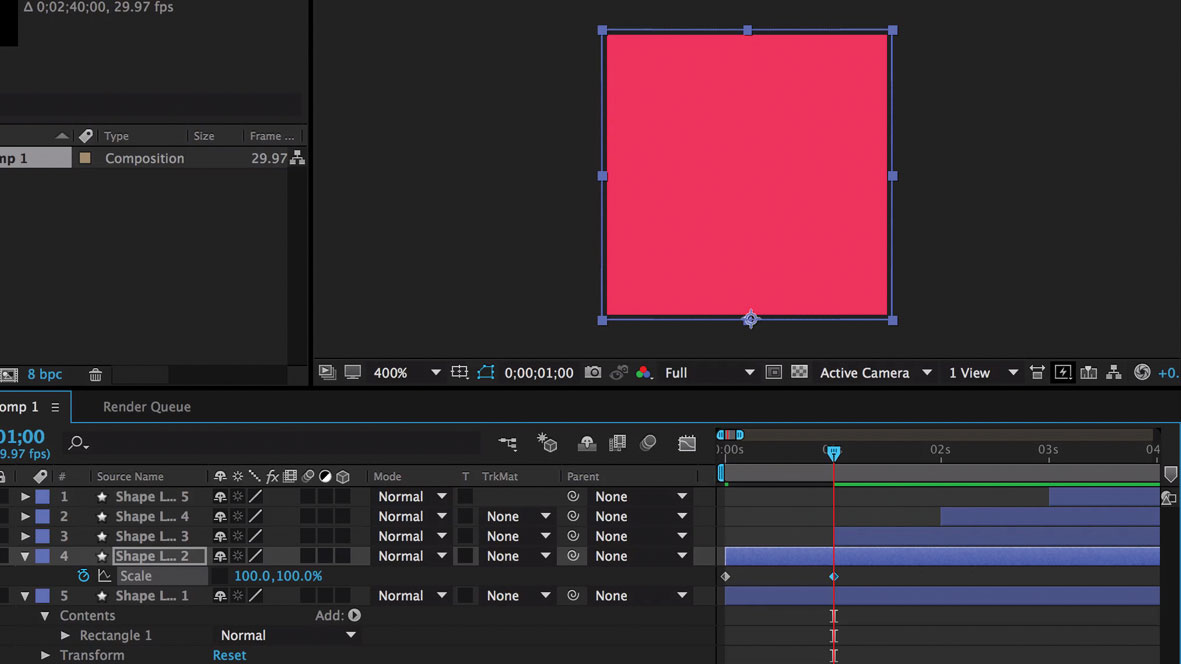
Drag the playhead up to 1 second and set your shape's value back to 100 per cent. Another keyframe should show up in your timeline at the playhead. Drag the playhead back to the beginning of your timeline and press spacebar to preview your animation. You should see the shape scale up and cover Shape Layer 1.
12. Make more keyframes
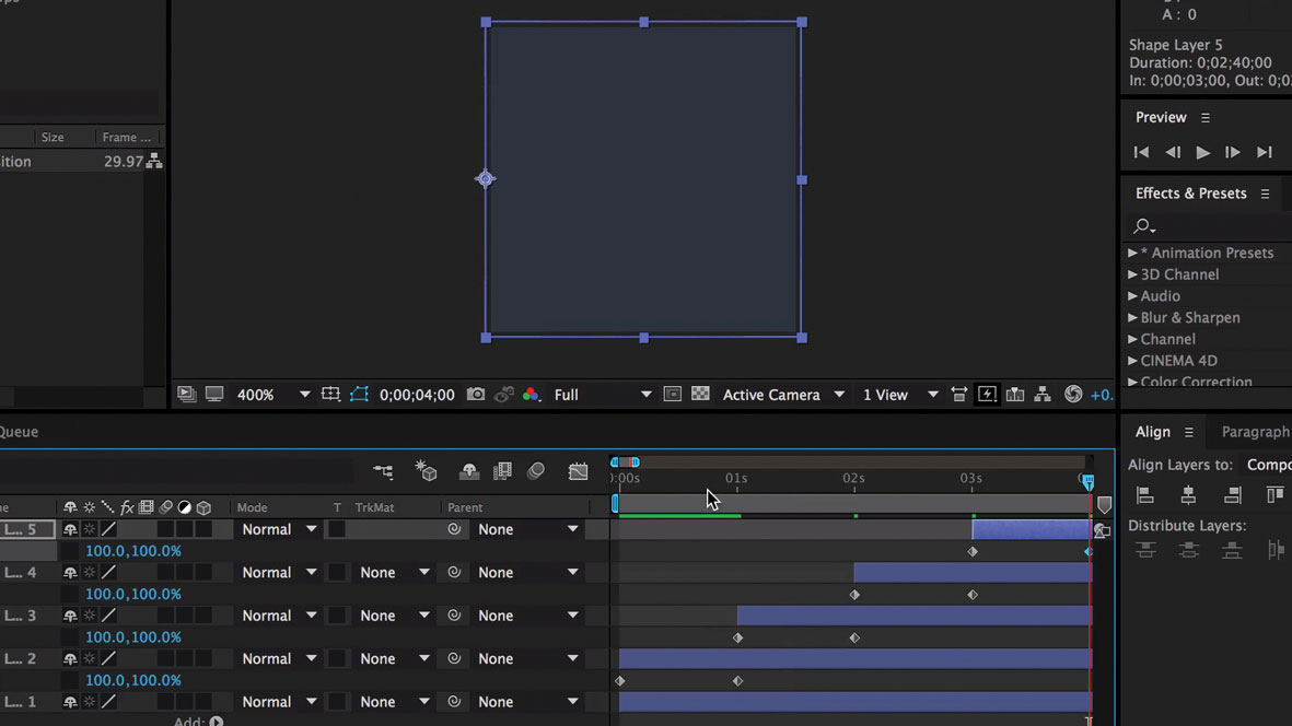
Repeat those steps again on Shape Layers 3-5, each time starting your animation at the beginning of the layer's blue bar, which we staggered by 1 second earlier on. When you're done, the first keyframe of each layer should line up with the last keyframe of the layer below it.
13. Preview again

When you've finished adding your keyframes, preview your work. You should see different shapes sliding in on top of each other from different angles. If that's the case, move your playhead to 4 seconds and hit N. This will mark the end of your animation, and loop your preview when you hit spacebar again. If Shape Layer 1 and Shape Layer 5 are the same colour, it should form a seamless loop.
14. Adjust the easing
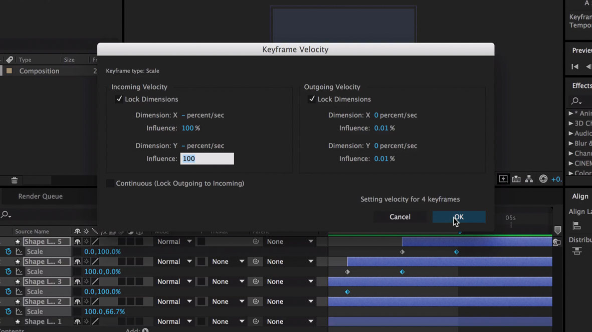
It's almost time to add your logo, but not quite. The animation right now is probably looking a little linear (read: boring) – let's liven it up by changing the easing. While holding the shift key, select the final keyframe of each layer, and right-click on one. Choose Keyframe velocity, then set the incoming velocity to 100 per cent and leave Dimension X and Y alone. Click OK and preview again. You'll notice the animations slow down at the very end, creating a more dynamic feel.
15. Add a logo
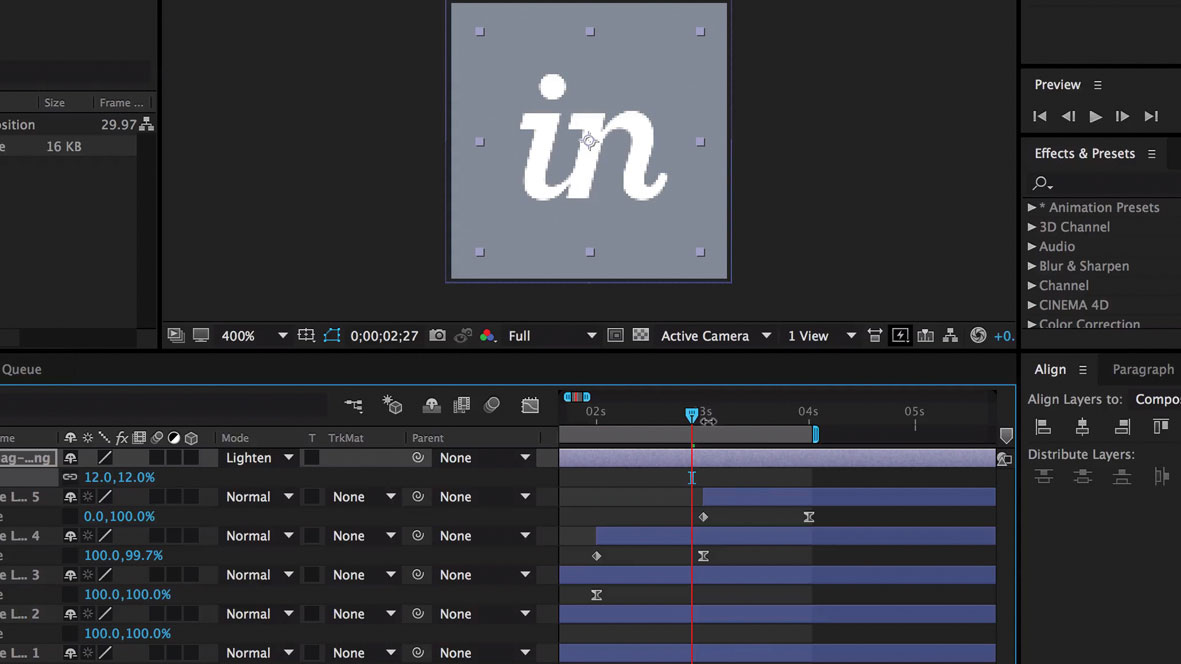
Now we're ready to add your logo on top of the animation. In the project panel at the left of your screen, double-click the empty area below Comp 1 and import your image file (it's best if it's a transparent image format, like a PNG or EPS.) Then drag it into the beginning of your timeline, making it the topmost layer. You can hit S again to scale your logo up or down, and use the Align panel again to place it dead centre in the composition.
16. Preview and export
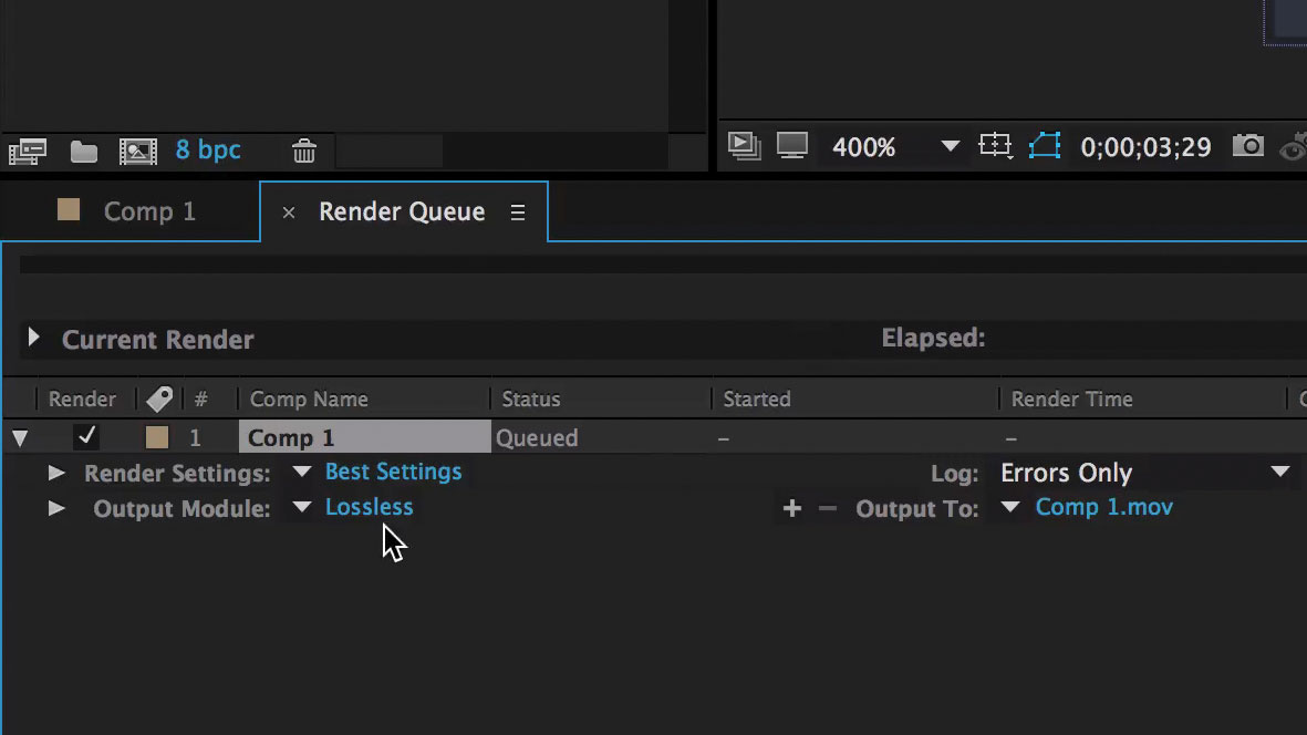
When you're happy with the size and placement of your logo, click play again and make sure everything still looks good. If it does, it's time to export your video. Go to File>Export>Add To Render Queue, then set your render settings to Best, output module to Lossless, and choose where to put your video file by clicking the file name in the Output To area.
17. Go to Photoshop
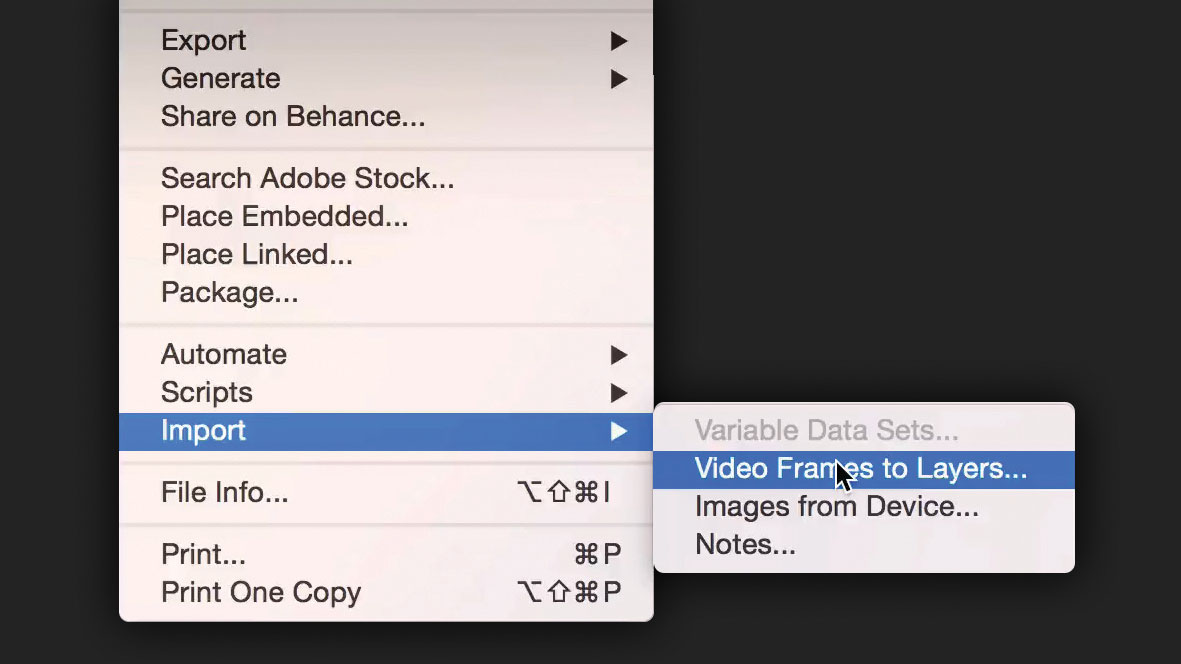
Now it's time to boot up Photoshop and convert our video to an animated GIF. In Photoshop, go to File>Import>Video Frames to Layers and select your video file. On the following prompt you have the option of adjusting a number of import settings for you video. However, since this animation is so short, we'll just click OK.
18. Check it's all good
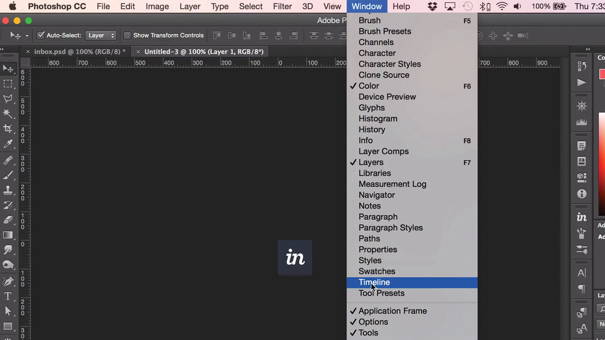
To make sure nothing looks funky with your GIF in Photoshop, go to Window>Timeline to bring up the timeline, and click the play button in the bottom left-hand corner. Playback may not be at 100% speed, so don't worry too much if it seems slow. You just want to make sure everything has come through OK and that it all seems smooth and seamless when looping.
19. Export your GIF
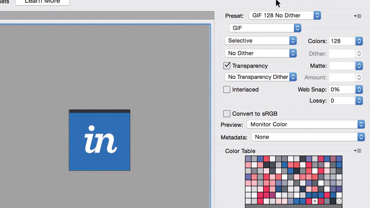
To save your GIF, press ctrl/cmd+alt+shift+S to bring up the Save for Web window. At the very top, select GIF as the file type and in the preset drop-down above that, choose GIF 128 No Dither. Near the bottom of the window you can adjust the image size down to 60px for final output. Make sure the animation looping settings are set to Forever, because much like diamonds, a GIF is forever (or at least it should be, anyway).
20. You're all done!
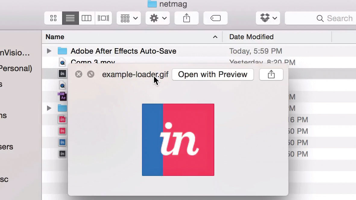
Congratulations! You now have a handmade, branded GIF that you can implement on your website or app, use to add realistic 'loading' states to your prototypes, or put up on Dribble or Behance for all the world to see.
This article originally appeared in net, the world's leading magazine for web designers and developers. Subscribe here.
Read more:

Thank you for reading 5 articles this month* Join now for unlimited access
Enjoy your first month for just £1 / $1 / €1
*Read 5 free articles per month without a subscription

Join now for unlimited access
Try first month for just £1 / $1 / €1
Andy Orsow is a communications designer at InVision.
