Clean up thumbnails for animation
Dylan White reveals how to smooth and prepare rough storyboard drawings for use in a comic-style animation
Having always been a lover of comic books and graphic novels, I’ve recently become interested in the development of phone and tablet apps as a destination and market for animated comic strips. My own design and illustration work tends toward a graphic style with blocked areas of colour, which works well for print but can feel somewhat flat when used for motion graphics.
However, there are plenty of tricks we can apply to help things feel slicker and look more optical, using just curves, blurs and blending modes. One of the neat things about After effects is that if you want to add an extra layer of finish and subtlety to otherwise flat images, you can add that extra level of texture and polish to your 2D designs while simultaneously preparing them to be animated. In this tutorial I’ll show you how I took some recent comic strip thumbnails and prepped them for animation, before using a few compositing tricks to style them up.
Discover what’s next for Augmented Reality over at Creative Bloq.
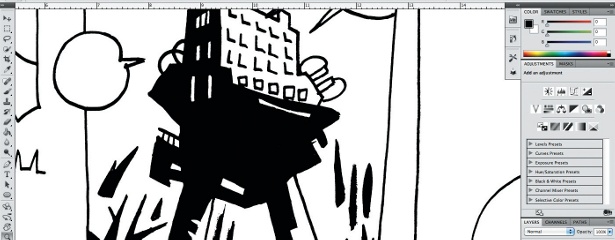
01 My original image is a rough thumbnail of some stylised water towers. This was drawn fairly small in a pocket notebook, so after scanning and tidying it up in Photoshop, you can see the linework is very rough and not ready for animation use.
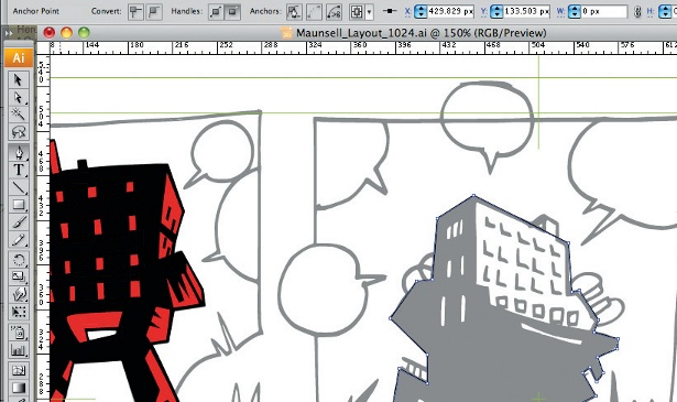
02 In Illustrator, create a new document with dimensions of 1024x576 pixels, and place your scan into it, dimming the opacity to 50% and locking the layer. Use this as a layout guide, and trace all of the major line art onto new layers using the Pen tool. I added some colour by altering the fill of certain shapes and saved it as a layered Illustrator document.
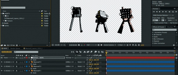
03 In After effects, create a new composition at 1080 HD in a 16-bit colour space. This is my default setting for new projects; it keeps the aspect ratio at 16:9 so it’s easy to upscale your Illustrator file, and is generally a good size if you need to scale or re-crop at a future date. After importing my artwork as a composition, I rescaled it using a null and swapped around the position of the towers for a better layout.
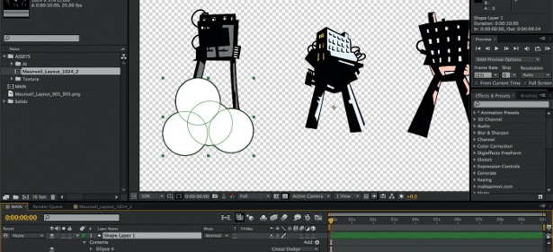
04 Create a new shape layer and make several ellipses with a black stroke and a white fill. Within the shape layer, apply the Linear Dodge blending mode to the ellipses, so they’ll overlap and join together while maintaining the outline. Keyframes or expressions can be added to any or all of the ellipses: this is a really simple way of animating clouds. Duplicate the shape layer and reposition the ellipses to create clusters of clouds.
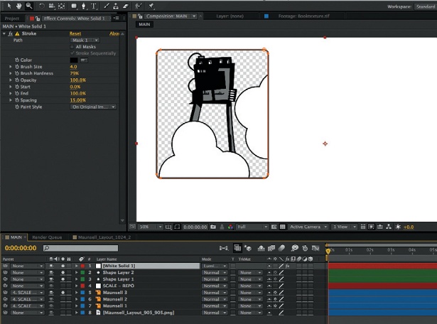
05 Create a new solid layer and apply a stroke to a mask to create a bounding box, which can be duplicated and repositioned accordingly for each comic panel. Change the layer blending mode to Screen, and the edge of the bounding box is absorbed into the shape layers of clouds. Now repeat these steps until you are happy with the layout.
Get the Creative Bloq Newsletter
Daily design news, reviews, how-tos and more, as picked by the editors.

Thank you for reading 5 articles this month* Join now for unlimited access
Enjoy your first month for just £1 / $1 / €1
*Read 5 free articles per month without a subscription

Join now for unlimited access
Try first month for just £1 / $1 / €1

The Creative Bloq team is made up of a group of art and design enthusiasts, and has changed and evolved since Creative Bloq began back in 2012. The current website team consists of eight full-time members of staff: Editor Georgia Coggan, Deputy Editor Rosie Hilder, Ecommerce Editor Beren Neale, Senior News Editor Daniel Piper, Editor, Digital Art and 3D Ian Dean, Tech Reviews Editor Erlingur Einarsson, Ecommerce Writer Beth Nicholls and Staff Writer Natalie Fear, as well as a roster of freelancers from around the world. The ImagineFX magazine team also pitch in, ensuring that content from leading digital art publication ImagineFX is represented on Creative Bloq.
