How to write engaging case studies for your portfolio
We examine 5 portfolios with powerful case studies.
Project case studies are one of the most important yet overlooked parts of building a design portfolio. In our efforts to design the perfect portfolio and showcase our visual work, we often rush the copy or omit it entirely, leaving only a shallow overview of who we are and what we can do. But dumping a bunch of photos on your project pages without any context sells your work short.
Case studies are so crucial to the success of a designer's website that we built Semplice, a portfolio system for designers, entirely around them. (If you're after design portfolio and case study inspiration, check out the Semplice Showcase.)
Your portfolio case studies are your opportunity to show prospective clients and employers how you think, how you work and what you can contribute to the world. Here are five examples of designers who do case studies well.
01. Liz Wells

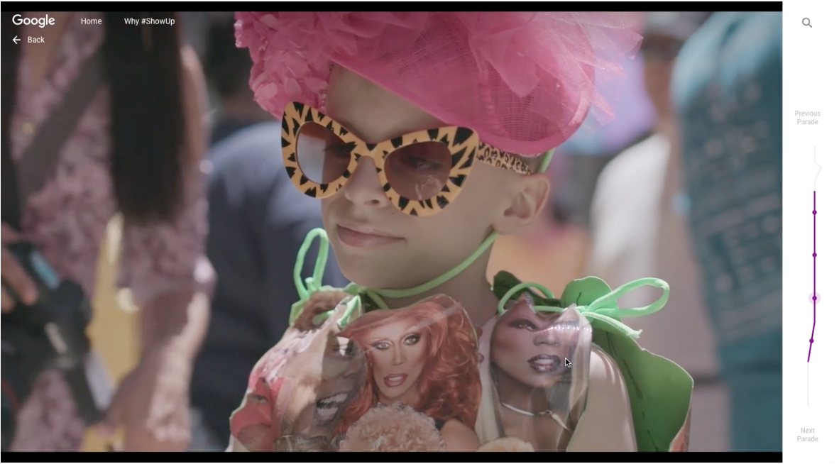
As a UX designer, Liz Wells has the unique task of making sitemaps, sketches, prototypes and user flows both visually engaging and concrete for her readers. She strikes the perfect balance in her portfolio case studies, highlighting work for brands like Google, Viceland and Spotify.
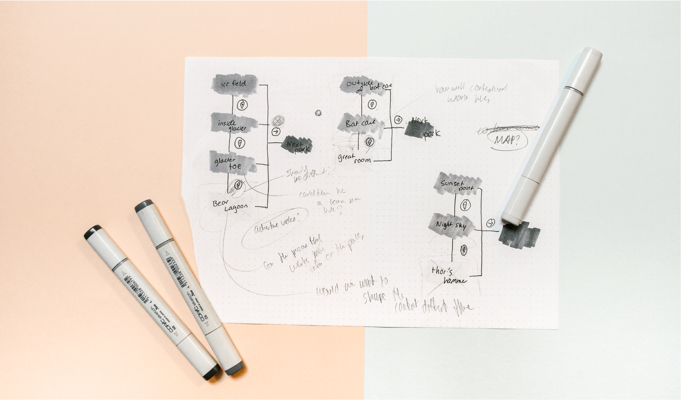
Wells shares the project story from challenge to solution, taking care to explain her process along the way. Photos, videos – even early sketches torn from her notebooks – are thoughtfully photographed and laid out. All of it works together to not only showcase Wells' work, but also who she is and how she thinks.

On my blog, I publish a series in which I interview top companies about how to get a design job where they work. Almost every company has voiced that they want to understand how you think and see your process.
Think about your project in phases and share your work – even the less glamorous notes and sketches, if they’re important to the story – from beginning to end, and you’ll find you have plenty to say.
02. Melissa Deckhert
Melissa Deckert’s case studies may be minimal but they pack a punch. Some, like her Food Quote GIFs case study for Tumblr, hook you in with a little secret that makes you look closer at the work.
“Tumblr asked me to animate a few food quotes for an internal project,” Deckert explains in the case study. “Naturally I found a way to weave Beyonce into two out of three.” Short and sweet, but the last line creates intrigue and make you want to see more.

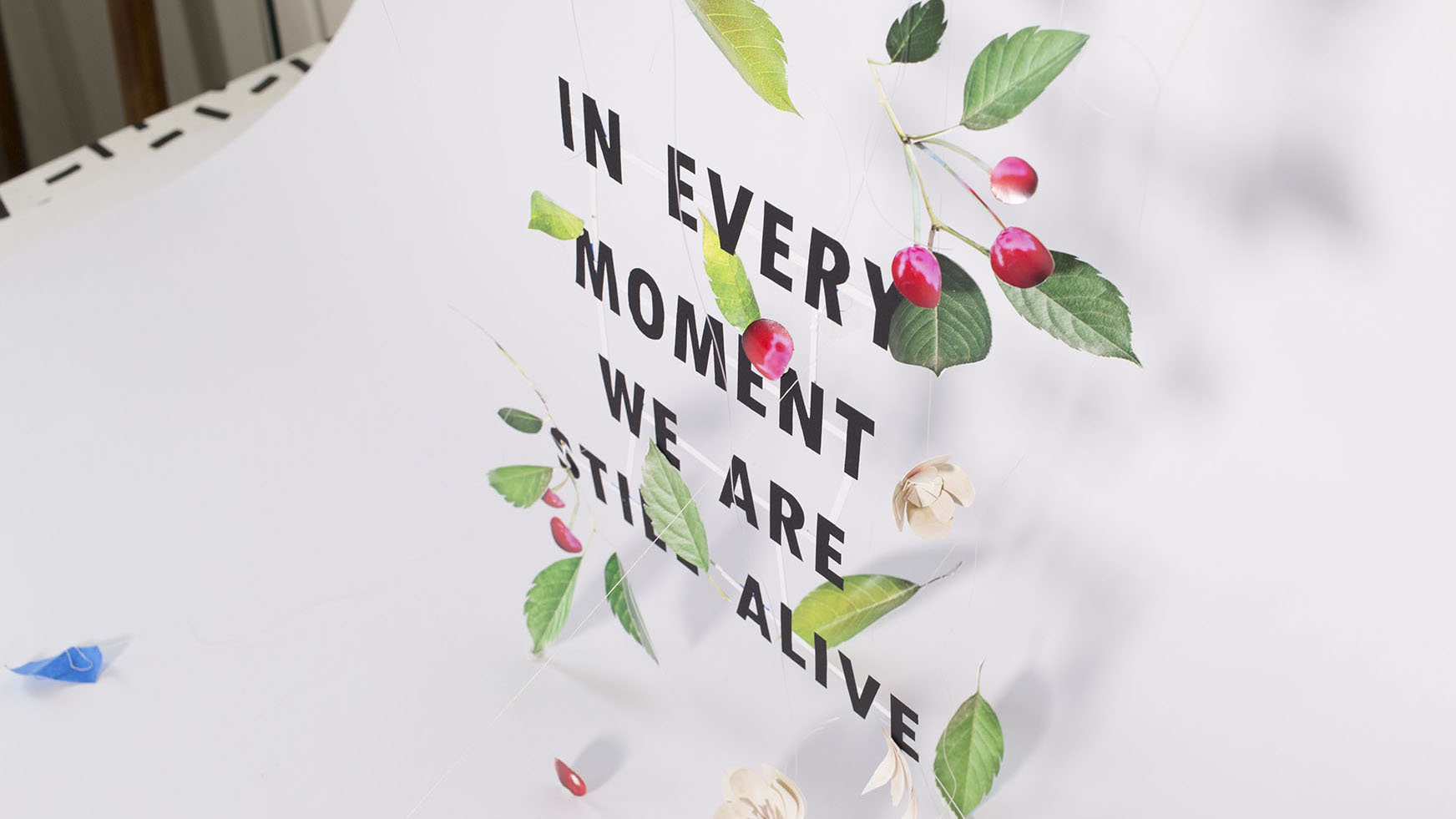
Others case studies, like her In Every Moment We Are Alive book cover project, surprise you with a big reveal at the end. The case study works in reverse, leading with the finished product (the final book cover) and ending with a behind-the-scenes shot that makes you rethink what you saw before.
Despite all our excuses, designers can write too. While it’s good to share your process, it also helps to remember the one person who is reading your website. They’re tired, they’re busy and they’ve probably reviewed dozens of portfolios today already. If your case study surprises them and brightens their day, it will be remembered.
03. Naim Sheriff

Naim Sheriff breaks his case studies into sections, making the page easy to read and digest. He leads with a brief paragraph introducing the client and task at hand, then shares each project element in bite-sized pieces.
Most importantly, he explains his visuals instead of just dumping them on the page. Sheriff’s case studies are rich in imagery but he doesn’t just show, he tells.
Just as with a newspaper or magazine article, it’s important to remember people are scanning your case studies. They may decide to read deeper if something catches their interest, or they may just skim and move on to the next project.
Use your layout to guide them through the content and draw them deeper. Make your captions meaningful for scanners, and write easy-to-read paragraphs for the ones who stay.
04. Mackey Saturday
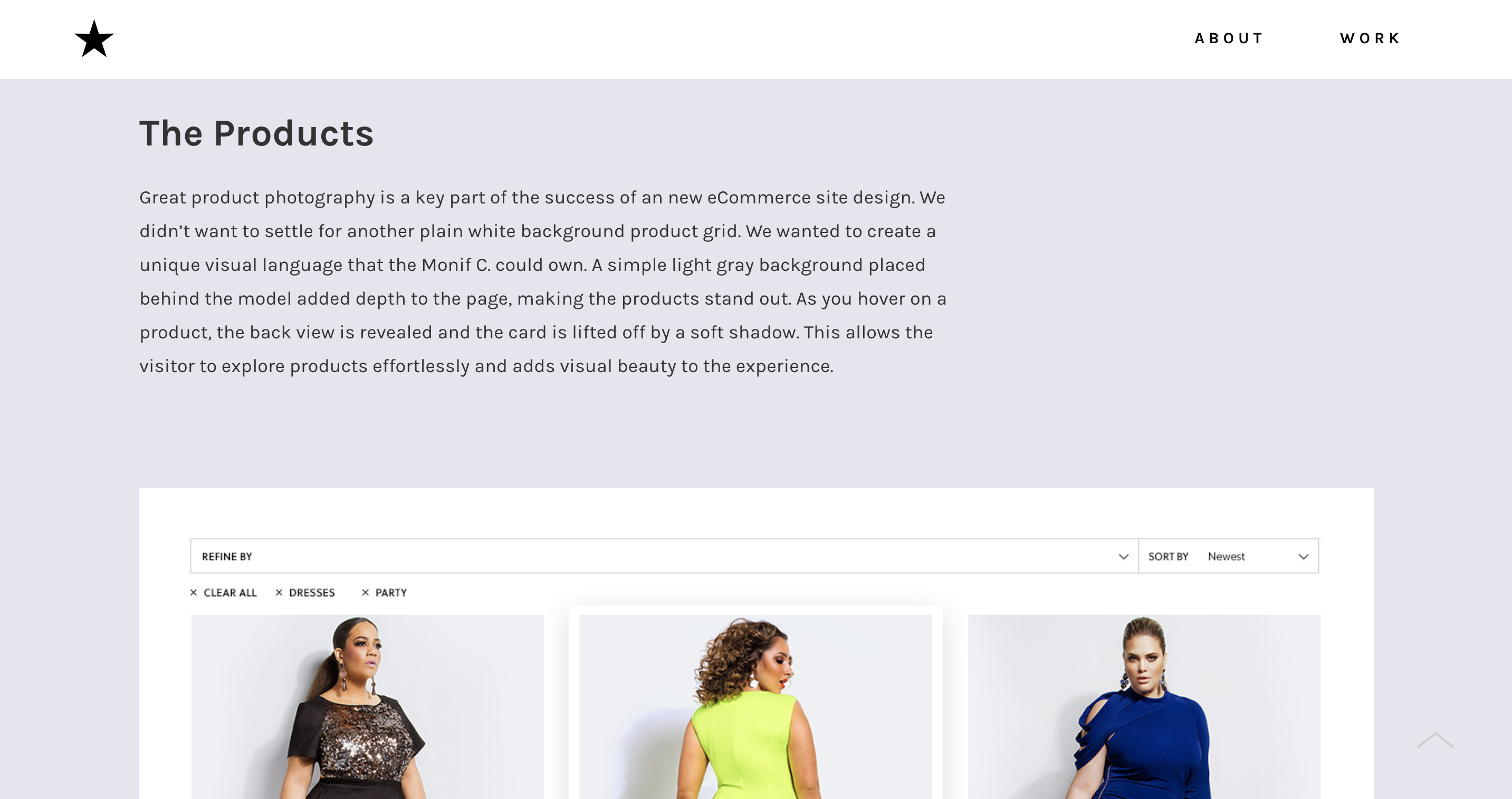
Mackey Saturday’s case studies, like his whole portfolio, are clean and light. His identity designs for brands like Instagram, Oculus and Luxe stand on their own (as logos must do) but his case studies, complete with videos, polished photos and before and after GIFs, explain the nuances and decisions behind the finished product. Most notably, Saturday reveals his entire perspective on branding and design in his case studies.

“Redesigning a globally recognised logo is a polarising opportunity: Do you put your personal style on display, or stay true to what the brand’s users are familiar with?” he writes. “I believe the best designs channel a company’s culture, not the designer’s.”
Don’t be afraid to share your opinion and perspective in your case study. While you should avoid sharing opinions like, 'I really hated working with this client', you should, where relevant, express your beliefs about design and how you applied them to your work.
Tell people what inspires you, what principles guide you, share your feelings about the final result. This adds personality and helps visitors understand who you are as a designer. Read more tips for writing case studies here.
05. Kali & Karina

Kali & Karina tee everything up for their case study readers with a strong introduction, including the project challenge, the project brief (in one sentence), as well as the partnering agency, their client and their role. They then follow through with their approach and the outcome.
On of the most common portfolio mistakes is forgetting to mention your role and give credit to your team. Giving credit doesn’t make your work on the project any less impressive.
In fact, it shows you can work well and collaborate with a team. It also helps a potential employer or client understand where your main skills lie and how you’ll fit into their team or project.
Read more:

Thank you for reading 5 articles this month* Join now for unlimited access
Enjoy your first month for just £1 / $1 / €1
*Read 5 free articles per month without a subscription

Join now for unlimited access
Try first month for just £1 / $1 / €1
Get the Creative Bloq Newsletter
Daily design news, reviews, how-tos and more, as picked by the editors.
