Why brands need to respect their heritage
North's Stephen Gilmore argues that truly great rebrands should face the future without neglecting the past.

My partners and I once met with a client who blew us away with a succinct and powerful articulation of their design philosophy: 'There is only one period which is authentic, and that is now – everything else is just pastiche'.
The clarity of this position gave us everything we needed, a one-sentence-brief, but it also caused us to shift a little uncomfortably in our chairs. We were in the middle of a separate project and process of reinstating Co-op's identity from 1968 and the word 'pastiche' stung us into thinking hard. Were we doing the right thing? And what does 'authenticity' really mean in relation to brand and identity?
At North, we have an instinctive leaning towards modernity and future-facing design. But we also accept that brands, and by extension identities, accumulate inherent values over time that cannot be ignored. The hard part comes in reconciling those two aspects – balancing the authenticity of the past with the relevance of the present.

Recently, Pentagram's John Rushworth and team performed this balancing act to great effect with their new identity for the Great Western Railway (GWR). The new logo design subtly references an old GWR monogram to create a contemporary marque. Rushworth used the phrase 'you've got to wear your history lightly' in describing his approach, and the end result is so solid and timeless that it makes almost every other UK transit identity appear frivolous and throwaway in comparison (the TFL roundel being the obvious exception).
In a similar vein, Mastercard's recent brand evolution reduced its classic logo (also 1968!) to its purest possible form. It's a solution which is so inevitable, so deeply rooted in the DNA of the brand, that it is difficult to imagine another direction the rebrand could have gone in.
It probably sounds obvious, but for us, the first place to start with any identity project is to carefully and objectively consider the existing position. It's vital to put your ego to one side and not dismiss designs created by others – and in doing so consider evolution as well as revolution.
Beyond that, we look into history, we try to respect the past and evaluate the merit in things that have come before. Visual identity updates are often reactive, driven by current trends or changes in application (Apple's millennial 3D-rendered symbol, for example). Examining the design archaeology, and stripping back these layers can be a fascinating process, and a rich seam of inspiration.
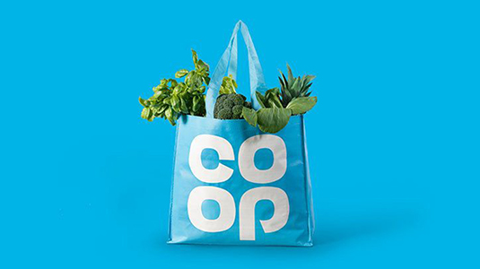
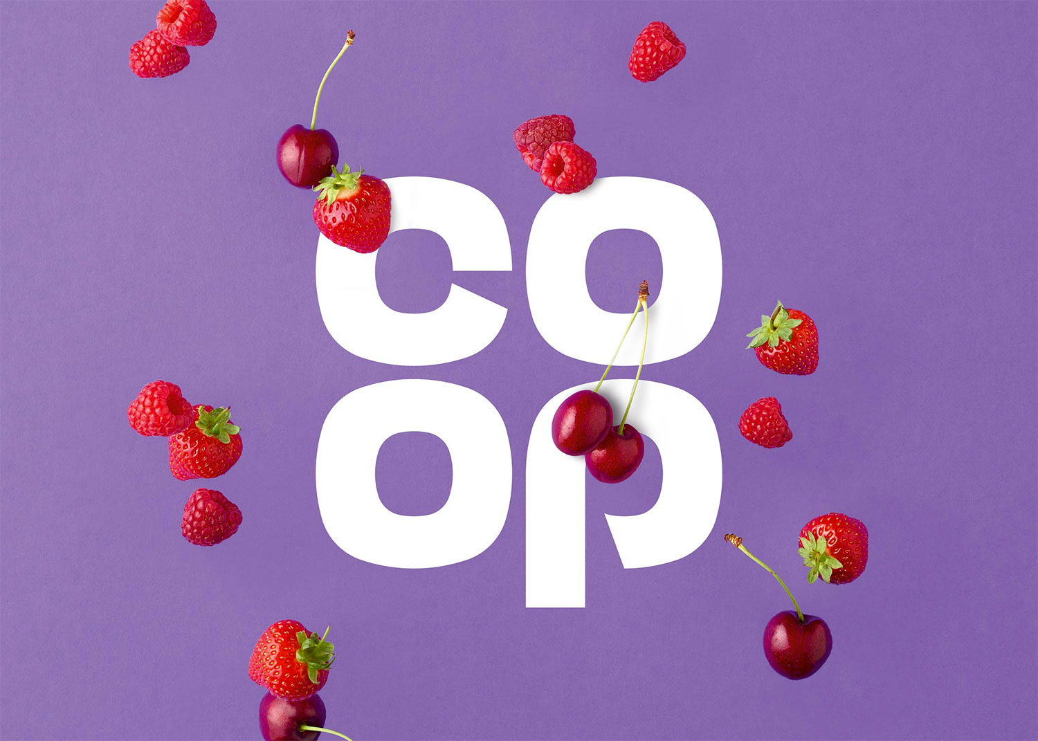
In the case of our project for the Co-op (or The Co-operative, as the organisation was named at the time), the client briefed and fully expected a new visual identity. We duly investigated this area, but our process of historical research lead us instead to propose a move back towards the Co-op's own past. It felt entirely logical to us because that's where the equity in the brand was strongest, where the real authenticity could be found. The Co-op clover-leaf symbol has always stood for something valuable: for membership, the divvy, for being part of and owning your share of the 'people's business'.

However, our proposed solution was not driven by any kind of nostalgia trip or fetishism of the past. We instinctively felt the clover leaf would perform as well in 2016 as it did in 1968, and this hypothesis was borne out in the overwhelmingly positive reactions from research groups of all ages. This gave us the confidence to push forward in this direction. We chose to retain the heart of the past, but evolve and modernise the identity through colour, form and application.
Paul Rand expressed a view we share: 'When a logo is designed is irrelevant; quality, not vintage nor vanity, is the determining factor'. Famously of course, Rand once offered (for free) to update his own UPS logo, which had endured since 1961. The offer was turned down and UPS went a different way, but as designers, I think we all would have loved to see what might have been.
This article originally appeared in Computer Arts issue 259; buy it here!

Thank you for reading 5 articles this month* Join now for unlimited access
Enjoy your first month for just £1 / $1 / €1
*Read 5 free articles per month without a subscription

Join now for unlimited access
Try first month for just £1 / $1 / €1
Get the Creative Bloq Newsletter
Daily design news, reviews, how-tos and more, as picked by the editors.
