Web designers tend to focus a lot of their attention on the visual elements of a design. How do the colours work together? Is the layout balanced? Is the spacing optimal? As designers, we want our creations to be as visually pleasing as possible, because we know this feeds directly into the overall quality of the experience.
But there’s far more to designing an excellent website than 'making it pretty'.
In fact, every dollar you invest in user experience (UX) can translate into $100 in income for your business. UX is thus a vital aspect of web design – and not just from the business side.
That’s why, when I wanted to up my game in web design, I turned to web developers to get a few ideas. As you bring the visual aspects of your next design together, take some time to focus on the following elements, and you’ll create a site people want to stick around on.
Provide security
If you’re asking your site visitors to share their personal information with you, they need to know their info’s safe from hackers and the world at large.
Security concerns are the main reason mobile users choose not to buy a product online, especially if they’re older. And that fear is just as powerful as aggravation over other usability issues. With identity theft rampant these days, people are reluctant to share financial data unless they feel safe.
So take time to think about how you protect the information people share with you. And perhaps more importantly for designers: how you show people their data’s safe.

Even if it’s something as simple as a name and email address, how will you secure it from hackers? And what visual signs will you offer that said info is safe? Chrome now does a great job of showing users that a site is served over HTTPS, but if your audience skews older, you may need to make such signals even more prominent.
You’ll also want to make sure your privacy policy is easy to access, so your site visitors will understand how you work to protect them.
If you use Webflow, we’ve got your back on the privacy front, with free SSL for all sites with Webflow Hosting.
Go responsive
These days, your website needs to be responsive. Around 77 per cent of Americans own a smartphone, and yet an astounding 91 per cent of small business websites aren’t mobile-optimised.
Let’s say you visited a rare coffee bean website on your laptop (we’re not going to say it’s civet coffee, but maybe). Then you head out to lunch with your friends and want to share it with them. But when you pull it up on your iPhone, it’s distorted and hard to browse. You can’t show your friends anything, and you’ll likely grow aggravated and find a different website that sells rare coffee beans.
Skip the app
Thinking about paying someone to build a mobile app for your website? Think again.
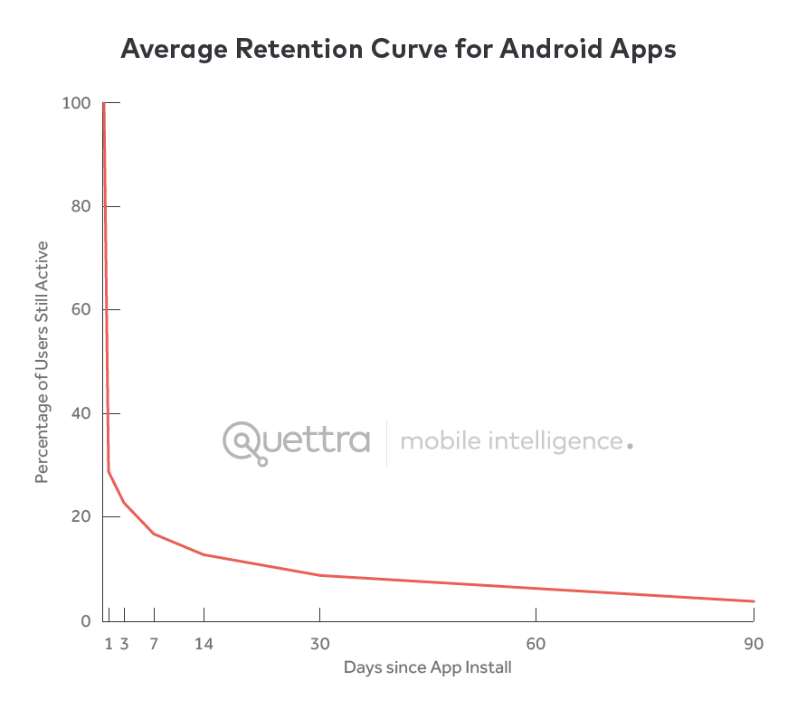
Statistics show that there are around 50 million mobile apps downloaded each day, yet 95 per cent are abandoned within 30 days. Beyond a few popular exceptions, people just don’t want to use your app.

So unless your product is all about getting something done quickly and easily while on the go, you need a responsive website, not an app.
Don’t lose sight of the visuals
Even when you’re focused on usability, visuals still matter.
90 per cent of the information transmitted to the brain is visual. And visual learners – people who learn best via visual aids – make up over half the population. So adding images, infographics and data visualisations to your content can help the majority of your site visitors fully understand the message you are trying to convey.
Even when you’re focused on usability, visuals still matter.
Just know that when you add a lot of graphics to a website, you have to make sure they don’t also slow it down and kill your conversion rates. That’s one reason Webflow automates responsive image creation – and offers tips you can use to optimise your images.
It’s okay to use video (in some places)
In the past, many web developers were reluctant to use video because not everyone was on high-speed internet. But in the US, that’s changing.
At the end of 2015, Pew Research Center reported that 67 per cent of Americans had broadband at home, while those who didn't often turned to their smartphones. For the rest, there’s high-speed internet at cafes, libraries and coffee shops. With so many more people on high-speed internet connections, bandwidth concerns have become less pressing.
Video can boost your conversion rates, too. According to survey data, 73 per cent of people say video helps persuade them to buy a product or service.
Don’t just add a video for the sake of adding a video, though – make sure it has a purpose. Do you want to teach your site visitors something? Inform them about the special features of your product? Make them laugh? Whatever your goal, your video should enhance the rest of your content, not replace it.
Stay up to date
The number one thing I’ve learned from web developers is to stay up to date on the latest trends in design, usability, and site visitor preferences. Web developers stay on top of the latest software and best practices, and they’re always trying new things. We web designers should do the same.
Don’t be afraid to think outside the box. Don’t be afraid to consult with other designers and web developers if you have questions.
Related articles:

Thank you for reading 5 articles this month* Join now for unlimited access
Enjoy your first month for just £1 / $1 / €1
*Read 5 free articles per month without a subscription

Join now for unlimited access
Try first month for just £1 / $1 / €1
Get the Creative Bloq Newsletter
Daily design news, reviews, how-tos and more, as picked by the editors.
