How to create effective user journeys
How to map user journeys to create better UX.
User journeys are vital for understanding a business' customers and the journey they take when interacting with the business/product. In the same way as we use GPS maps to guide us when we travel, customer journey maps or user journeys help businesses to understand the user pain points and identify important things.
This includes understanding various customer touchpoints and business needs at all the different stages in the sales funnel and identifying the logical stages and the gaps between the ideal customer experience and the current experience being offered. It can also help massively improve your landing page and the general user experience of your site.
It could also include prioritising the development priorities and enabling the business to concentrate spending efforts on what features matter the most. Here, I will explain the essential parts of a user journey with the help of an example.
For more web design resources, see our posts on choosing the ideal website builder and web hosting provider. Got files to keep safe? Our guide to cloud storage is here for you.
01. Choose the right persona
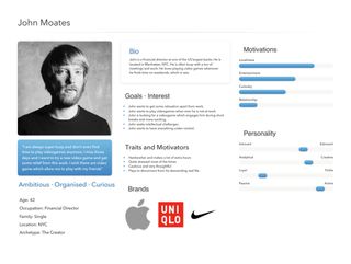
No two journey maps are the same. They vary from business to business and the design varies depending on the product you are planning to map. The user journey can be designed for a single customer persona or it can be created for a segment of customers. Once a customer journey is designed for a persona, it can be applied to other customers by establishing a common understanding of customer stages, goals, touchpoints, opportunities, and so on.
The two key things that should be focused on are motivations and emotions. Motivations include the actions that help the user to move forward in the experience. Emotions are powerful in determining whether the users love your experience or whether they want to abandon it.
Let us consider the scenario of a potential video game buyer. For the purpose of the article, I will keep the stages simple. The persona we will consider for this journey map is John, who is a financial director. He is 42, living in NYC with a high income and is often super busy. You can go as detailed as possible for the persona.
02. Create the stages of a journey map
Now that we have decided on the persona, let’s move on to the next important step of deciding what stages you want in the user journey. Each stage or phase is used to represent a vital goal your customer is trying to achieve as they progress through the journey.
Stages can be high-level or they can be more detailed. The problem with being more detailed is that the user journey could turn into an internal process diagram, which is not our goal here. Most of the stages are linear but it all depends on the product or service.
For this journey map of a newly launched video game, let’s start creating various stages that John goes through. A simple layout can be as follows:
- Previous experience with the games
- Awareness of our new video game (1st touchpoint)
- Choosing the video game
- Purchasing the video game
- Playing the video game
- Sharing the experience
03. Identify actions, mindsets and emotions
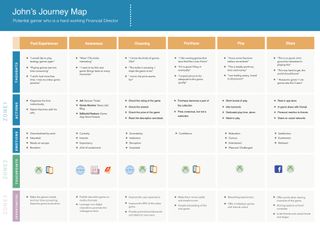
Each stage in the journey contains various key elements. All these are represented in vertical lanes and the stages are represented in horizontal lanes. All elements can be categorised under three zones. The first is actions, mindsets and emotions.
Actions represent what the customer is doing at that particular stage of the journey. Mindsets include all the things going on in the customer’s head about the product or service. Emotions are to capture the predominant mood of the user as they move from one stage to another. This is important because a business can retain its customers and gain more if the user experience they deliver results in more positive emotions.
Let’s look at our example and what these different elements can potentially look like. For the purpose of this journey map, let’s look at one of the six stages: ‘Choosing the videogame’.
- Actions by John include things like checking the rating of the game, checking the artwork, checking the price of the game, looking for deals, reading the description and playing the trailer
- Few thoughts in his mind could be: ‘Mmm, the price seems fair’; ‘Wow! Cool artwork’; ‘Ahh, this reminds me of the XYZ game’; or: ‘The trailer is amazing. I hope the game is too’
- Emotions in this stage could be uncertainty, indecision, deception, surprise
04. Consider touchpoints and channels
Touchpoints are the times when the customer interacts with the business or interface and channels usually refer to the methods of communication or service delivery. This can be anything, including a website, mobile app or physical store. This zone helps uncover any disconnected user experiences or inconsistencies in the brand.
Coming back to the video game example, a few touchpoints and channels in these stages can include digital mediums such as a mobile app, gameplay store on Xbox, game review websites or they could be non-digital touchpoints, such as an advertisement in a gaming magazine or a friend talking to you about the new video game.
05. Look at opportunities and barriers
This zone includes opportunities that will drive growth via investing in UX improvements. The business should always craft a journey map in a way that can be used for action planning, meaning it will uncover various opportunities, assess the potential impact and cost and further guide investing priorities for the business.
A barrier is an optional feature that you can have at each stage. These will include all the pain points for a customer when interacting with the business at a particular stage. This can be used along with opportunities to fix the issues with the interface, business or product. A few opportunities in the case of the video game example are:
- Choosing the video game stage – improve the user experience of the app store, improve the navigation and findability of the game, provide promotional discounts and deals to the new users.
- Sharing the video game stage – offer points when sharing moments of the game, sharing options on level completion, inviting friends to unlock new stages/levels.
These are the key zones and the relevant features you must take care of when designing a user journey. Based on the type of journey, the depth and breadth can be tweaked. For making informed decisions on these, there are few considerations:
- What is the level of detail that is required for telling the complete story to the stakeholders of the business?
- What key elements will be necessary in order to provide the most truthful and meaningful narrative/journey?
- What is the purpose of the journey map? To diagnose the existing issues or create a whole new customer experience?
- What are the issues on the customer side (external) versus business organisation (internal)?
- Who are the primary users of this journey map?
This article was originally published in issue 322 of net, the world's leading web design magazine Buy issue 322 or subscribe to net here.
Read more:

Thank you for reading 5 articles this month* Join now for unlimited access
Enjoy your first month for just £1 / $1 / €1
*Read 5 free articles per month without a subscription

Join now for unlimited access
Try first month for just £1 / $1 / €1
Get the Creative Bloq Newsletter
Daily design news, reviews, how-tos and more, as picked by the editors.
Vamsi is a senior UX designer at SunTrust Banks and is an expert in UX, mobile animation and JavaScript.
