Use negative space to create water effects in pencil
Learn how to use negative space to create realistic-looking water illustrations with these top tips.
Sometimes it’s what you don’t include that makes things work. In this tutorial, we’re going to look at how to draw a water effect in pencil using negative space.
We’ll mostly use the blank paper surface to represent the reflected light of the sky, and we won’t shade the water surface much at all, except in shadow.
Before you start, make sure you've got one of the best pencils to draw and shade with.
01. Think in planes
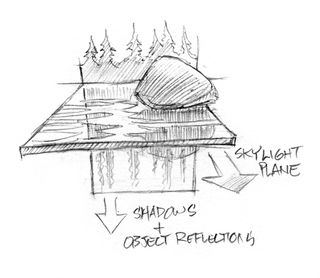
Start by mentally breaking down the water in the scene into two components: the reflections or shadows of objects moving ‘vertically’ down your image, and the sky light being reflected on the surface turbulence.
Visualising the two main planes in a water scene will help you construct the image. Objects such as trees, rocks and boats reflect and stretch/smear down vertically. Sky-light reflections lay horizontally across the water surface, on top of the vertical elements, breaking them up.
The more turbulent the surface, the more complex the skylight reflections. With calmer water, everything is simplified. You can adjust this complexity as you prefer.
02. Develop the scene
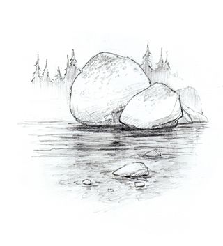
As an exercise, I tried building a scene with a rocky lake floor. When adding this detail, those values all need to stay in a narrow range, subdued by the water over them. However, I wanted to simplify detail in my final design, so I decided to use objects above the water surface instead.
03. Smear the shadows
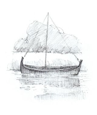
This is my warm-up boat sketch. I smeared the boat hull down into its shadow in the water, and looked for ways to indicate the plane of the water surface using minimal detail.
04. Enhance the scene with details
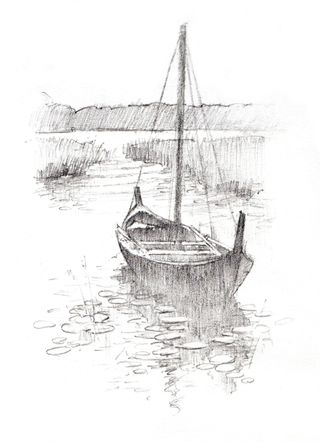
I realised the composition was too boring, and decided to use water lily clusters rather than ripples to describe the water surface. The water lilies could also be freely arranged to best serve my composition. I used a kneaded eraser to lift out any pads that I wanted to pop a bit more.
I also let the shading of the boat hull flow down into the boat’s shadow on the water, and cross over that with the horizontally arranged pads.
This article was originally published in Paint & Draw magazine issue 4. Buy it here.
Related articles:

Thank you for reading 5 articles this month* Join now for unlimited access
Enjoy your first month for just £1 / $1 / €1
*Read 5 free articles per month without a subscription

Join now for unlimited access
Try first month for just £1 / $1 / €1
Get the Creative Bloq Newsletter
Daily design news, reviews, how-tos and more, as picked by the editors.
