How to use Disney's 12 principles of animation
The Disney principles of animation underpin all motion work.

The Disney 12 principles of animation are often considered as a basis for all animation, not just movies and cartoons. These rules of animation may have been drawn up decades ago, but they remain just as relevant despite the significant changes in technology (see our pick of the best animation software).
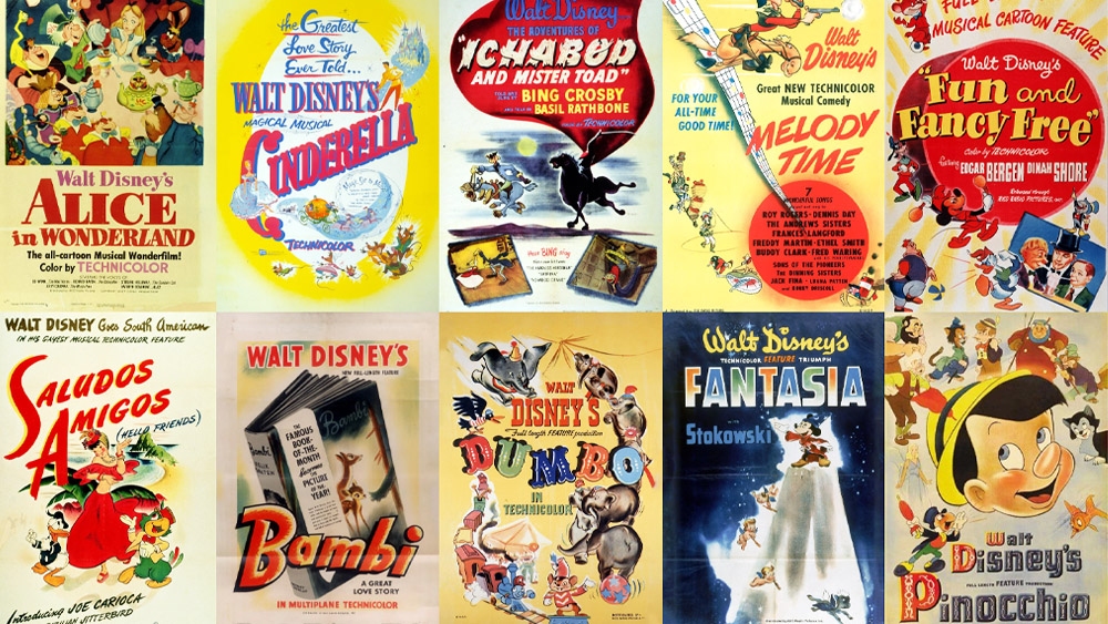
Disney's principles of animation were first laid out in 1982 in The Illusion of Life: Disney Animation. The animators Ollie Johnston and Frank Thomas combed through the work of leading Disney animators from the 1930s onwards and broke down their approach to identify 12 basic principles.
Over forty years later, these guiding concepts are still worth considering as a starting point no matter which of the best animation styles you're using. Whether you're working with physical media or using one of the best laptops for animation, these simple principles could help you on your way to become the next Walt.
Disney's 12 principles of animation in action
The Disney animation principles can bring even the most basic of objects to life. To illustrate that, this article features GIFs of animations by Vincenzo Lodigiani showing the princples applied using a simple cube.
Vincenzo also made the short video The Illusion of Life (below), which features all of the 12 Disney principles of animation in action, showing how they can work together to make immersive and dynamic animation.
01. Squash and stretch

The squash and stretch principle is considered the most important of the 12 principles of animation. It can give animated characters and objects the illusion of gravity, weight, mass and flexibility, which makes them feel more believable.
Think about how a bouncing rubber ball may react when tossed into the air: the ball stretches when it travels up and down and squishes when it hits the ground. When using squash and stretch, it's important to keep the object's volume consistent. So when you stretch something it needs to get thinner, and when you squash something it needs to get wider.
02. Anticipation

Anticipation helps to prepare the viewer for what's about to happen. When applied, it has the effect of making the object's action more realistic.
Consider how if might look if you were to jump in the air without bending your knees, or perhaps to throw a ball without first pulling your arm back. It would appear very unnatural (it may not even be possible to jump without bending your knees!). In the same way, animating movements without a flicker of anticipation will also make your motion seem awkward, stale and lifeless.
03. Staging

Staging in animation is a lot like composition in artwork. You should use motion to guide the viewer's eye and draw attention to what's important within the scene. Keep the focus on that, and keep the motion of everything that's not important to a minimum.
04. Straight ahead action and pose to pose

There are two ways to handle drawing animation: straight ahead and pose to pose. Each has its own benefits, and the two approaches are often combined. Straight ahead action involves drawing frame-by-frame from start to finish. If you're looking for fluid, realistic movements, straight ahead action is your best bet.
With the pose to pose technique, you draw the beginning frame, the end frame, and a few key frames in-between. Then you go back and complete the rest. This technique gives you a bit more control within the scene and allows you to increase the dramatic effect of the motion.
05. Follow through and overlapping action

When objects come to a standstill after being in motion, different parts of the object will stop at different rates. Similarly, not everything on an object will move at the same rate. This forms the essence of the fifth of Disney's principles of animation.
If your character is running across the scene, their arms and legs may be moving at a different rate from their head. This is overlapping action. Likewise, when they stop running, their hair will likely continue to move for a few frames before coming to rest – this is follow through. These are important principles to understand if you want your animation to flow realistically.
06. Slow in and slow out

The best way to understand slow in and slow out is to think about how a car starts up and stops. It will start moving slowly, before gaining momentum and speeding up. The reverse will happen when the car brakes. In animation, this effect is achieved by adding more frames at the beginning and end of an action sequence. Apply this principle to give your objects more life.
07. Arc

When working in animation, it's best to stick with the laws of physics. Most objects follow an arc or a path when they're moving, and your animations should reflect that arc. For example, when you toss a ball into the air, it follows a natural arc as the effects of the Earth's gravity act upon it.
08. Secondary action

Secondary actions are used to support or emphasise the main action going on within a scene. Adding secondary actions help add more dimension to your characters and objects.
For instance, the subtle movement of your character’s hair as they walk, or perhaps a facial expression or a secondary object reacting to the first. Whatever the case may be, this secondary action should not distract from the primary one.
09. Timing

For this principle of animation we need to look to the laws of physics again and apply what we see in the natural world to our animations. In this case, the focus is on timing.
If you move an object more quickly or slowly than it would naturally move in the real world, the effect won't be believable. Using the correct timing allows you to control the mood and the reaction of your characters and objects. That's not to say you can't push things a little (especially if you're creating an imaginary world) – but if you do, be consistent.
10. Exaggeration

Too much realism can ruin an animation, making it appear static and boring. Instead, add some exaggeration to your characters and objects to make them more dynamic. Find ways to push the limits just beyond what's possible, and your animations will pop.
11. Solid drawing

You need to understand the basics of drawing. This includes knowing how to draw in three-dimensional space and understanding form and anatomy, weight and volume, and lights and shadows.
While you can push the limits here, too, it's important to remain consistent. If your world has wonky doors and a warped perspective, keep that perspective throughout the entire animation. Otherwise, things will fall apart.
12. Appeal

Your characters, objects, and the world in which they live need to appeal to the viewer. This includes having an easy-to-read design, solid drawing, and a personality. There is no formula for getting this right, but it starts with strong character development and being able to tell your story through the art of animation.
Do the Disney principles of animation still apply?
The Disney animation principles were codified over four decades ago when most animation was still done by hand using the cel animation technique. Since the last 90s, huge technological change has seen most studios transition to digital animation software while 3D animation has increased in popularity.
However, in most cases the principles of animation still apply, including to 3D animation. Many of the basic animation principles are about respecting the laws of physics (which might seem surprising considering how many animated stories seem to break them!). These natural laws still apply today as much as they did in the 1930s and the 1980s, and respecting them can make any form of animation feel more natural and realistic.
That said, some have proposed new, additional principles for 3D animation, including cinematography and lighting, the feasibility of visual styling, blending motion from different sources, or example animation and live action and facial animation.
For more on how Disney, see our roundup for Disney animation secrets and these shocking original Disney character designs. We've also seen plenty of Disney character design conspiracy theories, including a theory about why Disney characters wear white gloves.

Thank you for reading 5 articles this month* Join now for unlimited access
Enjoy your first month for just £1 / $1 / €1
*Read 5 free articles per month without a subscription

Join now for unlimited access
Try first month for just £1 / $1 / €1
Get the Creative Bloq Newsletter
Daily design news, reviews, how-tos and more, as picked by the editors.

Tammy is an independent creative professional, author of Apple Game Frameworks and Technologies, and the maker behind the AdventureGameKit – a custom SpriteKit framework for building point and click adventure games. As an innovative problem solver and industry leader, Tammy enjoys working on projects from content creation – including books, tutorials, videos, and podcasts – to the design and development of cross-platform applications and games. For Creative Bloq, she has written about an array of subjects, including animation, web design and character design.
You must confirm your public display name before commenting
Please logout and then login again, you will then be prompted to enter your display name.
