Master the golden rules of UI design
Create effective interfaces with these essential UI design rules.

There are certain UI design rules that can help ensure effective user interface design. When they get broken, it's often because of a misunderstanding of what UI design is about. UI design is not only visual design, nor is it UX design in its entirety – but it does combine elements of each.
UI design is about usability. That means that it's not just form that's important, but rather how form aids function. Great UI design is a mixture of clarity and efficiency, and the golden rules of UI design proposed below can help to achieve that through typography, colour palettes, CTAs, components, and design systems.
Below, we'll look at 5 UI design rules, starting with typography. The rules apply whatever tools you're using (see our guide to the best UI design tools for options, or alternatively our general guide to best website builders if you're looking at UI for a personal website.
For more pointers, see our feature on the things you need to consider when designing a UI. And if you want to learn more about UI and UX, sign up for our online UX design course, UX Design Foundations.
UI design rule #1: typography is about accessibility
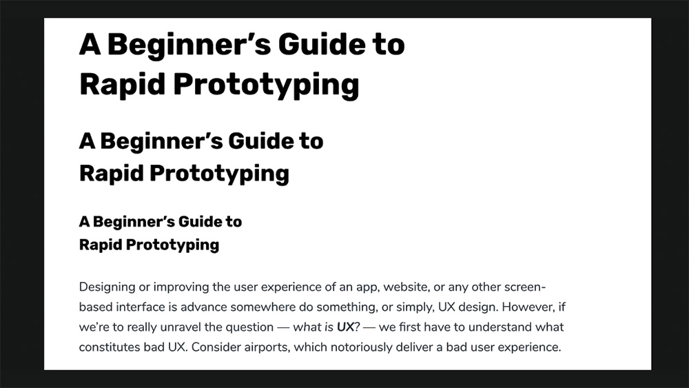
Great typography boils down to accessibility. In a design system for a UI, font size, line height, paragraph spacing and letter spacing should be designed in a way that enhances readability and legibility. Visual design – i.e., colours and fonts – certainly add to the user's overall experience, but at the end of the day users are using the UI, not looking at it as art.
Legible letters result in clarity, and readable words are what help users digest content efficiently. Well-designed typography can still be aesthetically satisfying. In fact, you might be surprised at how beautiful black-on-white Helvetica (or a similar font) can be after only a few simple typographic enhancements to font size, line height, letter spacing, and so on. Similarly, 'beautiful' fonts can become ugly when they're unreadable simply because frustration always trumps aesthetics.
Like many aspects of UI design, fine-tuning these individual styles isn't really the challenge. The challenge is maintaining consistency through the entire UI design, since, as humans, we navigate the world (and our user interfaces) based on mental models, patterns, past events, and familiarity.
This is where design systems come in. They help maintain consistency and establish a clear visual hierarchy between elements of varying importance, which helps users understand our UI faster and digest our content more efficiently. And while design systems can be almost as elaborate as a Bootstrap-like framework, they start off more like a style guide. These are the elements to consider:
Font size
When it comes to legibility and readability, the minimum acceptable font size as defined by the WCAG 2.0 Web Content Accessibility Guidelines is 18pt (or 14pt bold). We couldn't really tell you what font size to use as this largely depends on the font itself, but it's important to be mindful of visual hierarchy and how this base size distinguishes itself from summarised text such as headings (<h1>, <h2>, <h3> etc.).
With your UI design tool of choice, create a series of text layers (T) and adjust the sizes to correlate with the following template:
- <h1> 44px
- <h2> 33px
- <h3> 22px
- <p> 18px
Next, choose the font. What you might notice with some fonts is that 18px <p> and 22px <h3> doesn't look all that different. We have two choices here: tweak the font sizes, or consider using a different font for headings. Consider the latter if you anticipate that your design will be text-heavy. Keep in mind that visual UI design is often a gut-feeling approach, and nothing is fixed – everything is subject to change.
Line height
Optimal line height ensures that lines of text have enough spacing between them to achieve decent levels of readability. This is becoming more recognised as a standard, with even Google's PageSpeed Insights suggesting it as a manual check or a flag if the text contains links too close together as a result of line height.
Once again, the WCAG helps us out with this one, declaring that line heights should be 1.5x the font size. So, in your UI design tool under 'Line' (or similar), simply multiply the font size by – at least – 1.5. As an example, if the body text is 18px, then the line height would need to be 27px (18*1.5).
Paragraph spacing
For paragraph spacing (or text spacing), you'll probably want to manually align layers using smart guides for exactness. Similar to line height, the magic multiplier is 2x (meaning, double the font size). As an example, if the font size is 18px, then there should be a 36px space before leading into the next text block. In regards to letter spacing, this should be at least 0.12.
If your UI design tool supports it, consider turning these typographic styles into 'Shared Styles' to make them rapidly reusable while ensuring visual consistency. This is usually accomplished via the inspector.
UI design rule #2: three colours is enough
Colours can have a huge impact on a UI design and it plays many roles. It's not necessarily about how beautiful the colours are though, or even about the specific colour that's being used. It's more about the type of colour. This may not be true when it comes to branding – since colour is used for emotional impact there – but with UIs, colour can be used for visual hierarchy.
Choose your colours
Colours hold meaning, so it's important not to have too many of them. Too many means more things that the user has to understand and remember, and for the UI designer, it means more colour combinations to worry about. Generally speaking, this would be the recommended format to use:
- A call-to-action colour (also the main brand colour)
- A neutral light colour (ideal for text-heavy content)
- A neutral dark colour (better for UI elements, and also for dark mode)
- For all of the above, a slightly lighter and slightly darker variation
The final point on the list means that it's easy to achieve the following:
- Dark mode will be easily possible
- Our CTA colour will never conflict with other colours
- In any scenario, we'll can emphasise and de-emphasise as we wish
Create a colour palette
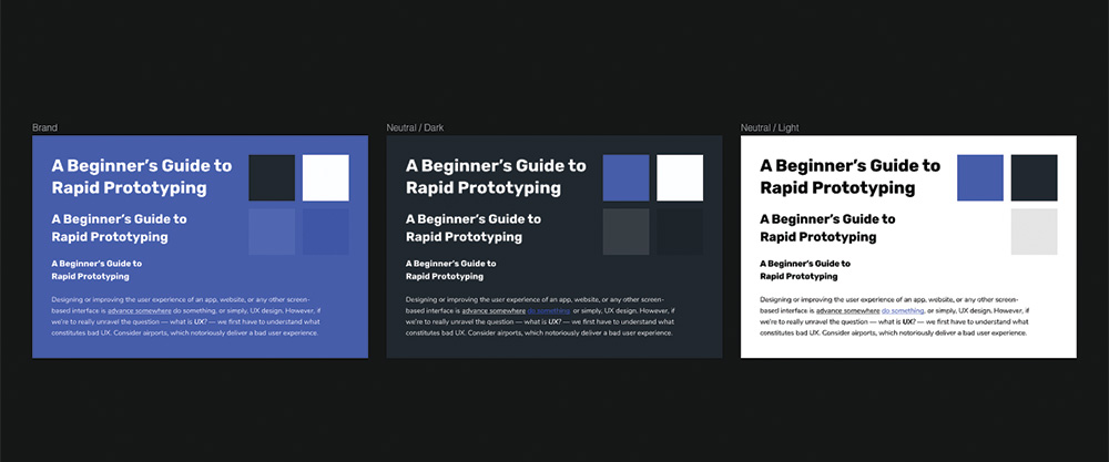
With your UI design tool of choice, create one fairly large artboard (tap A) for each colour (named Brand, Neutral / Light, and Neutral / Dark). Then, in each artboard, create additional smaller rectangles displaying the darker and lighter variations of the colour and also the other colours themselves.
Generally, consider slightly lighter and darker as 10% extra white and 10% extra black respectively. When you're done, display a copy of the typographic styles on each artboard. The colour of these text layers should be neutral light, except when on the neutral light artboard, where they should be neutral dark.
Check contrast levels
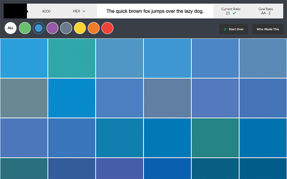
Next, we'll need to check our colours for optimal colour contrast. There are a variety of colour tools that can do this, for example, the Stark Plugin for Sketch and Adobe XD or Contrast for macOS. However, an online solution such as Contrast Checker or Colour Contrast Checker will do just fine.
Check the colour contrast for each combination and tweak the colours accordingly. If you're not sure which colours to use, try using Colorsafe's recommendations. Also remember that while colour in UI design can be mighty effective, it's not always reliable for people who have visual impairments.
UI Design rule #3: CTAs need hierarchy
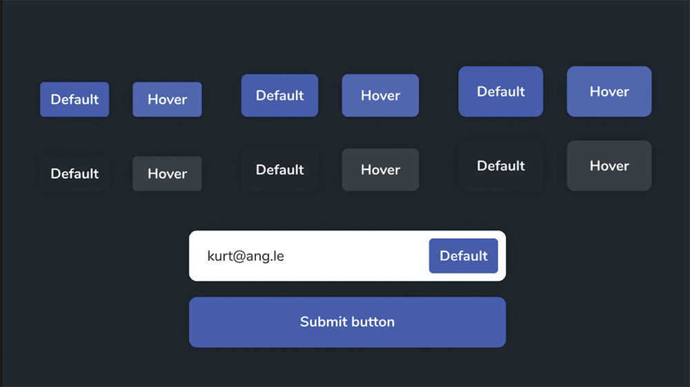
The majority of decisions made about our design lead the user towards an action – but this is only effective if the target looks clickable and communicates the visual hierarchy. Buttons and links, much like typography, should have a few variations. After all, not all actions are of equal importance, and colour is an unreliable method of communication, so it cannot be our main method of influencing visual hierarchy.
Size
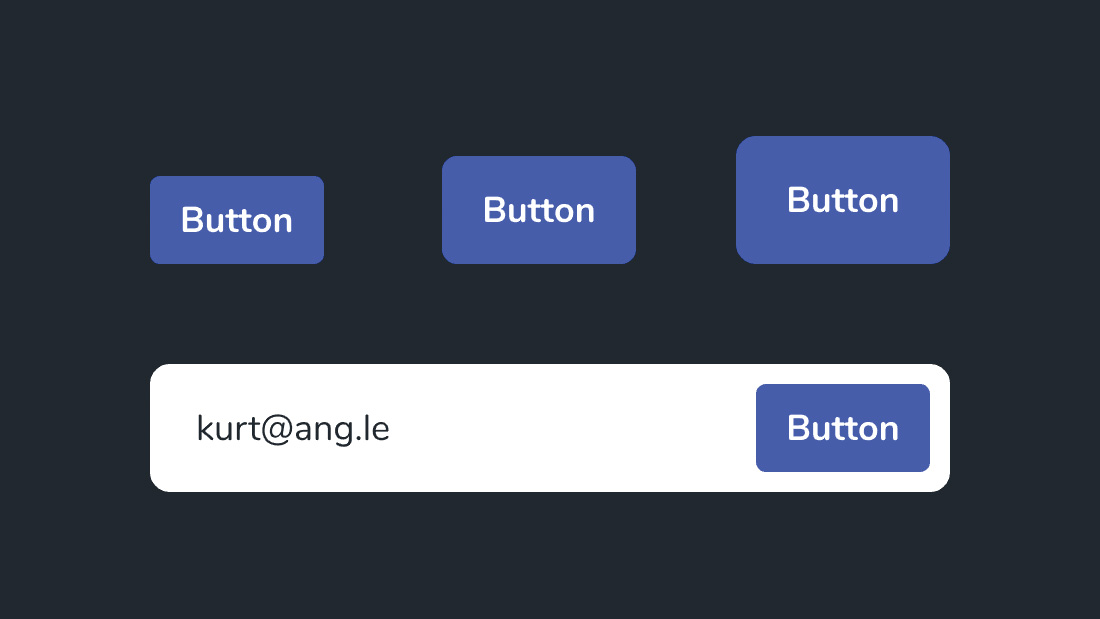
As for size, it's generally recommended that button text be declared as 18px (same as the body text), but have three variations in size. This allows us to make certain buttons appear more important without relying on colour, and also to nest buttons (for example, a button inside a minimal-looking form field):
- Normal: 44px in height (rounded corners: 5px)
- Large: 54px in height (rounded corners: 10px)
- Extra large: 64px in height (rounded corners: 15px)
Shadows
Shadows should be used to increase depth, suggesting interactivity. A single shadow style for all variants of buttons and form fields is fine – no need for anything fancy.
Interactivity
Each button type needs a variation that indicates its hover state. This clarifies to the user that what they've attempted to do is totally fine and ensures they carry on without delay. This is actually one of the more complex aspects of creating a design system, because the colour is often the favoured style to change when creating a state. Luckily, these state changes can be relatively subtle, so it's fine to change the colour into its slightly lighter or darker variation – that's what they're for. This applies to links as well.
Not doing this will lead to using a colour that either already has significant meaning, resulting in users becoming confused, or else deciding to come up with another colour. Deciding to use a secondary colour is fine, but it should be saved for marketing visuals rather than UI elements. Less is more (and easier). Remember to repeat this step for every artboard. Don't include branded CTA buttons on the brand artboard – we'll talk later about what happens when certain combinations don't work.
UI design rule #4: design elements must be consistent
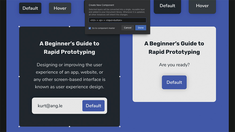
Converting design elements into components means we can reuse them, helping us speed up our workflow and maintain consistency across our design. Components are a huge time saver and all UI design tools offer this feature (for example, in Sketch, they're called Symbols). In InVision Studio, you can create components by selecting all of the layers that should make up the component and using the K shortcut.
Using components
We can reuse a component by dragging it onto the canvas (this workflow varies depending on your UI tool). This method of creating design systems (and eventually creating the design itself) works especially well with modular/card-based layouts, although 'common areas' – such as headers, footers, and navigations – will also be excellent candidates for components. Like we've done with our typographic styles, colours, and buttons, we must remember to organise components carefully.
Establish rules
It's important not to use branded CTA buttons on top of the brand colour, since branded CTA buttons will obviously need to stand out amongst everything else. This would be an ideal opportunity to go ahead and create a component – specifically, a heading + text + button combination with a neutral light 'card' backdrop to enable the use of the branded button.
Similarly, the neutral light form field (form fields are usually white because of the mental model historically synonymous with paper forms) doesn't look amazing on the neutral light background, so they can only be used on the neutral dark background – either directly, or within a neutral dark component. This is how we make our design flexible, whilst also obeying our rules and maintaining consistency.
Stress test
The quickest and most effective way of ensuring robustness in our design system is to stress test it. And that means being cruel. Let's say that we have a navigation with [x] amount of nav items, because that was the requirement; in order to really ensure flexibility, try changing these requirements by adding more nav items. To really throw a spanner in the works, try also adding a nav item with a much higher visual hierarchy than the others.
Do our size, typography, and colour rules allow for something like this, or, in order to offer optimal usability, do we need another rule? Bear in mind that there's a major difference between adding rules and bending the rules. More edge cases mean less consistency, so it's usually better to rethink the component.
Rule #5: Design systems must be organised
Designing systems means deciding and documenting when and where various styles are allowed to be used. Bold text for example can be used for extra emphasis, but... headings are already bold, so what happens in this case? Can we highlight specific words? When do we need to left-align, and when to center-align?
As you create your rules, you need to document them for your own use or for anybody else who might work with the design system. Designers of all types know about design principles, but these rules are unique to our app or website, or our brand as a whole. Choosing title case over sentence case, for instance, can be the difference between formality and informality. But most importantly, these rules help us make meaningful but quick decisions in total clarity.
A design system is not a one-time task – it's normal to be updating it constantly. Stay flexible and expect to make a number of changes as new elements, colours, and use-cases emerge. But for it to be useful, your design system needs to be well organised. This will often mean making files easily available in the right cloud storage option for you and your team.
Colours
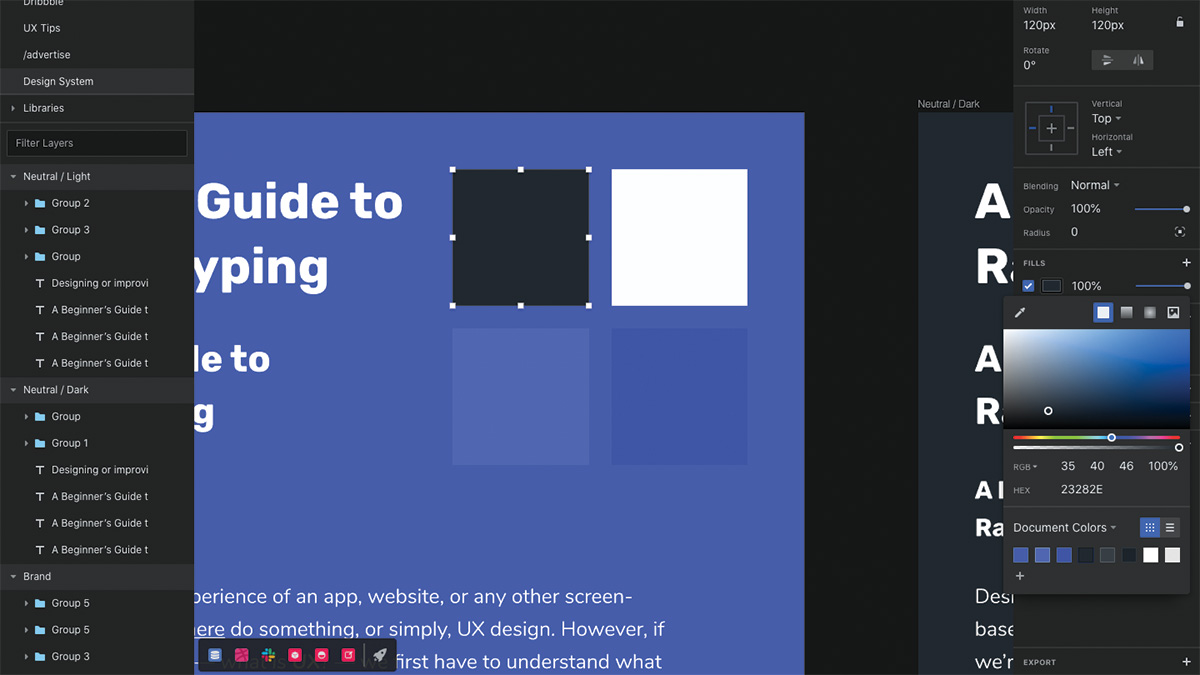
Step one is to save all of the colours to the 'Document Colors' swatch if you haven't done so already – this will make them easier to access when we need to apply them in our design. This workflow is the same (or very similar) in all UI design tools. Open the colour chooser widget from the inspector, choose 'Document Colors' from the drop-down, and then click the + icon to add the colour to the swatch.
Shared libraries
Next, we need to convert our document – complete with typographic styles, colours, buttons, common areas, and basic components – into a shared library. Essentially, this means that every element needs to be a component, even if it consists of only one layer. After doing this, it's simply a case of clicking the + button in the left-hand side Libraries sidebar and importing this very document into a new document. The very document we're working on right now is the library itself.
Design systems at scale
As a design system expands, managing it inevitably becomes harder. There are various adjustments that we might want to make to our design system to make it more efficient. For instance, we might want to use text layers to annotate our design system as a means of explaining the rules and use-cases of various elements. For the typographic styles, we could even edit the text to be more descriptive (e.g. <h1> / 1.3 / 44px).
Design handoff
Finally, design handoff tools display the various styles used by every element in the design so that developers can build the app or website. These tools include an overview of styles, and also a copy of the 'document colors' swatch. Developers can copy these styles as code, which is excellent if you've created written documentation for your design system and like to include code snippet representations of the components. Getting this write can help enable a smooth handoff for your UI design.

To learn more about applying the golden rules of UI, and about UI and UX design in general, don't miss our UX Design Foundations course.
Read more:

Thank you for reading 5 articles this month* Join now for unlimited access
Enjoy your first month for just £1 / $1 / €1
*Read 5 free articles per month without a subscription

Join now for unlimited access
Try first month for just £1 / $1 / €1
Get the Creative Bloq Newsletter
Daily design news, reviews, how-tos and more, as picked by the editors.
Previously a design blog editor at Toptal and SitePoint, and before that a freelance product/UX designer and web developer for several years, Daniel Schwarz now advocates for better UX design alongside industry leaders such as InVision, Adobe, Net Magazine, and more. In his free time, Daniel loves gaming, café culture and Wikipedia, and also travels perpetually when there isn’t a pandemic.
- Joe FoleyFreelance journalist and editor
