UX design is often noticed in the details, but successful user experiences almost always begin with broader UX fundamentals. Before fine-tuning exactly how a user experience will be configured, there are wider considerations that should define how you approach a project to ensure a genuinely pleasant experience for the user, whether it's an experience that takes place in the physical world or online.
UX design fundamentals include doing research to understand your customer and focusing on streamlining the user's experience. But sometimes it can be worth taking a step back and rethinking entire concepts.
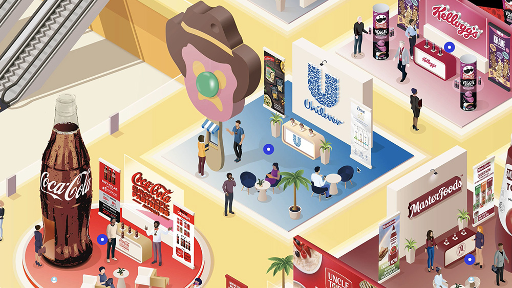
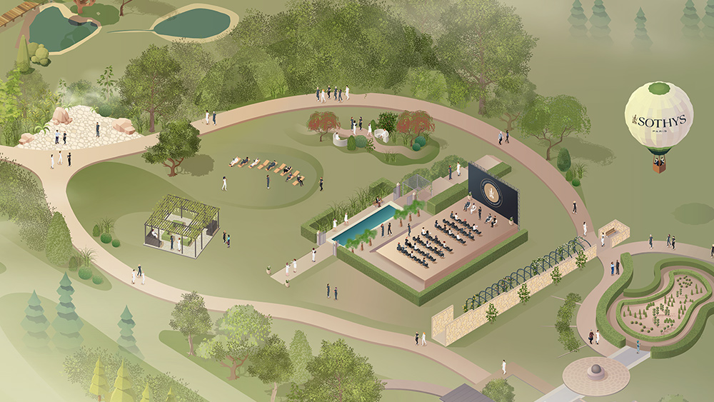
To pick up some tips for achieving great UX design, we spoke to Nena Salobir, one of the contributors to our new online UX Design Foundations course, which is aimed at anyone looking to learn UX design fundamentals from experts in the field. Salobir is chief creative officer at Orbits, an Australian company that creates virtual venues for online events using a map-based interface that allows users to explore virtual venues organically like they would in the physical world.
Salobir was a graphic designer before doing a professional UX design course to better understand the needs of a particular client. Intrigued by the parallels with marketing research and consumer behaviour, she went on to develop in this area and founded Orbits with chief executive officer Lachlan Phillips. In the guide below, she provides some fundamental tips for creating great UX design that truly has the user in mind. For more on UX, see our guide to UX and UI trends for 2022 and our piece on how to unify UX across platforms.
01. Understand your customers
One of the most important fundamentals of UX design is to take the time to understand your customer and their users. After all, it's hard to design a successful user experience if you're not fully clear on who the user is.
"Talk to a wide range of people to uncover their needs," Salobir suggests. "Keep in mind that some people will be more liberal with sharing strongly formed opinions rather than a clear picture of their own needs. Peel back another layer, because there might be a solution that they can’t see yet that makes their lives so much easier."
And you can't assume that once you know one user of a particular service, you know them all. "We’re continuously adapting and evolving our platform to service different kinds of clients, so there’s always something new to learn or challenge to overcome," Salobir says. "With each new client, we are exposed to different industry norms and expectations and we have to integrate this knowledge while building a consistent product and platform."
02. Question everything
Sometimes bad UX is more the result of convention than anything else. Things are often done in a particular way simply because that's the way it's been done for years and no one's stopped to ask if it could be done in a more efficient, intuitive or pleasing way. Good UX sometimes breaks that inertia.
"Brilliant UX happens when the designer has looked around and asked 'Why?'," Salobir says. "We’ve done a lot of thinking around why video conferencing can be so crazy-making, and how tech companies got it to that point. A lot of it comes down to rethinking why certain things are done simply as the industry norm. Just like when you drive past an ugly, poorly-constructed block of flats from the 1970s - which exists in most cities, in place of whatever wonderful thing used to be there - and you shake your head. Be constantly shaking your head!"
03. Think big
It can be tempting to dive straight into the details – after all, details are what designers love. But great UX often comes from considering the bigger picture and exploring whether there is something more fundamental that can be improved.
"Think big first, then drill down to the details," Salobir recommends. "You don’t want to be shoehorning new features into a bloated pipeline later. The best UX designers out there go beyond incremental improvements to reimagine how an entire industry or way of life could be. If you’re a lateral thinker, and you’re constantly thinking of better ways to go about things, guess what? You can be paid for that!"
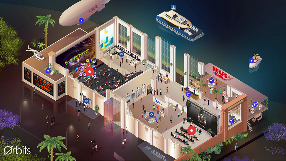
In the case of Orbits, their trade show offering involves adapting real-world environments. However, they don't see their virtual spaces as a compromise but as a way to make things better. At large trade shows, it can be a race against time to visit everyone, and it can be stressful if you get stuck in small talk at a stand. At Orbits' spaces, you can watch a pre-roll video and proceed to enter the stand only if you’re interested, saving time for everyone.
"It’s true that how we live our lives online can often fall short of the ‘real life’ experience. But what if there were some ways in which they improved things too?," Salobir says. "It’s an example of the virtual version not only not being a compromise but a super useful adjunct to the physical experience."
04. But keep it simple
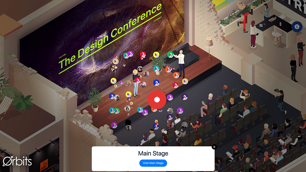
Design can surprise and delight, but it can also sometimes get in the way of an experience, and with UX it's the experience that we want to perfect. "It’s a fine balance, but if you can marry the expectation with reality, customers will love you for it," Salobir notes – and that includes not getting ahead of yourself when it comes to the tech you're considering.
"Work with the technology you have, not the technology you hope to have in 10 years. This was a difficult realisation for Lachlan and I. We started out ready for VR to be imminently ubiquitous [but] we realised that not even the tiny minority of people who have VR equipment want to live their lives in it just yet. We certainly don’t!"
05. Remove obstacles
Removing obstacles to create a seamless experience isn't only great for your users - it’s great for business too. The more quickly people can do something, the more likely they are to want to do it, and the less friction there is for customers, and the more lovable a brand becomes.
"The biggest UX mistakes I’ve seen usually come with the bloatiest projects," Salobir observes. "You’ll see $16 billion dollars being spent on a cross-city tunnel, but no one has bothered to signpost the exits properly... if you added up the cost of these poor UX decisions it would be in the billions of dollars as people take wrong turns, miss flights or get stuck in avoidable traffic. It could even save lives if people are hesitating less on speedy roads."
06. Advocate for great UX design
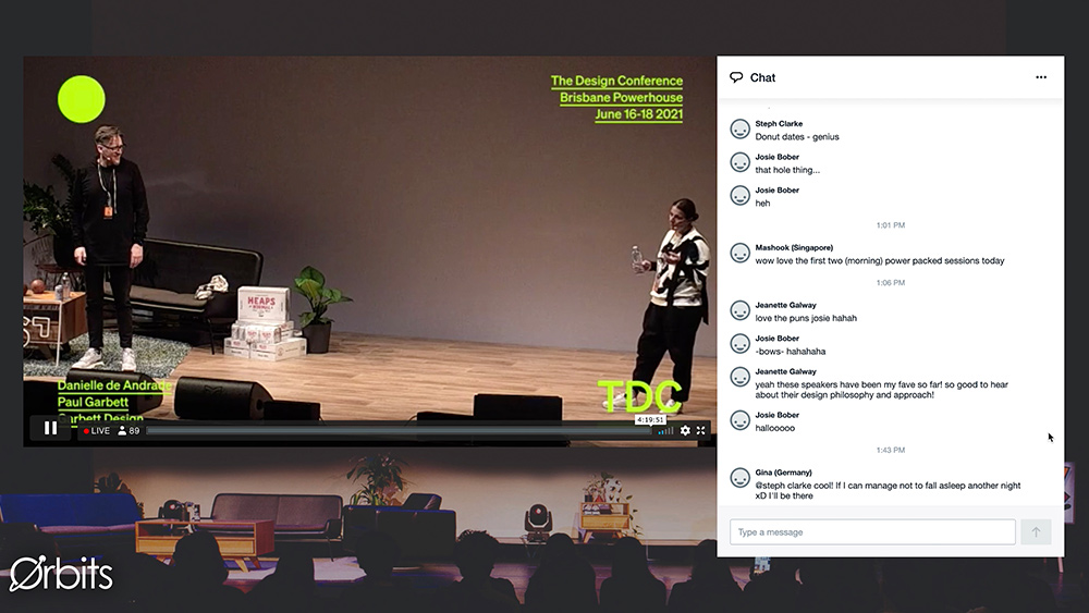
A good UX designer doesn't only need to be able to create engaging, seamless user experiences, they also need to be able to successfully, and passionately, advocate their designs to decision-makers. Salobir recognises that this can be a whole challenge in itself, but that evidence can help (See our guides to UX research and testing and the best user testing software for more advice in this area).
"Unfortunately some business leaders will be hesitant to invest in UX or be sceptical of its worth," she says. "So talk the talk, back up your recommendations with some data on what impact those improvements could have on the bottom line. Improvements in UX will almost always lead to reduced customer service hours, page/cart abandonment, higher perceived value etc."
Beyond the numbers, however, it's important to keep things human, Salobir believes. "Lots of people reject the idea that brands can have personalities, but we’re all human and we’re constantly projecting human traits onto things," she says. "If you can talk people through a process with language that reinforces the voice of your brand, and the promises your brand has made in the marketing that led to them choosing it, it makes such a difference to the perception of what you do and whether you care."

Hear more from the Orbits’ team and discover their key learnings by signing up for Creative Bloq's UX design foundations course.
Read more:

Thank you for reading 5 articles this month* Join now for unlimited access
Enjoy your first month for just £1 / $1 / €1
*Read 5 free articles per month without a subscription

Join now for unlimited access
Try first month for just £1 / $1 / €1
Get the Creative Bloq Newsletter
Daily design news, reviews, how-tos and more, as picked by the editors.

Joe is a regular freelance journalist and editor at Creative Bloq. He writes news, features and buying guides and keeps track of the best equipment and software for creatives, from video editing programs to monitors and accessories. A veteran news writer and photographer, he now works as a project manager at the London and Buenos Aires-based design, production and branding agency Hermana Creatives. There he manages a team of designers, photographers and video editors who specialise in producing visual content and design assets for the hospitality sector. He also dances Argentine tango.
