The web designer's guide to Flexbox
Have you started using the Flexible Box Layout module in your projects yet? Although the module has been around for some time, there have been two major barriers stopping front end developers from using it as a web design tool.
First, until recently the spec was in flux and there wasn't great support for it. Today, all modern browsers support Flexbox. The second barrier is that it is pretty tough to grasp the concept of Flexbox. While it is super-powerful, there are a lot of moving parts and it can be difficult to learn. But the ability to arrange page elements, and have them behave in a predictable way, across multiple screen sizes, is well worth the effort.

In this article, I will get you up and running with the fundamental concepts behind flexbox. Understanding these core concepts will open up a whole world of extremely flexible, easy to create layouts (especially for responsive web design).
Article continues belowNext-generation design
Flexbox is a next-generation tool to help you create layouts with CSS; whether you want to lay out a section of your website or display a grid of media elements. It enables you to easily align, centre, justify, scale and reorder elements on your page, without having to resort to nasty CSS hacks or fragile JavaScript dependencies.
Flexbox can replace floats, positioning tricks, inline-block layouts and even – shudder – table display layouts. If you have ever pulled your hair out wondering why some seemingly simple layouts were difficult or even impossible in CSS, you are going to love Flexbox.
Flex elements
The magic of Flexbox is in the relationship between the parent 'flex container' and the children 'flex items'. In order to take full control of Flexbox, you must put aside any previous ideas of floats, positioning and clearing. This is a totally new way of laying out your page.
Setting display:flex; on a parent element turns it into a flex container, and all of its immediate children will be turned into flex items. Once you have your markup set up, you can use one of the many available flex properties to create a layout.
Sign up to Creative Bloq's daily newsletter, which brings you the latest news and inspiration from the worlds of art, design and technology.
Note: any of the HTML elements can be a flex container or flex item. Any :before and :after pseudo-elements you have on your flex container will be treated as children, and therefore first-class flex items.
Rows and columns
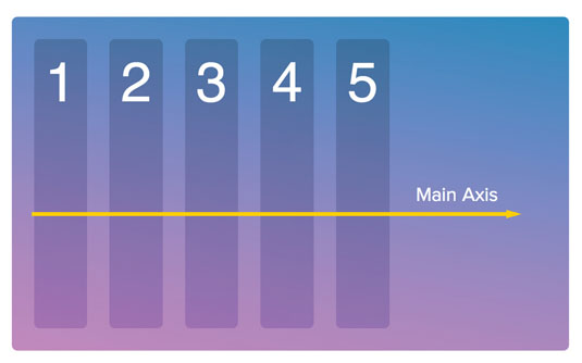
There are two axes in Flexbox that control how the flex items on the page are laid out: the main axis and the cross axis. By default, Flexbox is set up so the main axis goes from left-to-right (or the opposite, for languages that read right-to-left) and the cross axis flows top-to-bottom (shown above). Before you go memorising that, note that this can – and will – all change with the flex-direction property.
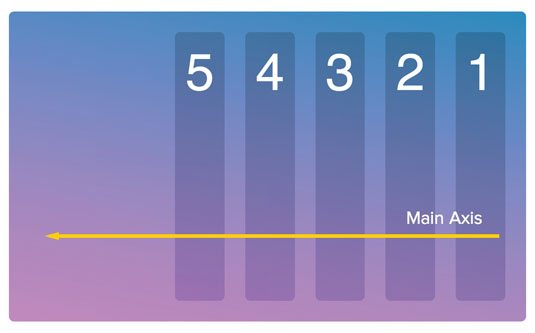
By default, Flexbox is set up with flex-direction: row; which means the items flow on the main axis from left-to-right, in a row. We can switch the main axis so it flows from right-to-left by using flex-direction:row-reverse (as shown above).
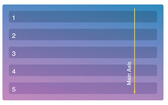
To switch both the main axis and the cross axis, we change the layout to flex-direction:column;. This will alter the main axis and flex item flow from left-to-right to top-to-bottom, in a column (above). We can also start from the bottom and move up by flipping the main axis with flex-direction:column-reverse.
Center items
One of the best things about Flexbox is that it allows you to align your content in any way you please – even vertical centring is an absolute breeze! There is often confusion surrounding Flexbox alignment, because there are three different properties that we use to modify the alignment of our flex items.
One reason for this is that these properties align the items along the main and the cross axis. So instead of asking, 'how do I centre something vertically or horizontally?' you must first establish which direction your axes are pointed, and then figure out which CSS property to use to properly align and centre your flex items on them.
In the next few examples, I'll be attempting to perfectly centre my items. However, you should know that each of these properties has a number of alignment options. For a full list, I recommend keeping this CSS-Tricks flexbox reference handy.
The cross axis
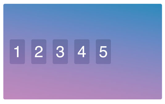
By default, flex items stretch across the entire flex container along the cross axis. If we want to centre items along the cross axis, we can use the align-items property on our flex container and set it to center (shown above).
In addition to stretch and center, we can also use flex-start and flex-end to anchor the items at the top and bottom respectively. Finally, we have baseline, which will align the items along the bottom (or baseline) of your text. This is extremely helpful when you are trying to align items with varying font sizes.
Justify along the main axis
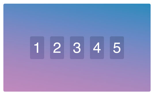
Now we have the centring working along the cross axis – top to bottom in our case – we need to get centring working across the main axis. For this, we use justify-content:center (shown above).
Just like with align-items, we can also use flex-start or flex-end, as well as space-between and space-around, which will evenly divvy up the remaining space between the elements. This is super-useful when working with grid layouts that don't add up to 100 per cent of the margin and widths.
Just remember, if we switch from the default flex-direction:row; to flex-direction:column;, the main axis can change from left-to-right to top-to-bottom. When we switch to column, align-items becomes the horizontal alignment while justify-content becomes the vertical alignment.
Align multiple lines
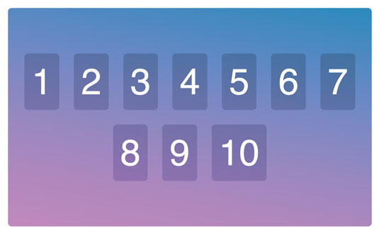
While align-items and justify-content work great when you have a single row or column of content, things get a little trickier when you're dealing with multiple lines of content as a result of using flex-wrap:wrap; on the flex container.
align-content works just like justify-content, but kicks in when we have multiple lines of content. By applying align-content:center; we can ensure that the lines will anchor in the middle of the cross axis and centre their elements from there.
Just like with justify-content, we can also use flex-start, flex-end, space-between and space-around. However, this time they refer to the space in-between the rows or columns of content, and not the flex items themselves.
Now, with just four lines of CSS, we have a bulletproof way of vertically and horizontally centring all direct children of a flex container.
.container {
align-items: center;
justify-content:center;
align-content:center;
flex-wrap:wrap;
}
Fill the space
So far, everything we have learned about alignment has to do with the flex container and how it aligns its children. With align-self it is possible to override the align-items property set on the flex container by individually setting align-self to flex-start, flex-end, center, baseline or stretch.
Another often misunderstood part of flexbox is how to work with grow, shrink and basis values. It's helpful to once again throw away any ideas of pixel-perfect grids and embrace that flexbox is, well, flexible.
Each flex item can be assigned a flex-grow, flex-shrink and a flex-basis value. With these values we can indicate our ideal sizes, and then specify how the items should act in situations where there is extra, or not enough, space. From there, the items will just figure it out for themselves.
I like to think of these properties as:
- flex-grow: How do I act when there is extra space available? How will the flex items divvy up the remaining space?
- flex-shrink: How do I act when there isn't enough room for all the flex items? Rather than overflow the container, who will give up part of themselves to make everything fit?
- flex-basis: Instead of setting a definite width or a height on your element, ideally what width (as a row) or height (as a column) will it be?
Note that while it is possible to specify these properties individually, you will almost always be using the flex shorthand to specify the grow, shrink and basis values all at once. Check the videos at Flexbox.io for a more detailed description of the flex shorthand property.
Growing and shrinking
The idea is that we can set our ideal width or height with the basis value, and then when there is extra space available for the flex items, the flex-grow property will decide how much extra to take up. Similarly, when there is not enough space available, the shrink property will decide how much each element will give up (or 'shrink').
The flex-grow and flex-shrink properties are unit-less, proportional values. They describe how much – in relation to all the other flex items – the item will grow or shrink.
Let's say we have two flex items: video and credits. We will set the video to flex:1 1 700px; and the credits to flex:3 3 300px;. Now the parent of both of these items is the flex container, and when it is 1000px wide things work out perfectly: the video takes up its 700px and the credits take up the other 300px.
What happens when the flex container is 1500px wide? We have an extra 500px to work with, so where does that go? That is where flex-grow kicks in. The video is set to 1 while credits is set to 3. That means of all the extra room, credits will take three times (375px) the amount of space the video will get (125px).
Similarity, what happens when our flex container is smaller than 1000px? Let's say it's 900px: how do the video and the credits act then? Unlike with floats, we don't just break onto a new line, or scale them down with percentages. Instead, we use the flex-shrink property.
Since the credits have a flex-shrink of 3 and the video has a flex-shrink of 1, this means the credits will give up three times as much space as the video. So since we need to shave off 100px from somewhere, the credits will give up 75px, while the video container will only give up 25px.
Unknown navigation size
Let's look at some common use cases of flexbox. If you have ever worked with a navigation in a CMS like WordPress, you'll know that it can be hard to predict how many elements will be included in your navigation.
Evenly distributing the space between all the elements requires JavaScript. For example if you have three elements, each one should be take up 33.33 per cent of the width, while with five elements each one should take up 20 per cent.
Let's take a look at this commonly seen code as an example:
<ul class="nav">
<li><a href="#">Home</a></li>
<li><a href="#">About</a></li>
<li><a href="#">Contact</a></li>
</ul>
With flexbox, we can easily create this navigation, and even make it responsive, all with just a few lines of CSS. All we need to do is to set our navigation container (usually an unordered list of items) to display:flex, and then each of the flex items to flex:1 or flex-grow:1;.
This will stretch the list items horizontally and fit them perfectly into the available width. The reason this works so nicely is that we set the flex items to grow 1, which means that when there is extra space left over, it will be divvied up evenly between all the items.
For more on this, and to learn how to size your navigation elements differently, make sure to watch the responsive navigation tutorial available on Flexbox.io.
Equal-height columns
Have you ever wished that CSS had a height:as-high-as-the-highest-sibling property? We have all been there – we have three columns of content, all of which are different sizes (above). The content is dynamic and the site is responsive, so setting a fixed height on each one is out of the question, and a JavaScript fix isn't ideal.
Earlier we learned that the default of align-items is stretch. This means the flex items will stretch to fit the parent flex container. And how is the height of the flex container defined? Almost always by the height of the tallest content box.
Let's take the following markup, for example. If we render this out with floats and percentage widths, we will see the container is sized by the middle element and the other two are only as high as they need to be.
<div class="container">
<div class="box">
<p>I'm short</p>
</div>
<div class="box">
<p>I'm a pretty tall box that is the biggest</p>
</div>
<div class="box">
<p>I'm a medium sized box</p>
</div>
</div> 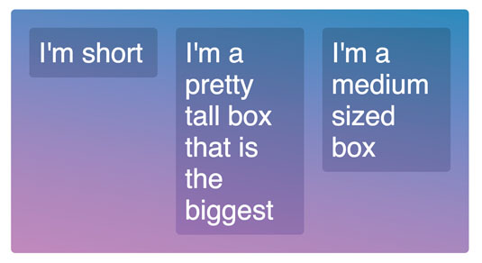
Now, if we simply use display:flex; on the flex container, and set each element to be 33.33 per cent with the flex-basis property, immediately the flex items stretch across the entire cross axis, regardless of how much content is in them (see image above).
.container {
display:flex;
}

.box {
flex: 1 1 33.33%;
}
Flexbox benefits
I hope by now you see the value in learning how to use the Flexible Box module. While it won't solve every issue you have with CSS, it's an important tool every designer and developer should know, and have in their arsenal.
It has been a while since we have had anything this large come to CSS, and I'd argue it's one of the tougher parts of CSS to learn. Just remember that you pushed though learning floats, so Flexbox is totally something you can master!
Must-have resources
'What the Flexbox?!' is a free 20-video training course I've created. In the first half of the course, each video introduces a new aspect of Flexbox. I've kept these nice and short, so you can reference them later when you need to brush up on a particular part. The second half of the course dives into a real-world example, detailing how we can use Flexbox to quickly and easily solve many of the common layout problems we face.
Once you get the hang of Flexbox, you can put the training materials aside. However, it's helpful to keep a visual reference handy. This fantastic resource from Chris Coyier breaks down each of the 13 different Flexbox properties, showing which apply to the flex container and which apply directly to the flex items.
Flexbox is not without fault, and like anything, there are a handful of cross-browser bugs and workarounds you should know about. Flexbugs outlines a range of known Flexbox bugs as well as offering possible fixes and workarounds.
Read more:
