The ultimate guide to GIF design
A GIF can capture a mood or convey a message in seconds. We share some essential tips on how to get started making your own.

We're in a world where communication increasingly takes place online, and GIFs are on the rise. They now permeate everything from popular culture to ad campaigns. For the next generation of designers and developers, knowing your way around motion graphics and having a good understanding of the basics of creating a GIF is essential.
A good GIF can be playful and full of dynamism, or it can be slow and smooth; whatever describes the feeling behind the moving images. The key is to understand what makes an eye-catching GIF and create a language that fits the mood of the message.
However, there are some rules to learn and tools that can help you on your way. Here, creatives from leading studios, as well as some well-known freelancers, share their tips for mastering the art of the GIF.
Building a site to display your GIFs? You might need a website builder. If it's a complex site, you'll need the perfect web hosting service, and once you've made them be sure to stash them securely in cloud storage.
01. Keep it eye-catching
With social media usage still high, it's perhaps no surprise that the trend for GIFs in advertising is rising rapidly. "Using GIFs in social content can be really powerful if executed right, " says Tom Grant, a designer at Fiasco Design in Bristol.
He sees GIFs as the ultimate attention-seeking device, bringing what would be a flat, static post to life in "eye-catching, engaging and informative ways".

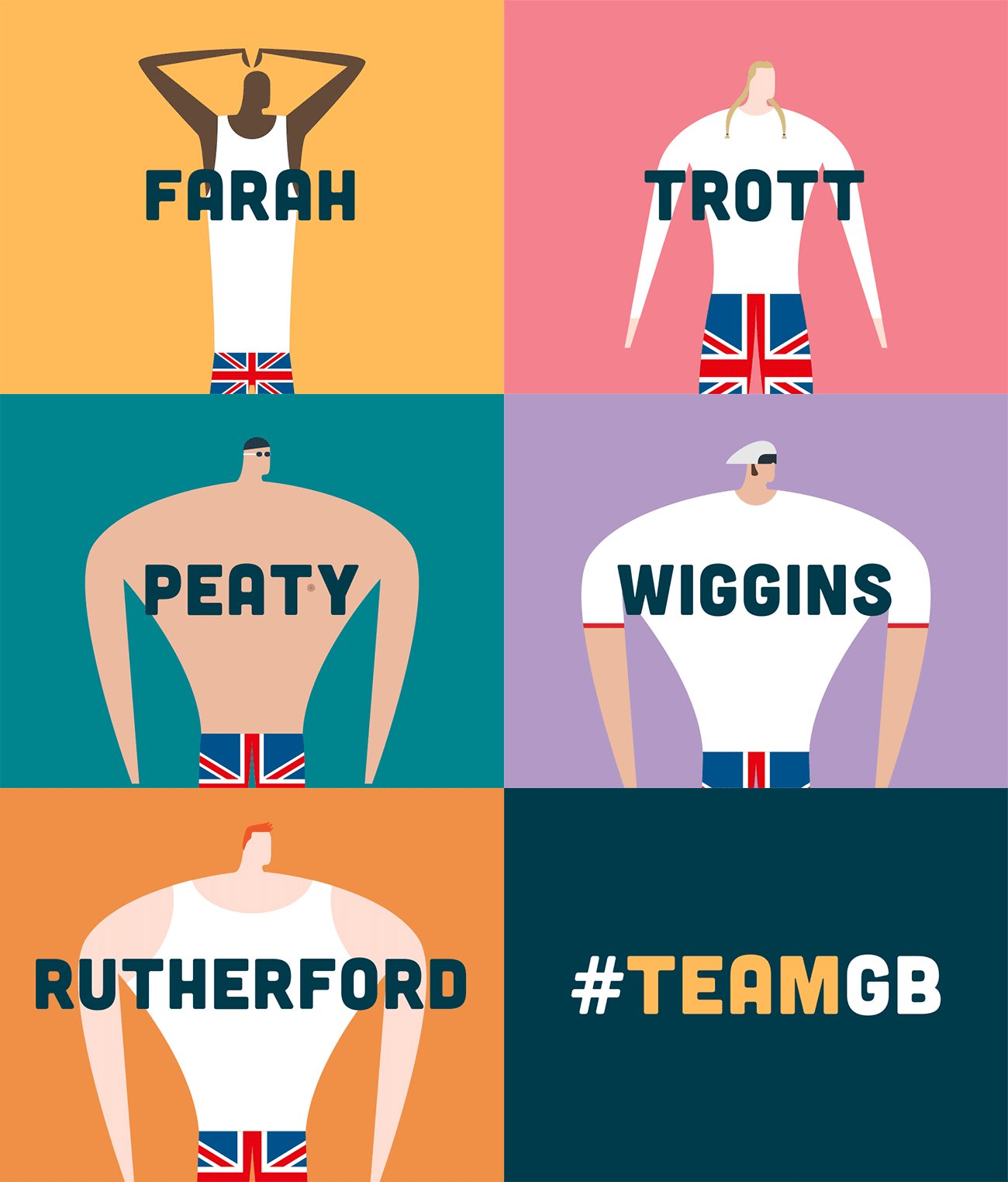
Fiasco Design created a range of lively and energetic GIFs for the Rio Olympics, combining a vibrant colour palette with quick, flashy frame speeds, and experimenting with a typeface that would be legible at different sizes.
02. Keep the size down for social sharing
For designers, there are a few rules to making effective GIFs for social platforms. "The main technical challenge is keeping them below the file size limitations of each social media platform, " suggests James Curran, senior director at global production company Partizan. "Tumblr in particular is always tricky as it has a 2MB limit [now 3MB] so I sometimes need to be creative with ways of shortening loops to keep the size down."
There are also some particular rules for creating GIFs that will be compressed: first off, stick to a limited colour palette. Avoiding gradients is essential, as you'll end up with either grubby shading or huge file sizes. Semi-transparent pixels are also a no-no, as the transparency is either fully on or fully off – something to keep in mind to avoid those jagged edges.
03. Design with mobile users in mind
Although different types of websites use GIFs in different ways, most designers agree that it's better not to have a huge number of GIFs playing at the same time on one page. Curran recommends using rollovers to avoid slowdown, and to keep the animations playing at the speed they were intended to.
And it's worth bearing in mind the kind of devices that your GIF is going to be viewed on. Curran's tip is to design with a small screen in mind: "Keep everything simple and bold so it works well on any device."
Russell Etheridge, a member of Animade's creative team, favours designing in a square. "Many of our GIFs start in that shape and get cropped if need be. Also, you tend to scroll social sites in portrait on your phone, so it's better to have a design closer to a square as narrower images will look smaller."
For his Olympops GIF (above) Etheridge animated everything in 4:3, which could then be cropped to a square or standard 16:9 video.
04. Make it work as a continuous loop
Parisian designer Valentin Adam, who works as Playground Paris, argues that rather than thinking about GIFs specifically, it's the concept of the 'loop' format that is gaining pace: "It's really fun to make a two-second animation that plays infinitely and looks like it's different at every loop."
Curran agrees, and suggests thinking about GIFs as being continuous, rather than having a definite start and end point. "Try to tell a story that works within the loop, " he suggests. "I think that helps to keep people watching GIFs for longer."

If the animation is short in length, it's good practice to limit the loops to no more than three times before halting the animation completely, recommends Nick Lewis, a designer and front end developer at Fiasco Design.
However, if you're designing the GIF to go on a social media platform such as Twitter you don't need to worry so much, as built-in functions only play GIFs when they are in view.
Finally, it's essential to get your loops nice and smooth – and there's one particular pitfall to avoid. "Having the last frame of your animation the same as your start results in a tiny little hold where you see the same frame twice, causing an un-smooth loop," Etheridge points out. "Make sure you remove that one at the end to avoid this."
05. Find the right tools for you
For the majority of designers, mastering Photoshop (with these awesome Photoshop tutorials) is pretty much key when it comes to making your own GIFs. Curran recommends YouTube as a go-to resource for online tutorials to pick up software basics: "Once you've got a good understanding, you can figure out how to adapt those principles to the style of work you want to create."
Grant suggests playing around in CodePen: "It holds great sources of inspiration and offers a place to learn and get creative with code; whether you're a novice or a seasoned pro."
For more complex GIFs, After Effects is many designers' tool of choice. "There is much greater control over the movement and timing functions, as well as some extra tools to create really powerful animations, " reveals Lewis.
If you're looking to brush up your After Effects skills, try Curran's GIF-making tutorial (above), our guide Get started with animation in After Effects or our compilation of 50 amazing After Effects tutorials available online.
It is possible to export your designs as GIFs directly, but Lewis suggests exporting as a video first: "It seems to be easier to compress that way and reduce the file size."
06. Start off simple
With all these different options, it's easy to get overwhelmed. "Because there are many variables to consider, there is a lot of testing and technical know-how required. It can take twice as long as a usual illustration turnaround to create a looping GIF, " says Melbourne-based illustrator Ellen Porteus.
Her advice to beginners is to keep things simple: "Start with a few elements, to understand how things move, and slowly build up to more complicated animation. I started out by creating a lot of bouncing balls."

Adam mastered the art of keeping things simple when he was working on expanding his GIF portfolio. "I had in mind to make a huge miscellaneous motion with a lot of silly and crazy things, but to make it happen I had to publish a GIF every day – partly to avoid overthinking it," he explains.
He ran the challenge for a whole month, publishing the GIFs on his Instagram page. By employing a range of tricks he managed to get his average creation time down to around an hour.
07. Turn a video into a GIF
Creating GIFs need not be the sole domain of illustrators – you can import any video into Photoshop to convert it into a GIF. For those whose Photoshop skills are lacking, Grant recommends experimenting with Giphy, which provides a free, simple way to break your videos down into frames.
"I don't really use the frame animation system in Photoshop, as video layers are much more intuitive," comments Etheridge. "If I'm animating graphics, I'll animate in After Effects and import into Photoshop as a rendered video file before converting."
However, he points out that if you're making a GIF from live action video footage, achieving a smooth loop is going to be much trickier, as is getting an even colour.
08. Make it accessible for everyone
To ensure content can engage with a wider audience, developers need to be mindful of accessibility and web standards. "Web animation should always be used to progressively enhance the experience," argues Grant.
He suggests describing animations and animated GIFs in text so they can be understood by screen reader-users, and avoiding too much blinking or flashing so they remain suitable for viewers with photosensitive epilepsy.

Animade co-founder James Chambers agrees that accessibility should be built in from the start: "Basics like providing alt tags on images – animated GIF or otherwise – should be a baseline."
He also points out that for vector animation, using inline SVGs can drastically improve accessibility. Simply put, an SVG is a XML-based vector image format for two-dimensional graphics that supports interactivity and animation. "From an accessibility standpoint, inline SVGs contain more information when compared to a blank <canvas> tag, and can therefore be better interpreted by the browser, " he explains.
For animation-heavy sites, Chambers suggests combining SVG with thoughtful use of ARIA labelling. Out of the box, screen readers work with regular HTML, but adding ARIA can provide screen reader users with more context and greater interactivity with content. Yet ARIA has no effect on how elements are displayed or behave in browsers – it is meant only to act as an extra descriptive layer. This is an incredibly useful tool for web developers.
09. Explore something new
So why have GIFs become so popular? For many designers, they offer a new outlet for creative expression. "I think it's partly because the core audience for GIFs is younger, [clients] are more interested in content that is a bit off-beat, " says Curran.
"For whatever reason, brands seem more open to allowing creators to be more creative with GIFs than they would be with more conventional content. Because GIFs are smaller projects with generally smaller budgets, it's less of a risk for brands to use this format to try something different."

Porteus agrees: "It's all about making the most of the flexibility of the digital medium. Traditional illustrations are great, but GIFs can be really engaging, fun and clever. For me, the most engaging GIFs are the ones that loop seamlessly and infinitely, with a lot of movement and playfulness."
As for what makes a great GIF, intuition has something to do with it. "It's about having an understanding of basic animation principles, a sense of rhythm, and being able to think of an idea," concludes Curran. "I'm still learning all of those things myself after over 10 years of animating!"
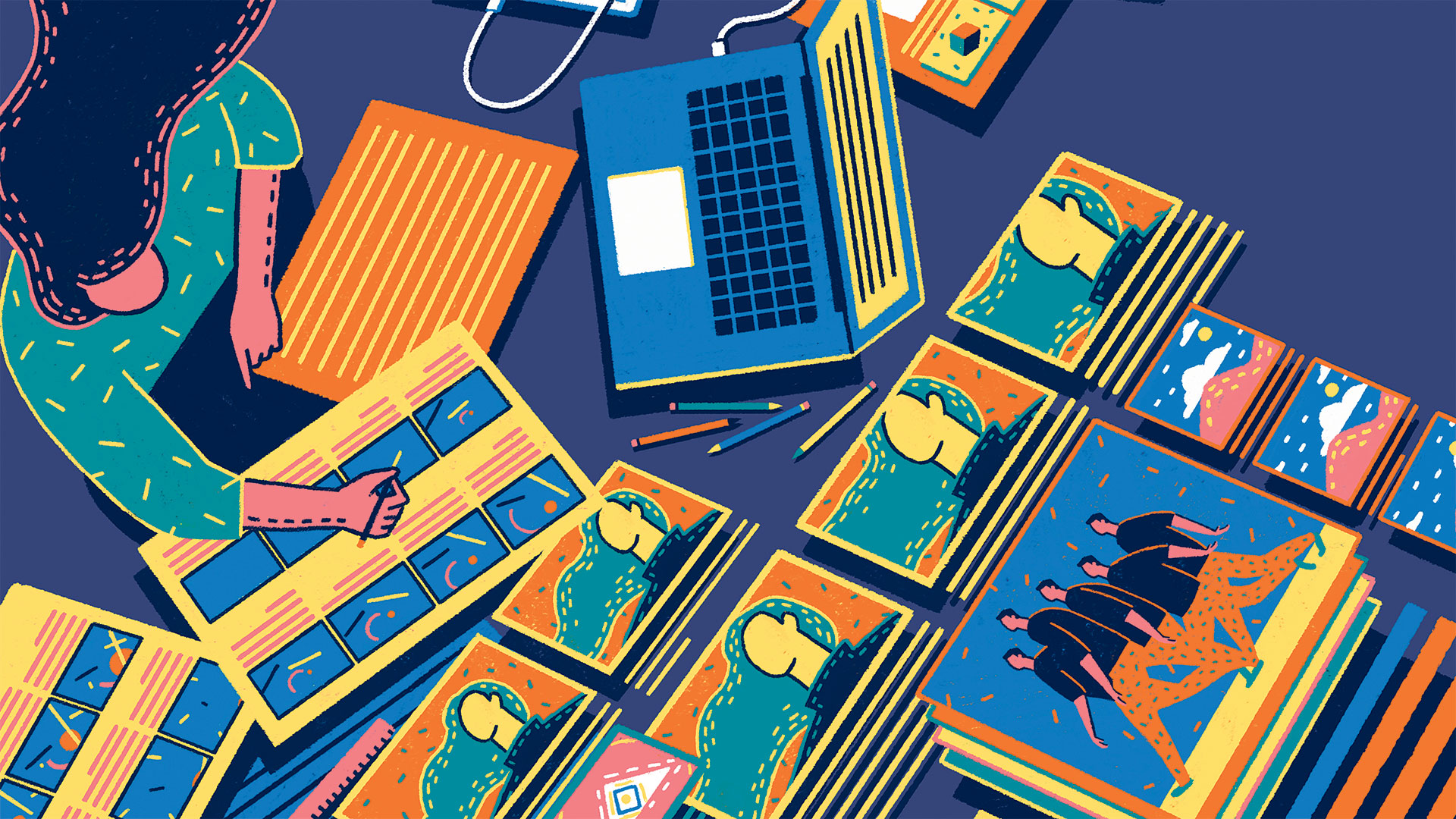
Main illustration: Yukai Du
This article originally appeared in a 2017 issue of net. Subscribe to net magazine here.
Related articles:

Thank you for reading 5 articles this month* Join now for unlimited access
Enjoy your first month for just £1 / $1 / €1
*Read 5 free articles per month without a subscription

Join now for unlimited access
Try first month for just £1 / $1 / €1
Get the Creative Bloq Newsletter
Daily design news, reviews, how-tos and more, as picked by the editors.

Lisa Hassell is a creative coach and the founder of Inkygoodness – a global community on a mission to connect, inspire, and empower the next generation of artists, illustrators and creative entrepreneurs.
