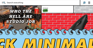
The golden rules of awesome ecommerce experiences
Dos and don'ts for creating a standout online store.

The ecommerce is big business, but despite the fact that the industry is still relatively new, our sites are already starting to look oddly similar. Many brands are also stubbornly focused on their physical stores, while their digital platforms remain comparatively uninspired. So says Daan Klaver, the man behind Dutch studio Build in Amsterdam, a multi-award-winning ecommerce powerhouse.
At Digital Design Days in Geneva, Klaver presented his hard-earned advice for creating standout ecommerce websites that "attract, engage and convert in an infinite loop", and we caught up with him afterwards to find out more. In this article, you'll find advice for creating ecommerce websites that offer your visitors a standout shopping experience.
Not working specifically with ecommerce clients? There's plenty to learn here anyway. "Every brand has something to sell. So in our mind every brand is ecommerce," says Klaver.
DON'T settle for best practice

"We're working in such a young industry, we have to push the envelope. We can't just look at best practice and just settle for that," urges Klaver. We've got to the point where we have certain established patterns in ecommerce that we know work – but we're relying on these and innovation in the industry is suffering because of it.
Most brands still see their 'flagship store' as a bricks-and-mortar shop, and it's here they focus on creating wonderful customer experiences. Klaver thinks this is the wrong approach. "Your ecommerce site is the biggest flagship store you have. It's open 24/7, worldwide," he says.
DO make 'snackable' content
Social media now plays a huge role in selling online. "Social media is where almost all the communication is happening now from brands," Klaver explains. That means the types of content that are popular on social media should also be informing your ecommerce strategy.
"Consumers nowadays don't want to read a lot. They just want the visuals, they want 'snackable', short stories. So I think we'll see that social thinking coming into ecommerce." For its latest project, Build In Amsterdam has been creating this kind of 'snackable content' for a brand, making sure the stories the brand communicates on its Instagram can be directly applied to its main site.
DON'T think in journeys

We tend to design for ecommerce in journeys, imagining there's a static route to channel customers through to reach the point of conversion. That way of thinking is obsolete. Thanks largely to the key role social media now plays in ecommerce, you can no longer predict where a customer will land on your site – more people will land on a detail page than your homepage. So it's time to stop thinking of your designs as separate pages.
DO use a headless CMS
There have been a lot of shifts in the CMSs that dominate in the ecommerce landscape, but what Klaver is seeing now is that the newer sites are using a headless CMS – an approach Build in Amsterdam has embraced for a while. This means you can use a CMS you like, and you have complete freedom over templating.
Klaver is fully behind the trend. "It's a really good thing, because hopefully then not all web shops will look alike," he smiles.
DON'T expect loyalty
Earlier in the festival, designer and entrepreneur Chris Do said that: "Having an audience is greater than having customers... You have to pay customers to get their attention (that's advertising). An audience will give your their time willingly." We ask Klaver if he agrees.
"Partially I agree. But I believe people are not loyal to brands so it's always about winning new souls, if you want to grow." He points out that while nowadays brands are expected to have a more honest and relatable message than they used to, that still that doesn't mean you can rely on customer loyalty.
"People hop brands very easily," he explains. "It's great if you've built an audience, because then you have a core and you should never let that go, but as a brand I would always hunt for new audiences."
DO know your strategy

The biggest and most common mistake designers make is to not pay enough attention to strategy. "They design things, very often, just from pure instinct," says Klaver. "Sometimes that leads to good design, but I believe that every decision you make during the design process should lead back to the strategy, and should have a good rationale behind it."
You don't want to end up in a conversation with your client where they ask why you've done something, and your only response is that you thought it looked beautiful, because if they disagree you have nothing to come back with. In Klaver's opinion, everything from the UX concept to the typeface and colour scheme should relate back to the overall strategy.
DO design mobile-first
There has been a focus on building apparently 'mobile-first' for a while now, but Klaver thinks many brands are still directing too much attention to their desktop solution. He points out that most brands now attract around 70 per cent of their visitors on mobile, and that figure is only going to rise. Only now are we starting to focus on mobile design, and implementing that thinking into the desktop versions.
DO get inspired by apps

Short of inspiration? Take a look at shopping apps. "I think we can learn a lot from apps," says Klaver. "They're trying to innovate and trying to push the limits. They're much more innovative than the ecommerce websites, even from the bigger brands. It's exciting to see."
Read more:

Thank you for reading 5 articles this month* Join now for unlimited access
Enjoy your first month for just £1 / $1 / €1
*Read 5 free articles per month without a subscription

Join now for unlimited access
Try first month for just £1 / $1 / €1
Get the Creative Bloq Newsletter
Daily design news, reviews, how-tos and more, as picked by the editors.
Ruth spent a couple of years as Deputy Editor of Creative Bloq, and has also either worked on or written for almost all of the site's former and current design print titles, from Computer Arts to ImagineFX. She now spends her days reviewing small appliances as the Homes Editor at TechRadar, but still occasionally writes about design on a freelance basis in her spare time.


