The dos and don'ts of perfect portfolios
How to avoid – or fix – classic portfolio site mistakes.
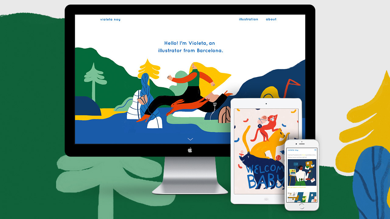
If you’re creating a design portfolio, it’s safe to assume you know at least the foundational rules of good design. Yet when we work in isolation on our own portfolio, it’s easy to forget the common rules we would apply to any other client project. Sometimes we’re just too close to our own work, which almost blinds us.
As a designer, a portfolio is essential to your success. But at the end of the day it’s not about the portfolio – it’s about you and your work. Instead of focusing on building the perfect portfolio, focus on finding the perfect way to share the work you’ve already created. Everything else will fall into place from there.
As co-founder of Semplice, I see plenty of design portfolio examples every day. In this article, I'll share what I've learned through my day job, and offer you my top tips for ensuring you don’t get in your own way, and instead create a portfolio that sets you up for success. Want more? See these top tips for content to include on your portfolio website and these portfolio tips.
01. Make first introductions count
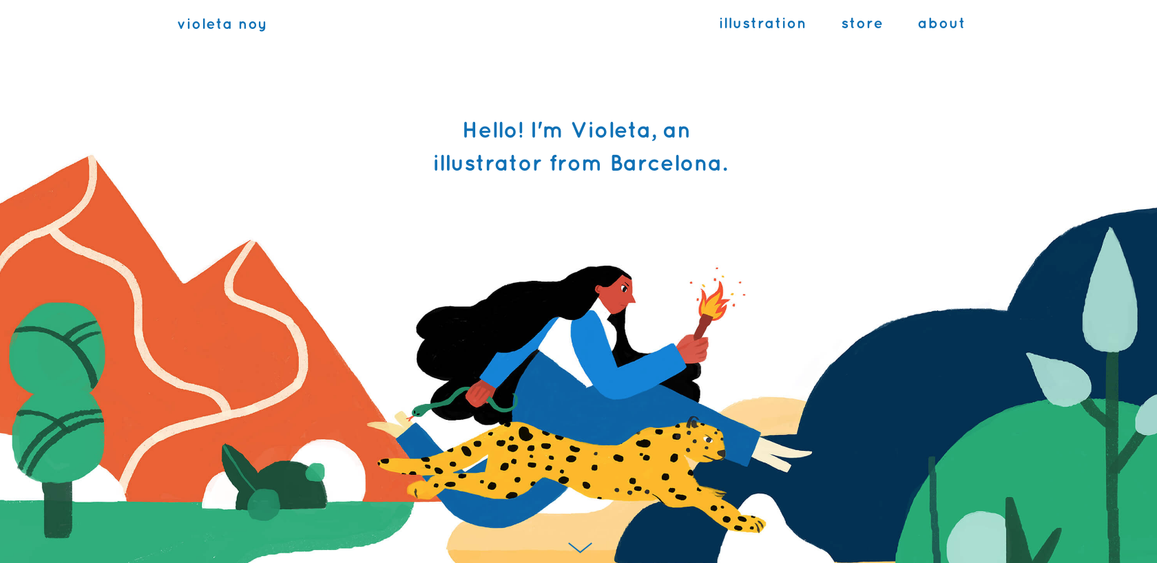
DO: Introduce yourself immediately with a quick paragraph that says who you are, where you’re located (if that matters to your work) and what kind of work you like to do. Show your personality but be straightforward, so the first glimpse at your website gives your viewer the context they need.
DON’T: Write some generic rubbish intro that says you 'craft meaningful experiences' or 'push pixels'. Aside from being overused, phrases like this don’t mean anything to anyone and won’t help your potential employer or client understand what you do.
02. Choose the right work to include
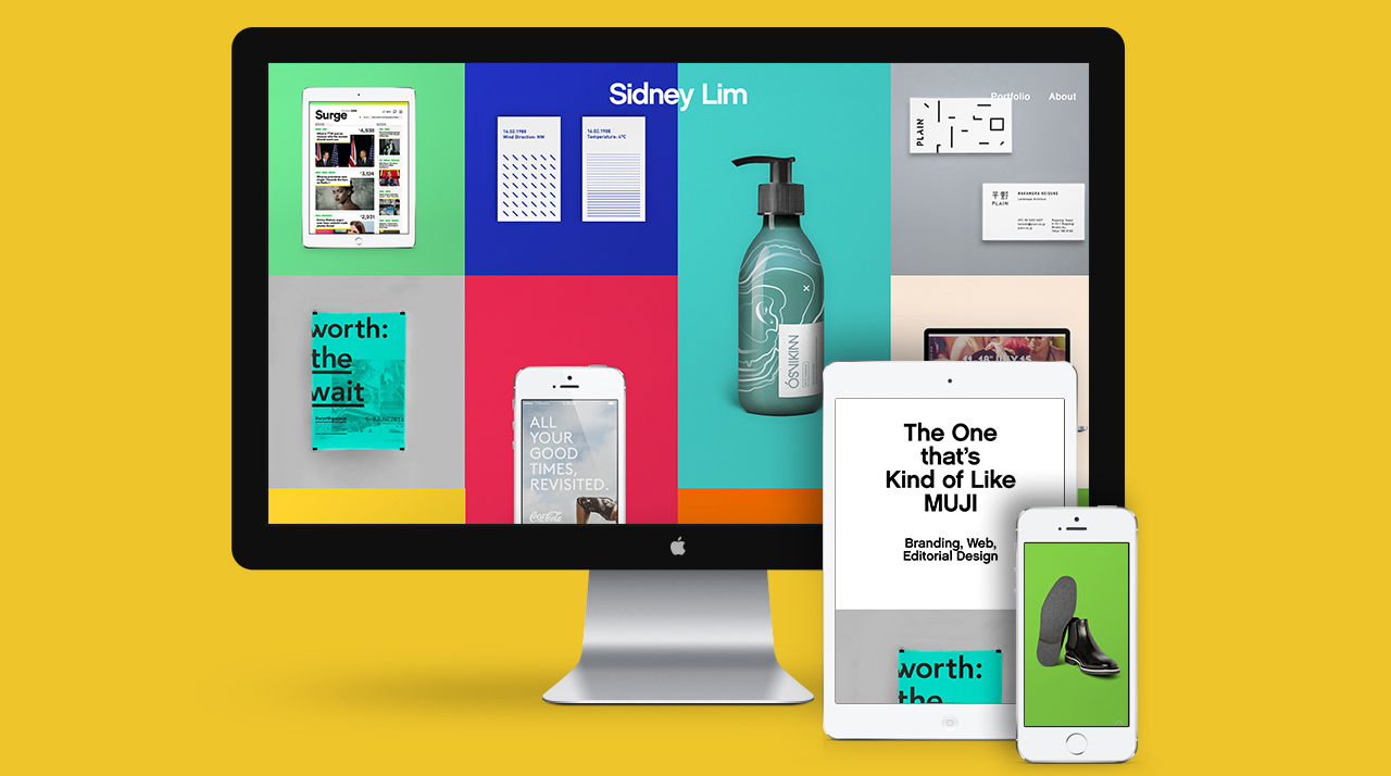
DO: Curate your portfolio to show only your best work. More importantly, pick the kind of work you want to do in the future.
DON’T: Fill your portfolio only with spec work or unsolicited designs. Of course the occasional unsolicited design can help show your skill when you don’t have the client work to prove it yet. But too many only shows that you’re good at working in isolation without any restraints, which is almost never the case on a paid project.
If you do choose to do some unsolicited work (if you’re a young designer trying to start fresh in a new field, for example), don’t do the typical Fortune 500 redesign for a company like Nike or Apple. These companies already have fantastic assets, so it’s not showing much skill to design for those brands. Choose a smaller company that you admire instead. Show what you can do when you’re working with nothing, and that will impress.
03. Make it easy and enjoyable to look through
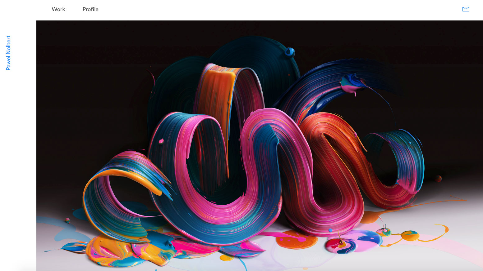
DO: Think of your portfolio as space in a museum. Make it clean, easy to navigate and fully focused on the work itself. Design for the end user who might be viewing hundreds of portfolios a day. Make it easy for them to learn who you are and what you can do.
DON’T: Design your portfolio like a work of art in itself. When we think of our portfolio like a personal project or creative outlet, we can overcomplicate or make it too playful – to the point where it becomes unusable for the person who has to view it.
For example, a fancy horizontal scrolling feature might seem unique and interesting to you as the designer, but no-one clicks blindly on next/prev arrows without knowing where they lead. We tend to browse portfolios in a visual way, by clicking on what interests us. Don’t make the user work to view your portfolio.
04. Create a standout About page
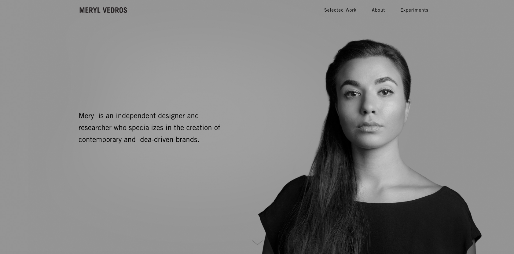
DO: Spend time making the perfect About page. Your About page is the most important page on your portfolio. I’ve reviewed hundreds of portfolios and always navigate here first to get context before I browse. The numbers on my own website confirm it too: The About page gets more hits than any other page on my site. Do something different and memorable here that offers a real glimpse into who you are.
DON’T: Get too cutesy and leave out the important information we need to know. Don’t forget your name (yes, I’ve seen portfolios where I couldn’t find any first or last name anywhere), a picture of you (a nice personal touch that makes a difference) and your main skills. And please, don’t forget to list your email address.
All the portfolios you see on this page were built with Semplice.
Read more:

Thank you for reading 5 articles this month* Join now for unlimited access
Enjoy your first month for just £1 / $1 / €1
*Read 5 free articles per month without a subscription

Join now for unlimited access
Try first month for just £1 / $1 / €1
Get the Creative Bloq Newsletter
Daily design news, reviews, how-tos and more, as picked by the editors.
