Image editing is the bread and butter of design agency work, and is performed not just by junior designers but also by team members at a range of levels. Scott Kimble, image creation director at London design agency BrandOpus, says that every photograph it produces in-house has to be edited in some way.
“If say, we had a shot of some food, we might add steam to it to make it look nice and hot. We’d add that in afterwards, because it’s very difficult to get that in on a shoot,” he says. “So it’s about cutting that scene in such a way that it’s on a transparent layer, so you can overlay it on top of the food, airbrush it out, make it soft.”
Another common job is cleaning up images. “There are always bits of fluff, hair and scratches in there,” he says. “You can’t always see it straight away, it’s only when you start to work into the image that you notice. For those sort of clean-up tasks, you’d use something like the Dust & Scratches Filter or the Spot Healing Brush Tool in Photoshop.”
Here we spoke to designers about what is commonly involved in image editing, and asked them to share their advice.
01. Ask questions
As a junior, being handed real-world image editing tasks – which may be very different from anything that you’ve had to do before – can dramatically expose gaps in your knowledge. That’s what happened when Kara Clifford started as a junior at PWAR Creative, a Huddersfield-based design agency.
“I realised I didn’t actually know as much as I thought I did,” admits Clifford. “I feel like image editing is something that most universities seem to skip past, which is a shame because once you’re thrown into the real world, it’s something you’re almost instantly faced with.”
She found the best way to learn was to ask questions. “So if you find yourself staring at your screen thinking: ‘How on earth do I do this?’, just ask someone who might know.”

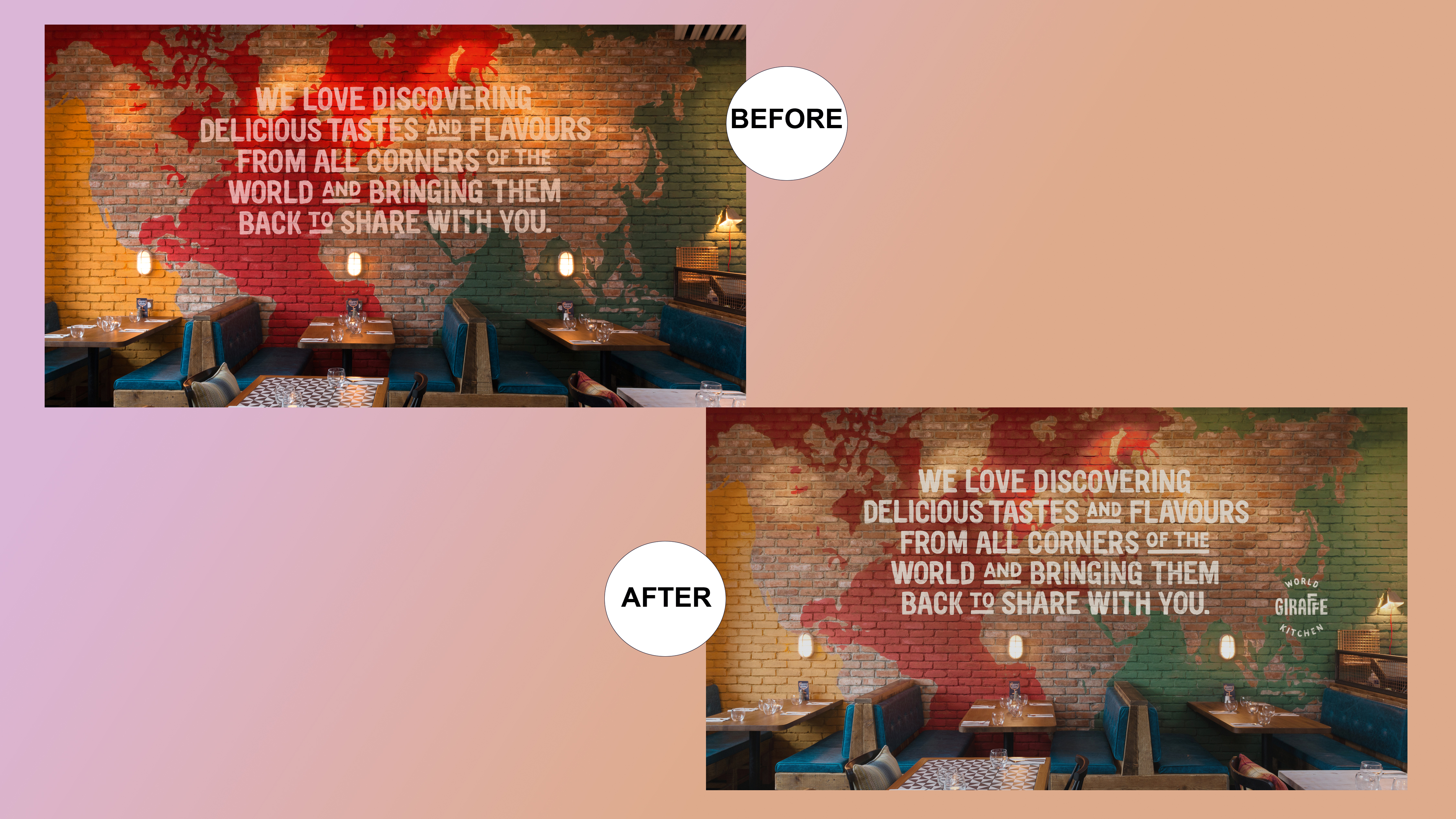
“This image required lots of small retouching to remove plug sockets, parts of the ceiling, and straightening tables along the bottom. The original image was far too saturated and warm, so we reduced the saturation and adjusted the colour balance to better represent how the wall would look in reality. We rebuilt the type on the wall and added in the logo, adjusting the layer blending options to let some of the wall texture from below show through.”
02. Be resourceful
That’s pretty much what Sarah Gray, a Dublin-based creative specialising in graphic and motion design, did in her first role as a junior. “When I started, I soon picked up a few extra tricks that my immediate boss showed me,” she recalls. But she also realised she wasn’t working quickly enough. Fixing this involved a lot of practice, both inside and outside of work.
“If you know the sorts of tasks you’ll be asked to do, have a quick look on YouTube to revise it beforehand,” she recommends. “It’s enormously stressful if you face something you’re not sure of. Photoshop isn’t the most user-friendly or intuitive to use, because there’s so much you can do with it. But frantically pressing buttons, accidentally changing formats and tools is an absolute mare, especially if you’re trying to impress your new boss and co-workers. Polish your Photoshop skills and you’ll feel a lot more in control.”
03. Learn by doing
Andrew Kitchener, junior designer at London-based agency Ragged Edge, says it's important to learn in your own time. “The key here is to learn by doing,” he says. "It’s like most design work: when something doesn’t quite go how you intended, often it ends up being a solution to a different problem. And you never know when a new trick is going to come in handy.”
With plenty of practice, you should soon start to develop your skills in a way that image editing tasks won’t phase you. And that’s exactly what happened to Clifford. “Since I started working as a designer, my image editing skills have improved massively,” she says.
“The pressure of working for clients and alongside other talented designers has taught me more than any course has. Some jobs can get a little routine, such as cropping and editing 300 photos of one type of product, but most of the time it’s really fun.”
04. Take your time
But don’t go overboard in trying to increase your speed; that can be counter-productive, says Elena Morán, a UX/UI designer at London digital agency atom42. “My biggest advice is to be patient and not rush your work,” she says. “For example, to separate the figure from the background, hugely zoom into the picture and be very meticulous with the cropping. You may feel it takes ages to complete the shape, but it will save a lot of time in the long term.

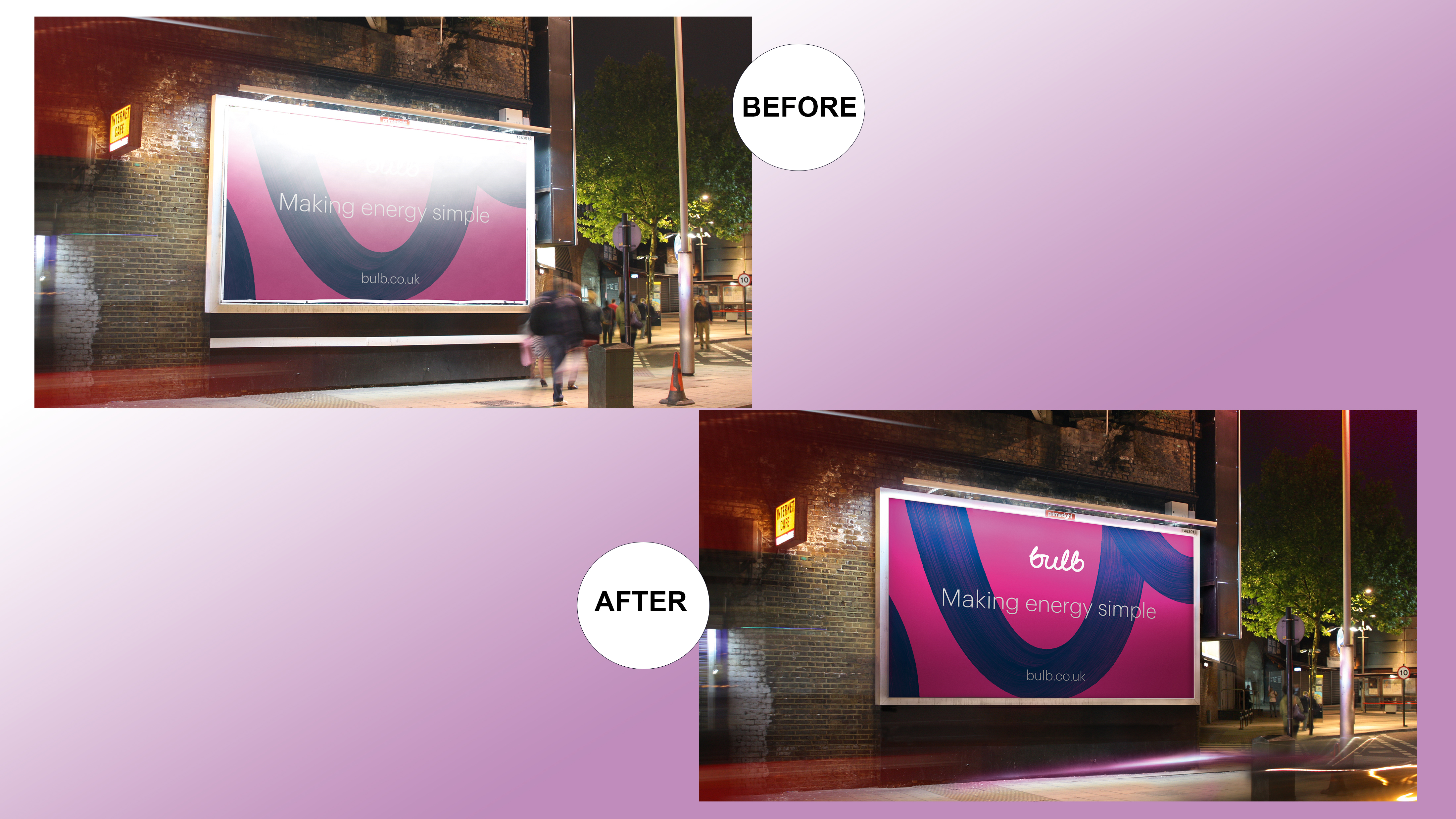
“This image took a lot of rebuilding," says Clifford. "As well as perfecting the colours throughout and adjusting the levels to make the image more vivid, we added in light blurs from passing traffic, removed pedestrians from the shot, warped the image to make all the verticals straight and replaced the billboard itself. This required rebuilding the lighting and shadows around the billboard, using the Multiply and Linear Dodge blend modes to reconstruct the light as realistically as we possibly could.”
05. Be organised
Doing it right at first will avoid repeating the job many times until you achieve a professional result. “Try, experiment, play and enjoy,” concludes Morán, “but always have a backup to revert the work you have done if you mess up your image. Also, be organised; very organised. Name your layers and files properly, group elements, get rid of unnecessary elements… that will save you a lot of time.”
This article originally appeared in Computer Arts issue 271. Buy it now.
Related articles:

Thank you for reading 5 articles this month* Join now for unlimited access
Enjoy your first month for just £1 / $1 / €1
*Read 5 free articles per month without a subscription

Join now for unlimited access
Try first month for just £1 / $1 / €1
Get the Creative Bloq Newsletter
Daily design news, reviews, how-tos and more, as picked by the editors.

Tom May is an award-winning journalist and editor specialising in design, photography and technology. Author of the Amazon #1 bestseller Great TED Talks: Creativity, published by Pavilion Books, Tom was previously editor of Professional Photography magazine, associate editor at Creative Bloq, and deputy editor at net magazine. Today, he is a regular contributor to Creative Bloq and its sister sites Digital Camera World, T3.com and Tech Radar. He also writes for Creative Boom and works on content marketing projects.
