17 expert storyboard tips for TV animation
Discover the vital concepts of sequential storytelling and how they apply to storyboarding for television animation.
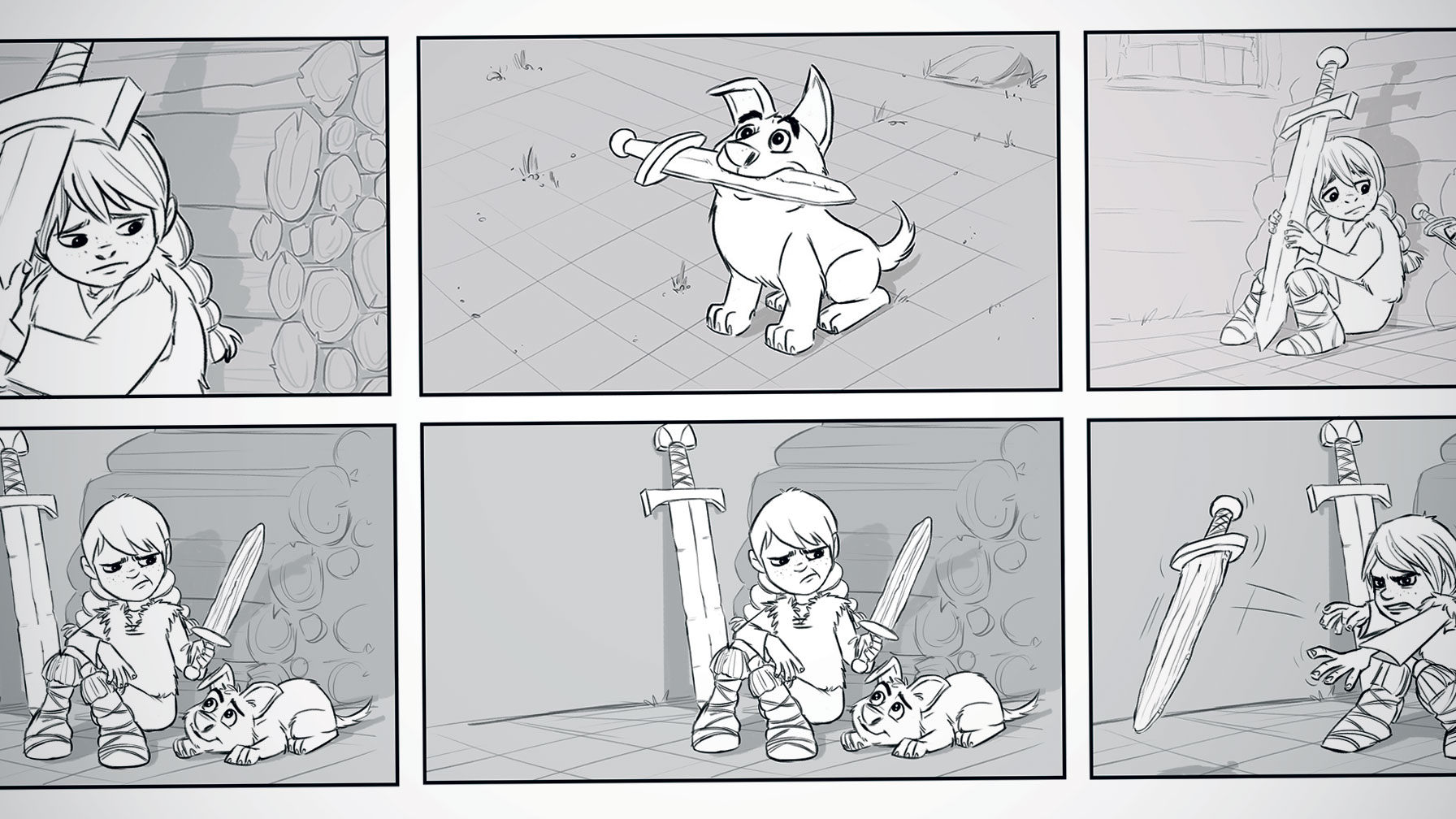
Storyboarding is a creative, exciting and fulfilling career. In addition to knowing how to draw to a high standard, a storyboard artist needs an understanding of storytelling, as well as a knowledge of animation layout mechanics.
The television storyboard artist creates the visual blueprint for the animated production. Put simply, if it isn't in the storyboard, it won't be on the screen. It's not unusual for the character poses from the storyboard to be traced and used as extreme poses by the animation artists.
In addition to knowing how to draw the characters acting out the performance, a production board artist (The Animation Guild title for a television storyboard artist) must also have a firm grasp of filmmaking principles and how to translate those principles when designing the layout for animation camera moves.
The tips below examine the most important principles an animation story artist needs to understand. Storyboards aren't finished art, but rather a key component of planning the production from which the finished art is designed. The storyboard enables the movement of the characters and camera, with each scene sequentially designed in context of what came before and what will come after as the story unfolds…
01. It's all about telling the story
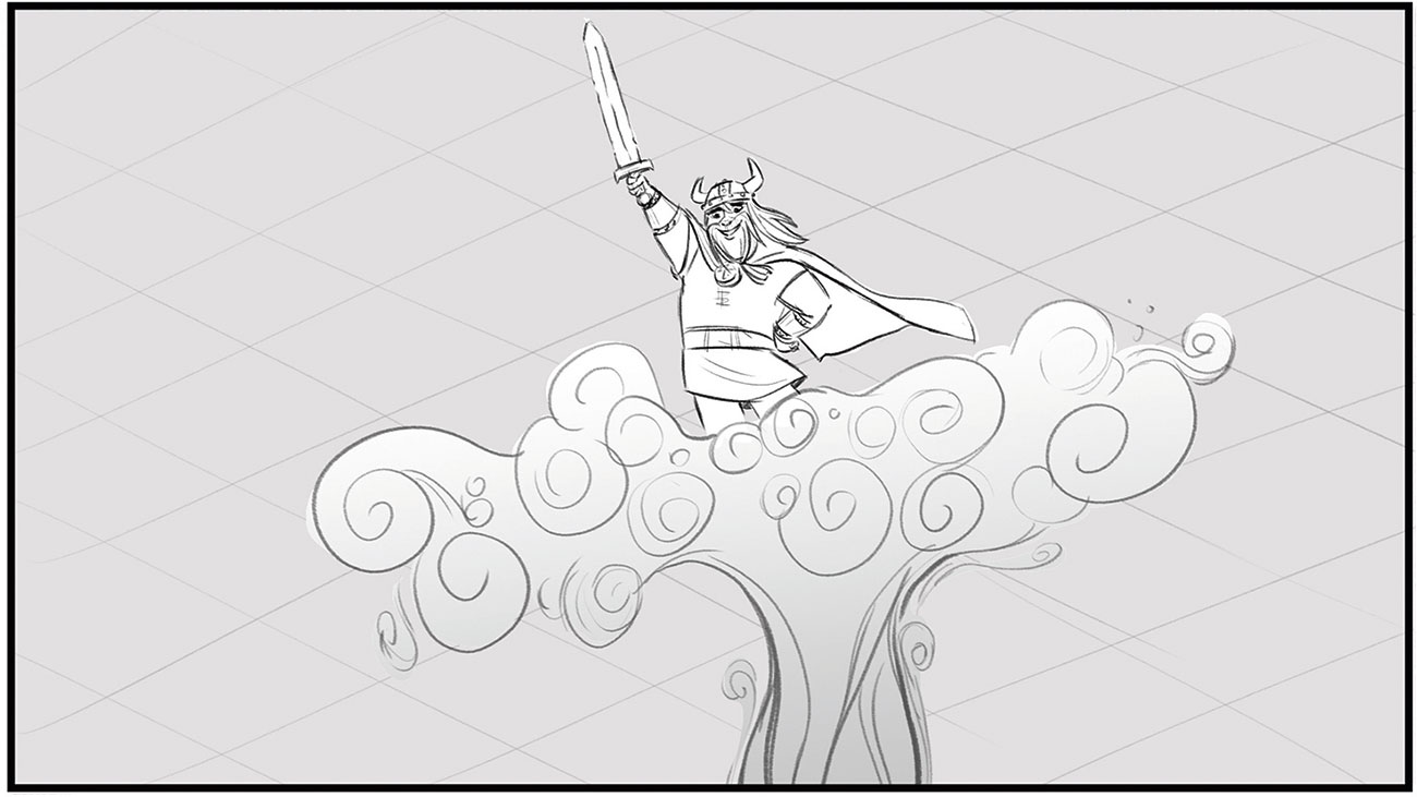
Boiled down to its essence, my job is to tell the story. I begin by reading the provided script or outline for the show. It's important to remember that the story is about the characters, so I always ask myself these questions:
- What is happening in the story right now?
- How does it affect the character?
- What is their state of mind?
- How do they feel?
- How should the audience feel?
- What is the emotional moment that I'm trying to communicate?
These are the key points that, as a whole, tell the story. Every decision should be driven by the story!
02. Build on the line of action
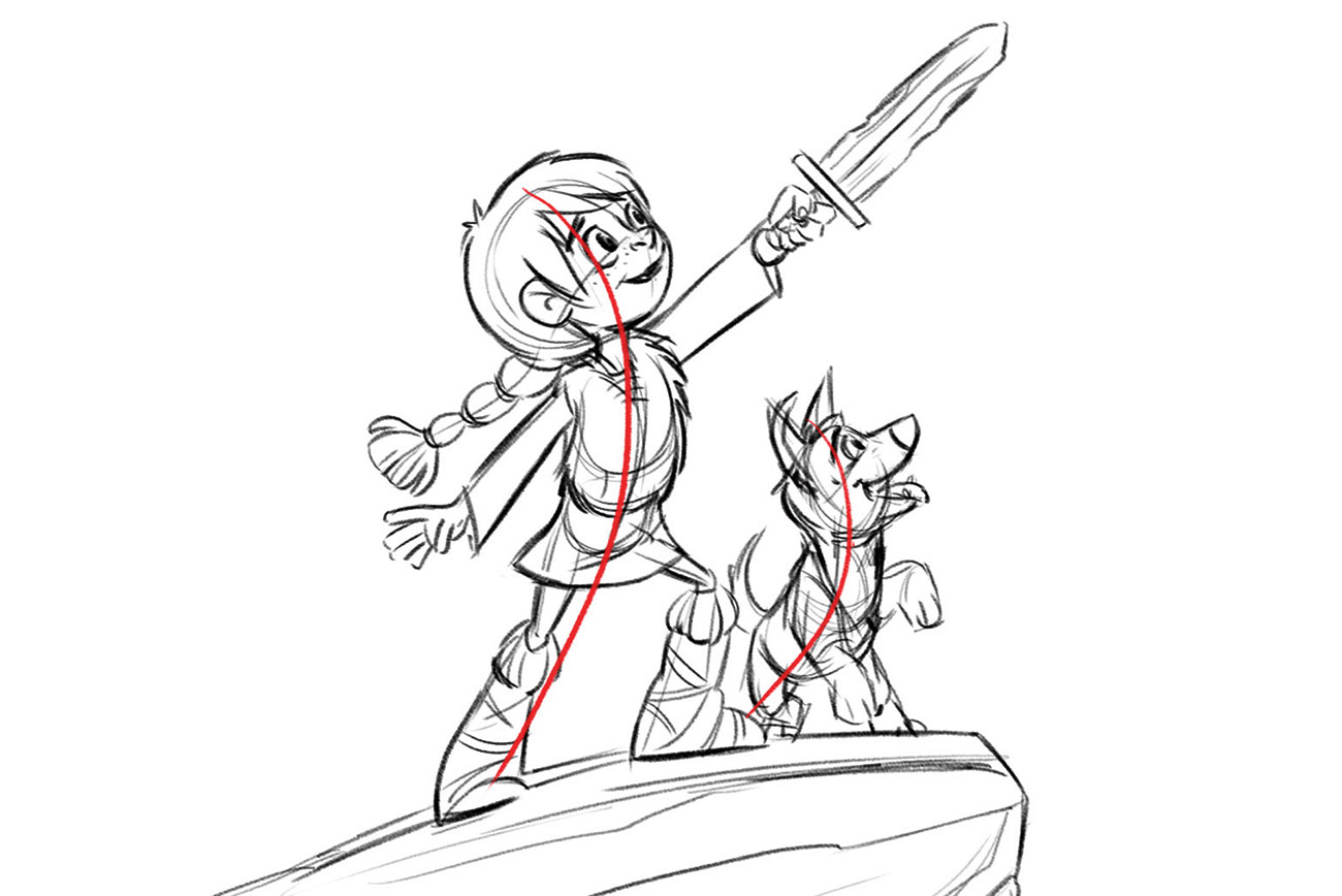
The line of action is a design decision related to the energy/force the character exudes and is the first line I draw. A character who has the weight of the world on their shoulders will slouch, with his/her head pulled to the ground. One exuberant with success will arc in the opposite direction, throwing his/her weight into the air and away from the pull of Earth's gravity. This line is the design foundation upon which the drawing of the character is built; communicating direction of movement, emotion, energy and so on.
03. One drawing equals one idea

Film moves quickly. The audience can only look at one thing at a time, so including multiple ideas in a drawing will just result in the audience missing some of those ideas. The storyboard artist must commit to creating a new drawing for each new idea. If an event takes more than one step to be described, then you're going to have to draw each step. For example, if a character sees something and reacts, draw the character looking, draw what they see, and then draw their reaction.
04. Draw cleanly for animation
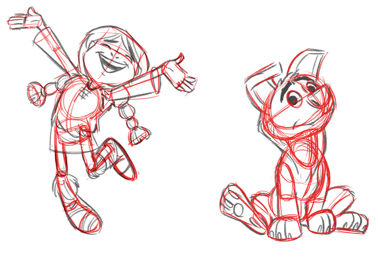
Disney animator Ollie Johnston said it was important to draw clearly, not cleanly. I begin drawing loose thumbnails to work out the flow of the storyboard and explore various solutions. When tying down the final drawings, keep the energy from those early sketches. Construct your drawings with simple shapes and volumes. Use guidelines and 'draw through' to ensure your drawings have sculptural dimension. Turn your character in space, tilt and twist the shoulders, hips and the head.
05. Find clarity in silhouettes
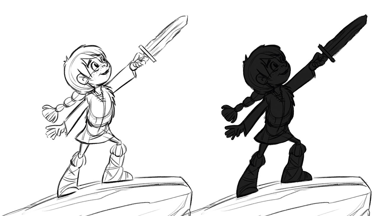
Clarity is key! The audience has a very short time to absorb information before the next idea appears. There should never be any doubt as to the action described, nor to the intent and state of mind of the character. Test the clarity of your pose by filling the drawing with solid colour. Can you still read the action of the character? Using clear silhouettes when designing poses ensures this clarity of communication.
06. Communicate the story through character poses

The poses I draw need to be clear and simple, but also unique to the character. Too many poses and the character won't stop moving, thereby losing emphasis on what matters. Too few poses and the character will be lost on the screen. Working with the dialogue track, I listen for the subtext, or the feeling beneath the words. The poses I draw capture this emotional subtext, so I change poses when the attitude changes. Pauses between lines are often more important than the dialogue itself; providing opportunity to show the character thinking and changing attitude.
07. Think like an actor

Storyboards plan the performance of the characters. For television productions, this character layout is detailed and very specific. Voice actors are vital in defining the character. Listen to the dialogue and then listen to it again! Don't be afraid to try acting out the words yourself – I have a mirror at my desk to help me draw convincing expressions and movements.
Subtle expressions are the most challenging. Each character is unique and the performance must reflect this individuality. Character design model sheets are a handy resource story artists use to maintain a consistent character performance.
08. Use the frame as the 'eye'
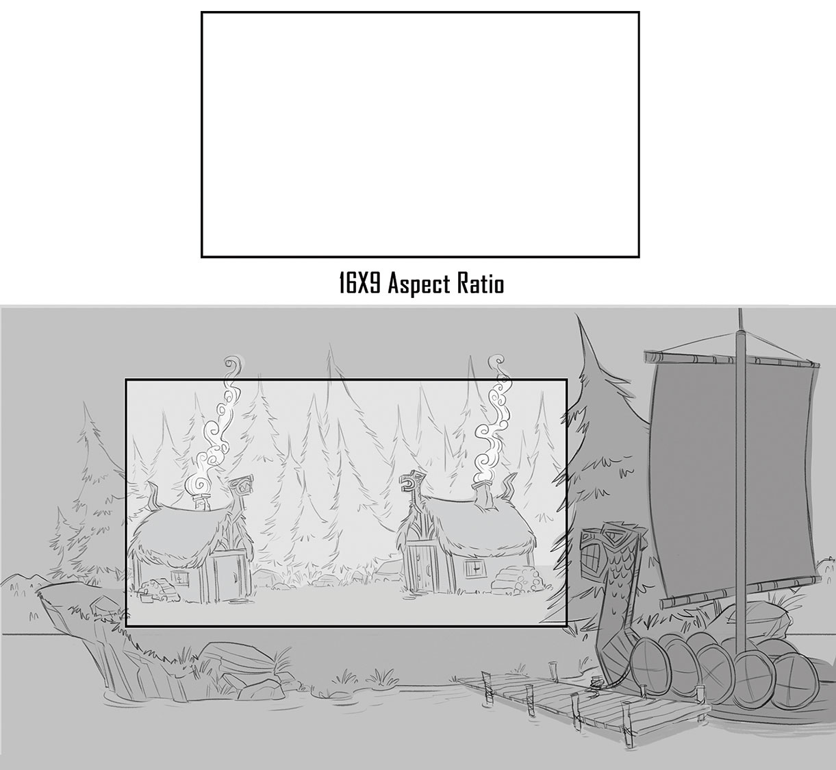
Tied with the concept of point of view (see tip 10), the frame is the lens or window we use to tell the story. The frame can move and elements can move into and out of the frame. In the example here, the frame is defined by a 16:9 aspect ratio, meaning the width of the frame is about 1.78 times that of the height of the frame. This 1,080p aspect ratio is the standard for American television. Be aware that theatrical distribution uses different standards, as do broadcasters in other countries.
09. Sketch thumbnails for a simple panel
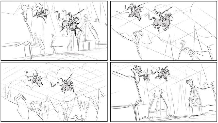
Thumbnails are meant to be drawn quickly and should be small in size. I use them to begin exploring solutions for telling the story. I then select the thumbnail that best communicates the story point. In this example, I explored four possible solutions.
10. Establish the point of view with the horizon line/eye line
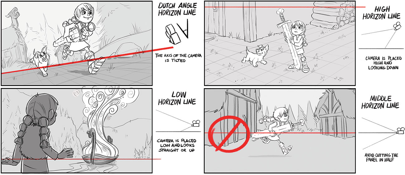
Within your rough thumbnails, consider the horizon line. This is determined by camera placement, dictates the point of view and is the first line I draw when beginning a panel. With a high horizon line, the audience will look down, while an extreme low horizon forces the audience to look up at the scene. A variety of camera angles ought to be considered, but the decision should always be dictated by the needs of the story. Low horizon lines are often preferred because they're consistent with how we experience the world, enable clearer staging (clean silhouettes), show depth (you can see for miles) and require fewer perspective challenges, for example.
11. Use grids to help with object placement
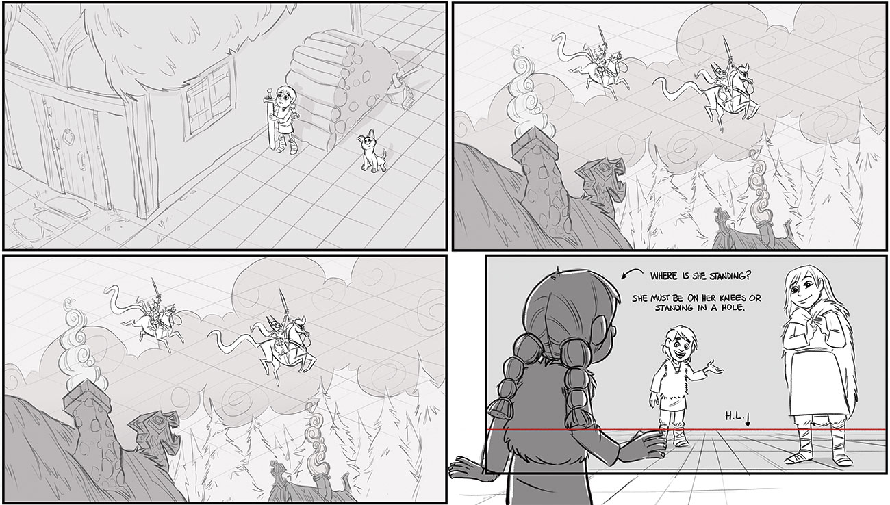
I draw a grid to show the ground, sky plane or even a wall. This helps me draw the scene in a solid, convincing way. When an element within the scene bisects the horizon line, everything in the scene will bisect the horizon line at the same relative height. Knowing this makes placement of elements within the scene easy. Be certain that your characters all fit within the world you've created. Too often, characters in the foreground would have to dig a hole to fit in the scene! Use overlap and line weight variation to communicate objects are further away.
Read more about grid theory here.
12. Create rough storyboard panel
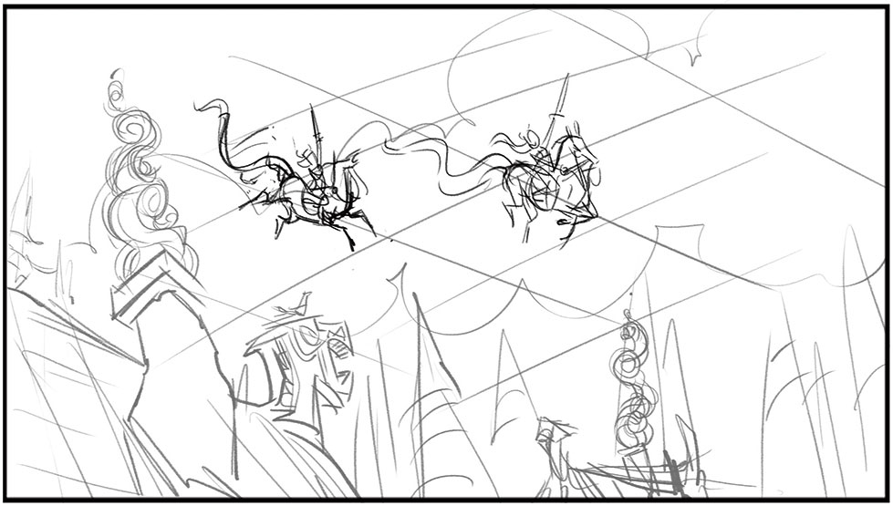
Once you've thought about all these elements, next comes the rough panel – I blow the selected thumbnail up to the size of the finished panel. At this stage I resolve perspective, structure and refine the posing of the character. The rough panel is reviewed by the director, storyboard supervisor or executive producer.
13. Clean up the storyboard
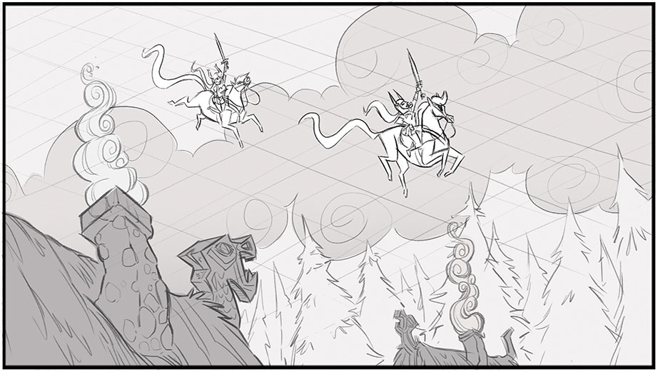
Any change requests from the review are sorted in the cleanup. The final line should delineate forms and idea, but also maintain the life of the character. Tone may be added. Some productions require tight 'on model' drawings; others like looser, more energetic drawings.
14. Ensure continuity
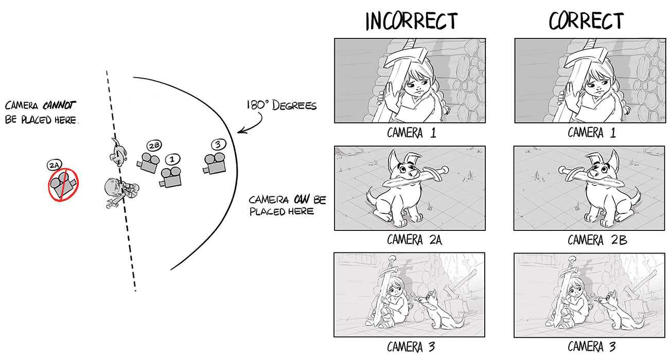
Continuity is a word used often to refer to screen direction, although its meaning extends beyond that. Maintaining continuity is ensuring the geography of the space and characters is kept clear from shot to shot. Screen direction, or the 180 Degree Rule, is an important filmmaking principle and a fundamental aspect of continuity. We're translating a 3D world into a 2D experience on the screen. Once a character is established as moving left to right or right to left, keep that direction of movement while the character is onscreen.
15. Consider film time and editing
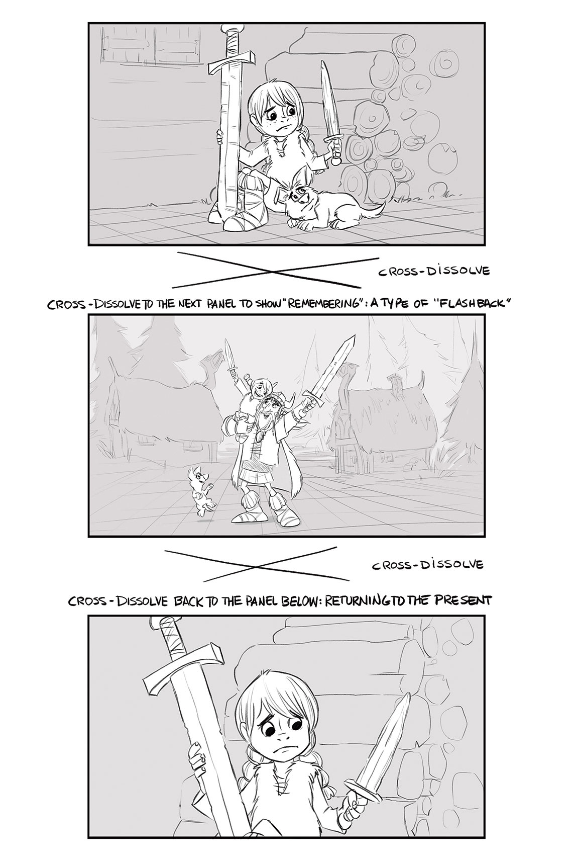
Scenes/shots are designed to work in sequence. We extend, compress and reorder time to best suit our story. Shot size and design should be varied as we transition from one shot to another. Film has a language. We learn to 'hear' this language, but often don't know how to use it to tell a story. Study great films. Thumbnail out the scene cuts and then assess what the filmmaker was doing when making choices, such as camera placement, character movement within the scene, sequencing of shots, time allocated to scenes and so on.
16. Compose for movement
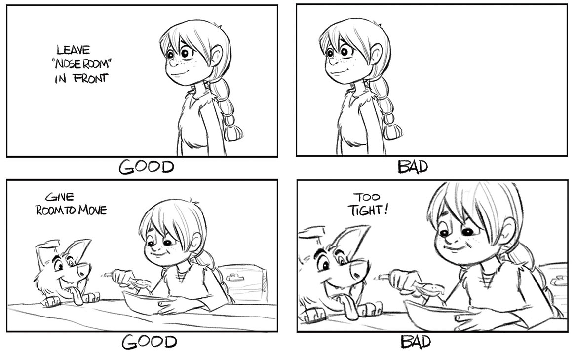
A scene/shot, comprising a series of panels, describes only seconds of time. Every idea must be clearly and simply presented. The focus of interest should be the only object of that size, shape and value within the scene. The Rule of Thirds can be useful in composing – avoid corners and edges of the frame. But remember that the world extends beyond the frame and the frame itself can move. And be sure to leave room for the characters to move around. They shouldn't feel 'squeezed' into a panel.
17. Think about animation layout
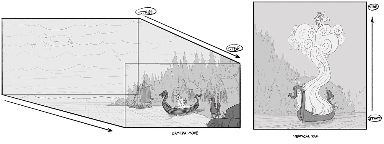
Animation layout refers to the mechanics of how an animation camera works. The illusion of a dimensional, moving camera is created by designing artwork that will slide past the camera. Layers of art are designed and synchronised to create an illusion of depth. Toon Boom Storyboard Pro has an excellent Camera tool that makes it easy to plan out camera moves.
This article was originally published in issue 165 of ImagineFX, the world's best-selling magazine for digital artists. Subscribe to ImagineFX here.
Related articles:

Thank you for reading 5 articles this month* Join now for unlimited access
Enjoy your first month for just £1 / $1 / €1
*Read 5 free articles per month without a subscription

Join now for unlimited access
Try first month for just £1 / $1 / €1
Get the Creative Bloq Newsletter
Daily design news, reviews, how-tos and more, as picked by the editors.
