Performance UX: A primer
Everything you need to know in order to put performance at the heart of your UX strategy.

Performance UX is a perfect solution for those of you who work on websites that are already live. The aim of this article is to provide an introduction to performance UX and help you understand its three core pillars. I’ll delve into a bit of history and let you know where the need for performance UX initially came from and how it can get clients bought into (and understanding) UX. Lastly, I’ll show you how to produce three performance UX tactical deliverables to help map your ongoing strategy.
UX (within service delivery) has been at the heart of the most successful customer-centric businesses for many years. A decade or so ago the market started taking UX seriously and the results have been exceptional, with new web design tools popping up all over the place to help measure and implement UX strategies (a decent web hosting service will give you analytics on this, too). A study from pointsource.com found that for every $2 spent on UX-related activities, $2 to $100 was yielded in return.
Right here, right now, it really doesn’t feel like those of us with a UX cap need to be backwards in coming forwards with new thinking and innovative ways of improving the experience of our clients and our clients’ customers. The digital market figures support UX as a viable solution to achieve ROI. UX has become a bread and butter service offering for agencies..
So being a UX practitioner is brilliant and all of our clients think we’re some kind of digital Dalai Lama, right? No. It certainly wasn’t this way for me, not for a long time. Feeling overwhelmed with how to best build your site? A top website builder will streamline the process.
What is performance UX?
UX, for me, isn’t something that ever finishes. It is an ongoing process, not a one-off project that has a start and end date. Within an agency, this thinking fits very nicely into a recurring (month-on-month) services model. I had long been an advocate of lean UX – it’s really the most appropriate means of delivery in a fast-paced, multi-client agency environment.
My whole digital product approach was already based on iterative cycles using agile sprints, which helps to keep progress moving forward. Lastly, the part of me obsessed with clean code and optimising for search marketing needed to minimise bloat, keep things nice and streamlined as well as being future ready. Blending all these aspects together with UX tactics and strategy, it felt like I was on to something.
I put together an initial program of ongoing delivery that I called ‘User Experience Optimisation’. It flopped. The results were good but prospects (more often than not) simply didn’t understand it and didn’t take it on. A month or so passed with slow progress until a wise Texan took me to one side and suggested I changed the name to ‘Performance UX’. He theorised that businesses understood performance and already wanted help in making performance better.
He wasn’t wrong. The delivery program didn’t change at all. Just the name. Service growth immediately surged. So how can performance UX build on the already solid foundations established in the UX marketplace? To put it in simple terms, it just requires a slight tweak to the perspective.
The three pillars of performance UX
When talking about UX, we can sometimes shy away from talking about cold hard cash. In my experience, the client wants to know what UX means in terms of ROI or how long the UX project will take before they see results on their bottom line. Sometimes this can be impossible to quantify until the actual work starts.
We need to move the conversation away from money and instead focus on performance, namely: technical, experiential and commercial performance. The three pillars of performance UX. These are tangible areas with the ability to benchmark and demonstrate progress.
Technical performance
This is all about clearing impediments and enabling your digital product to be the best it can be. You could have the best looking website on the market but if it’s slow or not utilising the latest technologies, it wouldn’t take much for it to be quickly left behind.
Experiential performance
This means understanding who your users are, what you want them to do on your site and being able to diagnose what they are actually doing.
Commercial performance
The final pillar requires you to become your client and understand their needs and the needs of the business. Knowing what each conversion, sale or interaction means to your client will help you prioritise your work and ensure you’re reporting on what’s important to them
By separating the process into three core areas, you are helping the client understand that improving digital experience can be tangible – but these areas must work together to achieve the best results.
Who can do performance UX?
I’ve found that the best UX professionals I’ve met have a varied skillset – it’s almost a given if you’ve worked in UX for any length of time. The majority started in different areas and moved into user experience later in life. This varied experience makes an ideal performance UX campaign delivery manager.
Performance UX works best when you can cover – by yourself or with a team – design, strategy, data analysis, code, project management and most importantly, excellent communication.
How to run a performance UX sprint
Your first performance UX sprint is about understanding and benchmarking. Understanding your client should be the first step with every new digital campaign – but that doesn’t mean it should be underrated.
Hold a kick-off meeting with your client and conduct a stakeholder interview. You’ll need to interview whoever will be evaluating your work and, if you can, whoever evaluates their work. You need to learn about their business, what’s important to them and what they expect from you (this works whether you’re in-house or from an agency). These interviews are integral when it comes time to plan your strategic UX roadmap later.
For those unaware, a sprint is a measure of time, and a key part of the Agile development methodology (read more about Sprints here). You set a list of tasks you believe you can achieve in your sprint and then report to your client at the end. In this example, my client has four days a month of performance UX. In this first sprint, I’ll spread two days’ worth of time over two weeks.
As a recurring service this means we have at least three client touch points each month. One at the start of the first sprint, one at the end of the first (and start of the second) and one at the end of the second sprint.
In this sprint we’ll deliver a technical diagnostics audit, experiential journey analysis and commercial goal review to our client. These documents will form the backlog for ongoing performance UX work – so keep them safe in secure cloud storage.
The technical diagnostics audit
Technical performance essentially boils down to speed. How quickly can the user find the site (in search)? How fast is your digital product in giving the user what they want? And how accessible is it? Although speed has been used in search ranking for some time, it was focused on desktop searches. This year, Google announced page speed will be a ranking factor for mobile searches. This now makes technical website performance more important than ever.
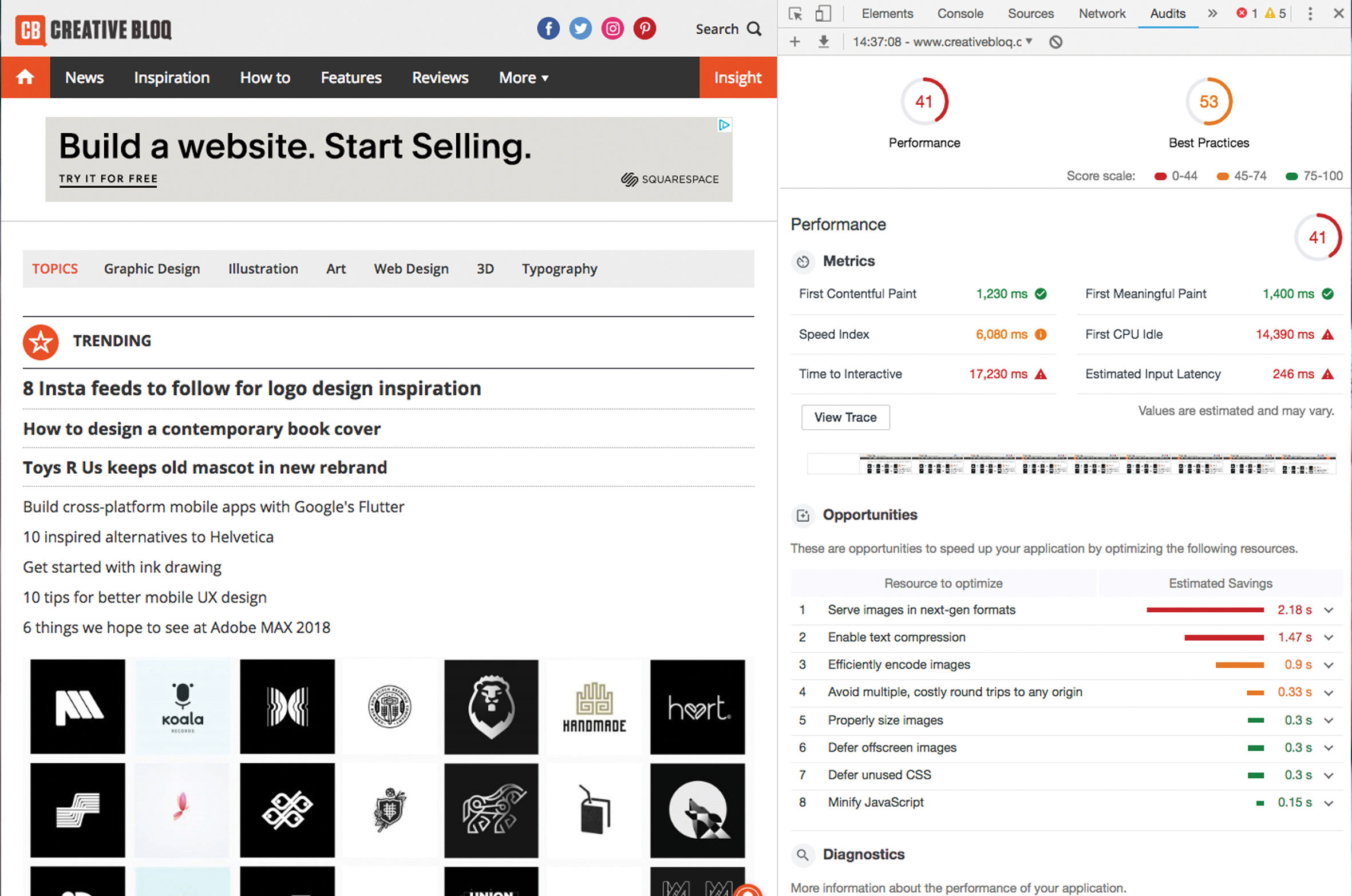
In order to diagnose the current state of technical performance, we need to gather benchmark data. We’ll use three sources of data that are all free. You’ll want to run your client’s site through: PageSpeed Insights, GTmetrix and Lighthouse. For the latter you’ll want to run all reports except the Progressive Web App one.

To compile your findings, you should provide an executive summary of why you are conducting the audit (benchmarking) and show the scores from the three sources up front. You should ideally explain to the client what each source looks at and why you chose it.
For the rest of the audit, compile the recommendations from the three tools into chapters with numbered lists of recommendations. Your chapters should be: basic site setup, speed and performance, accessibility and SEO. The chapters form themes you can use in the coming months and the numbers will enable you and the client to refer to line items during discussions. All of these elements directly affect the user and being able to talk about them is absolutely essential to being a user advocate to your client.
Experiential journey analysis
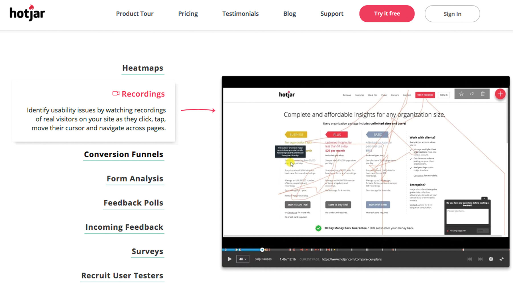
In order to show how we’ve improved the experience for the user, we record how users are currently using the site. We’ll do this using two industry-standard UX testing tools: Hotjar and Google Analytics. Sign up for Hotjar and get the tracking on your client’s site as soon as possible, ideally before this sprint starts. Once the code is installed, log in to Hotjar and activate Recordings – on the free plan you’ll get 100 sessions, which is more than enough. Make sure you select sessions that include clicking and scrolling and that you ensure it’s only recording sessions of over 30 seconds.

Once you’ve amassed a good few sessions, sort by the #pages column (high to low) and review what’s been recorded. You should take notes about the way users navigate through the site and the sequence of pages they take. 10 to 20 videos of three or more pages should give you a good feel of how users are moving through their journey. You should document these journeys, pulling out any information of note (users ignoring CTAs, not using the menu you thought they would, using the site search, etc).
Next, within your client’s Google Analytics, navigate to the Behaviour > Site content > All pages table. Set the date range for the last three months and make sure you’re sorting by page views. What we’re going to do now is show our client how users move through the site most of the time.
Take the top 10 pages for page views. For each of these click on their URL in the table. This takes you to the page level screen and the graph will only show visits for that one page. Click on the tab that says Navigation Summary, found above the graph in the top-left corner – it’s next to the one already selected that says Explorer.
This navigation summary screen shows you which page users were on before the page you selected and usefully, where it was that they went afterwards. You should record this data for each of your client’s top-performing pages (10 is a good number to start with).
Collate these findings in a document for your client and be sure to include a section where you note down anything of interest. You will refer to this document a lot in the coming months when justifying hypotheses or demonstrating journey improvements, for example ‘this page used to account for four per cent of visits to the demo sign up; my work on improving messaging/layout has increased this to 8 per cent’.
Commercial goal review
This task is exactly what it sounds like and can be somewhat painful for some less technical clients. The point of this exercise is to establish trust and to also let the client know you understand what is important to them.
Review your stakeholder interviews and distil what is important for your client to measure success. Is it product sales? Brochure downloads? Phone calls? Armed with this information, you should log into your client’s Google Analytics and review their goal tracking (Admin > Goals). Note down which goals relate to what and, more importantly, note any missing goals you will need to add. Next arrange a call or meeting with your client (this is important – an email won’t do) and run through each goal. Once you’ve established what each goal does and if any need replacing or amending, suggest any new goals you need to add.
For ease you should document what each goal is recording (in simple terms) for your client and then record the goals you mean to add on their behalf. It’s at this point I’d recommend learning how to deal with regular expressions (RegEx), which will help no end in dealing with complex goal tracking; regular expressions 101 is an excellent debugging tool once you’re up to speed.
How to review your progress
With your first sprint at an end, you now have three valuable documents ready to present to your client. It’s important to get these right, because these documents will form the basis of how you plan your next three, six or 12 months. Ideally, the whole of the second sprint will be used to produce your performance UX strategy. After the work you’ve already put in, the client will understand the importance of getting this right.
Within your strategy document you should record what is important to the client in terms of key metrics. You should then detail, month-on-month, how you will work towards measurable progress. Always justify your tactics using technical, experiential or commercial performance reasoning.
Performance UX is unique in that you get to be an advocate for the user and for your client
For example, instead of saying ‘I need to do some card sorting to make the navigation easier to understand’, try ‘our experiential user journey research showed a disconnect in the labelling used on the current navigation – card sorting would allow us to find a better solution’. Ideally you should have a way of showing how your work is influencing the benchmarks you have recorded. I’d recommend a tool like Power BI or Google’s Data Studio to make an dashboard with all the metrics updating in real time.
How you produce your strategy is ultimately down to you but I would strongly advise a varied strategy. Cover all three pillars whenever possible. Commercial is where users end up, experiential is how they get there and technical is what’s stopping them on their journey. Too much technical work and you will lose your client’s interest, too much experiential work and they might start to question value and too much commercial work just becomes conversion rate optimisation.
Performance UX is unique in that you get to be an advocate for the user and for your client. You job is to be an old-fashioned ‘middle man (or woman)’ and make it as easy as possible for both parties to get what they want. So get out there and start greasing those wheels.
Performance UX resources
The elements that make up performance UX are nothing new and there are already some fantastic books out there that make excellent reading for anyone wanting to start working with performance in mind.

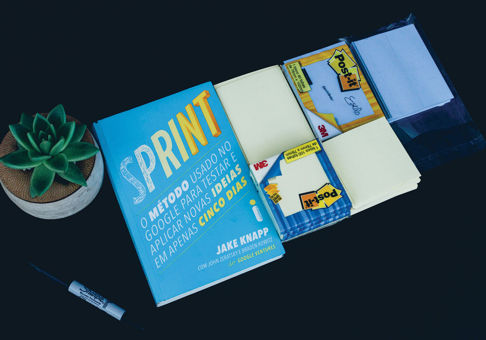
Sprint
Jake Knapp's book is all about solving problems and testing ideas in a five-day sprint. I found this book especially useful for moving ideas through a team setting.
Designing for Performance
If there was a book on web design I wish I’d written, it would be this one by Lara Callender Hogan. The knowledge contained will help you understand and dominate technical website performance.
Product Design
A neat little field guide from David Pasztor on the product design process. Touching on things like; journey flows, A/B testing and onboarding, it’s a good tool to brush up on some more general skills if you’re missing them.
Lean UX
The experiential performance element of performance UX owes a lot to lean UX processes. Rather than focusing on deliverables, this book by Jeff Gothelf and Josh Seidenwill show you how to directly affect the experience itself.
Design is a Job
Working in a recurring model means you need to manage your client properly. Make sure you understand what they need from you and be confident in leading them. This book by Mike Monteiro may just straighten your spine.
This article was originally published in net, the world's best-selling magazine for web designers and developers. Buy issue 313 or subscribe.
Read more:

Thank you for reading 5 articles this month* Join now for unlimited access
Enjoy your first month for just £1 / $1 / €1
*Read 5 free articles per month without a subscription

Join now for unlimited access
Try first month for just £1 / $1 / €1
Get the Creative Bloq Newsletter
Daily design news, reviews, how-tos and more, as picked by the editors.
