Painting shattered glass: 3 top tips
Improve your paintings of broken glass with these top artistic tips.

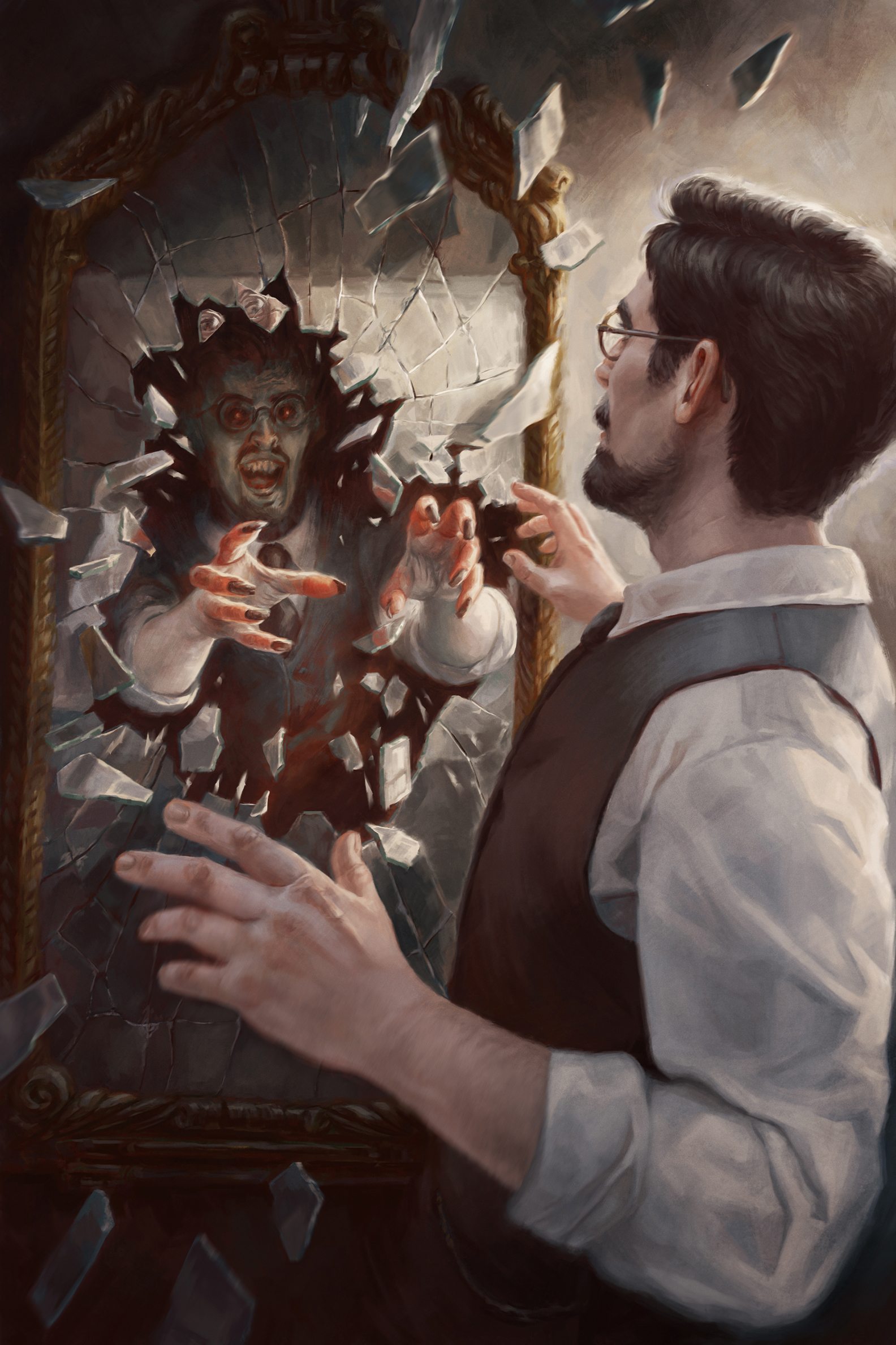
Creating an image with a mirror shattering can be challenging on several fronts. The main elements to consider are establishing light sources and angles of the shards for the reflections to make a believable broken mirror, and creating motion and action in the scene that doesn’t overwhelm the focal point: our sinister reflection and the reaction to its attack.
After developing a thumbnail that communicates the story within the frame, I take some photo reference in front of a mirror to get a better idea of how the light and reflections will work and get a sense of photorealism. Reference and thumbnail in hand, I start working up a value sketch in Photoshop with some additional planning help from SketchBook Pro for creating a symmetrical outline of the mirror design to lay into the scene.
With a value sketch complete, I apply some base colours and begin rendering. As I render to final, I keep a close eye on edges that begin to distract from the focal point of the scene. I use a soft Blender brush on edges that draw attention to knock them back, as well as motion blurs and radial blurs on shards of glass to give them momentum while softening them from focus.
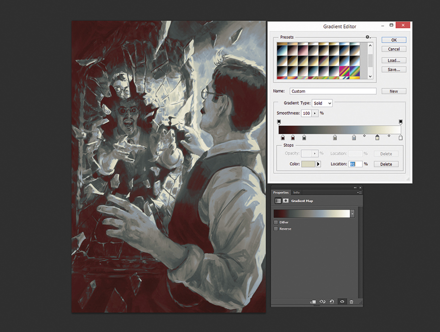
01. Foundation sketch

Creating an initial sketch using values is a great way to begin your piece, but you can run the risk of introducing too much muddy black if you use it as a base unaltered. I like to play with gradient maps on my value sketches to introduce colour into the shadows, and create colour schemes I may not have thought of initially.
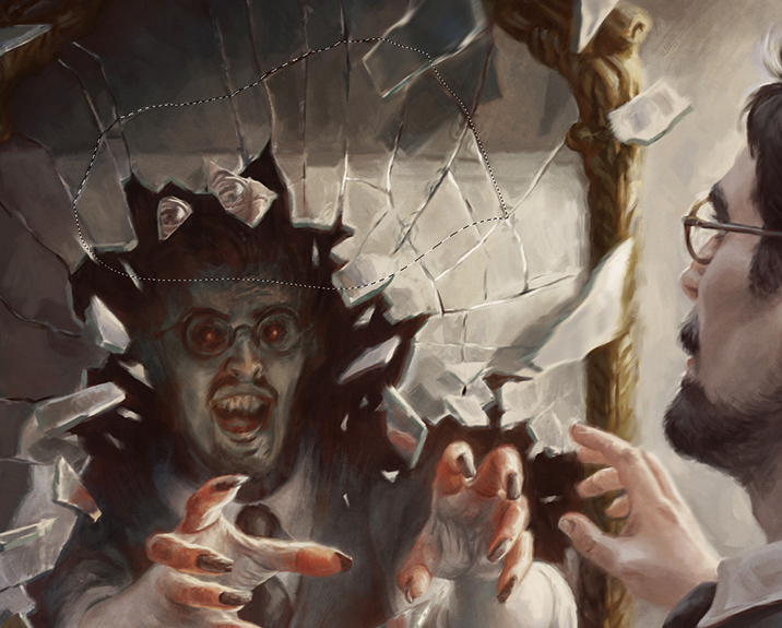
02. Creating jagged glass

When tackling the broken glass of the mirror, I make use of the Lasso tool to create guides for the sharp cuts in the glass. I alternate between dark and light lines to show the catch of the light in the seams. I make sure to add a level of thickness to the glass edges, so the broken pieces can read as flipping through space.
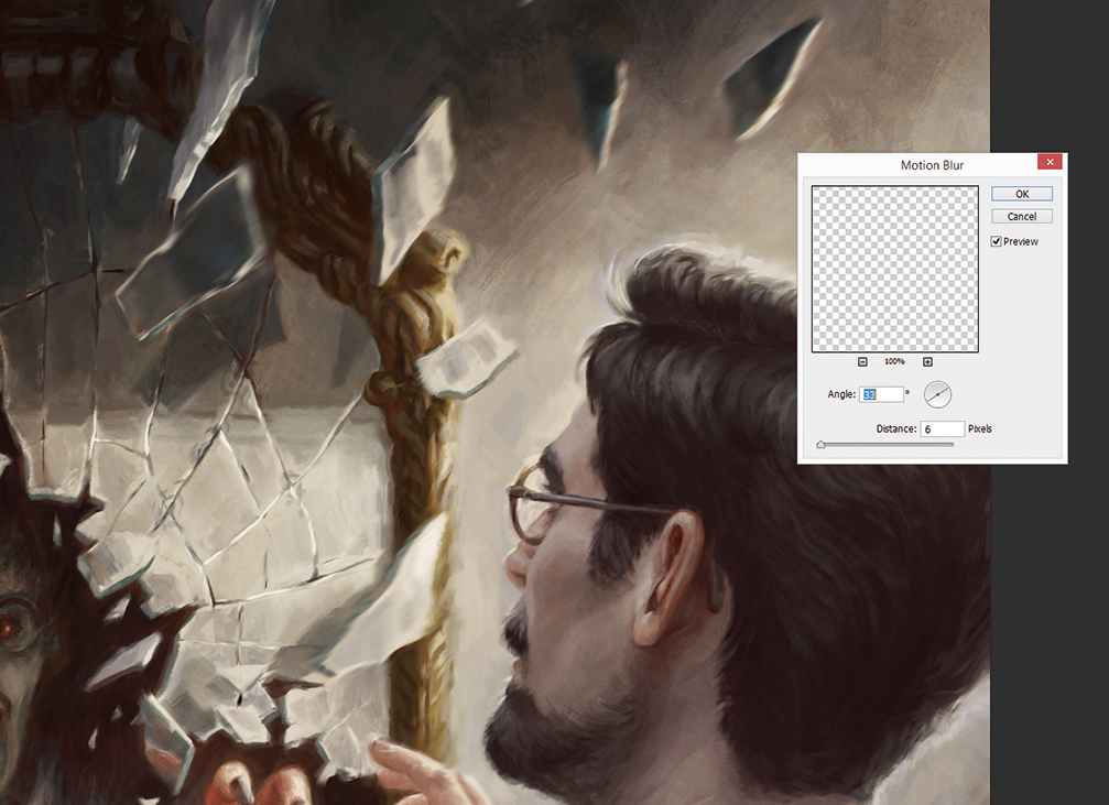
03. Adding movement

Broken glass flying from the mirror can give some compelling action to the scene, but has the potential of distracting from the main focus of the image. I use motion blurs on some of the shards to imply a direction of force as well as to soften them up, leaving harder edges for areas closer to the focal point.
This article was originally published in ImagineFX magazine issue 137. Buy it here.

Thank you for reading 5 articles this month* Join now for unlimited access
Enjoy your first month for just £1 / $1 / €1
*Read 5 free articles per month without a subscription

Join now for unlimited access
Try first month for just £1 / $1 / €1
Get the Creative Bloq Newsletter
Daily design news, reviews, how-tos and more, as picked by the editors.
