Mix more realistic-looking colours
Experiment with complementary shades for more accurate colour mixing.
The most important lesson you can learn about how to accurately mix colour is the relationship that complementary colours have with each other. No matter what medium you use, from coloured pencils through to oil paints, being able to understand the effect these colour combinations have on each other is crucial to understanding colour mixing.
When mixing colour, begin by choosing a tube colour that's closest to the shade you're trying to emulate in paint. Next, look at your subject's tone to decide whether you need to make the tube colour darker or lighter.
- Oil paints in complementary colours
- Paint palette
Then look at the saturation of the colour you're attempting to mix. You can't make the colour straight out of the tube any more vibrant, so most of the time you'll be desaturating the colour or greying it down. This is where the alchemy of complementary colours comes into its own.
Let's take two complementary colours from the colour wheel onto our palette, to experiment with what we can achieve when we put them together. Follow these steps to use complementary shades to mix colours accurately.
In need of more equipment? Try the best oil paint supplies and best art supplies roundups. And if you want a new canvas, these are the best oil paint canvas products available.
01. Lay down a pair of blobs
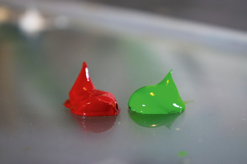
Grab two decent-sized dollops of complementary colours (make sure you choose from the best oil paints around). If you ever want your greens to look more green or your reds to look more red then put some of their complementary colour next to them to provide a striking contrast in your painting. The same goes for any of the other colours opposite one another on the colour wheel.
02. Mix a little dab
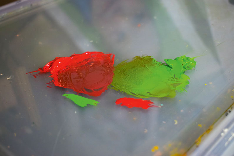
Start by mixing a little of the complementary colours in with each other to see the effect that they have on each other. Depending on what colours you're using, you'll need to judge how much to add. Some paints have higher tinting strengths, so a little dab will do. Notice how they take the punch out of each other, creating the 'greying down' effect.
03. Greying down
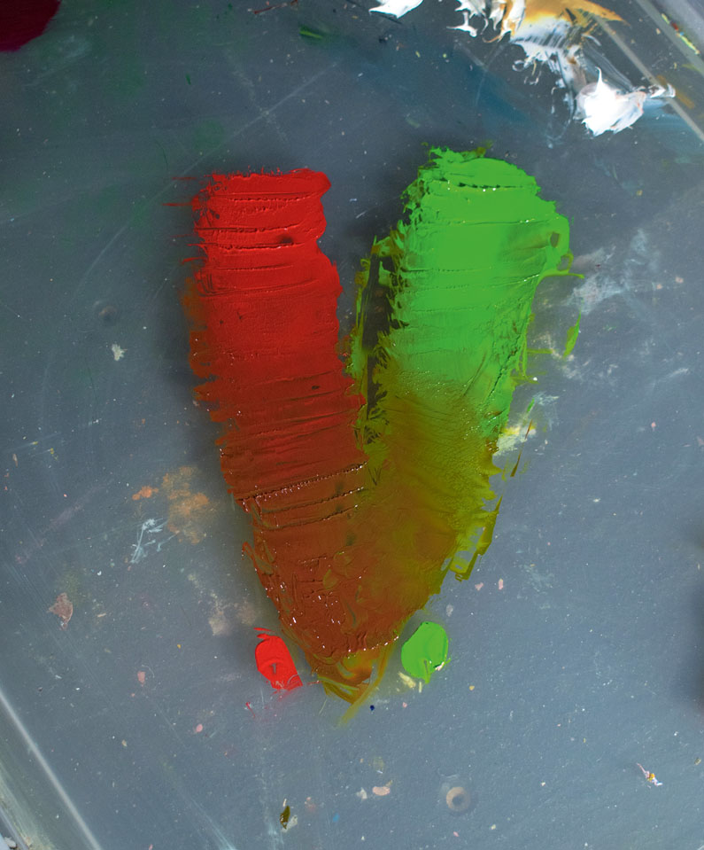
Taking this a step further, try greying down the red completely with the green until it becomes a 50/50 mix, then push on by adding green until it becomes the dominant colour. You can see the array of lovely rich reddish-browns and browny-greens available from just two colours. These mixes may be desaturated, but they're still packed full of colour.
04. Experiment
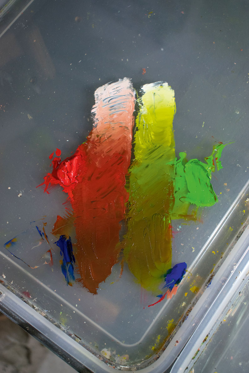
Now we've pushed the red all the way through to green, try adding some other colours to the mix! I've tinted the desaturated mixes with a little Titanium White so you can see the subtlety of the colours more easily. Taking the mixes to their shadow shades I've added a little blue (present in all shadows) and balanced this off with more of each complementary colour.
Related articles:
- Oil painting techniques: Elevate your oil painting
- Colour theory: Learn how to use colour
- Best paintbrushes for oils: Find the perfect brush

Thank you for reading 5 articles this month* Join now for unlimited access
Enjoy your first month for just £1 / $1 / €1
*Read 5 free articles per month without a subscription

Join now for unlimited access
Try first month for just £1 / $1 / €1
Get the Creative Bloq Newsletter
Daily design news, reviews, how-tos and more, as picked by the editors.

Rob Lunn is a self-taught painter, and loves to paint in oils. His influences are Vincent van Gogh, Caravaggio and Ilya Repin. He has taught art workshops since 2012 and gets a real buzz from teaching people to draw and paint. He has contributed to Paint & Draw magazine and bookazines, and has also provided traditional art tutorials for Creative Bloq.
- Georgia CogganEditor
