Get to grips with mobile app onboarding
Three great ways to introduce users to your mobile app.
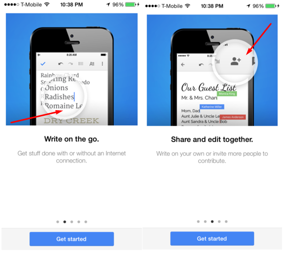
The function-orientated onboarding technique is pretty self-explanatory. Try your hand at it when your goal is to make it clear how to handle your app, show core functionality, and explain when users should rely on one or another function.
Here are some things to consider when employing function-oriented onboarding:
01. Explain one function per screen

As with benefits-oriented onboarding, strive to simplify the process and avoid an overload of information by explaining one function per screen, clearly and concisely.
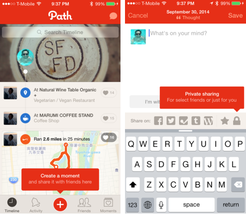
02. Try in-app hinting

Explain your app’s functions by using hints or button labels. However, avoid describing things that are crystal clear. Like the entire app, your onboarding should provide true value to users. It’s pointless to describe such obvious elements as toggles, back and forward arrows, or close and cancel buttons [x].
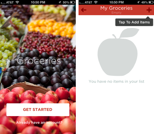
03. Help users get started

If your app welcomes users with an empty screen, it will likely cause confusion – they won’t understand how to start using it and may think there is a bug. That’s why it’s essential to include a note, such as 'tap to add items' to help them start.
04. Let users skip to registration
As mentioned in the previous technique, allow users to skip introduction screens and to register easily at any stage of onboarding.
Next page: Progressive onboarding for mobile apps

Thank you for reading 5 articles this month* Join now for unlimited access
Enjoy your first month for just £1 / $1 / €1
*Read 5 free articles per month without a subscription

Join now for unlimited access
Try first month for just £1 / $1 / €1
Current page: Function-oriented onboarding for mobile apps
Prev Page Benefits-oriented onboarding for mobile apps Next Page Progressive onboarding for mobile appsGet the Creative Bloq Newsletter
Daily design news, reviews, how-tos and more, as picked by the editors.
