Improve your architectural renders in 3ds Max
Follow these 4 pro tips to make your interiors shine.
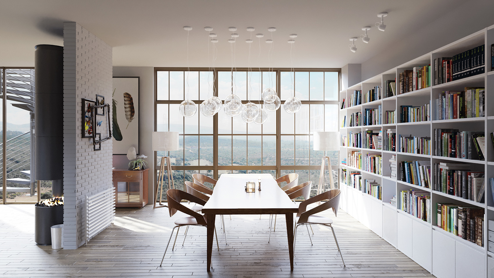
When I started doing architectural visualisations I used to go online and look at renders, and most of the time I was amazed and thought, how did they do that? I wanted to learn the techniques of those artists, but now many years have passed and I have come to realise that every artist has their own touch, their own magic and mostly their own way to express ‘reality’ in their renders.
Here I will talk you through four tips that I personally find very useful for achieving better architectural renders. Above you can see our final image. Let’s begin!
01. Focus on framing
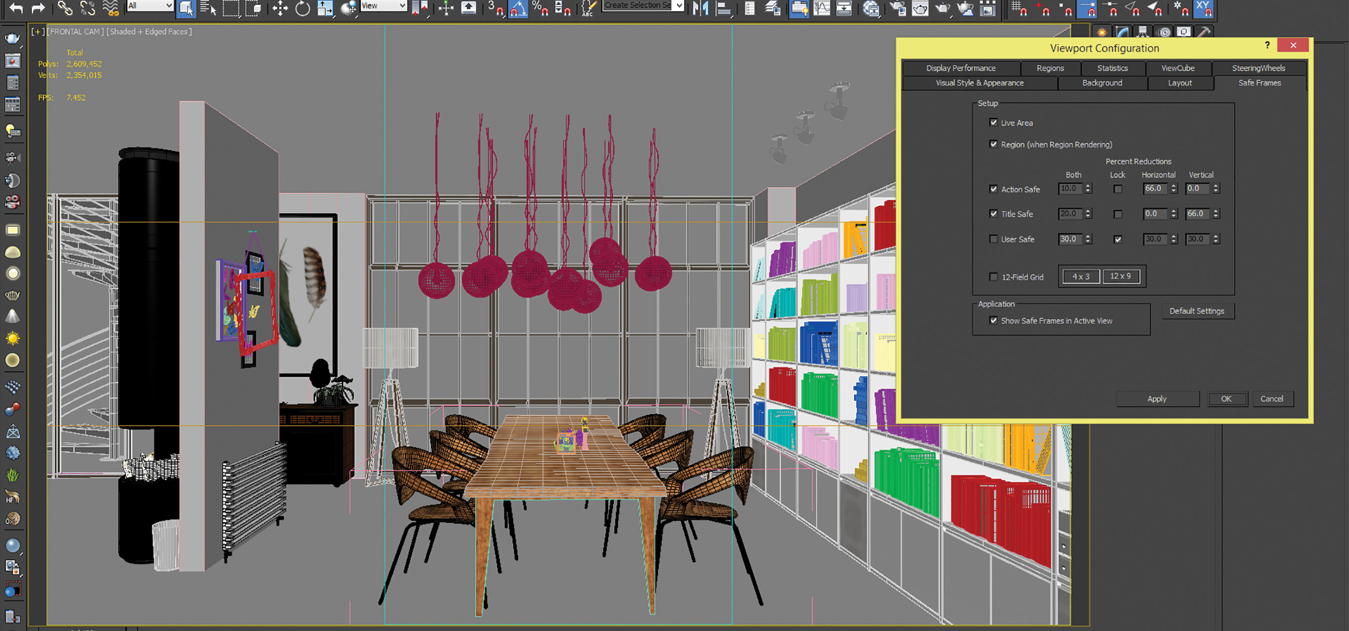
The first thing we have to consider is the format of the image. In this case I am doing an interior and I am interested in showing as much of the space as I can, but also making the space look bigger than it really is.
With my model ready I set the size of the image, in this case I set a 1.7 Image Aspect which is the one I use the most for interior scenes like this. Now it’s time to set the safe frames. I go to Viewport Configuration and in Safe Frames I set Action Safe to 66 in Horizontal and 0 in Vertical. For Title Safe I set 0 for Horizontal and 66 for Vertical. Activate Show Safe Frames in Active View, Apply and then OK.
Now we have a rule of thirds grid in our viewport. This grid enables me to see where I want to set the focus points: in this case I am aiming for the dinner table as the main target and I want to balance the weight of the left and right areas in the image.
02. Use shadows to create volume
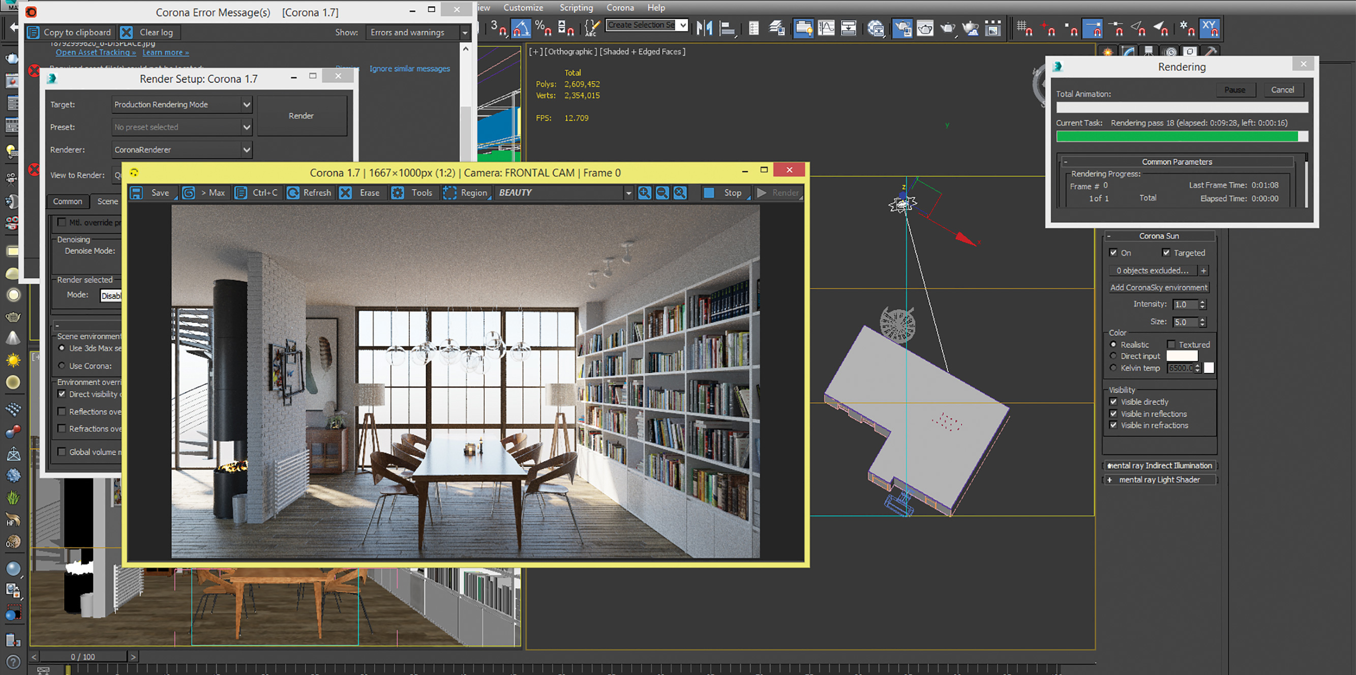
Lighting makes a huge difference in our scenes, and I like to do lots of tests before deciding on a final result. Most of the time I use a Corona Sun, as it’s faster than HDRI and I’ve developed my workflow with it.
Once I have the Corona Sun I like to activate the interactive render, because it allows me to see the effects of the sun. The most common mistake I used to do was setting my sun right in front of the windows – we can get nice shadows this way but if we look for references we will see that there are more subtle ways the light enters and lights the space.
In this case I decided to have light coming from the left windows so we could have a more immersive sensation, instead of only receiving light from the obvious front of the window. Always keep in mind that we need to be able to see volume in the image, no matter how subtle it is.
03. Play with the mood
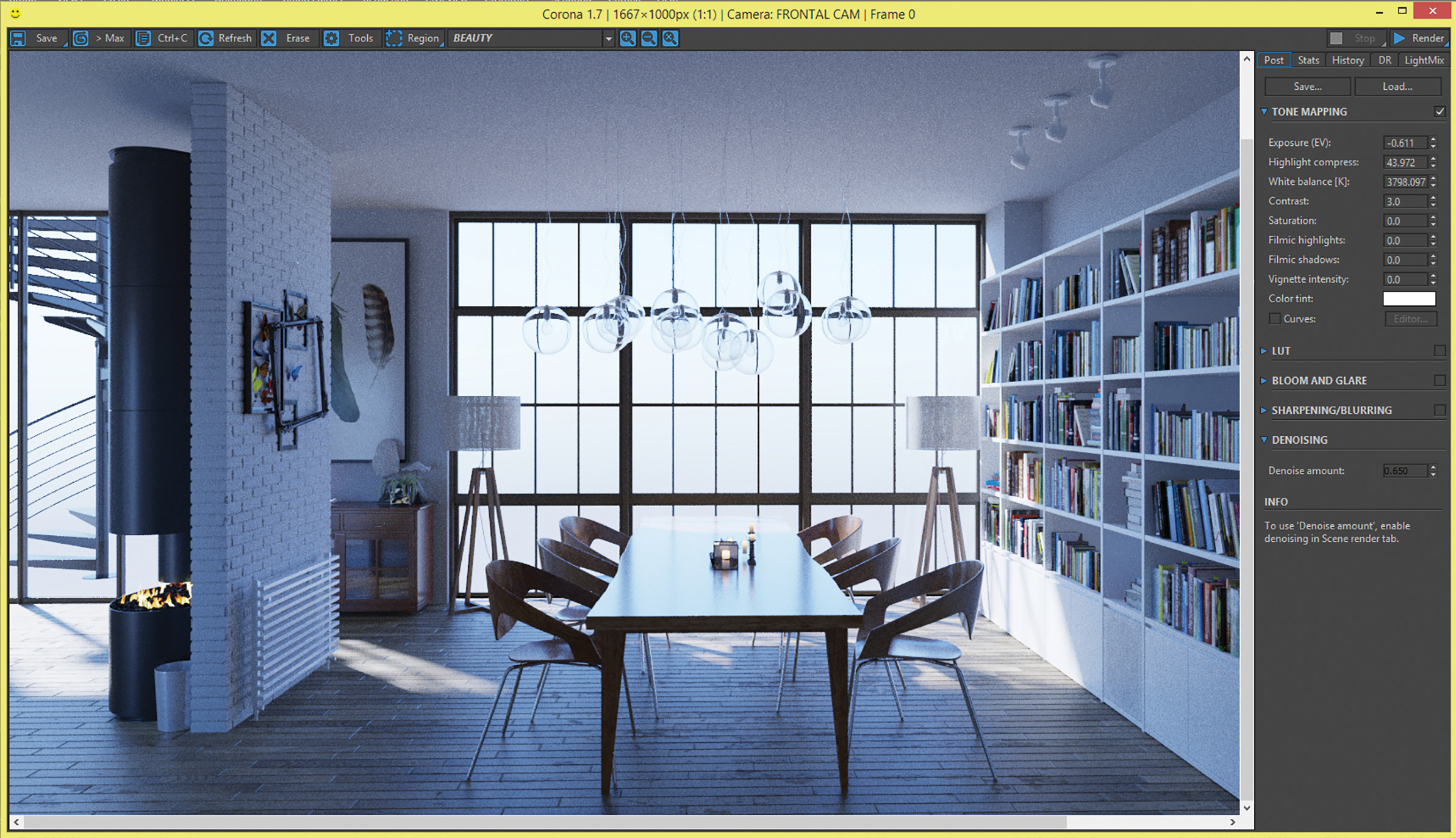
The natural light will be the only light coming into our scene, so if the light is not so hard we can consider it as a pre-dawn light setup. So what I do next is go to the white balance tool from the Corona buffer and change the values until I have a more warm look. Once I had achieved a pretty nice white balance I changed the exposure; we can lower the light as much as we want but always keep the function of the image in mind. Next it’s time to render the whole scene.
04. Add the right background
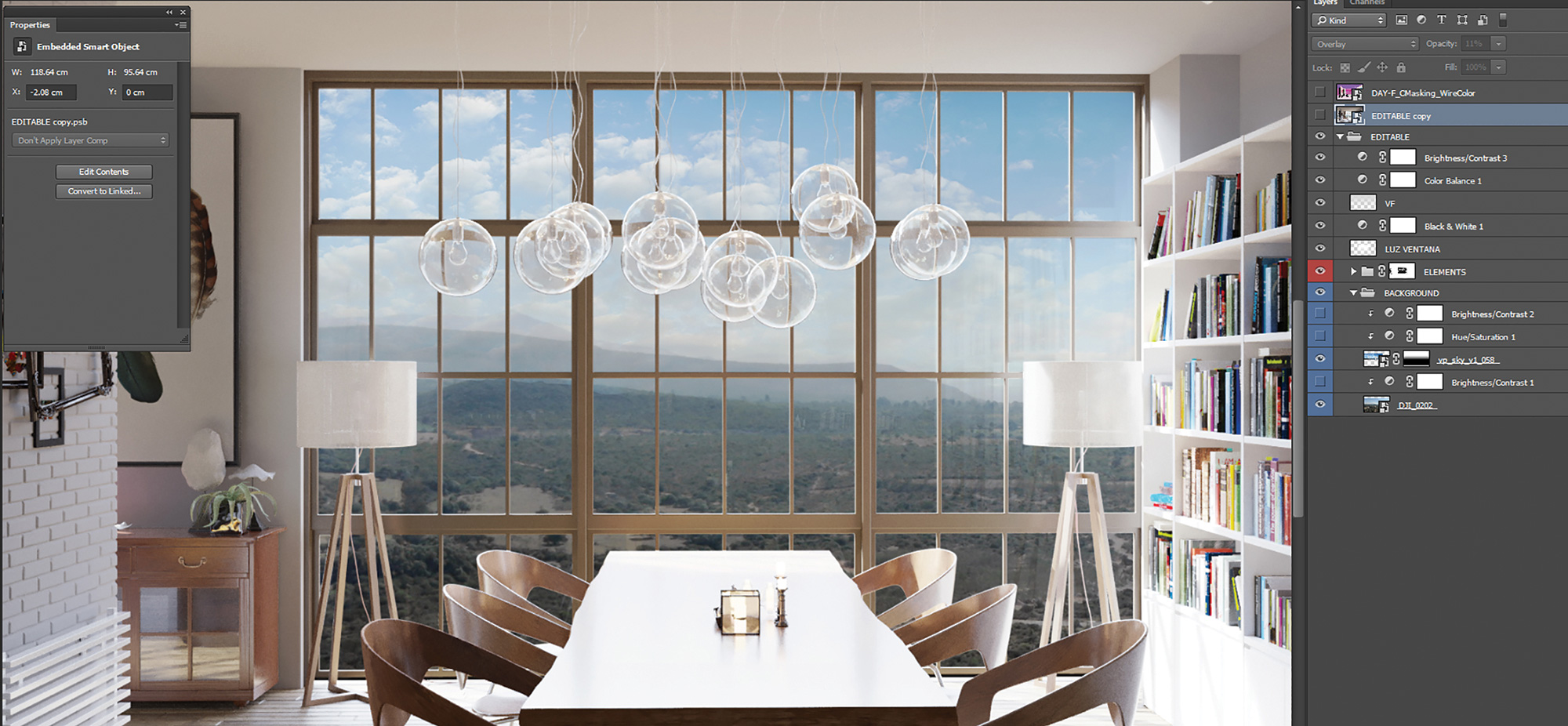
One of the elements that can ruin a good image is the background. What we have to consider is rendering the back in black. In Corona’s environmental overrides check the Direct Visibility override; we can render the back in black, which can be removed easily in Photoshop.
Once we have removed the background it’s time to add the scene we want as the back of our render. I have added a long field background, and here comes the most important thing: keep an eye on the image exposure. If we have a bright scene, the background exposure will be higher, so we will have a brighter image.
In this case we can use Photoshop’s Brightness and Contrast adjustments. The same needs to be done for each element we use to add detail to the background, for example clouds, mountains and so on.
This article was originally published in 3D World, the world's best-selling magazine for CG artists. Buy issue 243 or subscribe.
Read more:

Thank you for reading 5 articles this month* Join now for unlimited access
Enjoy your first month for just £1 / $1 / €1
*Read 5 free articles per month without a subscription

Join now for unlimited access
Try first month for just £1 / $1 / €1
Get the Creative Bloq Newsletter
Daily design news, reviews, how-tos and more, as picked by the editors.
