How to tell a story with your illustrations
15 top tips to creating expressive figures and settings.
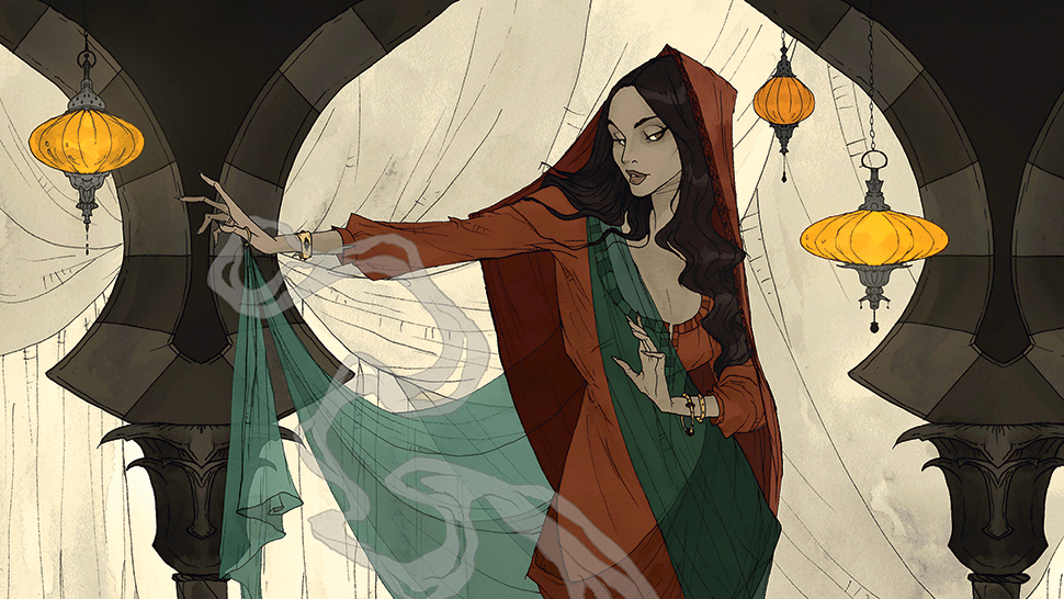
I didn’t always know I wanted to be an illustrator, but I did know from an early age that I loved telling stories with my drawings. I had a composition notebook that I filled with sketches of different characters, and I would write their stories in the margins of the page. I’ve worked with many wonderful clients on some incredible projects, and I’m happy to be able to share some of the tips that I’ve picked up over the years while working professionally.
Here, I’ll walk you through my process, and show you how to take a passion for character design and building to creating an exciting piece that tells that character’s story.
01. Decide on your story
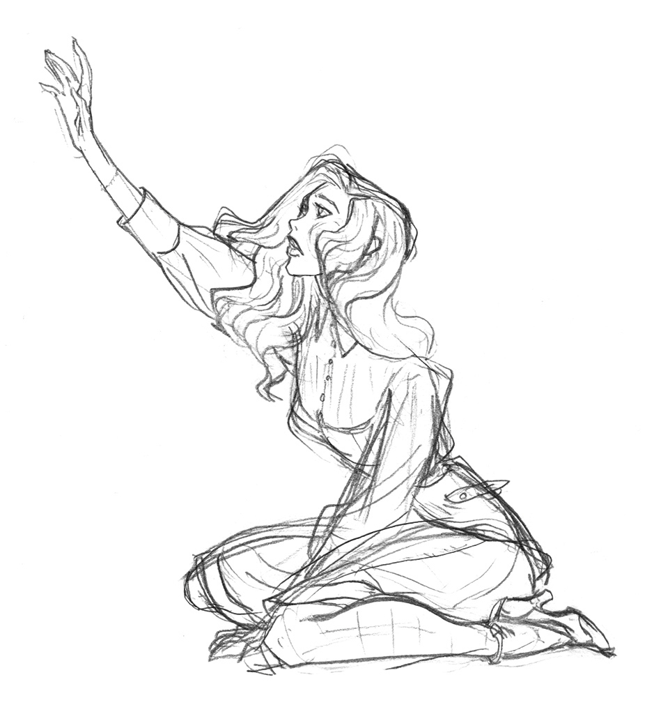
Illustration is a companion to a story. So while a story typically starts with a character, try to think about the tale you’re telling. What kind of setting will it have, what the mood should be, how expressive are the poses, and so on. Think about the situation you want to depict, and if you want, act it out and shoot some photos for reference to help you understand how people move naturally in various situations. Then sketch them out loosely. This is a great way to warm up for your final concept.
02. Create character poses
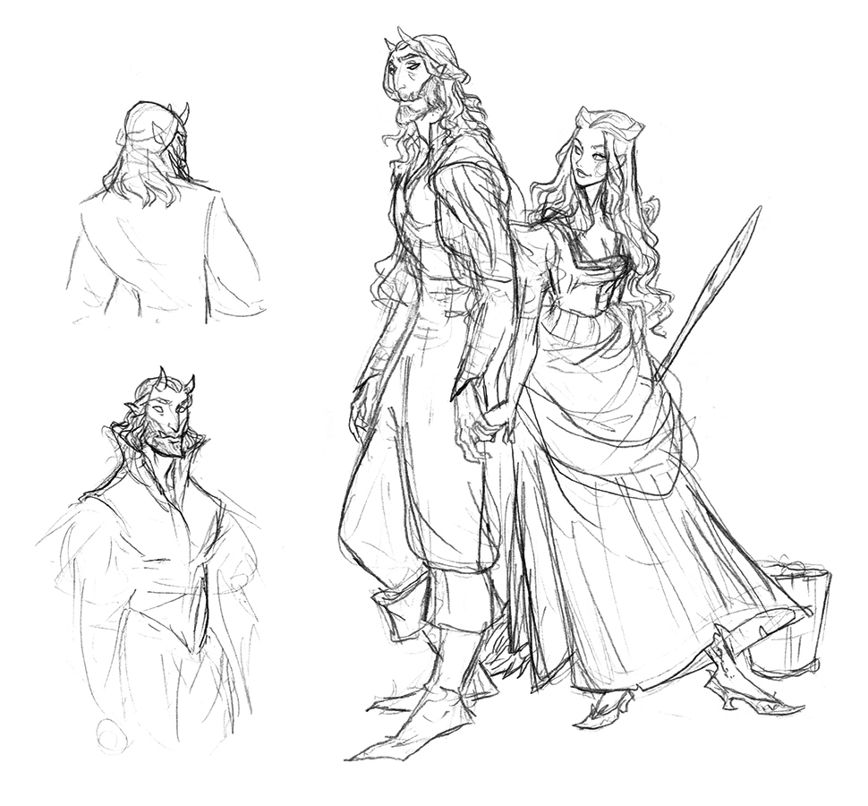
Get to know the subject of your art. If you’re going to be drawing them multiple times throughout, say, a picture book, get a few poses down on paper to look back on as reference when you’ll need to position the character in a certain setting for an illustration later on.
03. Keep sketches loose
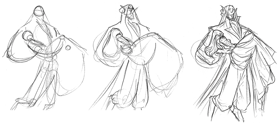
It’s tempting to jump right into your final sketch if you have a specific idea bubbling around in your head, but it’s still a good idea to produce some loose sketches first. These quick gestures will show right away if the pose and composition are right. As such, it’ll be easier to fix these issues in a loose drawing, rather than a final or detailed sketch. This is also a good time to play around with different features for your character, such as facial features, and their clothing and equipment.
04. Consider movement
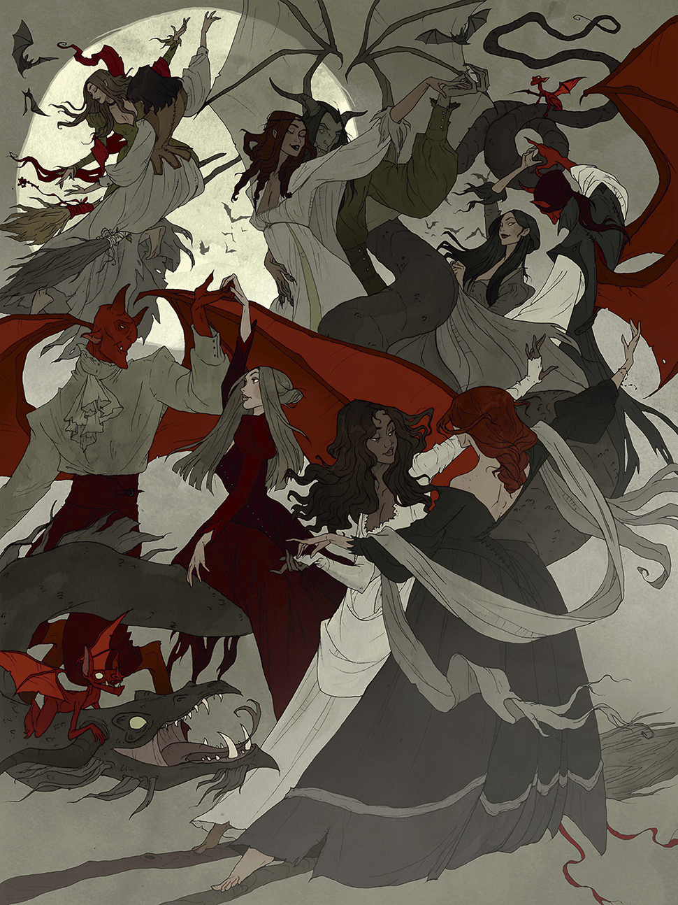
Having a sense of movement in your illustration helps their eyes move around the composition and explore what’s happening. Think about your characters in loose shapes while you’re planning your piece. How are they interacting with the rest of the scene and other characters? How do their postures change? Do their shoulders tilt? Is their back arched? Above all, are the subjects in harmony with each other?
05. Check your shapes
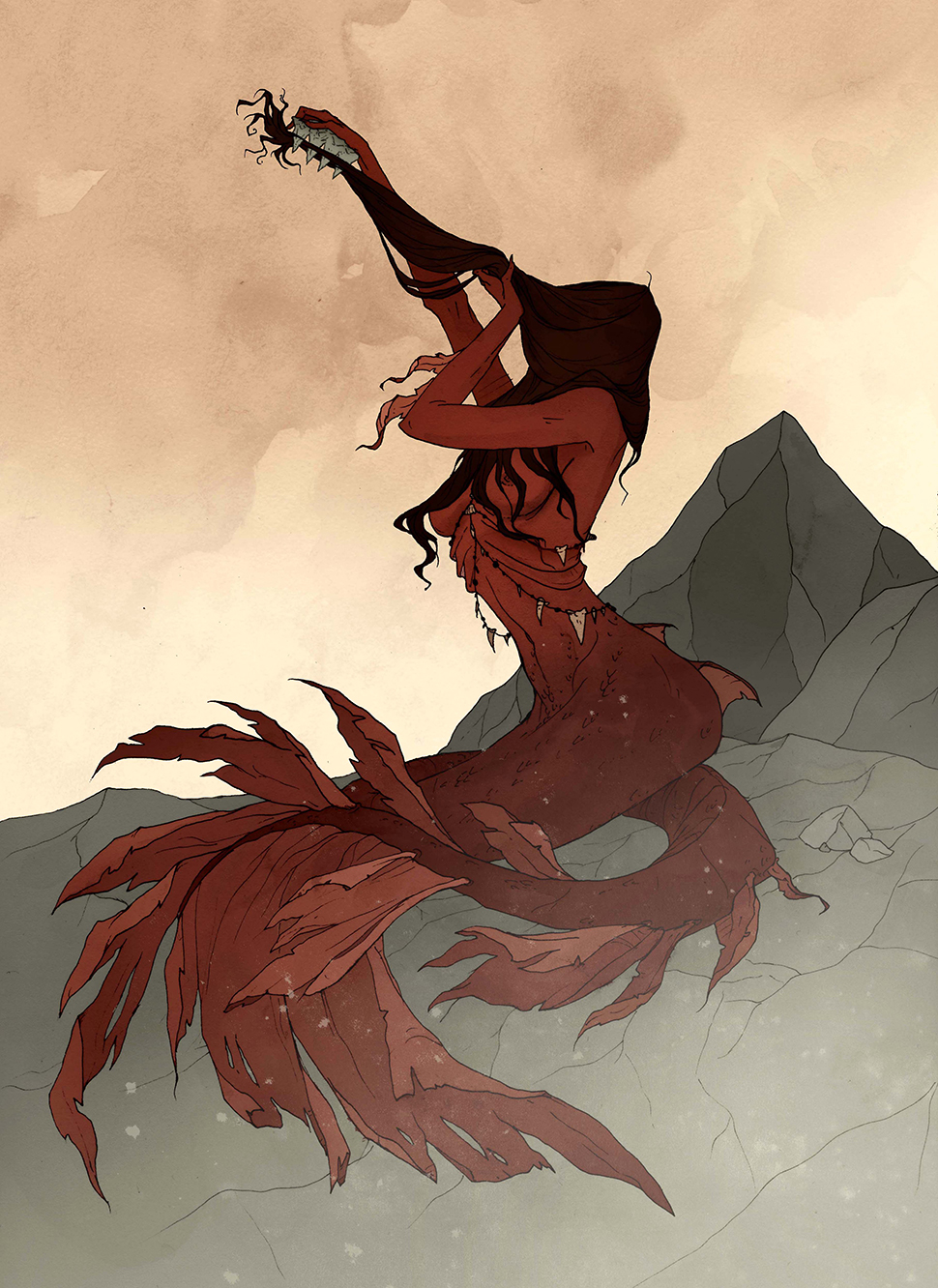
For tackling the form of your subject to convey a message to the viewer, think about the subject of your drawing in a silhouette. This helps you understand their shape in the composition, and you can see how you might want to position them in a way that describes the mood and story of the illustration.
06. Do warm-up studies
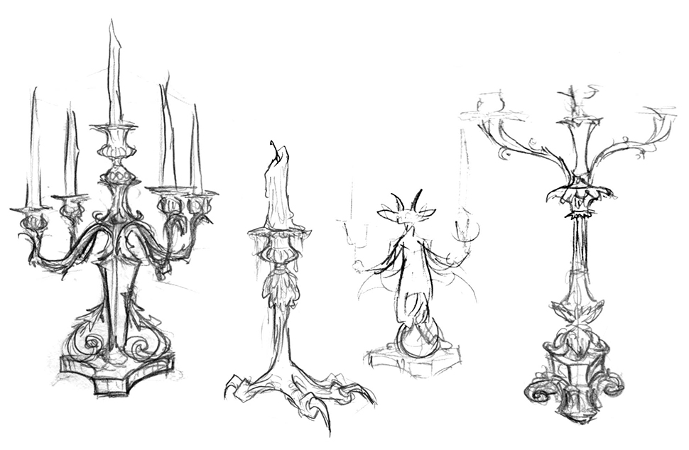
It’s helpful when mapping out your art to take some time to practise the focal points in your piece before going into the first sketch. I like to do studies of the objects I’ll want to add as details, and do some figure studies to warm up. This is also good practice even when you’re not planning a new piece, but simply want to keep in form.
07. Be expressive
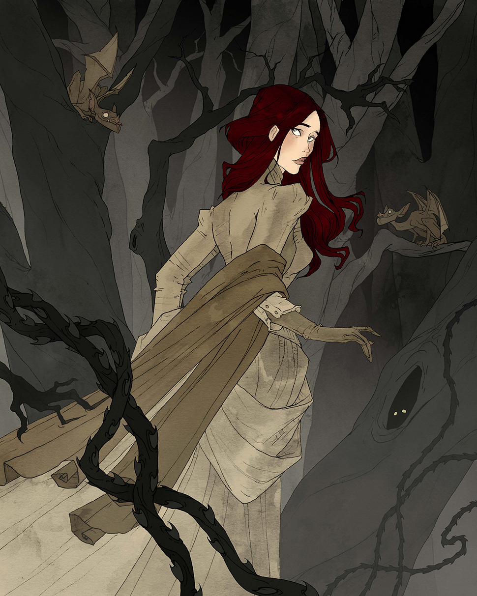
Your character’s expression isn't limited to their facial features. Expression can be found in their pose and movement, and interaction with their environment and other characters. Exaggerating features like wide eyes and upturned eyebrows can express fear, and slightly lowered eyelids and curved lips can show contentment. Note: pulling too far in any direction can lead to your character looking cartoonish.
08. Show weight
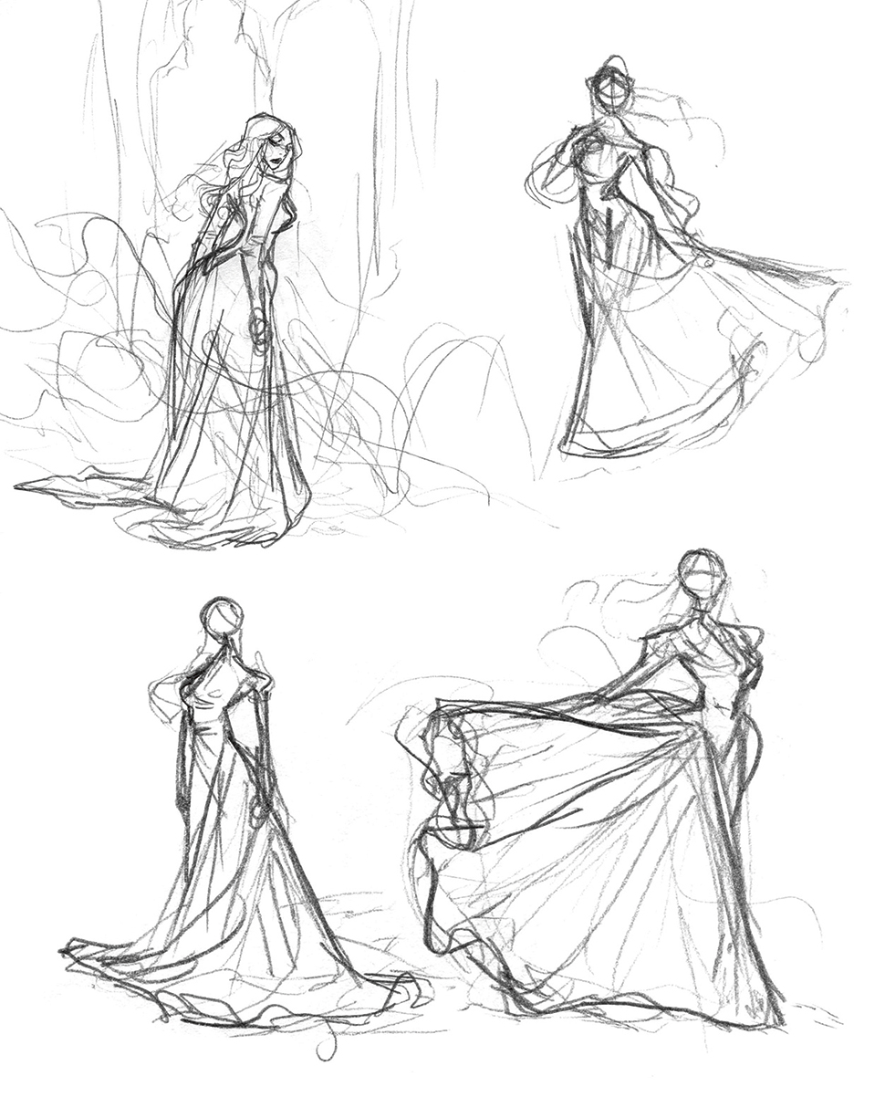
Think about the effect of gravity on your character. Are they positioned in a normal setting, or are they floating or falling? How does the drape of their clothing or hair change? If there’s a strong wind, the character’s hair and clothes will reflect that, and if the air is still, the drapery should hang down.
A character with billowing clothes and hair often adds drama, so if the situation calls for it, bear in mind the direction of the movement.
09. Convey motion through colour
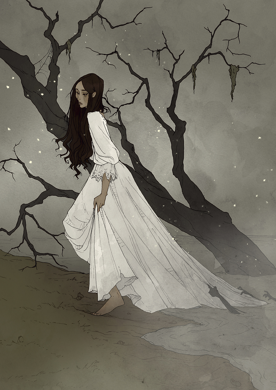
You can convey emotion with a figure’s expression, but also with the mood of your piece. A sad illustration might show a character looking down, with emphasis on a 'low' emotional state, and using a desaturated colour palette can accentuate this. Warmer, more saturated colours present a happier mood, and desaturated cooler colours do the opposite.
10. Play tricks with colour
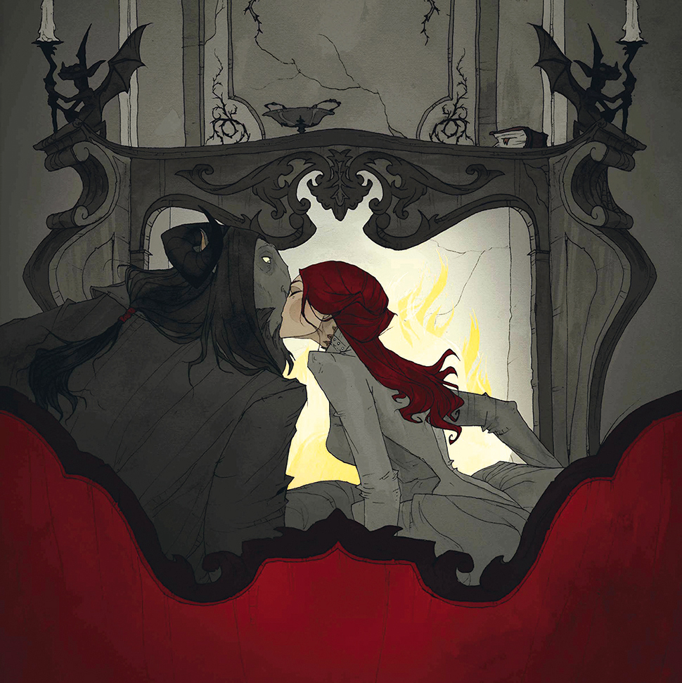
It’s important to understand the fundamentals of colour theory, but you can learn from observing nature and studying your favourite artists to see what palettes you enjoy the most. Rich, vibrant colours like reds and purples can convey passion and power, and cooler subdued tones can give a calm, or even bleak and sad feeling and warmer tones can add a sense of comfort and serenity.
11. Bring balance
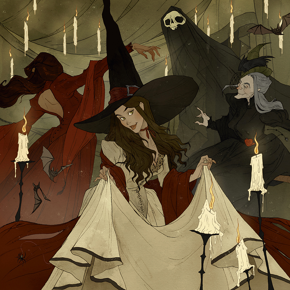
Lots of practice studies will help you find balance in your composition. Ideally, you’ll want to have your characters and their environment to be harmonious with each other. This starts with a composition that enables the viewer’s eyes to move around the scene with ease, and is helped by the use of colour and tone, which will set the subjects apart from each other and their environment, while still being connected to it.
12. Make use of tones
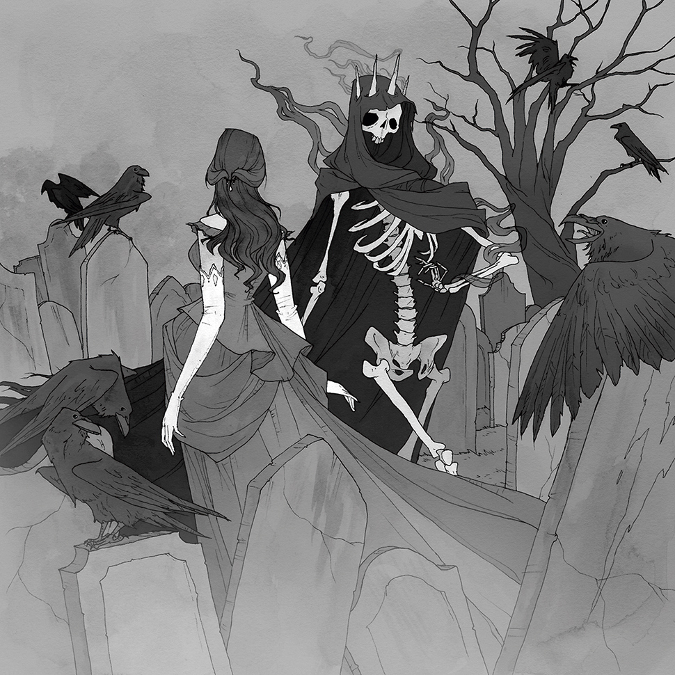
Before colouring a piece, I lower the piece to 50 per cent grey in Photoshop, then bring out or push back each item in greyscale. I do this at the beginning, so I can see if I have the right amount of contrast in my piece overall, and that it reads easily to the viewer.
13. Get to know your setting
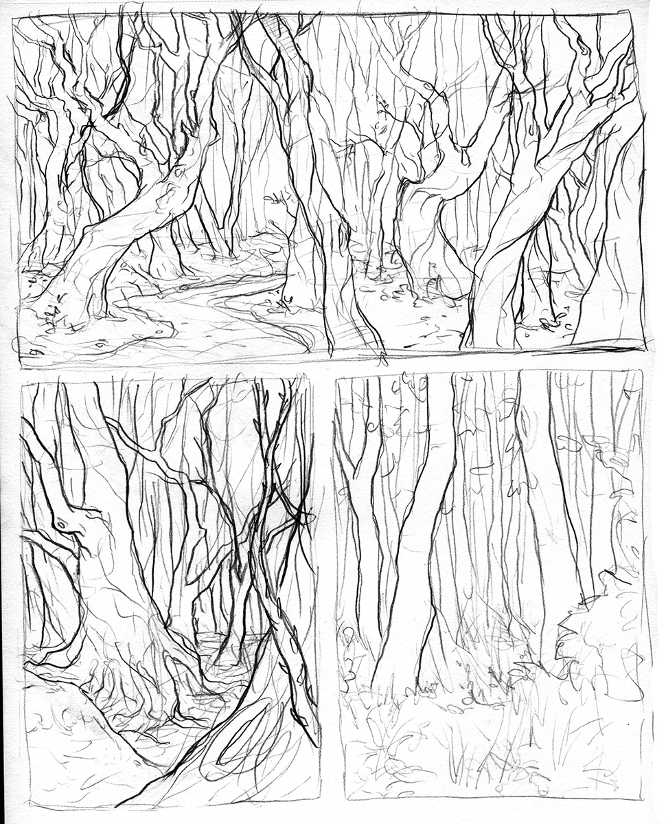
Even if I don’t need to draw an entire room or landscape for an illustration, I like to sketch it out in its entirety anyway, just so I can get an idea of the setting, and understand the space and perspective. In some cases, I’ll paint the background separately, and then have the subject dropped in on another layer in Photoshop, so that I can move them around if I need to.
14. Think about costume
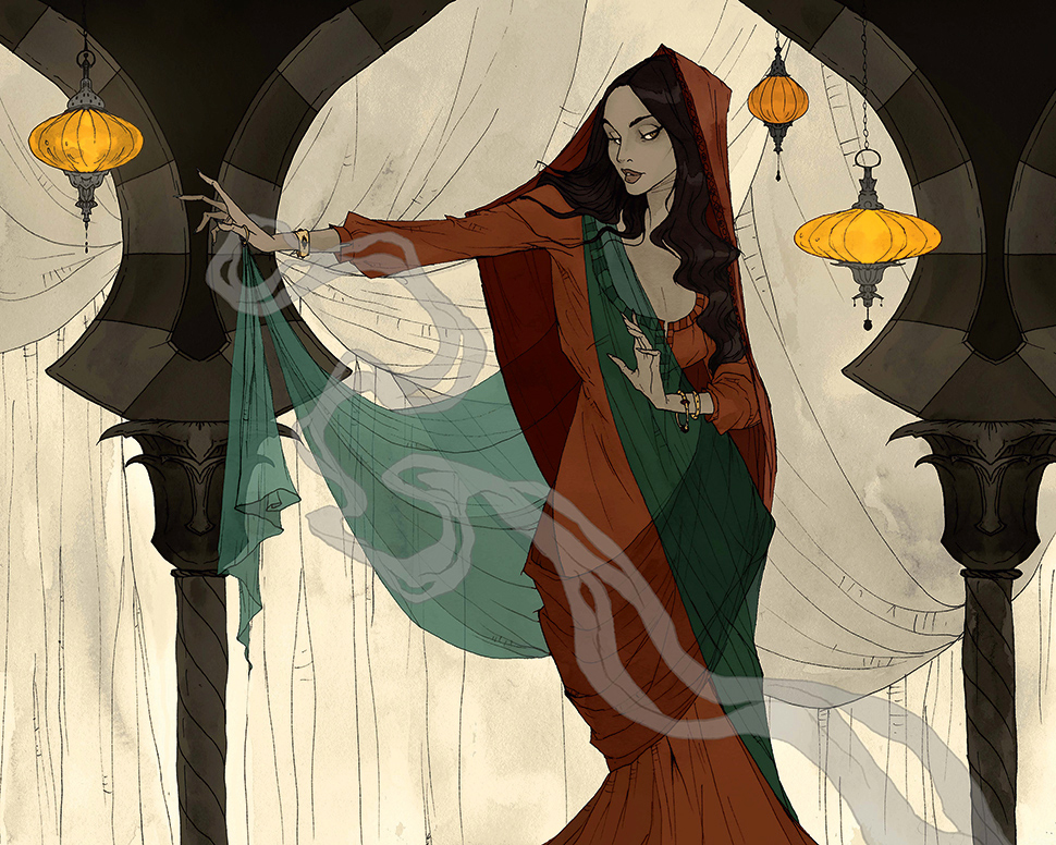
What a character wears tells the viewer more about them, so it’s important to consider their wardrobe when you’re planning your illustration. What’s the time period? What are they doing in this scene?
If it’s a fantasy character, you get a lot of room for design, but it does help to have some kind of historical context to base their costume on, and build from there.
15. Bring the story to life with details
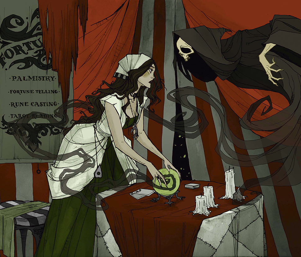
A character in a setting isn’t quite enough to tell their story. This is when details come in. Small details in the costume, or in objects in the room or environment will help make the composition more interesting, and it will give the viewer more hints about the story.
This article was originally published in issue 170 of ImagineFX, the world's best-selling magazine for digital artists. Buy issue 170 or subscribe to ImagineFX.
Read more:

Thank you for reading 5 articles this month* Join now for unlimited access
Enjoy your first month for just £1 / $1 / €1
*Read 5 free articles per month without a subscription

Join now for unlimited access
Try first month for just £1 / $1 / €1
Get the Creative Bloq Newsletter
Daily design news, reviews, how-tos and more, as picked by the editors.
