How to manage colours in Photoshop
We explore the colour management basics you need to know.
Now you're getting familiar with the conversion, here's how to have more control when converting from RGB to CMYK. For the very best result, you need to adjust your colour profile according to the particular printer, ink and paper you're using.
The best practice is to get a colour management profile from your printer then install it on your machine and sync it up with the rest of your applications – you can find out how to do that on page 3.
However, if you don't have that information, the following are the standard settings that will work in many situations.
01. Find your colour settings
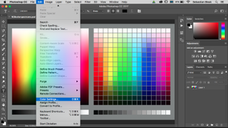
To have full control over the conversion you want to find your colour settings, which you'll find under the Edit menu at the top of your screen (or use the keyboard shortcut cmd+shift+K).
02. Explore the standard options
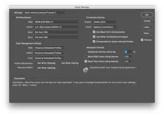
If this is your first time opening the colour settings, assuming no one has made any changes, you are now looking at the standard colour settings. These settings will work in most cases – however, if you are going to send your artwork to a commercial printer, you would want to ask which specific colour setting they would like you to go with.
If you're new to colour settings, this window might seem a bit intimidating. Let's take a look at the main settings you want to look at.
03. Choose a specific region
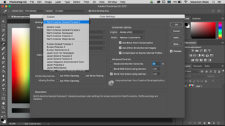
Starting at the top, you have a Settings section. If you click on the drop-down menu you'll find different settings. Choose your region.
04. Select an RGB colour space
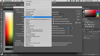
Next, you want to look at the RGB colour space that you will be converting from. There's not just one RGB colour space, you actually have many to choose from. You could test them out to find the one that works best for your particular monitor and workflow, but it's fine to leave it as-is.
05. Select a CMYK colour space
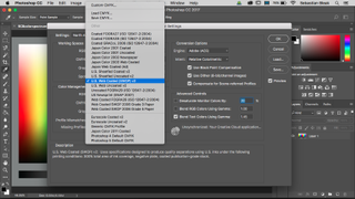
Next you want to look at the CMYK colour space that you will be converting to. The same rules apply as when choosing the correct RGB colour space.
06. Explore conversion options
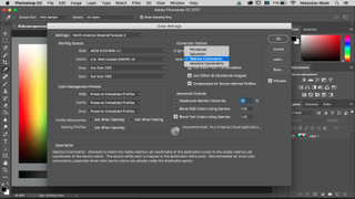
The last major setting to look at is going to be inside of your conversion options. Click on the drop-down menu for Intent and you'll see four different options.
The one that works best the majority of the time is Relative Colorimetric, but make sure to try the other ones to see if they work better for your particular workflow. Remember if you're not sure which one to go with, just leave it as-is or ask your printer for their suggestion.
Next page: Final Photoshop colour settings tips

Thank you for reading 5 articles this month* Join now for unlimited access
Enjoy your first month for just £1 / $1 / €1
*Read 5 free articles per month without a subscription

Join now for unlimited access
Try first month for just £1 / $1 / €1
Current page: Adjust your colour settings
Prev Page Convert RGB to CMYK Next Page Sync your colour settingsGet the Creative Bloq Newsletter
Daily design news, reviews, how-tos and more, as picked by the editors.
