How to make web design documentation suck less
3 steps to making UX design documentation that's actually useful.

Between research, design, client interaction and team collaboration, there may not be much time left for a UX specialist to think about creating web design documentation strategically.
Is it even worth spending time perfecting UX documentation? Well yes and no. It depends on the purpose, and usefulness, of the documentation. For example, generalised documentation, created for no other reason than to leave a paper trail, is too general to be useful, and (effectively) purposeless. Highly focused documentation, on the other hand, can be both useful and purposeful.
In order to ensure that the documentation you create isn’t taking away from time that could be better spent on design and research, consider the following questions:
- Is the UX documentation going to drive decision making?
- Is your UX documentation usable by your team?
Here we'll present a three-step plan to making your UX design documentation as useful as possible.
1. Give your UX documentation purpose
UX documentation has purpose if it drives decisions. UX documentation has a wide variety of end users – including designers, developers, QA specialists, stakeholders, and managers. All of these people might use a particular document to make informed decisions during the course of their work.
One particular document may impact one particular activity in the Agile Software Development Lifecycle (SDLC), while a different document may affect a number of subsequent activities. So it’s extremely important to take into consideration the lifecycle of the document – what path will it take, from user to user, before it's no longer needed?
It’s a matter of ROI. In general, the longer a document remains relevant, the greater the return on the time spent perfecting it. UX specialists need only make documentation where it is really needed. Otherwise, you’re wasting time and money.
The document lifecycle
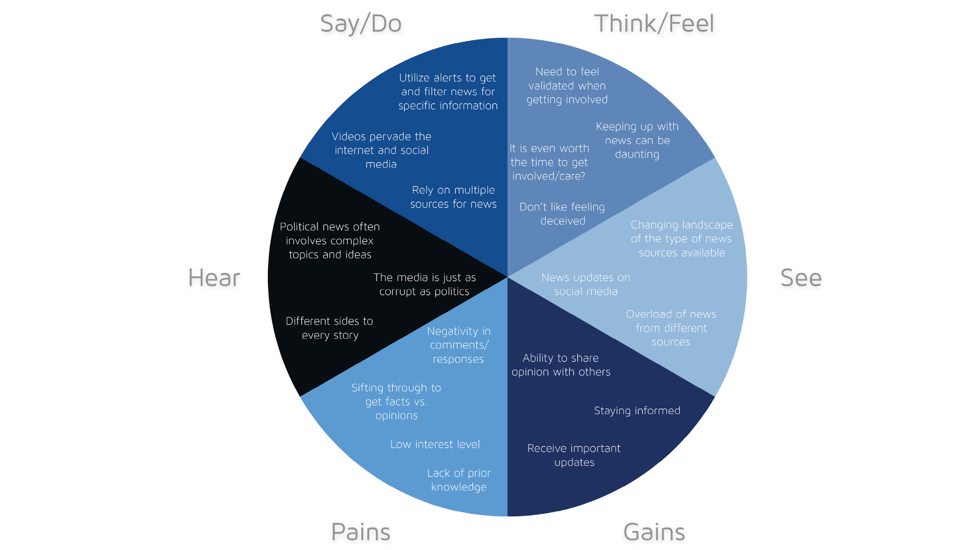
You may be wondering how it is possible to determine the lifecycle of a document before you’ve even made it. Well, it's as simple as looking at the document's various use cases. Take, for instance, the following empathy map.
![An empathy map created by the Codal team for a client [click the icon in the top-right to enlarge the image]](https://cdn.mos.cms.futurecdn.net/uaUtPVKyx5nKywQ2xNsXKK.png)
Let’s investigate the lifecycle of the above empathy map, considering who will likely use the document, and for what. In this case, the document in question is a compilation of user research results.
User research results drive the entire product strategy during the software development lifecycle. Even if developers and PMs don’t own the document, its insights will inevitably influence their work.
If we follow the logic presented earlier, then an empathy map is an incredible investment in the future of the product. It's a document that’s always worth creating – and the earlier, the better.
2. Make your UX documentation useful
A document can drive decision-making, yet be useless at the same time. Developers don’t always have equal say in how to lay out a particular page – they might just follow the designs created by the UX and UI designers. Thus, the design documentation, however poor it may be, will drive development decisions.
In other words, ‘driving decisions’ is one concept, and ‘driving good decisions’ is something else altogether. Keeping in mind that documentation has not only a purpose, but also a target audience, is likely to help stimulate good decision-making among targeted users.
The reverse is also true. Documentation that doesn’t consider the audience’s specific requirements is liable to miscommunicate the intentions of the UX specialist.
Avoiding the pitfalls of non-targeted documentation is simple:
- Determine the target user-base
- Analyse how the document will be used
- Craft the document so it speaks the language of the user
![This interactive wireframe targets the document's users [click the icon in the top-right to enlarge the image]](https://cdn.mos.cms.futurecdn.net/na6TQwguzxJwtDdHzUvNpM.png)
Consider this interactive wireframe. You can determine the target users of any document by examining its purpose. Static wireframes are typically used as visual scaffolds so the interface designer may craft a pixel-perfect mockup of the UX designer’s vision.
Interactive wireframes, however, have a wider audience. They can be used by developers to gauge dependencies and interaction models. Product managers can use them to quickly assess the feature breadth and depth. QA specialists may even use the interactive wireframe to double-check the work of the developer when recreating the functionality.
As such, the target audience for an interactive wireframe includes UI designers, product managers, web/mobile developers and QA specialists. In order to ensure the document is useful, it must cater to the specific needs of each of these users.
![An annotated prototype created in UXPin for a healthcare platform [click the icon in the top-right to enlarge the image]](https://cdn.mos.cms.futurecdn.net/RjJfAH6cdhNdaAu4Va5WCQ.png)
As shown in the annotated prototype above, here’s how you can quickly tailor the document to each audience.
- UI designers: Estimate image and layout dimensions
- Product managers: Note any ‘wobbler’ features that may provide additional value, but exceed current scope
- Developers: Add notes to clarify complex functionality and ask for input on feasibility
- QA specialists: Note which functionality is up for discussion, and which the team accepts
03. Make your UX documentation usable
Documentation, like software, depends heavily on usability. No matter how much good content you include in your documentation, it’s for nothing if the reader struggles to understand it. To improve document usability, you need focus.
Often, UX specialists have so much to say about their work that it gets in the way of the data that must be communicated. This can be the source of many problems, especially when the data gets lost in translation.
Human beings don’t like to read extraneous details. How many times in your life have you been thrilled to read a 20-30 page document? You need to keep it focused.
![For this sitemap, Codal worked to keep things focused [click the icon in the top-right to enlarge the image]](https://cdn.mos.cms.futurecdn.net/EBhzdquMd6hE5pLETzChjT.png)
Take, for instance, the sitemap above, created for one of our client projects. This is a focused document. There are no extraneous details, no excessive notes, and everything is confined to one page. The target audience is able to consume the intended data – nothing more, nothing less.
Achieving focus in UX documentation is simply a matter of applying the core principles of purpose and usefulness, as discussed previously. The above document illustrates this point quite effectively.
UI designers and developers might not need to hear all the reasoning behind the choices that you’ve made. Either save it for an in-person discussion, or only highlight the top five or so decisions.
There are exceptions, of course. If the document is intended for a member of the QA team, you might need to explain all your reasoning so they can adequately test the functionality of the software – but even then, it’s not always needed.
Documentation isn’t a paper trail
Respect your own time, and that of your coworkers. Don’t waste time crafting documentation that isn’t focused. Remember to keep it useful and purposeful, and remove extraneous details. Ensure the documentation you create will be used to drive decision making, otherwise you're simply wasting your time.
For more design process best practices, download the free ebook Real-life UX Processes: How Top Companies Build Products. The guide includes step-by-step processes from Slack, Autodesk, 3M, and other companies.
Yona Gidalevitz is a technical researcher at full stack mobile app development and UX and UI design agency Codal.
Read more:

Thank you for reading 5 articles this month* Join now for unlimited access
Enjoy your first month for just £1 / $1 / €1
*Read 5 free articles per month without a subscription

Join now for unlimited access
Try first month for just £1 / $1 / €1
Get the Creative Bloq Newsletter
Daily design news, reviews, how-tos and more, as picked by the editors.
