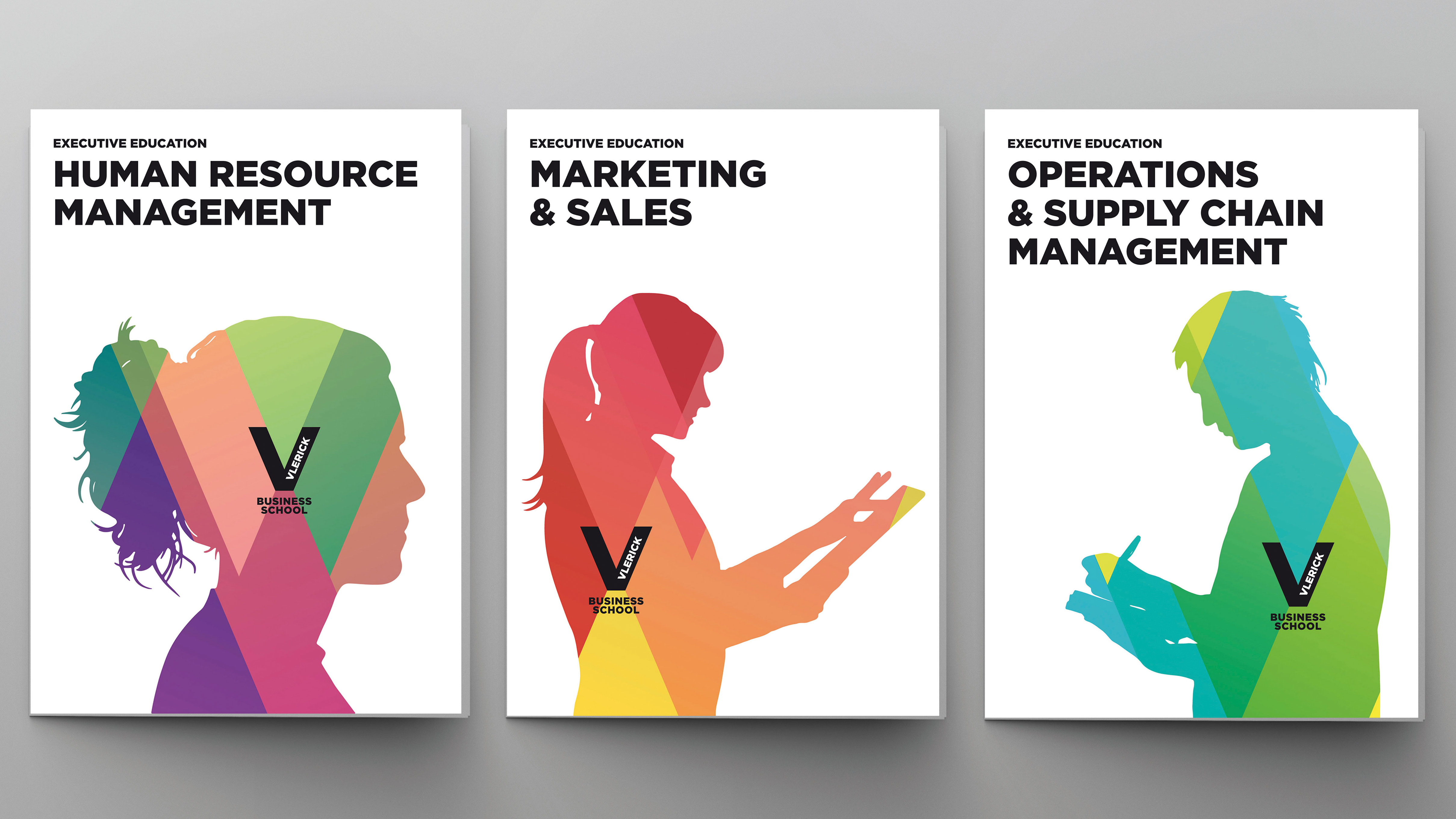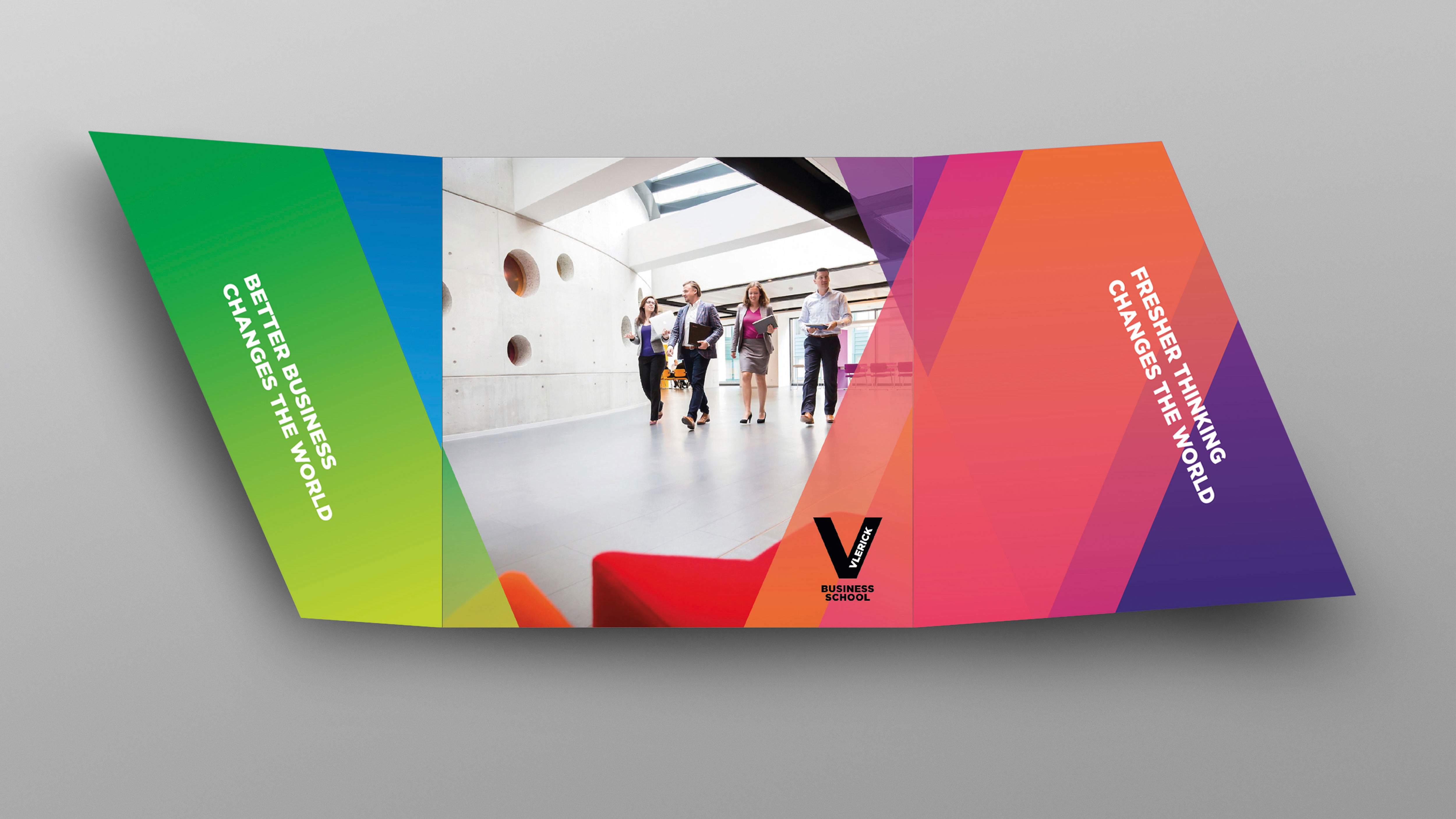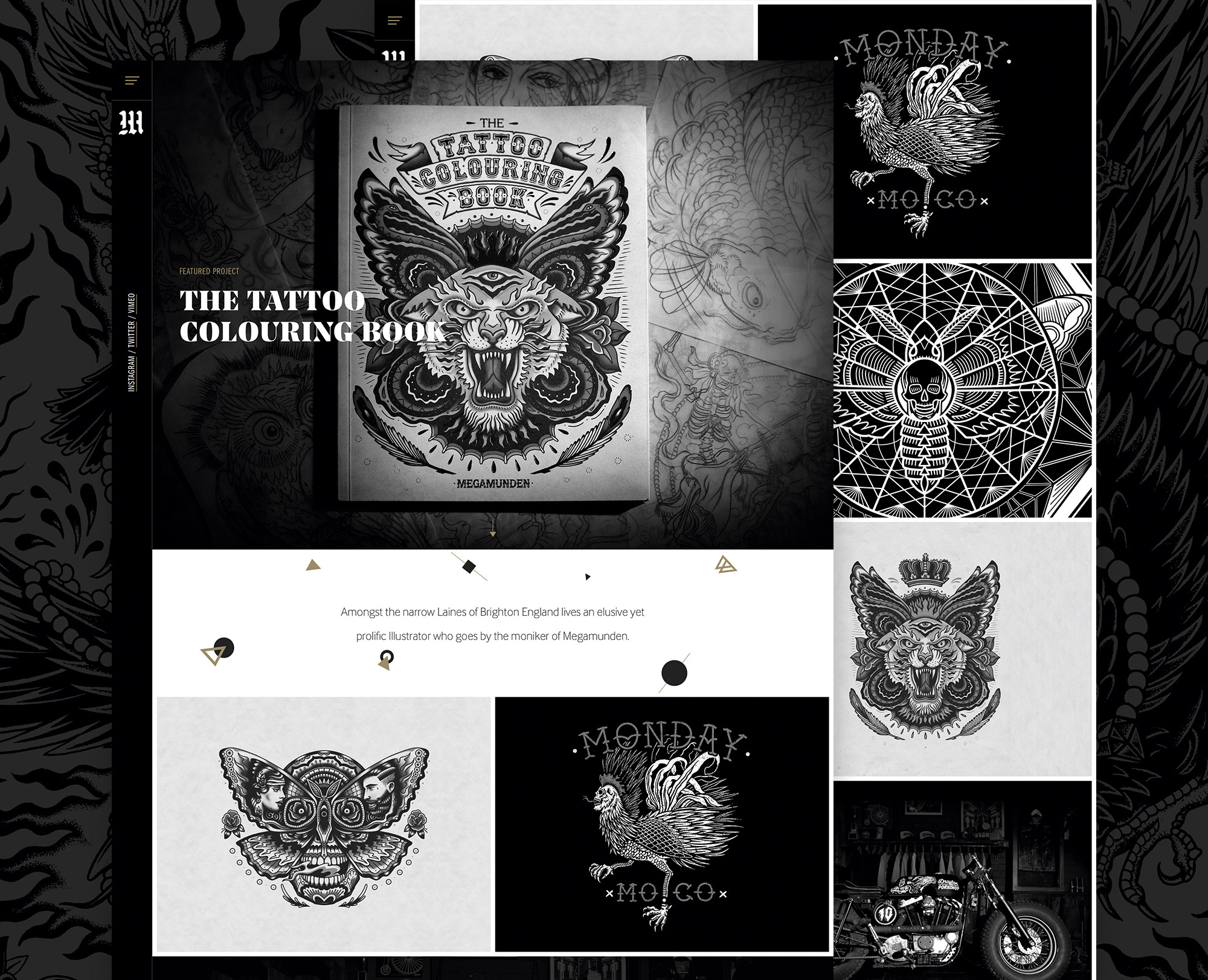
The idea of following brand guidelines is something that doesn’t get a lot of attention on most design courses. “I’ve never come across an intern or graduate who understands the fundamentals of brand guidelines,” says Ellie Pearson, senior designer and studio manager at Cambridge-based agency Mobas. “But it’s not their fault: they weren’t told about it, and neither was I.”
The concept itself, though, is quite simple. Brand guidelines are a set of rules that dictate how all elements of a brand should be applied. Designers are given a detailed outline of a brand's preferred colours, fonts, logos and so on, and how each are to be used. But what students are often taken aback by is the sheer range of things covered by brand guidelines.
“I was surprised at first by the complexity and depth of brand guidelines,” recalls Jess Dutton, junior designer at Mobas. “For some larger clients, they’re incredibly extensive. You think of brands having one or two primary colours, but I didn’t know they could have secondary colours too.”
Dutton was also surprised by the distinctions between internal and external colours for collateral that will be used for staff and for customers. “It’s a lot more complex than meets the eye,” she says.
If you're new to working with brand guidelines, here are some pro tips for making sure you get the most out of them – without stifling your creativity...
01. Read the brand guidelines before you start

It sounds obvious, but the complexity of some brand guidelines means it's good practice to spend time digesting them – before you start a project.
“I always make sure I’ve gone through the brand guidelines from start to finish, and that I have a clear understanding of the look and feel of the existing brand, before I start a project,” says Joe Bembridge, junior designer at Macclesfield design consultancy Brandon.
Tom Tennant, a motion graphics designer at Gramercy Park Studios in London, tells a similar tale. “I spend as much time as possible studying the guidelines, as it’s really helpful to be on the same page as your client,” he says. “Even reading the parts that aren’t relevant to what you’re doing can give you more insight into the brand. After all, it’s there to help.”
02. Know when to push back – and when not to
Laura Wynn-Owen, junior designer at Nelson Bostock Group in London, notes that guidelines are usually handed over without being talked through, so they can be open to your own interpretation. “But in our case, there are usually brand teams on hand to answer any questions,” she says. “There may also be brand sites that give access to assets, guidelines and best practice examples.”
As the word ‘guidelines’ suggests, these are not immutable rules. But pushing back on them should be a last resort, not a default, believes Andrius Petravicius, digital designer at Hampshire design agency Superrb.
“I usually wouldn’t push back on brand guidelines, as in most cases, you can still be creative and work around them,” he reasons. “I’ve done so on occasions, though, when I felt like the guidelines weren’t working well visually and I knew they could be improved upon.”
03. Make suggestions
Karl Doran of Manchester design agency Flow Creative concurs. “We did some work recently for Arts Council England,” he says. “They had a fairly detailed brand guidelines document, but we did try to push it a bit, and bring in some extra tints and colours, plus we created a kind of illustrative classic style that they’d not really used before.“
“It fitted in with their branding but it moved it on a little bit, and they were happy with it. If you can do that, that’s ideal, although it does obviously depend on the client and the brief.”
04. Don’t limit your creativity

“Don’t let brand guidelines hold you back on your creativity,” agrees Joe Bembridge at Brandon. “These guides are put in place not to limit creativity, but to help a brand stay recognisable and consistent,” he points out. “If you do go against the guidelines, make sure you have a valid reason for doing so.”
05. Work within a reliable system
Normally, your job is simply to understand and internalise the brand guidelines, as well as work within a reliable system to ensure they’re adhered to. Such systems will vary from studio to studio, but will normally be largely based on common sense.
“At Moras, we have a huge printed folder with details of all brand guidelines that we work on in the studio, which is also accessible on our server,” explains Dutton. “I go through and manually double-check colours, as well as doing an InDesign check that shows all the typefaces used, so you can easily weed out any that shouldn’t be there. Plus, we have an internal artworker in the team who checks everything against guidelines and specs before it’s sent back to the client.”
06. Use the right tools
Adherence to brand guidelines may also be integrated into the software itself. “At Superrb we use Sketch, which allows us to set up reusable colour palettes and typography styles,” says Petravicius.
“I’ve also been using InVision’s Craft plugin for Sketch quite a lot lately; this lets you create branding libraries with all brand assets, styles and symbols. I’m also really excited about a new tool from InVision called Design System Manager, which seems like a powerful system for creating, managing and scaling design libraries.”
07. Harness the software
“To make sure I follow the guidelines carefully, I’ll take a screengrab of the most important parts: the colour references, font, and point sizes,” says Gramercy Park Studios' Tom Tennant. “I also find it helps to copy the brand colours into whichever software you’re using so you have a palette that’s easily accessible.”
08. Ask if you don’t understand
The most important thing, adds Ellie Pearson, is that if there’s something you don’t understand – and there probably will be – ask. “Brand guidelines can be incredibly technical,” she says.
“One of our animal health clients has a lock up at the bottom of all designs that requires a mathematical formula to work out the right height and width for the exact document you’re working on. A junior or intern has little hope of understanding that, so they should always seek help if they’re unsure.”
“Raise any questions you have as soon as possible, rather than when you’re midway through the work,” advises Laura Wynn-Owen, junior designer at Nelson Bostock Group. “If there’s anything you’re unsure about, ask. Even senior designers need guidance. There are no stupid questions when it comes to brand guidelines.”
Related articles:

Thank you for reading 5 articles this month* Join now for unlimited access
Enjoy your first month for just £1 / $1 / €1
*Read 5 free articles per month without a subscription

Join now for unlimited access
Try first month for just £1 / $1 / €1
Get the Creative Bloq Newsletter
Daily design news, reviews, how-tos and more, as picked by the editors.

Tom May is an award-winning journalist and editor specialising in design, photography and technology. Author of the Amazon #1 bestseller Great TED Talks: Creativity, published by Pavilion Books, Tom was previously editor of Professional Photography magazine, associate editor at Creative Bloq, and deputy editor at net magazine. Today, he is a regular contributor to Creative Bloq and its sister sites Digital Camera World, T3.com and Tech Radar. He also writes for Creative Boom and works on content marketing projects.
