How to create new character designs in Photoshop
Pro tips for developing new video game character design ideas.
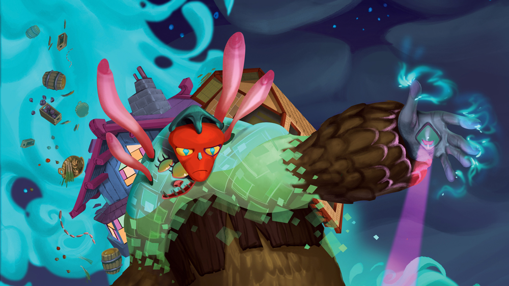
Creating your own video game characters means you can push yourself and go crazy with the design idea, as long as the concept still works as a video game character. This means it has to be readable in its environment, the design has to support the game function of the character, and the technical artists have to be able to rebuild the design within the game’s technical restrictions.
In this Photoshop tutorial I’ll first show you how to go completely nuts and push your ideas and concepts to the extreme. Then I’ll show how I take the design and clean it up for professional use. A key aspect is creating a beauty shot, which clearly shows the attitude and movement of the character.
My painting process combines traditional and digital media, so you'll be sketching with pens as well as painting with Photoshop brushes. All you need is an open mind, patience with yourself, and pushing through until you have that great idea.
Because creating a piece of concept art involves working within limits, here’s the character brief I’ll work to: create a non-playable character (NPC) for a 3D roleplaying video game, with a merchant game function and a wicked attitude. And just for fun, the shape will be page-filling and the colours will be flashy.
01. Explore sources of inspiration
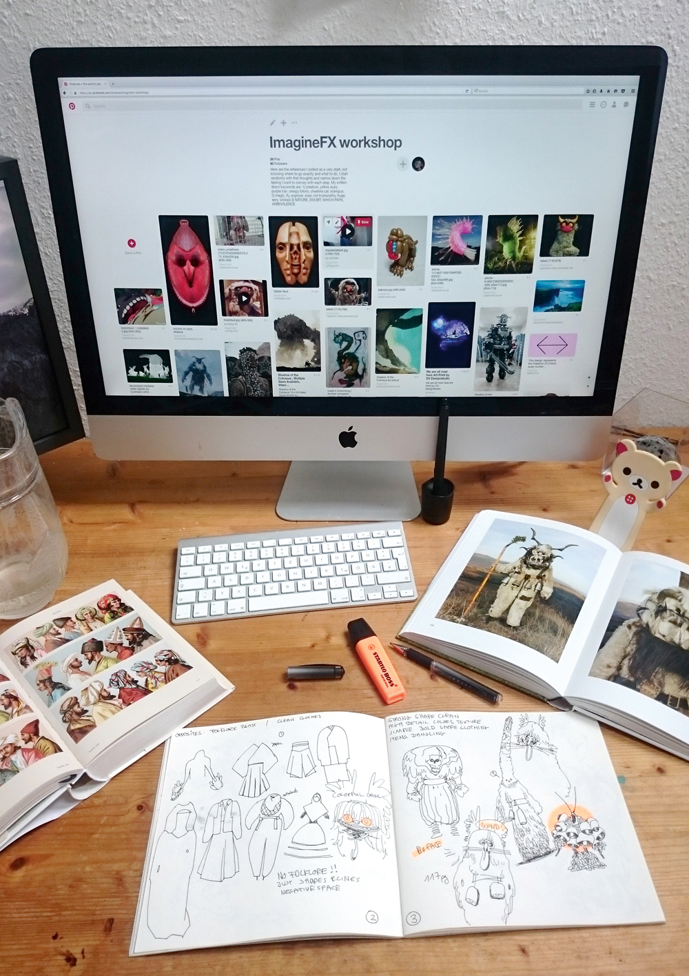
The brief is to create a Merchant NPC with a street-wise attitude, who’ll appear in a 3D RPG. My goal is to create a strong design with artistic value, so I explore photo books, music, art and literature for imagery that provokes an emotion. I take in as much as possible and make notes on whatever catches my eye. Scribbles at this stage are often ugly, so don’t worry about that.
02. Clearly define the character's game role
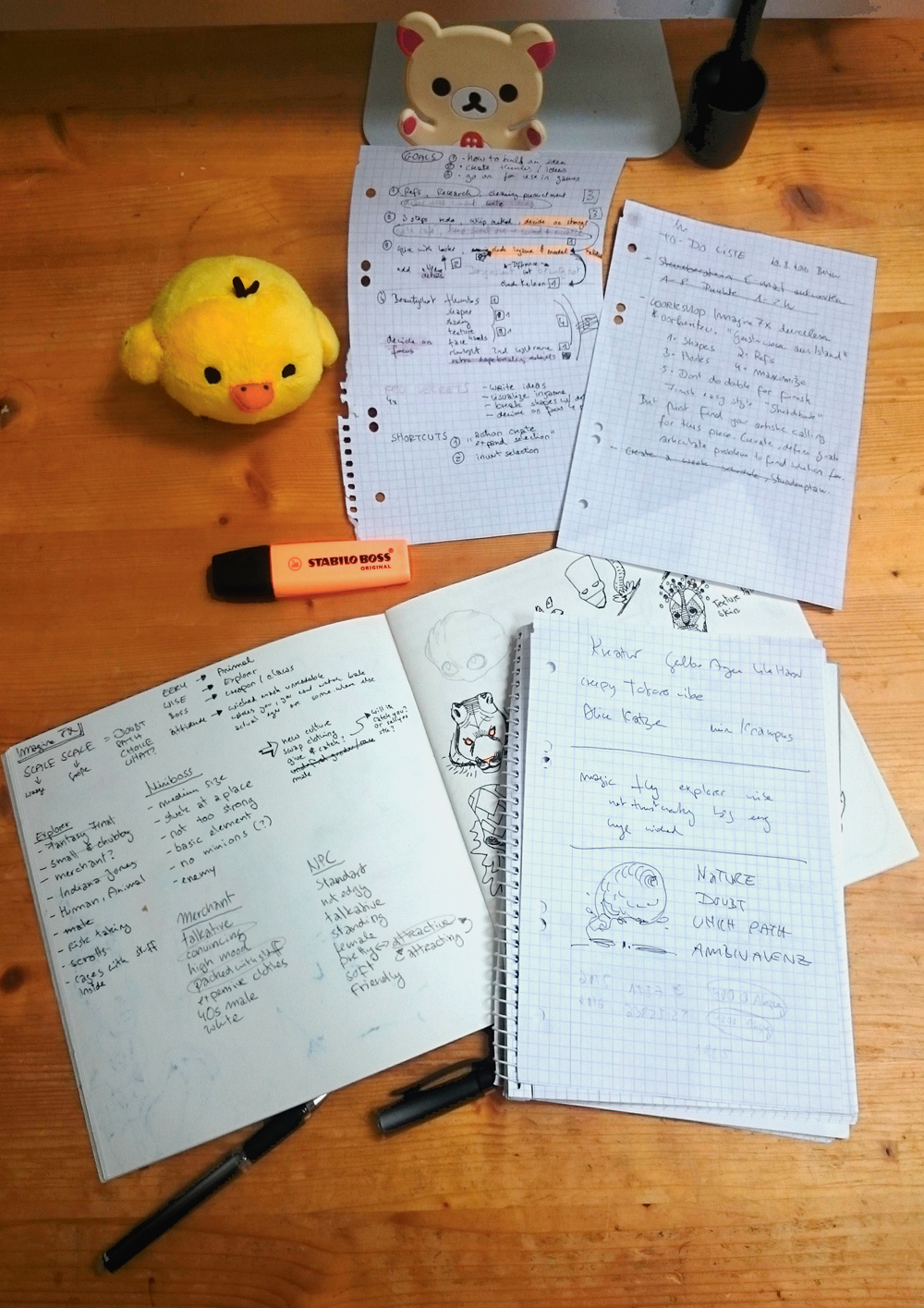
Now to the character’s game function. Given the brief I write down whatever I associate with the terms “merchant” and “NPC”. Then I separate my list into two: things that are necessary for the character’s readability; and those that aren’t. Exploring unconscious design decisions and then discarding them gives me room to freely explore outside the box.
03. Go wild!
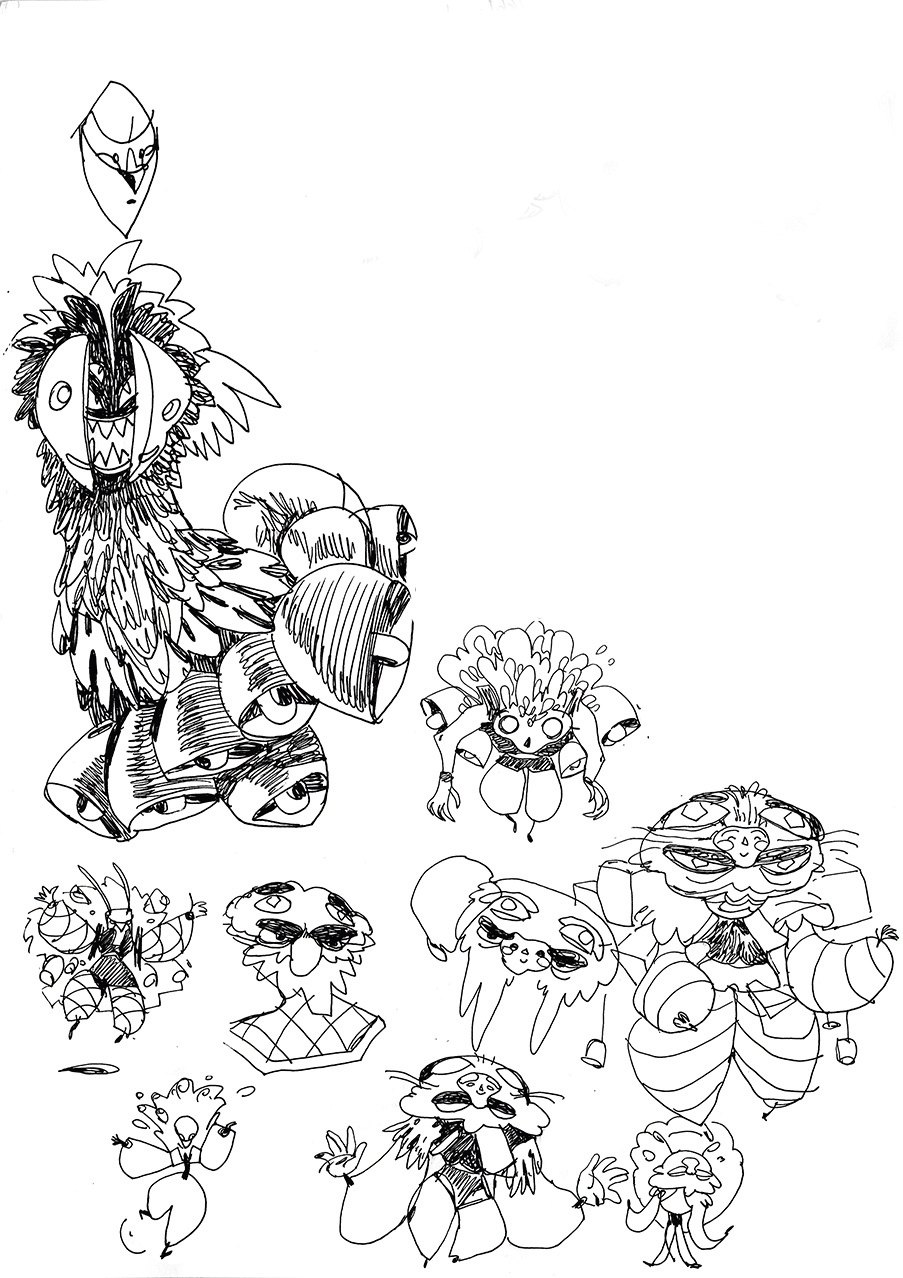
With this conceptual foundation in place, I start drawing whatever comes to mind. I want to find my own, unique source of inspiration. It’s at this stage that I get an idea for my character for the first time. I decide on complex patterns and simple, clean-cut clothing to balance them. I want an eerie-looking face and lots of items attached to the body.
Get the Creative Bloq Newsletter
Daily design news, reviews, how-tos and more, as picked by the editors.
04. Be prepared to push an idea
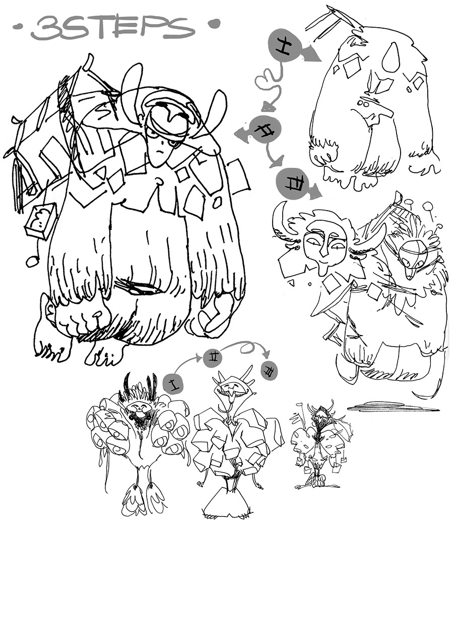
Whenever I hit an interesting idea I stop and redraw it three times, each time pushing it further, changing the main volumes and the level of detail. I also have to think about whether or not to add a main element, and decide that it’ll be a house. To keep my drawing bold, I only use fineliner pens here.
05. Pick the strong designs
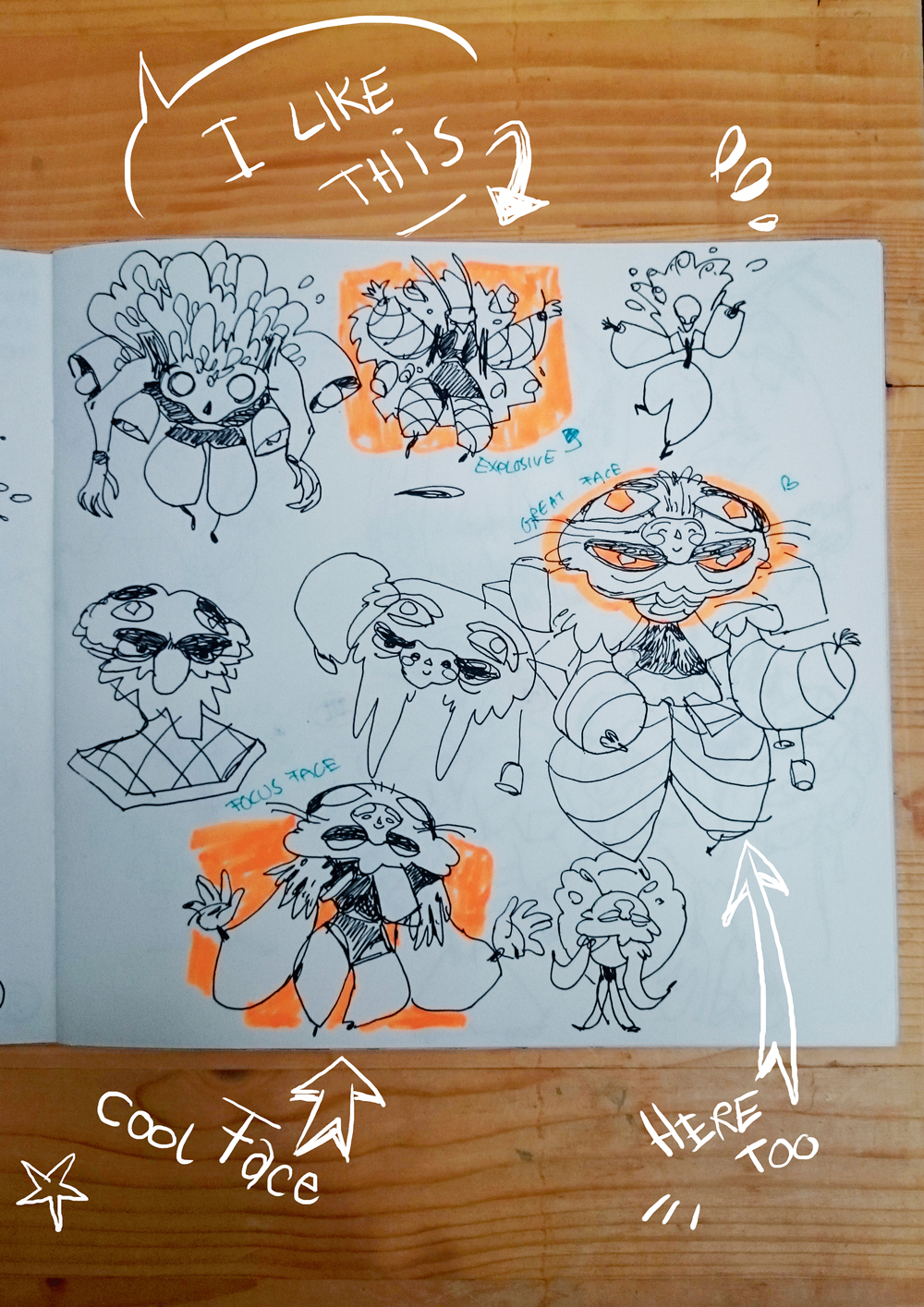
After taking a break I return to look at the sketches and immediately mark those designs that catch my eye first. Then I mark convincing attitudes and then strong shapes. I add notes to remind me later what I saw in each. I look out for opportunities to create clean volumes and contrast, because they add interest.
06. Create initial concepts in Photoshop
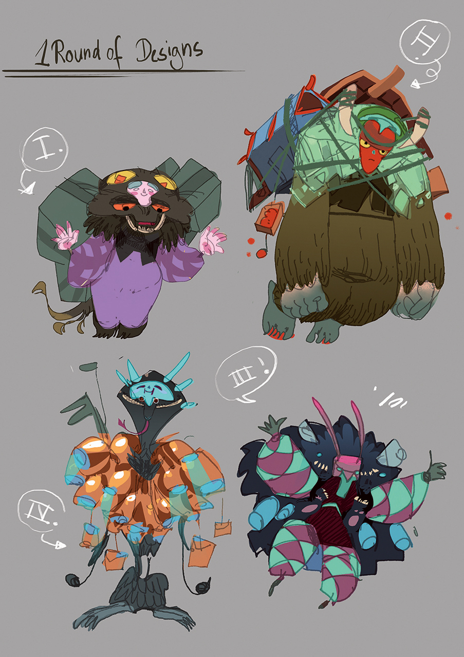
In Photoshop I take my good ideas and combine them into strong, single designs, keeping them loose but readable. I ensure each design has a clear focus. I select a shape using the Lasso and Magic Wand, then add colours or values. If you have a clear vision for the colours, go for it. Otherwise, work in greyscale for now.
07. Translate for your medium
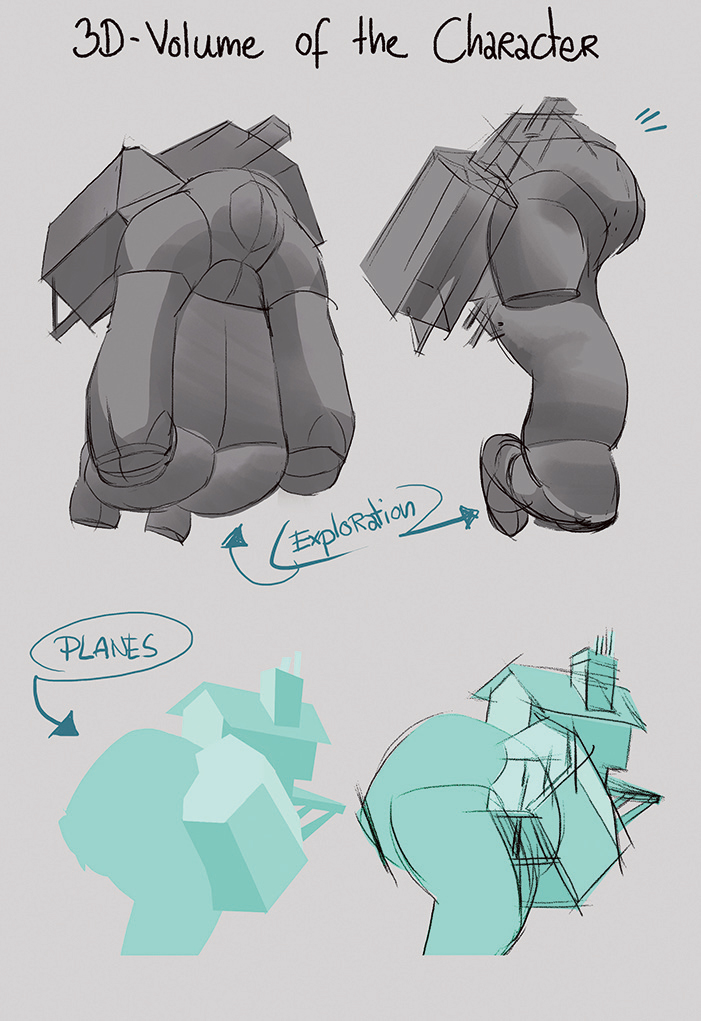
My final medium is 3D, so I have to break the design down into simple volumes and translate details into textures. I ensure that posture and gesture can be animated easily while everything else can be summed up with minimal effort. In a team I would work closely with the animator and modeller during this stage.
08. Make beauty shot thumbnails
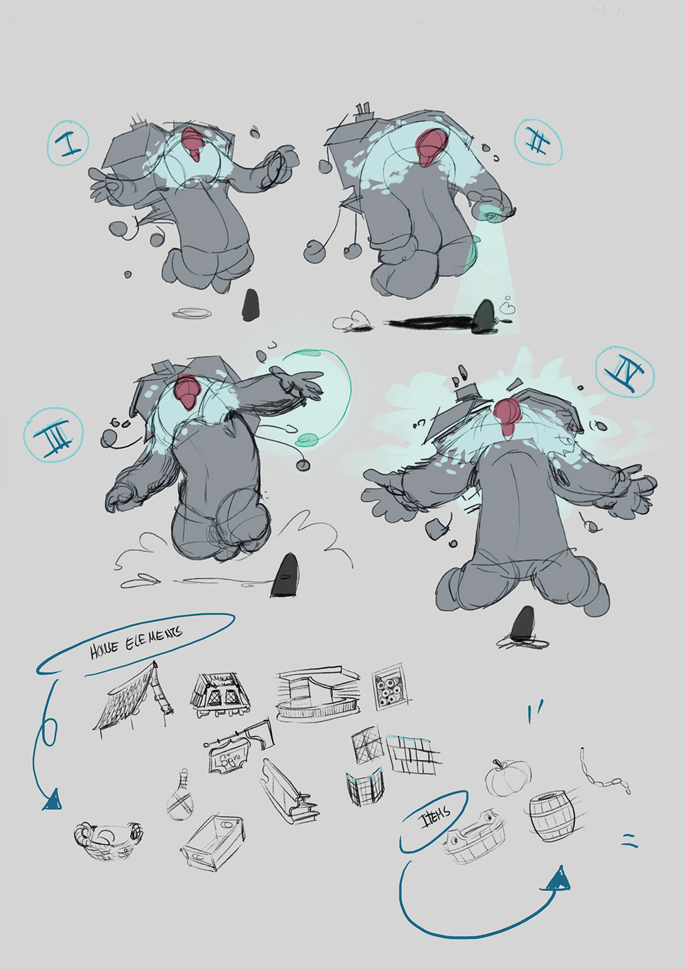
I do a lot of beauty shot thumbnails until I get a feeling for the character. A good beauty shot shows both the attitude and the atmosphere of the game. Showing the main volumes is more important than showing design details. These are the criteria for choosing the right sketch to take forward; I choose III.
09. Sketch loose background shapes
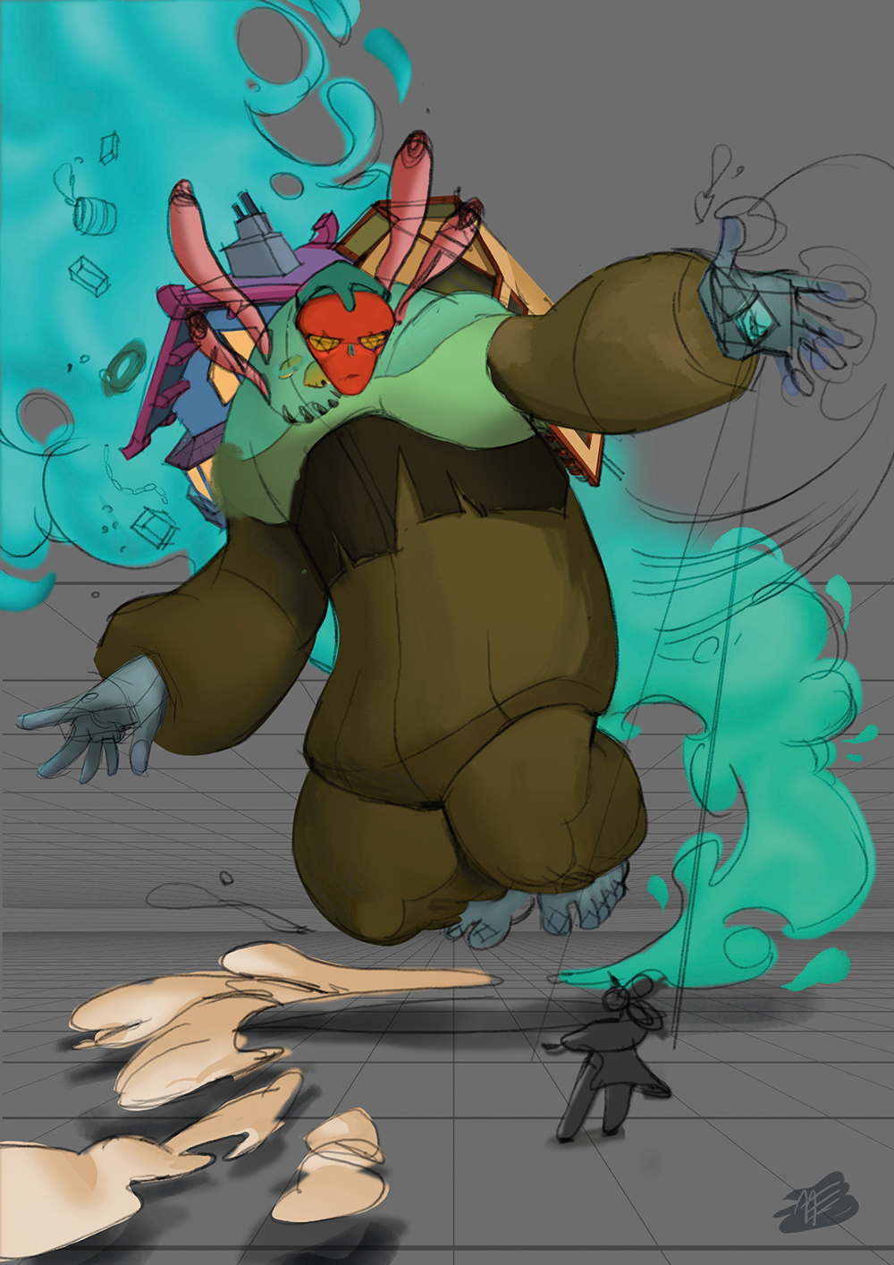
After drawing a clean sketch based on the thumbnail, I use the Pen tool to create the different shapes on separate layers. I keep things simple here because I can add details later using a mask. I then quickly airbrush some shadows indicating my main light source, to get a feeling for the overall look. After that I start rendering and adding details.
10. Sprint to the finish
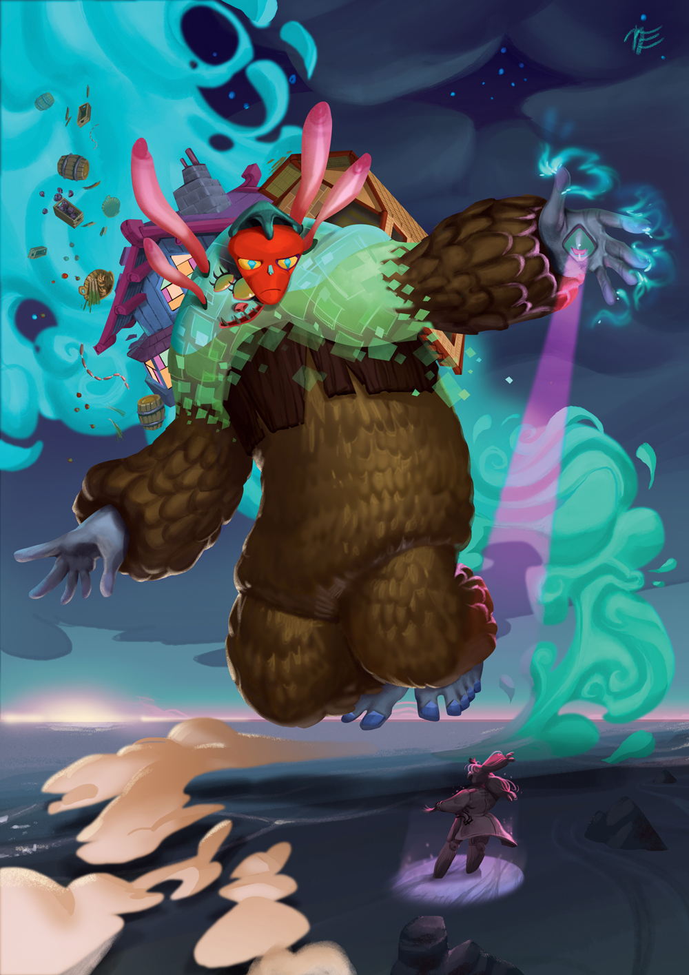
To make sure I don’t overwork it, I try to finish every element as quickly as possible. For this, selecting areas with the Lasso is key. I change the feathering from 0 to 8 pixels and add texture, smaller volumes and effects this way. I use a textured brush to fill my selection until I achieve the desired effect. I continue defining volumes and textures until it’s finished.
This article was originally published in issue 141 of ImagineFX, the world's best-selling magazine for digital artists. Subscribe to ImagineFX magazine now.
Related articles:

Thank you for reading 5 articles this month* Join now for unlimited access
Enjoy your first month for just £1 / $1 / €1
*Read 5 free articles per month without a subscription

Join now for unlimited access
Try first month for just £1 / $1 / €1
