How to design with wit
Why a sense of playfulness helps to create a lasting impact – the sign of good design.
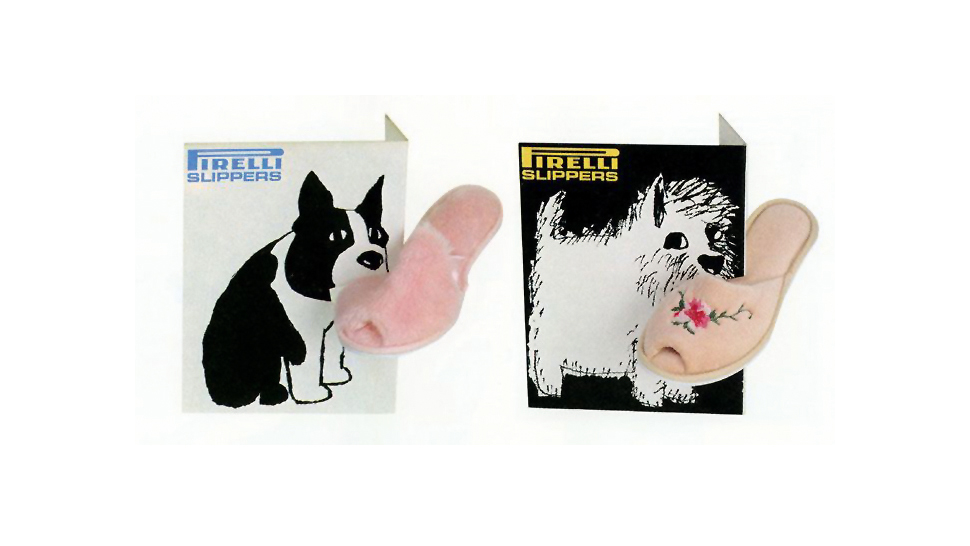
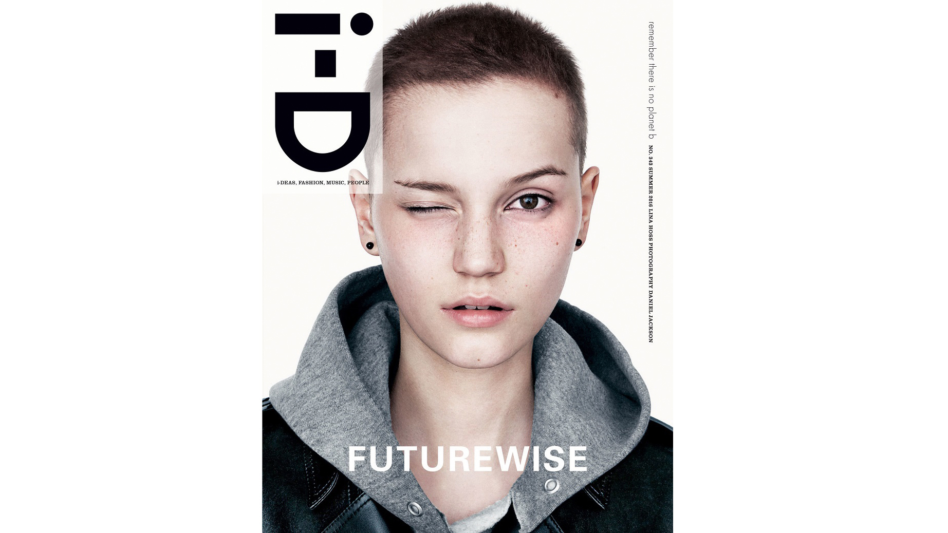
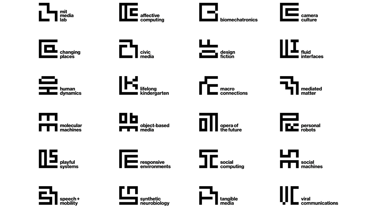
The designs that have had an impact on me are very different projects, but the common element among them is a sense of wit, playfulness and thoughtfulness. Classics such as FedEx, V&A, Pirelli slippers, i-D magazine covers, the Mexican 1968 Summer Olympics, Tate, Shelter, the Tusk Conservation Awards and MIT Media Lab all give a sense that the designer has gone beyond the conventional answer to find something extra.
They’ve injected joy into the work, and the viewer gets some of that joy at the other end, even years later. They’ve all had an impact on me, on the world of design, and on the wider world. Otherwise why would so many still be around? For me, that’s what it means to truly make an impact.
When it comes to executing that in your own work, there’s never an easy answer – but there are plenty of questions. These are the questions I ask myself in my own work, and when judging others' for awards.
Does it work?
This is the big one. I love judging work. It’s like being back at college with that terrifying tutor, except the terrifying tutor is now the voice inside my head.
We do it every day in the studio. Every idea goes on the wall and we interrogate it. Pull it apart, question it and tease out its merits and faults. Could it work better? Is there something worth developing? Sometimes it feels like the work is questioning you. It sits there asking: ‘Am I good enough?’
Does it really work?

It’s easy to deceive yourself. You have an idea you love, but a small voice (maybe that tutor again) says there’s a problem. You try to ignore it, talk yourself round – you can be so persuasive – but the voice insists.
And you have to listen. It’s what pushes you to do better work. When you get there, it’s worth it. The joy you feel at that moment is the joy I want to feel when I see the piece of work. Great work isn’t fragile, it’s robust, and it can handle any amount of interrogation. The more you look for potential weakness, the more you find strength.
Does it cut through?
Visual clutter has a numbing effect – we’re assaulted by it every day, and we develop an immunity to it. Creative work needs to cut through. That takes wit. Work needs to engage the mind as well as the eye.
I ask myself: Does it move me? Does it make me think? Is it meaningful? Is it joyful?
Is it beautifully done?
The craft of a piece of work is always as important as the idea. Has it been done beautifully? Is it executed with care and attention? Does it look good? It doesn’t always have to look conventionally beautiful, but it has to be beautifully considered.
Does it have a life?
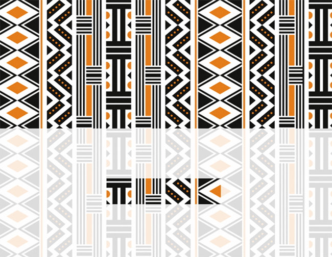
Logos and marks are as important as ever – social media icons have become such a powerful shorthand for brands. But good design work needs to do more than sit neatly in a corner. It needs come to life.
A brilliant identity should have joy at every turn, and playfulness at every point. It should take on a life of its own. It’s not about sticking logos on things; it’s about those small touches in application that people then notice, appreciate and love.
Does it do the impossible?
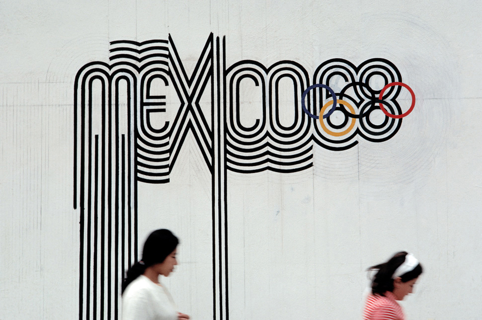

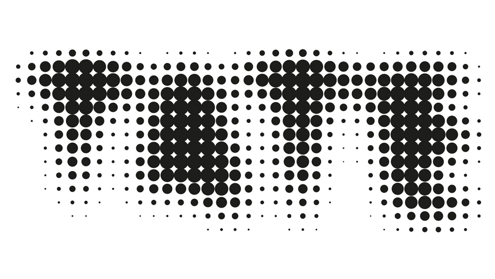
I want to see work that is thoughtful, engaging, beautiful, playful, impactful, surprising, startling, challenging, rewarding and meaningful. That’s a lot to ask, but it’s what makes it worthwhile – for the designer, the client, and especially the audience.
And it is possible – just look at the projects I've mentioned here. I hope there will be some more to add to my list soon.
This article was originally published in Computer Arts issue 266. Buy it here.
Related articles:

Thank you for reading 5 articles this month* Join now for unlimited access
Enjoy your first month for just £1 / $1 / €1
*Read 5 free articles per month without a subscription

Join now for unlimited access
Try first month for just £1 / $1 / €1
Get the Creative Bloq Newsletter
Daily design news, reviews, how-tos and more, as picked by the editors.
